Section 2.2. PHYSICAL STRUCTURE
2.2. PHYSICAL STRUCTUREOnce you've come up with the beginnings of a design, you have to translate it into a physical structure of windows, pages, and controls. That's one of the first aspects of an application that people perceive, especially on the desktop, which can host all the types of window arrangements described here. I've heard this debate many times before: should an application use multiple windows, a single window with several tiled panes, or one window whose content "swaps out" like a web page? Should it use some combination thereof? See Figure 2-6. You may already know by now which to usethe technology you're using often will set your course. Handhelds, cell phones, and most other consumer electronics simply don't give you the option for multiple windows or multiple panes. Even if you could, it's a bad idea, simply because users will find it too hard to navigate without a mouse. Desktop software and large-screen web applications give you more choices. There aren't any hard-and-fast rules for determining what's best for any given design, but the sections that follow provide some guidelines. Before you decide, analyze the kinds of tasks your users will performespecially whether they need to work in two or more UI areas at the same time. Do they need to refer to panel A while editing something in panel B? Do they need to compare A and B side-by-side? Do they need to keep panel A in view at all times to monitor something? Let your understanding of users' tasks drive your decisions. Figure 2-6. Three different physical structures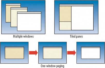 2.2.1. MULTIPLE WINDOWSMultiple windows sometimes are the right choice, but not often. They work best in sophisticated applications when users want to customize the layout of their screen. Infrequent users, and sometimes frequent users too, may find multiple windows irritating or confusing. Sometimes users simply lose them if there are too many of them onscreen at once. On the other hand, if users really need to see two or more windows "in parallel," you need either this or the tiled-pane model. 2.2.2. ONE-WINDOW PAGINGSimple web applications work best with a single-window paging model, which can show one page at a time. It's how the Web has worked from Day One, after all, and people are very familiar with that model. Also, because it conserves space so wellthere's nothing else on-screen to compete with the viewed contentit's the best choice for small handhelds and cell phones. (You couldn't fit tiled or multiple windows, anyhow.) See the One-Window Drill-down pattern for more; it shows how to fit a hierarchical list-driven or task-centered inter-face into a one-window model. 2.2.3. TILED PANESMany applications and web applications use tiled panes on one window. It's great for users who want to see a lot at once while expending little effort on window management. Countless windows and dialog boxes are designed with a two-pane structure, and three is becoming more common, thanks to the prevalence of Outlook and similar applications. People intuitively grasp the idea that you "click in one pane to see something in the other." Tiled panes can take up a lot of screen space, however. I've sometimes had to switch to a multiple window approach when the number of panes got too high, and users just couldn't fit enough of them in the window at once. The first pattern in this chapter, Two-Panel Selector, describes one situation that depends upon tiled panes for its effectiveness. You can structure Canvas Plus Palette with them, too. Some web sites arrange small modules of interactive content onto otherwise ordinary pages; individually, these modules might behave like single-pane windows, but on the page, they're tiled. The tiled and multiple-windows approaches together constitute the "open floor plan" idea mentioned in Chapter 1, in the discussion of focused versus open interfaces. Layouts that use tiled or multiple windows provide access to several things at once, and users take responsibility for focusing their attention on the various panels or windows at the right times. Sometimes technology prevents you from using tiled or multiple windows; at other times you ought to choose not to indulge in them, but instead use a single window to lead the user through the interface along carefully predesigned paths. So it's all about tradeoffs. Of course, this is always true. In the end, what matters is whether or not your usersnovices, intermediates, and expertscan use what you build and enjoy it. Play with the design. Draw pictures and build prototypes. Try them out on yourself, your colleagues, and, most importantly, the users themselves. |
EAN: 2147483647
Pages: 75