2.3. THE PATTERNS This chapter's patterns cover both of the approaches to application design just discussed. Some of them mix content structure with physical structure. They illustrate combinations that are known to work exceedingly well, such as the first four patterns: Two-Panel Selector Canvas Plus Palette One-Window Drilldown Alternative Views
The next few patterns don't go much into physical presentation, but instead deal with content in the abstract. Wizard talks about "linearizing" a path through a task; it can be implemented as any number of physical presentations. Extras on Demand and Intriguing Branches describe additional ways to divide up content. Wizard Extras on Demand Intriguing Branches
Many patterns, here and elsewhere in the book, contribute in varying degrees to the learnability of an interface. Multi-Level Help sets out ways to integrate help directly into the application, thus supporting learnability for a broad number of users and situations. 13. two-panel selector Figure 2-7. Mac Mail 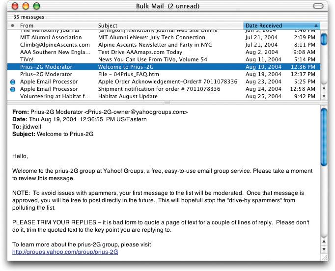
2.3.1.1. what Put two side-by-side panels on the interface. In the first, show a set of items that the user can select at will; in the other, show the content of the selected item. 2.3.1.2. use when You're presenting a list of objects, categories, or even actions. Messages in a mailbox, sections of a web site, songs or images in a library, database records, filesall are good candidates. Each item has interesting content associated with it, such as the text of an email message or details about a file's size or date. You want the user to see the overall structure of the list, but you also want the user to walk through the items at his own pace, in an order of his choosing. Physically, the display you work with is large enough to show two separate panels at once. Very small cell phone displays cannot cope with this pattern, but a screen such as the Blackberry's can. 2.3.1.3. why The Two-Panel Selector is a learned convention, but an extremely common and powerful one. People quickly learn that they're supposed to select an item in one panel to see its contents in the other. They might learn it from their email clients, from Windows Explorer, or from web sites; whatever the case, they apply the concept to other applications that look similar. When both panels are visible side-by-side, users can quickly shift their attention back and forth, looking now at the overall structure of the list ("How many more unread email messages do I have?"), and now at an object's details ("What does this email say?"). This tight integration has several advantages over other physical structures, such as two separate windows or One-Window Drilldown: It reduces physical effort. The user's eyes don't have to travel a long distance between the panels, and he can change the selection with a single mouse click or key press, rather than first navigating between windows or screens (which can take an extra mouse click). It reduces visual cognitive load. When a window pops to the top, or when a page's contents are completely changed (as happens with One-Window Drilldown), the user suddenly has to pay more attention to what he's now looking at; when the window stays mostly stable, as in a Two-Panel Selector, the user can focus on the smaller area that did change. It reduces the user's memory burden. Think about the email example again: when the user looks at just the text of an email message, there's nothing onscreen to remind him where that message is in the context of his inbox. If he wants to know, he has to remember or navigate back to the list. But if the list is already onscreen, he merely has to look, not remember. The list thus serves as a "You are here" signpost (see Chapter 3 for an explanation of signposts).
2.3.1.4. how Place the selectable list on the top or left panel, and the details panel below it or to its right. This takes advantage of the visual flow that most users who read left-to-right languages expect. (Try reversing it for right-to-left language speakers.) When the user selects an item, immediately show its contents or details in the second panel. Selection should be done with a single click. But while you're at it, give the user a way to change selection from the keyboard, particularly with the arrow keysthis reduces both the physical effort and the time required for browsing, and contributes to keyboard-only usability (see Keyboard Only, in Chapter 1). Make the selected item visually obvious. Most GUI toolkits have a particular way of showing selection, e.g., reversing the foreground and background of the selected list item. If that doesn't look good, or if you're not using a GUI toolkit with this feature, try to make the selected item a different color and brightness than the unselected onesthat helps it stand out. What should the selectable list look like? It dependson the inherent structure of the content, or perhaps on the task to be done. For instance, most filesystem viewers show the directory hierarchy, since that's how filesystems are structured. Animation and video-editing software use interactive timelines. A GUI builder simply may use the layout canvas itself; selected objects on it then show their properties in a Property Sheet (Chapter 4) next to the canvas. Consider using one of the models described in the "List of objects" section of this chapter's introduction: Linear, usually sorted 2D tables, also sorted, which often let the user sort via column headers or filter according to various criteria A hierarchy that groups items into categories (and possibly subcategories) A hierarchy that reveals relationships: parent/child, containers, etc. Spatial organizations, such as maps, charts, or desktop-like areas in which users can place things where they want
You also can use information-presentation patterns such as Sortable Table and Tree-Table (both found in Chapter 6) in Two-Panel Selectors, along with simpler components such as lists and trees. Card Stack (Chapter 4) closely relates to Two-Panel Selector; so does Overview Plus Detail (Chapter 6). When the select-and-show concept extends through multiple panels, to facilitate navigation through a hierarchical information architecture, you get the Cascading Lists pattern (also Chapter 6). 2.3.1.5. examples Figure 2-8. The Windows Explorer is probably one of the most familiar uses of Two-Panel Selector. Its content is organized hierarchically, using a selectable tree; in contrast, the Mac Mail example (Figure 2-7) uses a selectable table, which has a strictly linear organization. In both UIs, the dark backgrounds indicate the selected item. 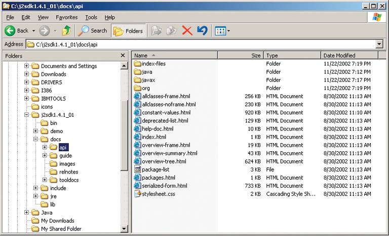
Figure 2-9. Nortel's Mobile Time Entry application is a rare example of Two-Panel Selector use in a handheld device. The Blackberry screen offers just enough space for two usefully sized panes; when you select an item in the top pane, its contents appear on the bottom pane. (Both are scrollable with the Blackberry's scroll wheel, barely visible on the right side.)
In practice, this interface was quite effective. The lawyers who used this time-billing application could easily find items that they wantedthe two views together give enough context, but also enough details, to identify items quickly and accurately. 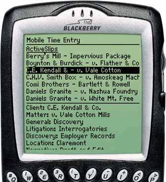
14. canvas plus palette Figure 2-10. Photoshop 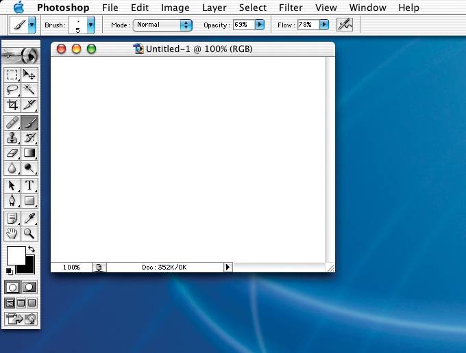
2.3.2.1. what Place an iconic palette next to a blank canvas; the user clicks on the palette buttons to create objects on the canvas. 2.3.2.2. use when You're designing any kind of graphical editor. A typical use case involves creating new objects and arranging them on some virtual space. 2.3.2.3. why This pair of panelsa palette with which to create things, and a canvas on which to put themis so common that almost every user of desktop software has seen it. It's a natural mapping from familiar physical objects to the virtual onscreen world. And the palette takes advantage of visual recognition: the most common icons (paintbrush, hand, magnifying glass, etc.) are reused over and over again in different applications, with the same meaning each time. 2.3.2.4. how Present a large, empty area to the user as a canvas. It might be in its own window, as in Photoshop (in Figure 2-10), in a tiled panel, or embedded in a single page with other tools. It works no matter what physical structure you've chosen, as long as you can see the canvas side-by-side with the palette. The palette itself should be a grid of iconic buttons or button-like areas. They can have text in them if the icons are too cryptic; some GUI-builder palettes list the names of GUI components alongside their icons. So does Visio, with its palettes of complex visual constructs tailored for specific domains. But the presence of icons appears necessary for users to recognize the palette for what it is. Place the palette to the left or top of the canvas. (It's likely that speakers of right-to-left languages might prefer it to the right of the canvas, not the left; usability-test it if this is an issue for you.) It can be divided into subgroups, and you may want to use a Card Stack, such as tabs, to present those subgroups. Most palette buttons should create the pictured object on the canvas. But some builders have successfully integrated other things, like zoom mode and lassoing, into the palette. This started early; MacPaint mixed its modes into its palette (see Figure 2-12), and people have learned what the arrow, hand, and other icons do. But be careful. I recommend not mixing other actions into a creational paletteit can be very confusing for users. The gestures used to create items on a palette vary from one application to another. Some use drag-and-drop only; some use a single click on the palette and single click on the canvas; and some use One-off Modes (see Chapter 8), Spring-Loaded Modes, and other carefully designed gestures. I have always found that usability testing in this area is particularly important, since users' expectations vary greatly. 2.3.2.5. examples Figure 2-11. You don't need all the trappings of a document-centered desktop application to make Canvas Plus Palette work. This web application, Mr. Picassohead, is a whimsical twist on this familiar pattern. The palette itself is merely a grid of icons, and it doesn't look like a set of buttons at all; the palette is subdivided and "tabbed" by category (a use of Two-Panel Selector). When you click on the words "eyes," "noses," or "lips," the palette changes to show those objects. The canvas itself is neutral, but not white. Its purpose is clear to the first-time user simply because it's a big open space, framed by a border. See http://mrpicassohead.com. 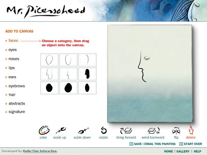
Figure 2-12. Taking a trip back in time, let's look at one of the interfaces that popularized this pattern: MacPaint. The pattern hasn't changed much since 1984the basic elements are all there, in the same spatial configuration used by contemporary software such as Mr. Picassohead and Photoshop. Photoshop and other visual builders, in fact, still use many of MacPaint's icons over 20 years later. The screenshot is from http://mac512.com. 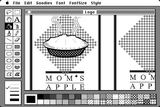
15. one-window drilldown Figure 2-13. Two iPod menus 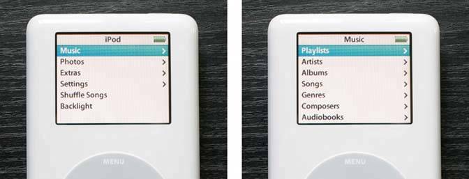
2.3.3.1. what Show each of the application's pages within a single window. As a user drills down through a menu of options, or into an object's details, replace the window contents completely with the new page. 2.3.3.2. use when Your application consists of many pages or panels of content for the user to navigate through. They might be arranged linearly, in an arbitrary hyperlinked network, ormost commonlyin a menu hierarchy. Address books, calendars, webbased email readers, and other familiar applications often use this pattern. One or both of these constraints might apply to you: You are building for a device with tight space restrictions, such as a handheld (see Figure 2-13), a cell phone, or a TV. On these miniature screens, Two-Panel Selector and tiled panes in generalare impractical because there just isn't enough room to use them well. Traversing from one panel to another on a TV screen also is difficult, since TVs have no mice. Even if you build for a desktop or laptop screen, you may have a complexity limit. Your users may not be habitual computer usershaving many application windows open at once may confuse them, or they may not deal well with complex screens or fiddly input devices. Users of information kiosks fall into this category, as do novice PC users.
2.3.3.3. why Keep it simple. When everything's on one screen or window, the options at each stage are clear, and users know they don't need to focus their attention anywhere else. Besides, everyone these days knows how to use a web browser, with its single window and simple back/forward page model. People expect that when they click on a link or button, the page they're looking at will be replaced, and when they click "Back," they'll go back to where they were before. You could use multiple windows to show the different spaces that a user navigates througha click in a main window may bring up a second window, a click in that window brings up a third, etc. But that can be confusing. Even sophisticated users can easily lose track of where their windows are (though they can see several windows side-by-side and place them where they want). One-Window Drilldown is an alternative to several of the higher-density patterns and techniques discussed here. As pointed out earlier, Two-Panel Selector may not fit, or it may make the screen layout or interactions too complex for the typical user. Tiled windows, Closable Panels, Movable Pieces, and Cascading Lists (the last three are patterns in Chapter 4) also have space and complexity issues. They don't work on miniature screens, and they complicate interfaces intended for novice computer users. 2.3.3.4. how You are given one window to work witha miniature screen, a full-sized screen, a browser window, or an application window that lives on the desktop alongside other applications. Structure your content into panels that fit gracefully into that window: not too large and not too small. On these panels, design obvious "doors" into other UI spaces, such as underlined links, buttons, or clickable table rows. When the user clicks on one of these, replace the current panel with the new one. Thus the user "drills down" deeper into the content of the application. How does the user go back? If you're designing for a device with back/forward buttons, that's one solution. If not, create those buttons and put them in one permanent place on the windowusually the upper left, where browsers put them. You should put "Done" or "Cancel" controls on panels where the user completes a task or selection; these controls give the user a sense of closure, of "being done." Remember that with no graphic depiction of the application's structure, nor of where they are in that structure, a one-window application forces the user to rely on a mental picture of how all these spaces fit together. Simple linear or hierarchical structures work best. In usability tests, make sure people can use the thing without getting lost! Breadcrumbs and Sequence Maps can help if they do; see Chapter 3, Navigation. Implementations of Hub and Spoke often use OneWindow Drilldown, especially on the Web and miniature screens. Again, see Chapter 3. 2.3.3.5. examples Figure 2-14. The Mac OS X System Properties tool keeps everything within one window. The main panel is on the left; a drilldown panel (for the Dock) is shown on the right. There's only one level of drilldown panels. The user goes back to the main panel via the "Show All" button in the upper left.
Mac screens often are large, and OS X users are varied in their levels of experience. The System Properties designers may have chosen a OneWindow Drilldown approach not because of small screens, but because of the sheer number and diversity of subpanels. That main panel takes up a lot of space, and it probably didn't work well in a tiled Two-Panel Selector window. 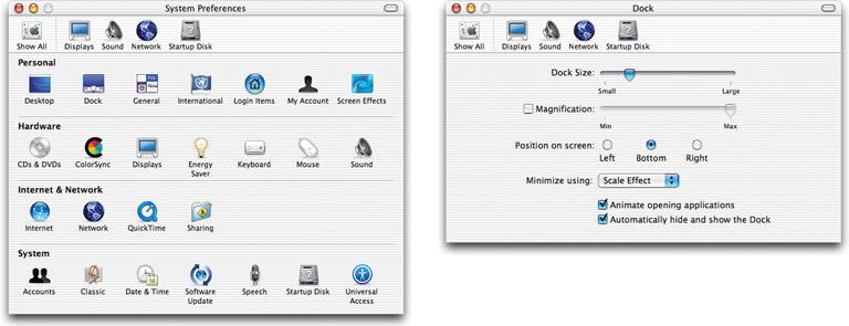
Figure 2-15. The Pine email client is a lightweight, text-only user interface driven entirely from the keyboard. The greater-than and less-than keys navigate the application's hierarchy: the main screen, the list of mailboxes, the list of messages within the selected mailbox (left), the text of the selected message (right), and the attachments to the message.
Pine thus contains a deep hierarchy of UI "spaces," but it works well within one window. Compare this screenshot to that of Mac Mail in the Two-Panel Selector patternboth are good interfaces, but they have very different designs. We might guess that two stringent requirements drove Pine's One-Window Drilldown design: to run in a text-based terminal window, and to be operated with only the keyboard. 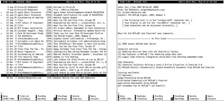
16. alternative views Figure 2-16. A boston.com article in standard format and in printer-friendly format 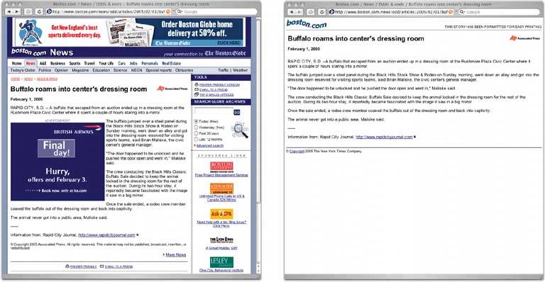
2.3.4.1. what Let the user choose among alternative views that are structurally different, not just cosmetically different, from the default view. why 2.3.4.2. use when You're building a web page, an editor, a map application, or anything that displays formatted content of any kind. People will use it under many conditions. Maybe you already provide some customizability font sizes, languages, sort order, zoom level, etc.but those lightweight changes don't go far enough to accommodate all the things people typically do with it. 2.3.4.3. why Try as you might, you can't always accommodate all possible usage scenarios in a single design. For instance, printing is typically problematic for applications because the information display requirements differnavigation and interactive gizmos should be removed, for instance, and the remaining content reformatted to fit the printer paper. See the news article example above (Figure 2-16) for what that can look like. Beyond different usage scenarios, you should use Alternative Views for several other reasons: Different technologies at the user's end one person might view the application on a desktop, but another person would view it on a PDA, and a third would use a screen reader such as JAWS. Users' preferences with regard to speed, visual style, and other factors. A need to temporarily view something differently, in order to gain insight.
2.3.4.4. how Choose a few usage scenarios that the application's (or page's) normal mode of operation cannot easily serve. Design specialized views for them, and present those views as alternatives within the same window or screen. In these alternative views, some information might be added, and some might be taken away, but the primary content should remain more or less the same. If you need to strip down the interfacefor use by a printer or screen reader, for instancethen consider removing secondary content, shrinking or eliminating images, and cutting out all navigation but the most basic. Stuffing content into a PDA or cell phone screen is trickier; it could force you to redesign the navigation itself. Rather than showing a lot of content on one screen or page, as you could with a desktop computer or TV, you might split it up into multiple pages, each of which fits gracefully onto a smaller screen. Put a "switch" for the mode somewhere on the main interface. It doesn't have to be prominent; Powerpoint and Word (as you'll see in Figure 2-19) put their mode buttons in the lower-left corner, which is an easily overlooked spot on any interface. Most applications represent the alternative views with iconic buttons. Make sure it's easy to switch back to the default view, too. As the user switches back and forth, preserve all of the application's current stateselections, the user's location in the document, uncommitted changes, Undo/Redo operations, etc. Losing them will surprise the user. Applications that "remember" their users often retain the user's alternative-view choice from one use to the next. In other words, if a user decides to switch to an alternative view, the application will just use that view by default next time. Web sites can do this with cookies; desktop applications can keep track of preferences per user; an app on a digital device like a cell phone can simply remember what view it used the last time it was invoked. Web pages may have the option of implementing Alternative Views as alternative CSS pages. This is how some sites cope with print-suitable views, for example. Figure 2-17. Both the Windows Explorer and the Mac Finder permit several alternative views of the files in a filesystem. This example shows two views: a sortable multicolumn list (see the Sortable Table pattern in Chapter 6) and a grid of icons.
Each view has pros and cons. The table is terrific for managing lots of informationthe user can find things by sorting on the columns, for instance. But the icons work better if she is looking for a particular image that she can recognize on sight. These views address different use contexts, and a user might go back and forth among them at one sitting. 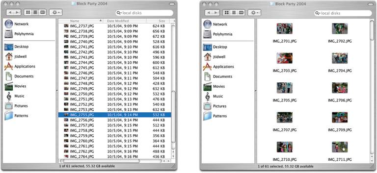
Figure 2-18. Google's search results can return not just ordinary HTML Web pages, but PDF, Word, and Powerpoint documents as well. What if you don't have Word or Powerpoint on your client machine? That technology problem dictates the use of an alternative view: the HTML "translation." What if you really don't want to download a large Powerpoint slideshow and just want to skim the HTML translation in a hurry? That's a user preference. 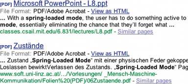
Figure 2-19. Of course, we have Word and Powerpoint themselves. Both full-fledged WYSIWYG editors can construct fairly complex documentsa Powerpoint presentation has a sequence, a template, perhaps notes for some slides, fancy transitions from one slide to another, and even code to support interactivity. A user who's authoring the slideshow may need to see all that. A user who's just running the slideshow doesn't. Again, these are different use contexts.
Word's views include the normal view, intended for most editing tasks; a "print layout" view, which shows how the document might appear on printed pages; a "reading" mode for uncluttered viewing; and an "outline" view, which shows the structure of the document. Someone might use the outline view to gain insightif you loaded a large, unfamiliar document, for instance, you might switch to outline mode just to see a "table of contents" overview of it. Both applications put the Alternative Views buttons in the lower lefthand corner of the document's window.
Note that in these Word examples, the selected text remains the same as the user switches from one view to another. The position in the document also stays the same through most transitions. However, different toolbars come and go, the zoom level changes, and some kinds of contentnotably footnotes and annotationsare visible only in the print layout view. 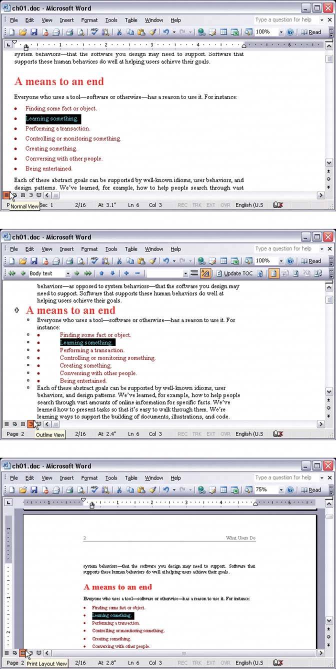
17. wizard Figure 2-20. Flight Wizard from http://expedia.com 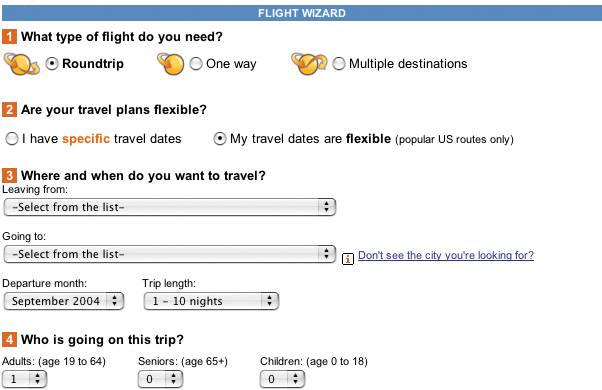
2.3.5.1. what Lead the user through the interface step by step, doing tasks in a prescribed order. 2.3.5.2. use when You are designing a UI for a task that is long or complicated, and that will be novel for the userit's not something that they do often or want much fine-grained control over. You're reasonably certain that those of you who design the UI will know more than the user does about how best to get the task done. Tasks that seem well-suited for this approach tend to be either branched or very long and tediousthey consist of a series of user-made decisions that affect downstream choices. The catch is that the user must be willing to surrender control over what happens when. In many contexts, that works out fine, since making decisions is an unwelcome burden for people doing certain things: "Don't make me think, just tell me what to do next." Think about moving through an unfamiliar airportit's often easier to follow a series of signs than it is to figure out the airport's overall structure. You don't get to learn much about how the airport is designed, but you don't care about that. But in other contexts, it backfires. Expert users often find Wizards frustratingly rigid and limiting. This is particularly true for software that supports creative processeswriting, art, or coding. It's also true for users who actually do want to learn the software; wizards don't show users what their actions really do, nor what application state is changed as choices are made. That can be infuriating to some people. Know your users well! 2.3.5.3. why Divide and conquer. By splitting up the task into a sequence of chunks, each of which the user can deal with in a discrete "mental space," you effectively simplify the task. You have put together a preplanned road map through the task, thus sparing the user the effort of figuring out the task's structureall they need to do is address each step in turn, trusting that if they follow the instructions, things will turn out OK. 2.3.5.4. how 2.3.5.4.1. "CHUNKING" THE TASK Break up the operations constituting the task into a series of chunks, or groups of operations. You may need to present these groups in a strict sequence, or not; there is value in breaking up a task into Steps 1, 2, 3, and 4 just for convenience. A thematic breakdown for an online purchase may include screens for product selection, payment information, a billing address, and a shipping address. The presentation order doesn't much matter, because later choices don't depend on earlier choices. Putting related choices together just simplifies things for people filling out those forms. You may decide to split up the task at decision points so that choices made by the user can change the downstream steps dynamically. In a software installation wizard, for example, the user may choose to install optional packages that require yet more choices; if they choose not to do a custom installation, those steps are skipped. Dynamic UIs are good at presenting branched tasks such as this because the user never has to see what is irrelevant to the choices she made. In either case, the hard part of designing this kind of UI is striking a balance between the sizes of the chunks and the number of them. It's silly to have a two-step wizard, and a fifteen-step wizard is tedious. On the other hand, each chunk shouldn't be overwhelmingly large, or you've lost some benefits of this pattern. 2.3.5.4.2. PHYSICAL STRUCTURE Wizards that present each step in a separate page, navigated with Back and Next buttons, are the most obvious and well-known implementation of this pattern. They're not always the right choice, though, because now each step is an isolated UI space that shows no contextthe user can't see what went before or what comes next. But an advantage of such wizards is that they can devote an entire page to each step, including illustrations and explanations. If you do this, allow the user to move back and forth at will through the task sequence. There's nothing more frustrating than having to start a task over just because the software won't let you change your mind about a previous decision. Back buttons are, of course, standard equipment on separate-page wizards; use them, and make sure the underlying software supports stepping backwards. Additionally, many UIs show a selectable map or overview of all the steps, getting some of the benefits of Two-Panel Selector. (In contrast to that pattern, Wizard implies a prescribed ordereven if it's merely suggestedas opposed to completely random access.) If you choose to keep all the steps on one page, you could use one of several patterns from Chapter 4: Titled Sections, with prominent numbers in the titles. This is most useful for tasks that aren't heavily branched, since all steps can be visible at once. Responsive Enabling, in which all the steps are present on the page, but each remains disabled until the user has finished the previous step. Responsive Disclosure, in which you wait to show a step on the UI until the user finishes the previous one. Personally, I think this is the most elegant way to implement a short wizard. It's dynamic, compact, and easy to use.
Good Defaults (from Chapter 7) are useful no matter how you arrange the steps. If the user is willing to turn over control of the process to you, then odds are good he's also willing to let you pick reasonable defaults for choices he may not care much about, such as the location of a software installation. (The Design of Sites discusses this concept under the pattern name "Process Funnel." Their pattern aims more at web sites, for tasks such as web shopping, but the concepts generalize well.) 2.3.5.5. examples Figure 2-21. TurboTax is a web application that presents several steps in a wizard-like fashion. Each major step is on a different page, and the pages have "Back" and "Continue" (or "Done") links at the ends of the pages, as traditional wizards do. (They're not visible on these screenshots, but trust me, they're there.) A Sequence Map at the top shows where you are in the steps at all times. Good Defaults generally aren't used here. That may be because sensitive informationpersonal financial datais involved, but many users will find themselves entering "0" for a lot of fields. 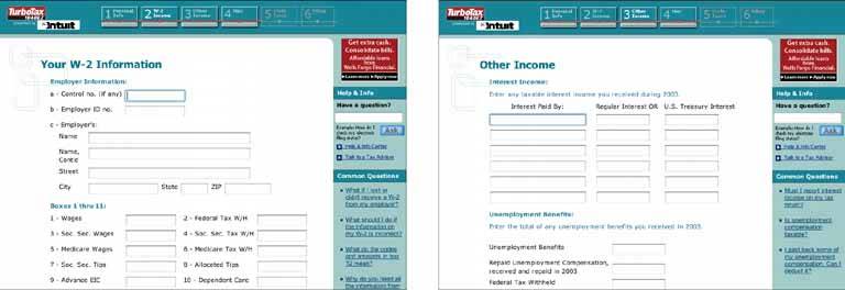
Figure 2-22. The Expedia example showed a wizard structured with Titled Sections (Chapter 4); the TurboTax example uses a paged model, replacing the contents of the browser window with each successive step. This example uses a Card Stack (also Chapter 4) to fit all steps into a very limited space. When the user selects a date from this calendar and clicks "Next Step," panel 2 opens up. When that step is done, the user moves on to Panel 3. The user can go back to previous steps anytime by clicking on the yellow titlebars.
Also note the use of a Preview (Chapter 5) on the righthand pane of the window, entitled "Your Itinerary." This tracks the user's choices (no pun intended) and shows a summary of those choices. This is convenient because only one wizard page is visible at a time; the user can't see all their choices at once. See http://thetrain.com. 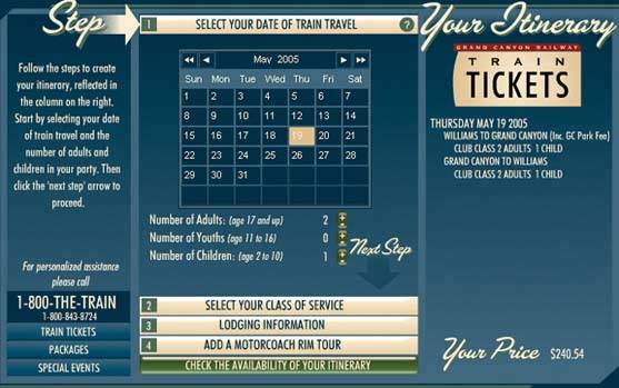
18. extras on demand Figure 2-23. The color dialog box in Windows 2000 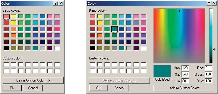
2.3.6.1. what Show the most important content up front, but hide the rest. Let the user reach it via a single, simple gesture. 2.3.6.2. use when There's too much stuff to be shown on the page, but some of it isn't very important. You'd rather have a simpler UI, but you have to put all this content somewhere. 2.3.6.3. why A simple UI is often better than a complex one, especially for new users, or users who don't need all the functionality you can provide. Let the user choose when to see the entire UI in its full glorythey're a better judge of that than you are. If your design makes 80 percent of the use cases easy, and the remaining 20 percent are at least possible (with a little work on the user's part), your design is doing as well as can be expected! When done correctly, Extras On Demand can save a lot of space on your interface. 2.3.6.4. how Ruthlessly prune the UI down to its most commonly used, most important items. Put the remainder into their own page or section. Hide that section by default; on the newly simplified UI, put a clearly marked button or link to the remainder, such as "More Options." Many UIs use arrows or chevrons, ">>", as part of the link or button label. Others use "…", especially if the button launches a new window or page. That section should have another button or other affordance to let the user close it again. Remember, most users won't need it most of the time. Just make sure the entrance to and exit from this "extras" page are obvious. In some interfaces, the window literally expands to accommodate the details section, and then shrinks down again when the user puts it away. See the Closable Panels pattern (Chapter 4) for one way to do this. Various desktop UIs provide another mechanism: a dropdown for fill color, for instance, contains a "More Fill Colors…" item that brings up a separate dialog box. Figure 2-24. Narratives frequently use Extras On Demand to separate the gist of an article from its full text. A reader can scan the leader, such as this one from CNN, and decide whether or not to read the rest of the article (by clicking "Full Story," or the headline itself). If they don't go to the jump page, that's finethey've already read the most important part. 
Figure 2-25. This is the file search facility in Windows 2000. Clicking "Search Options" opens a box of extra options. Likewise, clicking the titlebar of the Search Options box, with its "<<" chevron, closes the box. Not shown is another level of Extras on Demand: when the user unchecks "Advanced Options," the indented checkboxes below it disappear. This makes it similar to Responsive Disclosure (Chapter 4), which talks about content that comes and goes as a side effect of the choices the user makes, as opposed to Extras on Demand, which requires an intentional act to open or close content. 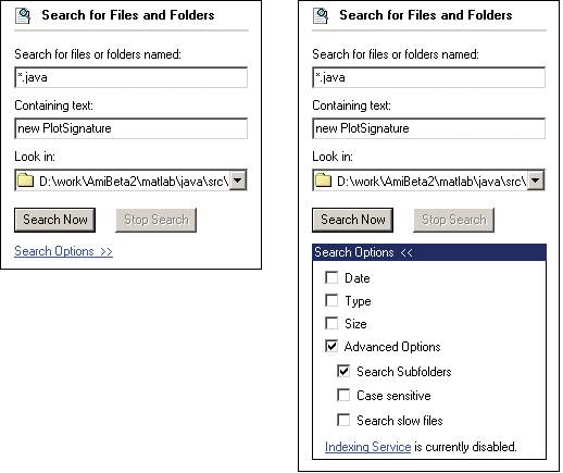
19. intriguing branches Figure 2-26. From http://kuro5hin.org 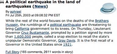
2.3.7.1. what Place links to interesting content in unexpected places, and label them in a way that attracts the curious user. 2.3.7.2. use when The user moves along a linear patha text narrative, a well-defined task, a slideshow, a Flash movie, etc. You want to present additional content that's not the main focus of attention, however. It might be information tangential to a story, as in Figure 2-26. It might be supporting textexamples, explanations of concepts, definitions of termsor full-fledged help text. Or it could be hidden functionality, like an "Easter egg." In any case, you want a graceful way of presenting the content so it's ignorable by users trying to get something done quickly, but still available to users for whom it's appropriate. 2.3.7.3. why People are curious. If they see something that looks interesting, and they have the time and initiative to check it out, they will. Web surfing would never have become popular without this natural curiosity and willingness to follow links into the unknown. Skillful and playful use of Intriguing Branches can make your interface more fun. A tradition of creating Intriguing Branches as inline links (also known as "embedded links") already is well-established on the Web. But functional applications might provide a more interesting use of it. It's well-known that users tend to ignore what is labeled specifically as "Help." But what if you put help-like content behind links (or buttons, or icons) that were labeled in some other way, like "Learn more…"? You can exploit users' natural curiosity to get them into a place where they can learn what they need. 2.3.7.4. how Start with a deep understanding of your users. What might interest them? Where in the interface are they likely to take time to explore something further, and where do they just need to get something done? Create "doors" into the supplemental content that would appeal to users. These doors might be underlined links (even in desktop applications), headlines, buttons, menu items, icons, or clickable image regionsit's up to you to figure out how to label them in a way that inspires curiosity. There's an art to it. When in doubt, usability-test it with a representative sample of your user base. With particularly obscure affordances, like icons or images, you might want to add tooltips or some other kind of short description to inform the user where they might go when they click on it. (With an Easter egg, though, its very non-obviousness is part of the fun.) Also, provide an obvious way for the user to get back to their original workflow. The idea is to persuade users to read the branch content, and then go back to what they were originally doing; don't get them stranded in a backwater! Pop-up windows should provide "Close" buttons, and new pages in a browser-like UI should provide "Back" links or buttons. Figure 2-27. Gmail's settings page offers links that are clearly help-related, but are phrased as suggestions, not as "help." Here, a "Learn more" link is under the Keyboard Shortcuts caption. This is akin to other forms of context-sensitive help, like pop-up menus, help buttons, and function keys. "Learn more" is an active phrase, unlike "Help," though, and it's clearly visible on the page, unlike menus and function keys. One can assume that it opens yet another web page, so its operation is entirely predictable. 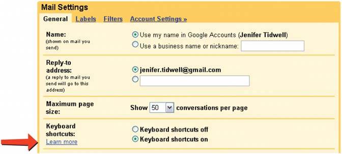
Figure 2-28. Browsing photos in Flickr is often an exercise in following various intriguing branchesit offers "side trips" into other photostreams, image sets, and groups of images with common tags. The result is a thoroughly engaging (and very popular) user experience. 
Figure 2-29. A not-so-great example lies in Adobe's PDF reader for Windows. The pink button, "Create an Adobe PDF from your desktop," takes you to a page on Adobe's web site that explains how to use a different product to achieve that task. The button's color and content actually changes every few minutes; it shows a different teaser each time. This is an unusual case of such a link being present in an applicationmost don't take up valuable toolbar space with something like this.
But these buttons are somewhat self-serving on Adobe's part, since they encourage you to look at other Adobe products and services. Unfortunately, it looks like an advertising device. It would be interesting to know how effective they are, both at cross-selling and at helping users figure out how to do things they need to do anyway. 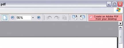
20. multi-level help Figure 2-30. Excel's various help techniques, all integrated into the UI 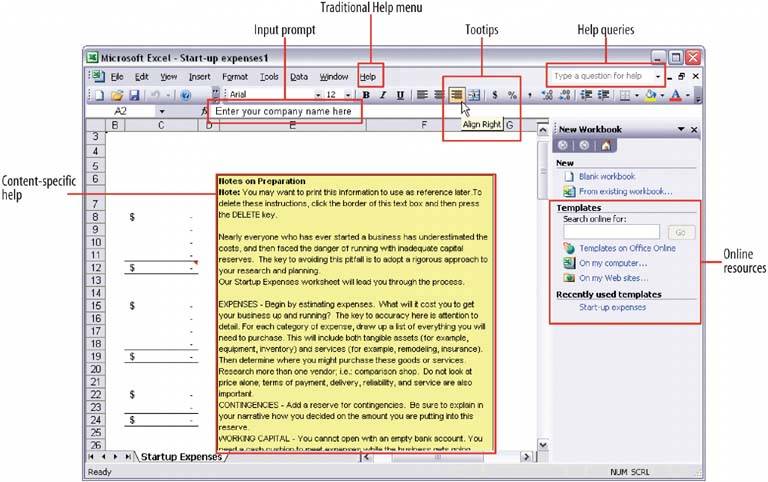
2.3.8.1. what Use a mixture of lightweight and heavyweight help techniques to support users with varying needs. 2.3.8.2. use when Your application is complex. Some users are likely to need a full-fledged help system, but you know most users won't take the time to use it. You want to support the impatient and/or occasional users too, to the extent you can. In particular, your software may be intended for intermediate-to-expert usershow will you help beginners become experts? 2.3.8.3. why Users of almost any software artifact need varying levels of support for the tasks they're trying to accomplish. Someone approaching it for the first time ever (or the first time in a while) needs different support than someone who uses it frequently. Even among first-time users, enormous differences exist in commitment level and learning styles. Some people will want to read a tutorial, some won't; most find tooltips helpful, but a few find them irritating. Help texts that are provided on many levels at onceeven when they don't look like traditional "help systems" reach everyone who needs them. Many good help techniques put the help texts within easy reach, but not directly in the user's face all the time, so users don't get irritated. However, the techniques need to be familiar to your users. If they don't notice or open a Closable Panel, for instance, they'll never see what's inside it. 2.3.8.4. how Create help on several levels, including some techniques (but not necessarily all) from the following list. Think of it as a continuum: each requires more effort from the user than the previous one, but can supply more detailed and nuanced information. Captions and instructions directly on the page, including patterns like Input Hints and Input Prompt (both Chapter 7). Be careful not to go overboard with them. If done with brevity, frequent users won't mind them, but don't use entire paragraphs of textfew users will read them. Tooltips. Use them to show brief, one- or two-line descriptions of interface features that aren't self-evident. For icon-only features, tooltips are critical; users can take even nonsensical icons in stride if a rollover says what the icon does! (Not that I'd recommend poor icon design, of course.) Tooltips' disadvantages are that they hide whatever's under them, and that some users don't like them popping up all the time. A short time delay for the mouse hovere.g., one or two secondsremoves the irritation factor for most people. Slightly longer descriptions that are shown dynamically as the user selects or rolls over certain interface elements. Set aside an area on the page itself for this, rather than using a tiny tooltip. Longer help texts contained inside Closable Panels (see Chapter 4). Help shown in a separate window, often in HTML via browsers, but sometimes in WinHelp or Mac Help. Help is often an online manualan entire bookreached via menu items on a Help menu, or from "Help" buttons on dialog boxes and HTML pages. "Live" technical support, usually by email, the Web, or telephone. Informal community support, almost always on the Web. This applies only to the most heavily used and invested softwarethe likes of Photoshop, Linux, Mac OS X, or MATLABbut users may consider it a highly valuable resource.
2.3.8.5. examples MATLAB is a complex, multilayered software application that offers help on all these levels. Each of the following examples comes from it. Figure 2-31. When you start MATLAB, the command line immediately directs you to help documents: "To get started, select MATLAB Help or Demos from the Help menu." You also can see captioned items on the Shortcuts toolbar, on which the "How to Add" and "What's New" buttons bring up help texts in separate windows. 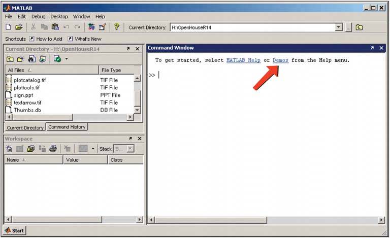
Figure 2-32. Each toolbar button on the main window has a tooltip. Since MATLAB is an application designed for intermediate and expert users, it packs a lot of unusual functionality into small spaces, and tooltips are necessary to learnor rememberwhat some of these buttons do. 
Figure 2-33. Rollover help is used in a few areas, such as the status bars of movable panels. The sentence shown in this status bar, "Click and drag to move Workspace…," is a little too long to view comfortably in a tooltip. More importantly, the status bar is less obtrusivea user can ignore it more easily than he can a tooltip. 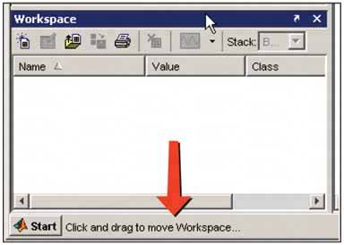
Figure 2-34. Elsewhere in the MATLAB interface, the selection of an object might cause a short description to appear in a closable panel. In this window, selecting a plot type causes the "Description" panel to show a short formatted help page. The help text is longer than often needed (the user can close that panel if he wants), but it's more immediateand thus more likely to be usedthan help in a separate window. 
Figure 2-35. In the previous window, clicking the underlined word "plot" in "See the plot reference page for more information" brings up a full-fledged help window. This tool gives the user access to the entire MATLAB manual. 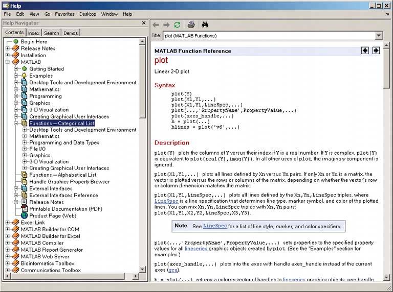
Figure 2-36. MATLAB users also get technical support over the phone and the Web. We've now moved beyond the realm of software design per se, but this is still product designuser experience extends beyond the bits installed on their computers. It includes the interactions they have with the company and its web site. 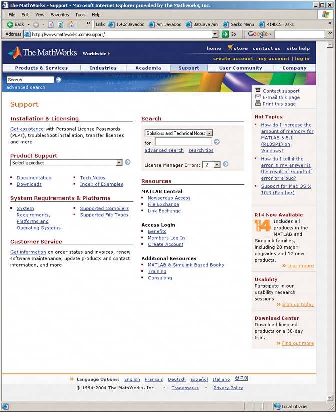
Figure 2-37. Finally, if all other sources of help are exhausted, a user can turn to the wider user community for advice. In the case of MATLAB, users ask and answer one another's questions on a specialized newsgroup, comp.soft-sys.matlab. (Webbased discussions can serve the same purpose.) Communitybuilding like this happens only for products in which users become deeply invested, perhaps because they use it every day at work or home, or because they have some emotional attachment to it, as many people do with games, Macs, or open source software. 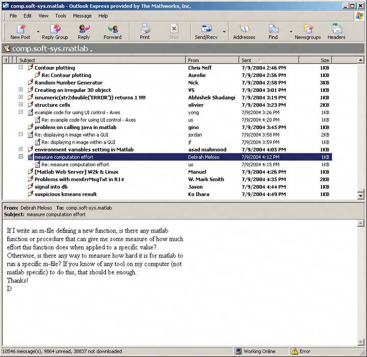
|