Selecting and Preparing the Best Graphics
Regardless of whether you use your PDFs on the Web, in desktop work, or in high-quality print output, you will want to pay attention to the quality of your graphics so that your PDFs will view well, at least on screen. If you plan to output your PDFs on high-resolution devices such as commercial printing presses, you will want to pay particular attention to the dimension, resolution, color space, and file format in which you save your graphics. Following is an overview of some of the key issues to attend to when creating and formatting your graphics.
Controlling Image Quality
To assure good-quality images, you should make key fundamental adjustments (in a graphics application, of course) including setting the overall brightness and contrast control and performing basic color corrections for color images. You initially control brightness and contrast by setting the proper highlight and shadow starting points (usually with an editable histogram, like the one in Figure 2.3) and then fine-tuning between those (typically with a curve tool, like the one in Figure 2.4). You perform basic color correction by making RGB values equal in neutral areas of your image (as in Figure 2.5). See the recommended reading list in the appendix for more complete information on image correction.
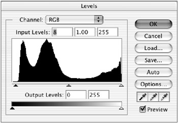
Figure 2.3: Histogram setting of highlight and shadow points
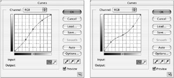
Figure 2.4: Raise the curve to lighten and apply an S shape to increase contrast; lower the curve to lighten and flatten the shape to lower contrast.
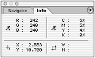
Figure 2.5: Equalize RGB values at a neutral location in your image to remove color cast.
Creating Images at Final Dimensions
For the best quality and results and easiest and fastest output when printing, you should place images in their page layout documents at 100 percent size . If possible, it is best to scan or capture the images at the proper dimension in the beginning. When this is not possible and you find yourself scaling images later, you should return to your graphics application ”before inserting your graphic into the page layout and prior to outputting to PostScript and PDF ”and resize your image there so that it will be placed in your page layout application at 100 percent. Figure 2.6 shows the image-sizing process in PhotoShop. After resizing the image dimensions, you will want to update the link to this graphic (as described in the later section Establishing and Maintaining Links ).
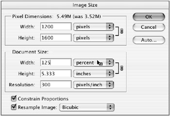
Figure 2.6: Resize images and control resolution in a graphics application, and then place at 100 percent in a page layout application.
| Note | Most professional page layout applications provide a hot link from placed graphics to their original graphics application (such as PhotoShop for pixel-based images or Illustrator for vector-based images), which streamlines any resizing or updating of the placed images. |
Make sure that when you scale an image (particularly up), you maintain the resolution of the image. See the next section for a discussion of resolution requirements.
| Note | I realize that you may not always have the time to create the best quality and results. And cutting some corners, such as scaling your graphics in your page layout application, may often produce acceptable results ”I cut corners sometimes too. However, in this chapter, I am noting those key issues and methods that will produce the best quality and results when you want or need to. |
Setting Appropriate Image Resolution
Images of a wide range of resolutions (from 72 ppi to more than 2000 ppi) all typically look fine on screen because screen resolutions tend to be low (72 “96 ppi). It is during printing that you often see a degradation of image quality (the common blockiness known as pixelization or rasterization). The resolution of your images should be determined by the demands for the highest-quality output device you will be using. Table 2.2 lists typical resolution (in pixels per inch, or ppi, commonly referred to as dpi) requirements for various categories of output devices. Note the high-resolution requirements for commercial printing.
| Device | Resolution |
|---|---|
| Monitors | 72 “96 ppi |
| Desktop inkjet printers | 150 “200 ppi |
| Desktop laser printer | 125 “200 ppi |
| Wide format printing | 300 ppi (8 ³ —10 ³ image) |
| Commercial printing( ‰ 133 lpi) | 200 ppi |
| Commercial printing(150 “200 lpi) | 300 ppi |
| Note | For printing devices that use lines screens (LPI), if you provide 100 percent scaled images with resolutions of 2x lpi, you will have plenty of resolution to support high-quality printing. |
Remember that if you scale your image up in a page layout document, the effective resolution of your graphic will drop by a similar percentage to the scaling. For instance, if you scale an image up 200 percent, your effective resolution will drop by 50 percent. So, if your original image was 300 ppi, its final resolution will be 150 ppi after scaling. If you intend to output this image at 175 lpi, it would no longer offer enough resolution to support this high-quality output. This is one of the key reasons why you want to make sure that you scale and control the resolution of your image when you capture your image or in the original graphics application before final placement and output (see Figure 2.6).
| Note | Throughout this book I will use the proper image, or input, resolution terminology of pixels per inch (ppi). You will commonly find image resolution referred to as dots per inch (dpi). Images are constructed of pixels, not dots. Dpi is appropriate for referring to print or output resolution where you actually print your images with spots and dots. LPI is short for lines per inch, and refers to the number of halftone dots (which form rows or lines of dots) per inch used when printing an image. It is often useful to clearly distinguish between input and output resolution to prevent confusion. My books SilverFast: The Official Guide (Sybex, 2003) and Avoiding the Output Blues (Prentice-Hall, 1999) have complete discussions of this topic. |
Assigning the Appropriate File Format for Output
File formats can be thought of as containers that hold the pixels and vector components or building blocks of your images. Like the shoes you choose to wear for different occasions or uses, it is often necessary to match the containers (file formats) with specific uses. As with resolution, the device to which you intend to output your PDF should determine the file format you choose for your graphic images. Here again, on-screen viewing is the least demanding in terms of file format assignments. The most demanding is PostScript printing. The processing of the image during printing, known as RIPping, proceeds faster and more dependably if you use specific file formats such as TIFF and EPS. Table 2.3 includes some common file formats and their contents and uses.
| Format | Uses |
|---|---|
| BMP | Pixel-based image format: Appropriate for non-PostScript desktop printing. |
| EPS | Vector-based and pixel-based ( especially multi-tonal and/or pre-color separated), and pixel+ vector-based images: Appropriate for commercial PostScript as well as general-purpose printing. Some RIPs will not process EPS files and will render only low-resolution versions during printing. |
| GIF | Lossless compressed pixel-based image format: Appropriate for web viewing. Not recommended for high-quality and/or PostScript printing; 8-bit pixel depth does not contain enough information for printing at high quality or resolution. |
| JPEG | Lossy compressed pixel-based image format: Appropriate for web viewing. Not recommended for high-quality and/or PostScript printing. Lossy compression may lower the print image quality too much. |
| TIFF | Very flexible pixel-based file format (recent versions support both pixel and vector components): Appropriate for commercial PostScript as well as general-purpose printing. |
| WFM | Combined pixel- and vector-based image format: Appropriate for non-PostScript desktop printing. |
| Note | RIP is an acronym for raster image processing or processor , used as either a verb or a noun. Ripping is the process through which a document is converted from a document code (for text and graphic elements) into printable elements. A RIP is a device that does this processing. So RIP is either a process or device that is used to convert a document into a printable page. |
If your intended output includes PostScript printing devices, I recommend that you consider using TIFF and EPS exclusively. (For an explanation of lossy and lossless compression, see the later section Compressing Images. )
Choosing Color Spaces and Color Assignments
You need to pay attention to two kinds of colors: captured colors and assigned colors. Captured colors are those captured with a scanner or digital camera. Colors typically are captured in red, green, and blue (RGB) components. RGB also refers to the color space and components used by monitors to create the colors you see on your screen. However, most printing devices reproduce colors using cyan, magenta , yellow, and black (CMYK) inks. So, your captured RGB colors need to be converted to CMYK prior to printing. The second category of color, assigned colors, are colors that you apply to objects such as borders, logos, line art, and backgrounds when you draw boxes, arrows, and other line-based images.
You typically have a choice of three types of color systems: RGB, CMYK, and spot colors. Spot colors, often referred to as Pantone colors, are special mixtures of a limited number of standardized color inks used to create custom ink colors. Spot colors should be assigned only when a device capable of printing separated colors, such as a commercial printing press, will be used to output your image and other graphics in PDF files.
Here again, as with resolution and file format, the type of output device you are using should determine the color you use when you assign your colors. Do you see a recurring theme here about image use (and particularly the demands of output devices) being a key factor in how you construct your files prior to converting them to PDF files? Some output devices, such as monitors and projectors, require RGB colors only, and in fact converting to or assigning CMYK or spot colors may slow them down and result in unwanted color changes. Other devices, such as commercial printing presses, demand that they be sent either CMYK or spot colors. An increasing number of desktop printing devices, while they print in CMYK, are set up to perform the RGB to CMYK conversion on-the-fly . Table 2.4 is a matchup of some common output devices and their pref, as well as those to avoid.
| Device | Preferred Color Systems | Color Systems to Avoid |
|---|---|---|
| Monitor | RGB | RGB |
| Desktop printer | CMYK | RGB and spot |
| Commercial printer | CMYK and spot | CMYK and spot |
Remember that many desktop printing devices prefer to be sent RGB (captured) images, which will be converted to CMYK values on-the-fly. But even with these devices it will be best to use CMYK colors when you assign (as contrasted with capture) colors. Also, desktop printers will typically convert spot colors into CMYK simulations, with unpredictable and often unsatisfactory results. Due to color shifts that can occur during the distilling process, it is best to standardize on the CMYK color mode when saving image files destined to be rendered as print-oriented PDFs. RGB images and spot colored graphics that are distilled frequently appear and print in paler tones than their originals .
Compressing Images
The primary role of compression is to reduce file size. File size reduction is important in some output/distribution environments, such as the Web. It is far less important, and in fact can lead to complications, in other output environments, such as commercial printing.
There are two types of compression, lossless and lossy:
-
Lossless compression, such as is found in GIF files with LZW compression, offers a maximum of 50 percent compression, and therefore file size, but protects your images and especially your contone (continuous tone) images from any data loss, and therefore image quality loss. .ZIP and .sit (StuffIt) are other common examples of lossless compression.
-
Lossy compression, used in JPEG file format images, offers far greater compression from 5/1 up to 100/1 of contone images but also results in loss of image data and, as a result, image quality. The greater the amount of compression applied to an image, the smaller its file size but the greater the potential damage to the image. And once again the use of your images should control if, what kind, and how much compression should be applied to your images. If the PDFs will be used only on the Web, you can apply more lossy compression without fear of too much visual degradation of your images.
In PDFs for desktop printing, you should reduce the amount of compression to limit the amount of damage that will be apparent in the final print. To print images on high-quality devices such as photo-quality printers or commercial printing presses, it is typically best to avoid compression altogether. Table 2.5 shows the various uses, image types, and recommended compression types, amounts, and file formats.
| Image Use and Type | Type of Compression | Amount of Compression | File Format |
|---|---|---|---|
| Web:line art and flat colors | Lossless | 2/1 max | GIF |
| Web:contone grayscale images | Lossless | 2/1 max | GIF |
| Web:contone color images | Lossy | Moderate 10/1 max | JPEG |
| Desktop printing | Lossless | 2/1 max | TIFF/EPS |
| Commercial/photo printing | None | 0% | TIFF/EPS |
Reducing Bit Depth of Images
In addition to using compression to control file size, you can also adjust the bit depth (also known as pixel, color depth, or density) of an image. Reducing the bit depth of an image reduces its file size but also decreases the number of tones in an image, which in turn reduces the number of shades of gray or color in an image. Decreasing the number of tones in an image can have a significant deleterious effect on the visual quality of your images. Images with more shades of gray or colors will show greater impacts than those with fewer shades/colors. In general monitors are more forgiving than print devices when rendering reduced bit depth images. When creating a PDF for print, your print image quality will be best served by using grayscale images with a minimum of eight bits per pixel and RGB color images with a minimum bit depth of 24. Table 2.6 shows some of the common file formats, their supported bit depths, and some print recommendations.
| File Format | Grayscale bit Depth | RGB Color Bit Depth | CMYK Supported | Print Recommendations |
|---|---|---|---|---|
| TIFF | 8 “16 | 24 “48 | Yes | Desktop and commercial |
| EPS | 8 “16 | 24 “48 | Yes | Desktop and commercial |
| JPEG | 8 | 24 | Yes but not recommended | Desktop |
| GIF | 1 “8 | 1 “8 | No | None |
| |
You typically work with two types of tonal images:
-
Bitonal images, which have only two (bi) shades of gray (black and white line art is a common example)
-
Multitonal images, such as continuous tone (contone) photographs, which have many (multi) shades of gray
Line art images lend themselves well to lossless compression. Contone images can be compressed with either lossless or lossy compression, but they tend to be damaged with the lossy compression, particularly at higher compression ratios.
| |
| Note | The process of RIPping and printing will often show image quality degradation that is not apparent on a lower-resolution device such as a computer monitor. In addition, the presence of compression in an image, even lossless compression, can slow down, complicate, and even prevent the RIPping process. For this reason it is best to avoid the use of compression, especially when outputting to high-quality PostScript printing devices. And remember that even web images will clearly show the impact of too much applied lossy compression. The posterization commonly seen on web page images is typically the result of too much applied lossy compression. You must always balance the need for speed with the demands of image quality. Many graphics creation applications offer side-by-side image comparison screens, which allow you to preview various combinations of resolution, compression, and bit depth settings. |
Establishing and Maintaining Links
Whenever you place a graphic in a page layout document, the original, high-resolution version of the graphic remains outside the document. Only a small, low-quality (low-resolution, low “bit depth) proxy version of the graphic, linked to the original, becomes part of the page layout document (see Figure 2.7). But it s the linked high-quality graphic that needs to be included in the PostScript file and PDF document. If the link between the proxy and the external graphic is broken, only the low-resolution proxy will be included in the PostScript and PDF. And, the missing high-quality graphic may not be discovered until long after the PDF has been created and moved.
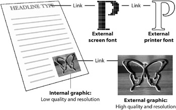
Figure 2.7: A page layout document, with linked fonts and graphics
Broken links can occur for a variety of reasons, including moved documents and/or moved or renamed graphics. The easy way to make sure the high-quality graphic-proxy links are maintained is to place the linked high-quality graphics in the same folder as the page layout document (see Figure 2.8). Then just move the whole folder whenever you want to move the document. With this method, any time that document is launched and printed or converted to a PDF document, no matter where it is, the links will automatically be maintained and the high-quality graphics will be included in the PDF document.
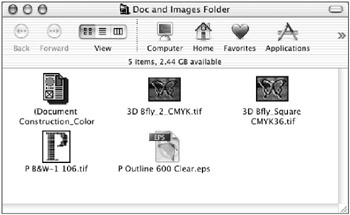
Figure 2.8: Document and images together in one folder
EAN: 2147483647
Pages: 102