Choosing and Assigning Fonts Appropriately
Like graphics, font files need to be properly linked to document pages. But unlike graphics, there are no internal proxy font files to maintain the active links with the external font files. Each time a document is closed and then reopened, new links need to be established with the font files, and because of a myriad of naming and font-recognition problems (which are too lengthy to get into in this book), relinking with the same font files used the last time the document was opened often does not occur. Following are some tried and true, and hard won, font management guidelines to help you make sure you select, use, and maintain the font and typesetting integrity of your documents.
Separating Operating System Fonts from Document Construction Fonts
Every version of every operating system, whether it s Windows, Macintosh, or something else, requires a minimum set of fonts, known as operating system (OS) fonts, that are used by the OS to provide basic OS features such as window titles, menu choices, and dialog box text. These OS font files are specifically designed to work on screen and are therefore usually not appropriate for document construction. In addition, many OS fonts are copyrighted and should not be used to create documents. And in fact, copyrighted OS fonts often cause problems during the distilling process.
For these reasons it is generally best to avoid using operating system fonts when creating documents. One of the first things I do when I set up a new computer, besides partitioning my drive, is to separate the OS fonts from the document construction fonts. I place all the document construction fonts outside the default operating system folder(s). Creating this external fonts folder not only separates my OS fonts from my document construction fonts but also ”critically ”allows me to control access to my document construction fonts. Figure 2.9 shows how in Mac OS 9, you need only Chicago, Geneva, and Monaco in the system s fonts folder; all other fonts are in external folders and are available for document construction. You will need to determine which fonts are required by your operating system, leave those in the default system fonts folder, and organize and place the remainder of the fonts that you intend to use for document construction in a folder external to the operating system.
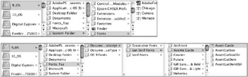
Figure 2.9: A default system fonts folder (top) and a document fonts folder outside the system (bottom)
Creating and Using Font Sets
Once you have moved your document construction fonts to a folder external to your operating system, you will need to use a font management utility to access and control these fonts. There are a number of good font management utilities that work in both Mac and Windows environments; Figure 2.10 shows one called Suitcase by Extensis. (See the resource guide in the appendix for a list of recommended font management utilities.)
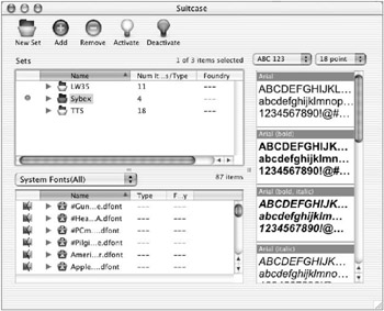
Figure 2.10: A font set, activated in Suitcase, one of several available font management utilities
One of the key aspects of using a font management utility successfully is to create and use sets of fonts. It is a good idea to collect font sets for each project. By creating and using separate font sets for each project, you can help guarantee that the same fonts will be used whenever you launch your document and that these same fonts will be available for embedding in the PostScript and PDF documents when you create those.
Matching Font Architecture Choice with End Usage
Font architecture refers to the basic type of font structure used to create a set of font files. There are a wide variety of font architectures available on most computers today, including the two most common PostScript Type 1 and TrueType fonts. Most current font technologies are OS specific and therefore not cross-platform compatible. For this and typesetting integrity reasons, make sure that the fonts you use to create your document are included in the final PDF file. For onscreen viewing, the Web, and low-end non-PostScript printing, TrueType fonts will work okay. But if you intend to output your final PDF document at a commercial printing company or other high-end PostScript-able output device, you will be better off using PostScript Type 1 fonts (most people simply refer to these as PostScript fonts since the earlier Type 3 variety is now out of use) because of the unpredictability of TrueType fonts on PostScript devices. Some publications (such as Time Magazine ) and vendors are standardizing on PDF/X compatible files (a refined version of PDF) for their high-end printing workflows. While PDF/X files are made the same way as regular PDF files, one prerequisite for compatibility is that they contain only Type 1 fonts.
Acrobat uses another font architecture, known as Multiple Master fonts (a changeable version of PostScript Type 1), to create proxy or substitute fonts for PDF files that lack embedded fonts ”more on this in the next section. Another font architecture to be aware of is called OpenType, which has been designed by Apple Computer with the intent of replacing the less-compatible OS-specific current versions of PostScript and TrueType fonts. Table 2.7 provides an overview of font technologies and their recommended uses.
| Font Technology | Recommended Uses | Uses to Avoid |
|---|---|---|
| Bitmapped fonts | Early version. Operating system fonts (Mac and Windows) | All printing |
| TrueType fonts | Monitor, web, non-PostScript printing | PostScript printing |
| dFonts (Apple TrueType) | Mac OS X system font use only | Anything other than OS X system |
| PostScript Type 1 | PostScript Printing, PDFs, web | Non-PostScript printers |
| Multiple Master (Acrobat) | Acrobat font substitution | Any non-Acrobat function |
| Multiple Master (Standard) | PostScript printers [*] | Some RIPs don t like MM. |
| OpenType [**] | All and cross-platform | None known |
| [*] Multiple master (MM) fonts are special versions of PostScript Type 1 fonts that allow adjusting of its optical axes to create font style variations called iterations. MM fonts tend to be structurally more complex than standard Type 1 fonts and thus can be more problematic on output, particularly at high resolutions . [**] It is hoped that OpenType will eventually replace the now platform-specific versions of TrueType and PostScript fonts. This will make font management, and in particular cross-platform font management, much easier. This transition may take some time due to the enormous investment many companies and individuals have made in purchasing their font libraries. | ||
Avoiding Acrobat Font Substitution and Copyright Problems
One critical part of Acrobat font technology of which you need to be very aware is Acrobat s ability, even proclivity, to substitute fonts in PDF files. Adobe, being well aware of the font challenges we all face, built a font substitution capability into Acrobat. Whenever a PDF document is opened that does not have a complete set of embedded font files for all of the type characters used in that document, Acrobat or Reader will automatically attempt to simulate those type characters by using substitute character versions, which it creates using its Acrobat Multiple Master fonts.
Acrobat MM fonts are automatically installed on your computer whenever Acrobat or Reader is installed. And the dangerous part of all this font substitution is that it occurs transparently without warning or offering a choice. Unlike applications such as QuarkXPress or PageMaker, which will at least warn you when they attempt font substitutions and provide you with the chance to make substitution choices, Acrobat makes font substitutions on-the-fly , whether you like it or not. The good side of this slick font substitution is that it make Acrobat easier to use. The downside is that if you are not careful about including your font files in your PostScript files and PDF documents (covered later in Chapter 3, Creating Quality PostScript Files, and Chapter 4, Creating the PDF You Want ), the typesetting integrity of your PDFs may be violated each time the PDF is opened. Figure 2.11 shows the icons for the Serif and Sans Serif versions of the Acrobat MM fonts that are used to simulate font characters in PDF documents that have missing and/or incomplete font character sets.
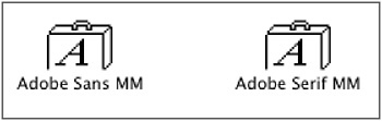
Figure 2.11: Acrobat Multiple Master font files
One other key Acrobat-specific font point to make is that if you use operating system fonts, and particularly those from Microsoft, they may well be rejected or substituted during the PDF-creation process when distilling takes place. Many operating system fonts are copyright protected against document creation use. Acrobat Distiller is designed with the ability to recognize this type of copyright protection. When Distiller encounters a document using a copyright-protected font, it may either reject it, which will likely derail the distilling process, or substitute another font, usually an iteration of its Multiple Master variety. To avoid this potential problem, it is best to avoid using OS fonts in your documents.
| |
Whenever you set type in a page layout document, you should use style sheets if possible to control the formatting of the type. Inside the style sheet dialogs, use your font menus to assign the typeface style. The Type Style field should always indicate Plain (see Figure 2.13). You will be able to use these style sheets to quickly and easily create and update an accurate table of contents. In addition, once you ve constructed the PDF document, these same style sheet “based TOC elements will be used to create internal hyperlinks that will allow rapid navigation though the PDF document (this is covered in Part II of this book).
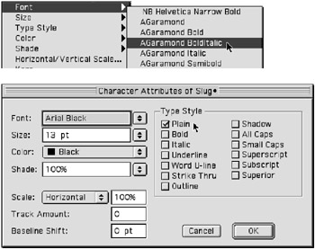
Figure 2.13: Proper application of typeface styles: Font menu (top), style sheet font menu (bottom, always check Plain)
| |
Selecting Typefaces and Styles
Besides using different fonts files in most documents, one of the most common problems to avoid is a phenomenon called false styling. Many body copy typefaces, such as Arial and Helvetica, have multiple styles commonly including roman, bold, italic, and bold italic. Other, typically display, typefaces, such as Copperplate, do not have any style variations; they have only one style (see Figure 2.12).
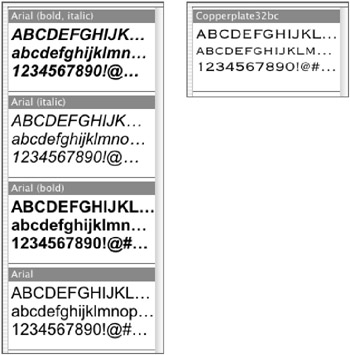
Figure 2.12: A multiple-style typeface (left, Arial) and a single style typeface (right, Copperplate)
A problem develops when you use a style menu or palette to assign a style to a typeface that does not exist. When this happens, the font characters appear on screen in their falsely styled appearance, and they may actually print with that false style on low-resolution printers. But when these falsely styled characters are included in a final PDF document, all sorts of font problems can arise. These fonts may be substituted, double printed, rejected, or just plain not recognized. You can easily avoid these false style “ related problems by following one simple rule: Apply font styles from font menus only (Figure 2.13); don t assign font styles using style menus or style palettes (see Figure 2.14).
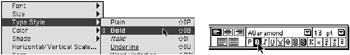
Figure 2.14: Improper application of typeface styles: Style menu (left), palette style menu (right)
EAN: 2147483647
Pages: 102