WORKING WITH RGB, CMYK, AND SPOT COLORS
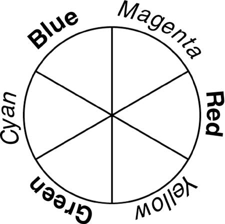
| The vast majority of work in Photoshopand all work in Illustratoris done in RGB or CMYK color mode. Virtually all output is done in RGB, CMYK, or Grayscale mode, although Photoshop actually supports eight color modes. Illustrator can accept grayscale artwork in either RGB or CMYK documents, but each document can contain artwork of only its own color mode. For more on the additional color modes, see "Understanding Photoshop's Other Color Modes and Models," later in this chapter. Understanding the Relationship Between RGB and CMYTheoretically (but not in practice), all RGB colors could be replicated by using cyan, magenta, and yellow. Likewise (and also theoretically), all CMY colors could be reproduced by using red, green, and blue. (Black [K], remember, is added to CMY to compensate for impurities in the inks. It is not one of the theoretical component colors.) The relationship among the six component colors is shown in Figure 5.3. The relationship is also shown in Table 5.1. Figure 5.3. Notice that RGB and CMY alternate.
These relationships may not be the same as those you learned in elementary school, or even art school, but they are the relationships among component colors in Photoshop and Illustrator (and other digital imaging and illustration programs). When displayed in a color wheel (a circular arrangement of colors), the relationships among the component colors is clear. A color wheel, such as the one in Figure 5.3, shows the way that the component colors interact with each other. Red is at zero degrees, the three o'clock position on the circle (see Figure 5.4). Figure 5.4. The 0° point is typically on the right side of a color wheel.
In a color wheel, each of the RGB colors is opposite a CMY color. These opposites represent the inverse relationships among colors. The inverse color relationships are summarized in Table 5.2.
Choosing a Color Mode
The inverse relationships among the component colors simplify color correction. For example, if an RGB image has a magenta cast to it, adding green is the same as subtracting magenta. An image's color mode should be dependent on the image's final destination. The two major color modes, RGB and CMYK, are intended for different applications. CMYK is for use with commercial four-color printing presses and smaller printers specifically designed for the CMYK color mode. These devices include color laser printers, proofers (printers that simulate a printing press's output), and some high-end inkjet printers used for fine-art prints. The RGB color mode is intended for use on the Internet, on monitors and kiosks, with film recorders, for broadcast and digital video, and with most desktop inkjet printers. Virtually all Photoshop and Illustrator work not destined for a commercial printing press should be done in RGB mode.
When using the terms print, printing, and printer, keep in mind that there are differences between the inkjet printers likely to be found in studios, offices, and homes and the commercial offset printing presses, color laser printers, high-end inkjet proofers, and fine-art printers. When designing for home/office inkjets, remember to use RGB rather than CMYK. Although these printers actually use cyan, magenta, yellow, and black ink, these desktop printers' software requires RGB image data. In the following discussions, Photoshop's 8-bit color mode is assumed. Photoshop also permits you to work in 16-bit and 32-bit color. You'll find more information on that subject in the section "A Note on Color Bit Depth," later in this chapter. Working with RGB Color NotationRGB colors are designated as proportions of the three component colors: red, green, and blue. Each value can range from 0 to 255. These 256 possible values for each component color are a product of 8-bit color depth. The standard notation is (red value)/(green value)/(blue value). For example, 35/120/57 means that the red value is 35, green is 120, and blue is 57. When all three component colors are 0, black results, and when all three are 255, you get pure white. When the component color values are equal and between 0 and 255, you get shades of gray. The specific color for each pixel is broken down into the three component colors. Each component color value is recorded in the appropriate color channel. In practice, each color channel is a grayscale copy of the image, with only the component color values recorded in the channel. Because each color channel can have 256 possible values, the total number of different colors that can be reproduced in 8-bit RGB is 16,777,216. That's 256x256x256. Consider, if you will, the sequence of colors 0/0/0, 0/0/1, 0/0/2, 0/0/3 through 135/87/42, 135/87/43, 135/87/44, 135/87/45 all the way to 255/255/252, 255/255/253, 255/255/254, and 255/255/255. The difference between 135/87/42 and 135/87/43 is too subtle for the human eye to see, even with the two color swatches side-by-side. In fact, variations of as much as 5 in a single color component are difficult to detect in most circumstances. A variance of 5 in two color components can, on the other hand, be very noticeable. Working with CMYK Color NotationLike RGB colors, CMYK colors are recorded as proportions of the component colors. Unlike RGB, CMYK has four components. Therefore, the notation is a bit longer. If you have a green color recorded in RGB as 35/120/57, a comparable shade of green could be recorded as 85/29/100/17 in CMYK. (Depending on the color settings in use, there could be considerable variation in the specific values. Also note that several different combinations of CMYK colors could produce similar shades of green.)
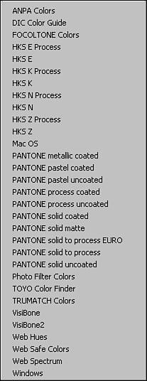
Both RGB and CMYK artwork can contain areas that appear to be grayscale. Even if (in a CMYK image) that area is to be printed with only black ink, it is still technically part of a color image. In RGB notation, all three component colors are represented, and they all have equal values (50/50/50, 128/128/128, 225/225/225). In a CMYK image, there can be a considerable variation in the amount of each ink used to represent grayscale. Besides the additional component, CMYK notation differs from RGB notation in a very significant way: RGB values range from 0 to 255, but CMYK components are measured in percentages. Each of the four values can range from 0% to 100%. In practical terms, the percentage represents the ink density for that particular color. Values less than 100% can be thought of as "thinning the ink." Although in theory a particular spot on a page could have 100% each of cyan, magenta, yellow, and black ink, in practice, that is not done. Depending on the paper used, maximum ink density is typically between 250% and 300%. Like RGB color mode, CMYK records the component color value for each pixel in a separate color channel. CMYK images have one channel for each of the component colors, plus a composite channel used for editing the image. Identifying Spot ColorsPhotoshop and Illustrator enable you to specify a particular color by using spot colors. These predesignated colors, chosen from a library of color, represent premixed inks for use in commercial printing. Spot colors are used in addition to, or in place of, CMYK inks. The color is identified by name in the image, and the press operator mixes the exact color, using a specific formula or a premixed ink. Photoshop supports a variety of spot color collections. Most common in North America are the Pantone collections. These and other spot color collections can be accessed through Photoshop's Swatches palette menu (see Figure 5.5). Figure 5.5. Photoshop's Swatches palette menu contains a wide variety of spot color libraries, often referred to as books.
Although you could specify a spot color when working in RGB color mode, spot colors are designed for use with CMYK. One of the most common uses of spot colors is to ensure an exact color match. For example, the specific red of the Adobe logo can be specified in a print image as PANTONE 485. This particular shade of red can also be reproduced by using CMYK 0/100/100/0. Spot colors can also be used to supplement an image's tonal or color range. And they can provide a cost-effective printing method: using black ink and one spot color rather than all four process (CMYK) colors. Keep in mind that although most spot colors can be reproduced by using process colors, the premixed inks require only a single pass through the press, instead of three or four. Some colors cannot be reproduced on a printing press by using the CMYK inks, so other spot colors are added. Metallic and neon colors, for example, can be added to an image only through the use of spot colors. These inks cannot be duplicated with process inks. Spot color names are assigned by the companies that produce the inks. The notation varies from company to company (and within brands, to some extent). Pantone inks for use with uncoated paper have a three- or four-digit number, followed by the letter U. Pantone inks for use with coated paper have the letter C following the number. A specific color has the same number, whether the ink is for use with coated or uncoated paper. Most other manufacturers also use numeric designations for their inks. Here are descriptions of some of the spot color collections installed with Photoshop CS2:
|
EAN: 2147483647
Pages: 426