UNDERSTANDING THE TWO TYPES OF COLOR
| Colors in Photoshop can be considered additive or subtractive. Additive colors produce white when all colors are combined (added) at full strength. Subtractive colors produce white by removing (subtracting) all component colors. Conversely, a lack of color in an additive model produces black, whereas combining all colors in a subtractive model produces black. Consider spotlights in a theater. The more spotlights you train on a specific area of the stage, the more brightly lit that area is; this is additive color. You can aim spotlights of many colors at the same spot, but when you've added enough different lights, regardless of their color, the audience sees only white light. Now consider preparing paint for a blank canvas. Without any paint, the canvas is white. Because paints are subtractive colors, when you start mixing various paints together, they get darker. (The result is more likely to be muddy brown than black, but the concept is the same.) Working with Additive ColorsAdditive color is produced from a light source that's typically filtered to present color. For example, a household light bulb (which emits "white" light) behind a blue lampshade gives you blue. Behind a yellow lampshade, the same bulb gives you yellow. A stage spotlight can be filtered with a gel (a translucent piece of colored gelatin or acetate) to produce colored light. Multiple gels can be combined to create a wide range of colors. Televisions and computer monitors produce additive color. The light is viewed directly or nearly directly, preferably without interference from other light sources. The light is filtered into red, green, and blue components that, in combination, produce all the colors that can be created with that device. Many large front- and rear-projection TVs actually use three synchronized lights, one of each of these colors, to produce images onscreen. Televisions, computer cathode ray tube (CRT) monitors, liquid crystal display (LCD) screens for computers, and other devices all use red, green, and blue light in combination to produce the colors of the spectrum. When working in the Adobe CS2, you should remember these key concepts about additive colors (the colors you see on your monitor):
Working with Subtractive ColorsSubtractive colors are, generally speaking, seen with reflected light. A white or colored light source reflects off a colored surface to the eye. The color that's visible to the eye is the part of the spectrum that is not absorbed by the colored surface. For example, if you shine a white light on a wall painted yellow, you see yellow because all other colors are absorbed by the paint, and yellow is reflected back to the eye. The wall itself is not a light source; rather, light bounces off the wall to the eye. As with the wall's yellow paint, subtractive colors are applied to a surface. The visible color of the paint or ink is the part of the spectrum that is reflected rather than absorbed. Subtractive color is used to design for print, where ink is applied to paper (or another substrate) to reproduce the artwork. For Photoshop, Illustrator, and InDesign, subtractive color is reproduced by using cyan, magenta, yellow, and black inks. This color mode is called CMYK. Theoretically, the entire range of color can be produced with varying amounts of CMY inks, but it's necessary to add black to reach the darkest colors. (CMYK inks can be supplemented with other inks, called spot colors, to produce colors not available with just cyan, magenta, yellow, and black.) Remember these key concepts about subtractive colors:
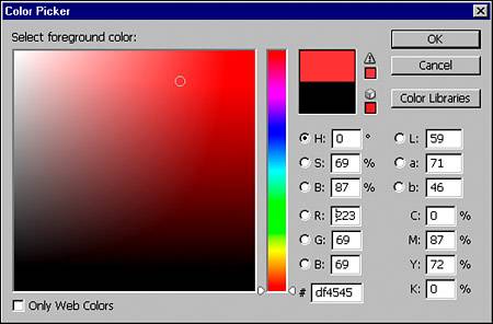
The Printing GamutIn the Color Picker, to the right of the color slider, a small warning icon appears when the color chosen is out of gamut (see Figure 5.2). The gamut is the range of color that can be reproduced in printing. Because printed colors are subtractive, their color properties are based on what they reflect. This is a more narrow band of color than what a monitor can display. When you see that warning, the color you choose is out of the print range and will be altered when converting to CMYK color mode or when using that color in a CMYK image. When you click the gamut warning icon, the closest color within range inside the gamut is automatically selected in place of your color. Figure 5.2. The warning symbol (the exclamation point in a triangle) tells you that the chosen color is out of gamut. Click the symbol, and Photoshop picks the closest color within the gamut, often a noticeably darker color.
One of the biggest differences between RGB and CMYK color modes is the number of channels. Each component color is recorded in a separate color channel. Because RGB has three component colors, it has three color channels (plus a composite channel). CMYK has four component colorsso it has one more color channel than RGBplus a composite channel. In printing, CMYK inks can be supplemented with additional inks, often called spot colors. Spot colors are usually predetermined, premixed inks of a specific color. They are typically applied to a specific area (spot) on an image. It is not unusual to use one or more spot colors in place of CMY inks to create two- or three-color images. Spot colors can add color that the CMYK inks cannot produce. Neon, metallic, and even white are examples of colors that can be printed only with spot inks. |
EAN: 2147483647
Pages: 426