USING THE CHARACTER PALETTE
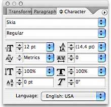
| Many options for changing the appearance of your text are found in the Character palette (choose Type, Character to display this palette). Here you can select your font and the font style (see Figure 27.4). InDesign does not allow you to stylize type artificially; only those type styles that are installed with your fonts are available from the top two pop-up menus in this palette. Figure 27.4. The Character palette.
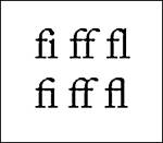
The default setting for InDesign is metric kerning, which is the automatic kerning created by the type designer and stored within the font file. Besides being able to enter specific kerning values for selected type, you can also use Optical kerning, which looks for letterforms that typically have kerning problems in their standard settings. For example, when the letters W and a are typed together, there is typically too much space between the two letters. Optical kerning automatically looks for these issues and corrects them. The next section of the palette enables you to set type size (the size of text in points; there are 72 points in an inch), leading (the amount of space between lines of type), kerning (the amount of space between letters), and tracking (the tightness or looseness of horizontal lines of type). In the next section of the Character palette, select the percentage of the text height and width if you want the text to appear wider or taller than the default for the font size you've chosen. Enter a baseline shift amount (the amount you want the selected text to be placed above or below the baseline on which the text rests). You can also enter a degree of skewing for your typethat is, the degree to which the type leans. Positive numbers create type that leans to the right; negative numbers create type that leans to the left. Finally, use the pop-up menu at the bottom of the palette to select your language for spelling options. In the palette menu, select to view OpenType Options for OpenType fonts. More information about OpenType fonts can be found later in this chapter. The Character palette menu also enables you to set the desired case of your typechoose from all caps, small caps, superscript, or subscript. Select to underline or strike through your text. If the selected font supports it, you can turn ligatures on or off (see Figure 27.5). (Ligatures refer to the connections you sometimes see between letters like ff, fi, and so on.) Figure 27.5. Some fonts display ligatures you can turn on in the Character palette menu.
The Underline and Strikethrough Options on the palette menu give you control over the stroke of the underline and strikethrough. If there are certain places where you do not want text to break like a URL or phone number in a line, paragraph, or column, highlight the text and select No Break from the Character palette menu. |
EAN: 2147483647
Pages: 426