Custom Controls
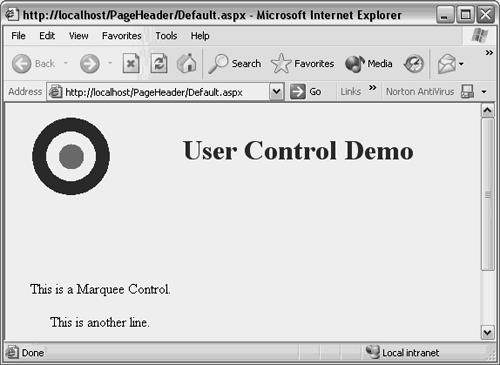
| Custom controls are another type of reusable component that provide fine-grained control over UI rendering. Because they are more powerful than user controls, they are also more complex. Custom controls are well suited for distribution as a separate component for other projects. Good candidates for custom controls are enhanced Calendar, DataGrid, or TreeView components. These are the types of things that many people buy from third-party component vendors because they provide extra functionality beyond what comes with the .NET BCL. The Marquee control created in this section will not try to be as ambitious. However, it will cover basic information necessary for those who want to create their own custom controls with C#Builder. Creating a Simple Custom ControlThe first custom control in this chapter will be a static marquee that scrolls a message up the screen. Later sections will be more sophisticated, but this example will show the basics. There is a wizard for creating a new custom control, which you can run by right-clicking an existing Project Group in the Project Manager, selecting Add New Project, and double-clicking the Web Control Library icon in the C# ASP Projects folder. After running the Web Control Library wizard, C#Builder creates a project with a skeleton set of standard files and a WebControl1.cs file, which I renamed to MarqueeTextOut.cs. The skeleton code contains a class derived from System.Web.UI.WebControls.WebControl, which contains a core method named Render. Listing 14.4 shows how this code can be modified to create a working custom control. Listing 14.4 Very Simple Marquee Custom Control (MarqueeTextOut.cs) using System; using System.Web.UI; using System.Web.UI.WebControls; using System.ComponentModel; [assembly:TagPrefix("MarqueeControl", "csb")] namespace MarqueeControl { [DefaultProperty("Text"), ToolboxData("<{0}:MarqueeTextOut runat=server> </{0}:MarqueeTextOut>")] public class MarqueeTextOut : System.Web.UI.WebControls.WebControl { private string text; [Bindable(true), Category("Appearance"), DefaultValue("")] public string Text { get { return text; } set { text = value; } } /// <summary> /// Render this control to the output parameter specified. /// </summary> /// <param name="output"> The HTML writer to write out to </param> protected override void Render(HtmlTextWriter output) { string html = @" <marquee direction=""up"" width=""200px""> <center> <p> This is a Marquee Control. </p> <p> This is another line. </p> </center> </marquee>"; output.Write(html); } } } When a Web Form is requested, ASP.NET calls the Render method of a custom control, which produces the HTML code fragment that represents the control. This code fragment is inserted into the response stream at the place where the custom control is located on the Web Form. The Render method in Listing 14.4 builds a static HTML fragment that will put a marquee on the Web Form where it resides. The way it tells the Web Form what to write is through the HtmlTextWriter parameter passed to it when the Render method is invoked. The Write method of the HtmlTextWriter inserts the HTML from the Render method into the Response stream. The MarqueeTextOut class contains a Text property with attributes that were generated by the wizard. This is simply sample code, which is not used in this example, and can be deleted if desired with no effect on the control. The next section explains the attributes on this property and how it could be used. The ToolboxData attribute describes how this control will appear in the Web Form code when added. The {0} placeholder is a formatting instruction for adding a prefix to the tag. By default, C#Builder will assign a default prefix to this tag. To assign a custom prefix, use a TagPrefix attribute, repeated from Listing 14.4, as follows: [assembly:TagPrefix("MarqueeControl", "csb")] The first parameter to the TagPrefix attribute is the namespace the control resides in and the second parameter is the prefix to be used. When added to a Web Form, the full tag name for this control will be csb:MarqueeTextOut, where the {0} placeholder in the ToolboxData attribute was filled in with the second parameter of the TagPrefix attribute. This example uses the same Default.aspx Web Form as was used in the user control in the previous section. To use this custom control, you must add it to the Tool Palette. Before going further, make sure the MarqueeTextOut project compiles okay because the compiled DLL will be added to the Tool Palette. Because the Web page has dependencies on the controls, I select Build Sooner or press the Ctrl+Up keys to move the control project higher than the Web page in the Project Manager. This makes sure the controls are built and have the most recent changes before compiling the Web page. To add the control to the Tool Palette, open the Default.aspx file in Design view, right-click in the Tool Palette, and select Installed .NET Components. Click the Select an Assembly button on the Installed .NET Components dialog and open the MarqueeTextOut.dll library. The control library should be located in the bin\debug directory of the main control project directory for debug builds or in the bin\Release directory for release builds. The custom control will appear in the Installed .NET Components dialog with its class name appearing in alphabetical order in the Name column. When you selected the library, the box by the control in the Name column should automatically have been checked. After you click the OK button to close the Installed .NET Components dialog, the control will appear in the General category in the Tool Palette. After you have added the custom control to the Tool Palette, you can add it to the Web Form using drag-and-drop, just like any other control. Listing 14.5 shows what the Web Form code looks like after the control has been added. Listing 14.5 Web Form Code with a Custom Control (Default.aspx)<%@ Page language="c#" Debug="true" Codebehind="Default.aspx.cs" AutoEventWireup="false" Inherits="PageHeader.WebForm1" %> <%@ Register TagPrefix="csb" TagName="HeaderControl" src="/books/2/805/1/html/2/HeaderControl.ascx" %> <%@ Register TagPrefix="csb" Namespace="MarqueeTextOut" Assembly="MarqueeTextOut" %> <!DOCTYPE HTML PUBLIC "-//W3C//DTD HTML 4.0 Transitional//EN"> <html> <head> <title></title> <meta name="GENERATOR" content="Borland ASP.NET Designer for c# Package Library 7.1"> </head> <body ms_positioning="FlowLayout"> <form runat="server"> <csb:headercontrol runat="server"> </csb:headercontrol> </form><br> <csb:marqueetextout runat="server"> </csb:marqueetextout> </body> </html> When adding a new custom control to a Web Form, C#Builder adds a Register directive to the top of the file. In Listing 14.5 there are two Register directives, one for the user control from the previous example and one for the custom control for this example. Both have a TagPrefix but differ in other attributes. In the case of the custom control, C#Builder was able to ascertain the tag prefix to use based on the TagPrefix attribute within the custom control code. The custom control contains a Namespace attribute, identifying the namespace that the control belongs to. The other attribute is Assembly, which contains the name of the assembly the custom control resides in, minus the DLL extension. This differs from the user control, which was located via its source filename with the Src attribute. The custom control tags, <csb:…>, in the code appears as defined in the ToolboxData attribute for the MarqueeTextOut class in Listing 14.4. Figure 14.6 shows what this Web Form looks like when running. Figure 14.6. Custom control running on a Web Form.
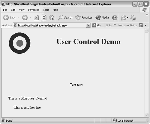
Setting Custom Control PropertiesThe MarqueeTextOut custom control was hardly useful because there was no way to configure it. There was no way to change its style, font, colors, size, or text. With both custom controls and user controls, configuration is exposed with properties. The next example will show how to make a configurable control by exposing a Text property that allows developers to customize this control when designing their Web Form. Listing 14.6 shows a new custom control named MarqueeHtmlTextWriter that demonstrates how to customize properties. Additionally, Listing 14.6 shows another way for the Render method to produce its output with other methods of the HtmlTextWriter parameter. Listing 14.6 Customizable Custom Control (MarqueeHtmlTextWriter.cs) using System; using System.Web.UI; using System.Web.UI.WebControls; using System.ComponentModel; [assembly:TagPrefix("MarqueeControl", "csb")] namespace MarqueeControl { /// <summary> /// Summary description for WebControl1. /// </summary> [DefaultProperty("Text"), ToolboxData("<{0}:MarqueeHtmlTextWriter runat=server> </{0}:MarqueeHtmlTextWriter>")] public class MarqueeHtmlTextWriter : System.Web.UI.WebControls.WebControl { private string text = "Test text"; [Bindable(true), Category("Appearance"), DefaultValue("")] public string Text { get { return text; } set { text = value; } } /// <summary> /// Render this control to the output /// parameter specified. /// </summary> /// <param name="output"> /// The HTML writer to write out to /// </param> protected override void Render(HtmlTextWriter output) { output.WriteBeginTag("marquee"); output.WriteAttribute("direction", "up"); output.WriteAttribute("width", "200px"); output.Write(HtmlTextWriter.TagRightChar); output.WriteFullBeginTag("center"); output.WriteFullBeginTag("p"); output.Write(Text); output.WriteEndTag("p"); output.WriteEndTag("center"); output.WriteEndTag("marquee"); } } } Besides the customization features of the custom control in Listing 14.6, there is a noticeable difference in the way the Render method is implemented. It is using helper methods of the HtmlTextWriter parameter for rendering the control definition. The meaning of these methods is clear from their names and can be investigated further by referring to the documentation on HtmlTextWriter. Later, when running the Web Form that this control is added to, be sure to view the source in the browser to observe the code that is produced. Within the Render method is a call to the Write method of the HtmlTextWriter with its parameter set to the control's Text property. The Text property will default to "Test text" until a developer changes it in the Object Inspector while designing a Web Form. The default behavior of the Object Inspector is to read all the public properties of a control, via a C# capability known as reflection, and show them in the Object Inspector property grid. Additionally, properties can be decorated with attributes to control their appearance in the Object Inspector. In the code, the Text property has three attributes for controlling its appearance in the Object Inspector. The Bindable attribute is set to true, stating that the control may be bound to a data source, the Category attribute places the Text control into the Appearance section of the property grid, and the Default attribute sets the initial default value of the property. The Default attribute is overridden by explicitly setting the private field that the property refers to, which is "Test text" in this case.
To use the MarqueeHtmlTextWriter control, add it to the Tool Palette the same way as the MarqueeTextOut control was done in the last section and drag-and-drop it on the Web Form next to the MarqueeTextOut control. The MarqueeHtmlTextWriter control will begin running with the default text "Test text". Go to the Appearance section of the Object Inspector and change the Text property to "Some other text". The text in the MarqueeHtmlTextWriter control will change immediately after you press the Enter key or click something other than the Text property. Figure 14.7 shows what this application looks like with the new MarqueeHtmlTextWriter custom control. Figure 14.7. Running a customizable custom control.
It is significant that the control text can be modified through the Object Inspector. This makes the control reusable, which is one of the primary reasons for creating controls in the first place. Using the techniques here, you should be able to create your own controls that can be placed in the Tool Palette, dragged-and-dropped to a Web Form, and modified via Object Inspector properties. |