Section 3.1. Use Office-Style Toolbars
3.1. Use Office-Style ToolbarsWith .NET 1.0 and 1.1, VB developers have had to content themselves with either the woefully out-of-date ToolBar control, or draw their own custom toolbars by hand. In .NET 2.0, the situation improves with a rich new ToolStrip control that sports a modern, flat look, correctly handles Windows XP themes, and supports a wide range of graphical widgets, such as buttons, labels, drop-down lists, drop-down menus, text boxes, and more. 3.1.1. How do I do that?To use the System.Windows.Forms.ToolStrip control, just drag the ToolStrip from the Menus & Toolbars section of the Visual Studio toolbox onto a form. To control which side of the form the ToolStrip lines up with, set the Docking property. For example, Figure 3-1 shows a form, Form1, with two ToolStrip controls, one docked to the top of the form and the other to the right side. Figure 3-1. Three ToolStrip objects in one RaftingContainer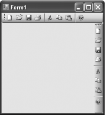 Note: Finally, a ToolStrip control whose looks are worthy of a modern Windows application. To add buttons to the ToolStrip, you can use the Visual Studio designer. Just click the ToolStrip smart tag and select Edit Items. You can choose new items from a drop-down list and configure their properties in a window like the one shown in Figure 3-2. Or, select Insert Standard Items to create standard ToolStrip buttons for document management (new, open, save, close) and editing (cut, copy, paste). Figure 3-2. The ToolStrip designer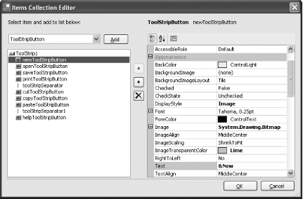 The key to mastering the ToolStrip control is learning about all the different widgets you can put inside it. These include:
All the ToolStrip items derive from the ToolStripItem class. That means they all support a few basic properties (the most important include Text, Image, and ImageAlign, all of which set the display content). ToolStrip items all provide a Click event you can use to detect when the user clicks a toolbar button. For example, if you want to react to a click of a ToolStrip item that you've named TestToolStripButton, you can use the following code: Note: When the user clicks a button on the ToolStrip, that button's Click event fires. This is different than the legacy ToolBar control, which fired a generic Click event no matter which button was clicked. Private Sub TestToolStripButton_Click(ByVal sender As Object, _ ByVal e As System.EventArgs) Handles TestToolStripButton.Click MessageBox.Show("You clicked " & CType(sender, ToolStripItem).Name) End SubOnce you've created a ToolStrip and added at least one item, you can take advantage of a significant amount of out-of-the-box formatting. The following are just a few of the impressive features provided by ToolStrip:
Figure 3-3. An overflow menu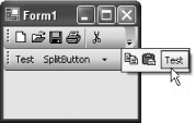 In the previous example, the ToolStrip is fixed in place. If you want, you can give the user the ability to drag a ToolStrip, either to dock it in a different place or to rearrange several that appear together. To make this possible, you need to add a ToolStripContainer to your form, which shows up as a box with a blue gradient background (like the background of the ToolStrip). Although you can use more than one ToolStripContainer, usually you'll just use one and dock it to fill all or a portion of your window. Note: To add a ToolStripContainer and place a ToolStrip in it in one step, click the ToolStrip smart tag and then click the "Embed in ToolStripContainer" link. The ToolStripContainer actually wraps four ToolStripPanel objects, one for each side. These objects are exposed through properties such as ToolStripContainer.LeftToolStripPanel, ToolStripContainer.TopToolStripPanel, and so on. Each panel can hold an unlimited number of ToolStrip objects, which are then docked to the corresponding side. The interesting part is that once you place a ToolStrip in a ToolStripContainer, the user gains the ability to drag a ToolStrip freely about its panel at runtime. Users can even drag a ToolStrip from one ToolStripPanel to another to change the side it's docked on (or even to an entirely separate ToolStripContainer in the same window). Tip: If you want to prevent the user from docking the ToolStrip to the left side of the container, set the ToolStripContainer.LeftToolStripPanelVisible property to false. You can also use similar properties to prevent docking to the right, top, or bottom sides. 3.1.2. What about......updating the rest of your interface to look as good as the ToolStrip? .NET 2.0 actually provides four controls that sport the flat, modern look of Windows XP, and support Windows XP theming. These are ToolStrip, StatusStrip, MenuStrip, and ContextMenuStrip, which replace ToolBar, StatusBar, MainMenu, and ContextMenu. You can quickly refresh your application's interface just by updating these old standbys to the new controls. Tip: In Visual Studio 2005, you won't see the legacy controls like ToolBar and StatusBar, because they're left out of the toolbox by default. If you want to use them, right-click the toolbox, choose Choose Items, and select these controls from the list. 3.1.3. Where can I learn more?For more information, read about the ToolStrip classes in the MSDN help library reference. You can also refer to a few more recipes in this chapter:
|
 A Developer's Notebook")
EAN: 2147483647
Pages: 123