| The JCheckBox[5] class is shown in various L&Fs in Figure 5-7. JCheckBox is a subclass of JToggleButton and is typically used to allow the user to turn a given feature on or off or to make multiple selections from a set of choices. A JCheckBox is usually rendered by showing a small box into which a "check" is placed when selected (as shown in Figure 5-7). If you specify an icon for the checkbox, this icon replaces the default box. Therefore, if you specify an icon, you should always also supply a selected icon otherwise, there is no way to tell if a checkbox is selected. [5] Note that the java.awt.Checkbox class differs in capitalization from javax.swing.JCheckBox.
Figure 5-7. JCheckBoxes in four L&Fs 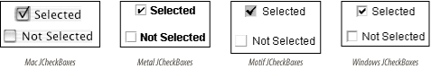 5.7.1 Properties The JCheckBox class inherits most of its properties from its superclasses. The exceptions are shown in Table 5-12. By default, no border is painted on JCheckBoxes, and their horizontalAlignment is to the leading edge (which means to the left in the default locale, in which text reads left to right).[6] Setting the borderPaintedFlat property to true is a hint to the L&F that the checkbox should be drawn more plainly than usual. (This is used primarily by cell renderers for tables and trees.) [6] This locale sensitivity was introduced in SDK 1.4; previously, checkboxes were always aligned to the left.
Table 5-12. JCheckBox properties | Property | Data type | get | is | set | Default value | | accessibleContexto | AccessibleContext | · | | | AccessibleJCheckBox | | borderPaintedo | boolean | | · | · | false | | borderPaintedFlat1.3, b | boolean | | · | · | false | | horizontalAlignmento | int | · | | · | LEADING1.4 | | UIClassIDo | String | · | | | "CheckBoxUI" | | 1.3since 1.3, 1.4since 1.4, b, ooverridden See also properties from JToggleButton (Table 5-10). | 5.7.2 Events See the discussion of JToggleButton (JCheckBox's superclass) events. 5.7.3 Constant JToggleButton adds one constant for use in PropertyChangeEvents to the list defined by AbstractButton (see Table 5-13). Table 5-13. JToggleButton constant | Constant | Type | Description | | BORDER_PAINTED_FLAT_CHANGED_PROPERTY | String | borderPaintedFlat property has changed | | See also the constants defined by AbstractButton in Table 5-7. | 5.7.4 Constructors - public JCheckBox( )
-
Create a checkbox that has no text or icon and is not selected. - public JCheckBox(Action a)
-
Create a checkbox with property values taken from the specified Action, register the Action to receive ActionEvents fired by the checkbox, and register the checkbox as a ChangeListener of the Action. The checkbox adapts to any future changes made to the Action. The properties set are the ones listed in Table 5-8, except that the SMALL_ICON is not honored since JCheckBox uses its icon property to show its state. (This constructor was introduced with SDK 1.3.) - public JCheckBox(Icon icon)
- public JCheckBox(Icon icon, boolean selected)
-
Create a checkbox that displays the specified icon. If included, the selected parameter determines the initial selection state of the button. - public JCheckBox(String text)
- public JCheckBox(String text, boolean selected)
-
Create a checkbox that displays the specified text. If included, the selected parameter determines the initial selection state of the button. - public JCheckBox(String text, Icon icon)
- public JCheckBox(String text, Icon icon, boolean selected)
-
Create a checkbox that displays the specified text and icon. If included, the selected parameter determines the initial selection state of the button. |