Scissors and Imagination
|
|
Friday afternoon, Tampere, Finland. An office table is covered with a mess of tiny pieces of paper. The people sitting around the table are reading aloud from them with very strange pronunciations, and every now and then roaring with laughter. An outsider would assume that they’re just goofing off, having fun, and getting into the weekend state of mind. But no, they are on a mission.
These four people are trying to make sense out of 82 small printed display screens in Italian. The Italian translations for screens, test tasks, user questionnaires, and nondisclosure agreements have just arrived. Nobody understands the language except for a couple of words here and there.
The group is in the midst of a training session for a usability test trip that will start later this afternoon. Each one will have an opportunity to act as a test moderator, an observer, and a test subject. Eventually they decode Italian terminology well enough to follow the test task sequences; the relationship between the Italian screenshots and the familiar English version gradually become clear. “Connesso,” “rubrica,” and “indietro” acquire their meanings. In the meantime new display pictures are still being created—the total number now exceeding 90 options lists are being updated, material is being duplicated, organized, and packed. Two team members head for the airport.
We had begun design of the prototype just a few weeks earlier by defining a set of critical use cases. These were selected so that they would lead the user into performing and managing typical navigation sequences, such as finding certain menu options or starting, ending, and switching between applications. The use cases also reflected our need to learn more about the localized communication terminology in different cultures, the most critical design solutions in UI graphics, and novel interaction concepts. The Series 60 was in an early design phase and open to improvements and new design ideas. We were not yet fine-tuning.
The definition of use cases was followed by the creation of a prototype body and a set of printed screenshots in English. The test was prepiloted twice, verifying that the set of screenshots covered all the most probable user actions. Prepiloting sessions were also used as training for the test teams.
The usability test team comprised five different shareholders in the product development group: a UI designer, a localization expert, a usability expert, a native (Italian) market research expert, and an interpreter. This team included people who most directly needed information and a good grasp of the tested functionality, and who could also directly influence the design. In other words, having first-hand access to the development process from test results to product design optimized the effectiveness and efficiency of the test.
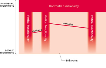
The prototype covered the whole scope of the product’s functionality on a surface level and was focused on detailed sequences for the features that we were especially interested in; thus it was a combination of horizontal and vertical prototyping (Figure 8.1). Several features were interlinked for fluent task switching—users could switch directly from call management to the calendar application, for instance.

Figure 8.1: Horizontal and vertical functionality in a prototype. All features of the user interface are presented in a nonspecific manner. The most critical features are prototyped in more detail.
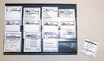
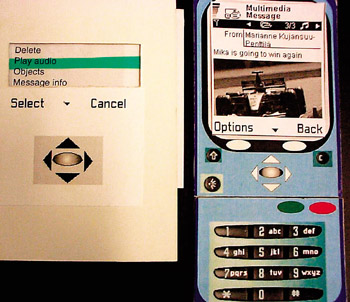
The number of UI prints was no less than 80 at this stage, a large amount of material to be organized. A handy solution was to use folders (Figure 8.2) for storing postage stamps, where the prints were immediately visible, were logically organized, and could be browsed easily. The body of the prototype was constructed from a phone-shaped piece of cardboard (Figure 8.3) according to the mobile handset form factor. Buttons and UI elements were printed on the cardboard. Menu options lists, which are an essential part of the UI solution, were printed on separate paper sheets.

Figure 8.2: Prototype screen prints organized in a folder
Before starting the tests in each country, we spent a day on prototype localization. This was done in a workshop where a localization expert went through the screens with a usability expert and looked for translated texts for each screen and option list. Translations were implemented straightforwardly on the screen pictures using the layering technique of a graphics design application. This is a simple method for saving the localization information within each file, and it enabled easy printing of different language versions. The quality of the localized prototype was assessed for the final time during the kickoff sessions of the final test tour.

Figure 8.3: Cardboard prototype with color printing
|
|
EAN: 2147483647
Pages: 142