Chapter 2: Takeout Menu-The Elements of a Nokia Mobile User Interface
|
|
Seppo Helle, Johanna Järnström, and Topi Koskinen
In this chapter we discuss the elements of Nokia mobile phone user interface: the menu, softkeys, shortcuts, and localization. How and why were these solutions adopted, how are they applied in our designs, what are their benefits to the user, and what kind of problems may they involve? We present detailed examples of the design implications set by the small product size and the wide consumer range.
The Ultimate in Mobile Computing
Meet the Apollo Guidance Computer, a rather special piece of equipment designed and built for use in Apollo spacecrafts during the moon flights of the late 1960s and early 1970s. Its processing power was very modest compared to today's equipment, but it remains a recordholder in its own arena; no other computer has ever been used by humans so far from home and traveling so fast.
The programs in the Apollo Guidance Computer (Figure 2.1) performed star navigation measurements, controlled the spacecraft's orientation and propulsion systems, guided lunar descent and ascent maneuvers, coordinated the rendezvous of the spacecrafts, and performed numerous other tasks. At that time, using computing equipment was not an everyday job. Only the most important tasks were worth the formidable price of the hardware. One needed a fair amount of training to be able to utilize a computer; and often the user was also the programmer.
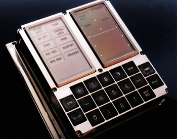
Figure 2.1: User interface module of the Apollo Guidance Computer. The right-hand display panel contains seven-segment numeric displays; the left-hand panel is for warning lights. The computer itself was housed in another, larger unit. Two of these were launched into space for each lunar mission: one in the command module, another in the lunar module.
The user interface of the Apollo Guidance Computer was built into a display-keyboard module (DSKY, or 'diskey' in astronaut jargon). It contained 19 push buttons, three 5-digit numeric data displays (consisting of seven-segment digits), three 2-digit code displays, and some 15 warning and indicator lights. The number of buttons and the display's data capacity in today's mobile phone are surprisingly close to those of the Apollo computer-and indeed, in both cases the need to save space and weight is a critical design requirement. [The giant leaps in technology since the early 1970s become clear when you know that a 31.7-kg (70-lb) processing unit and a 7.9-kg (17.5-lb) user interface module were actually considered a lightweight design back then.] There was another similarity in respect to modern mobile phones-in the Apollo case, too, the users were strictly users, not programmers.
Like us, the Apollo astronauts had buttons to push and a screen to watch, but their tasks were very different from ours, and that difference is clearly reflected in the designs. Because astronauts receive extensive training, intuitivity and learnability are not as important for them as efficiency is-quite the opposite of a consumer device aimed at millions of untrained individuals. The ideal UI design could not be the same for two such different types of equipment even if the processing technologies inside the boxes were.
In the 1960s, integrated circuit technology was still taking its first steps, and it limited the amount of memory and processing power available for computing. Within the memory space of 2 kilowords of RAM and 32 kilowords of ROM built into the computer, there were few other alternatives than typing the commands in as numbers. The Apollo computer used a peculiar command interface where two-digit command codes were entered either as verbs or nouns. The verb key told the computer to interpret the numbers as an action command-for example, verb 49 meant the initiation of a crew-defined maneuver. The noun key cued the computer to interpret the numbers as a parameter, or as the object to which the action applied. One verb code was used for loading programs; there were about 70 of those in use. Astronauts memorized hundreds of numeric codes that helped them know what was being done, and their flightplans were also equipped with checklists to help them keep everything in order. This system worked quite well for the task, and it was optimized for weight and space requirements.
|
|
EAN: 2147483647
Pages: 142