Takeout Menu
|
|
The vanilla home stereo has separate knobs for volume, balance, bass, and treble, and push buttons for selecting the radio, CD player, or other sound sources. The kitchen stove has one dial for each burner. This one-function/one-button principle was used in early mobile phones as well, but expanding feature lists and shrinking electronics have driven phone UI design toward other solutions. Command interfaces would get the job done, but they are better suited for moon walkers than pedestrians.
The accepted solution turned out to be the menu. It found its way onto stationary computers first, and then also proved useful for small gadgets carried around far and wide such as the early mobile phones (see Figure 2.2). Today, with the menu as a cornerstone of the Nokia phone UI, it is fair to define that interface as a menu UI.
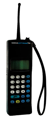
Figure 2.2: One of the first hand portable mobile phones, the Mobira Cityman 900.
The fundamental idea of the menu is to present functions in a structure so well organized that even a first-time user can find and operate them all. A menu UI reduces the learning curve considerably by comparison to a command UI. Users don’t need any advance knowledge of available functions in each application and how to invoke them. They merely have to learn how to browse the menu and select items from it.[*]
In Nokia phones, a menu concept consists of the following items, each having its specific purpose, requirements, and representation:
-
Idle screen
-
Application menu
-
Hierarchical submenu
-
Option list
Let’s take each component in turn.
The idle screen is the launch pad for all phone functions. A phone goes to “idle” when it is powered up, and there it returns when calls and other tasks are completed.. The idle screen displays information about the current status of the phone (see status icons illustrated in Figure 2.3); the quality of the cellular signal, the identity of the currently accessed network, the amount of power left in the battery, the profile name, and so on. It can also display notifications about received messages, missed calls, and other events that the user may not have noticed. Finally, the idle screen grants access to the applications menu—one key is always reserved for opening the menu from idle.
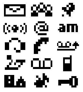
Figure 2.3: A status icon in a Navi-key or Series 30 style is just 6 pixels high; the width can vary. This few pixels means efficient screen usage, but it also calls for minimalist graphic design. One can almost say that when drawing such a small icon, it’s possible to try all possibilities, although 249 is really too large a number to do it literally. Some metaphors just don’t work in such a tiny space.
Designers know not to pack an idle screen with too much information. As the most frequently seen view of the phone, it should be calm while distinctive. As the main view to the phone’s interactive functions, it should also act as a kind of home page—a place for the user to personalize the device.
The applications menu (see Figure 2.4), also known as the main menu, lists the main functions and applications of the phone. There are the traditional phone applications like phonebook and call registers, and others that vary with the phone model such as the calendar, ringing-tone composer, and games. The applications in the main menu will change from product to product, but the essential applications are kept in their “traditional” places.
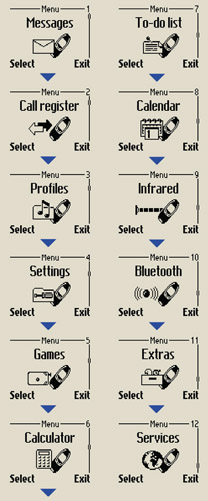
Figure 2.4: Applications menu in Series 30 style.
The purpose of an applications menu is to give the user an overall idea about what the product can do. We think it’s essential that the user can learn the product’s possibilities soon after switching it on. The main menu should have a reasonably limited number of items; much more than 10 are considered excessive. The items should have communicative names presented in a straightforward fashion, one by one, to increase the user’s confidence. We chose to combine text and graphics in the main-menu layout; text communicates the application’s name in an unambiguous way while the graphic can emphasize some characteristics of the application and give extra visual appeal to the menu.
Applications are often constructed using hierarchical submenus whose appearance depends on the kind of items it contains:
-
Higher-level menus, and ones with items that contain long texts, use a full-window layout, where each item in turn occupies the complete display area (some styles that apply larger screen sizes, e.g., Series 45 and Series 60, use layouts containing a few items each with more than line of text).
-
Lower-level submenus are presented in one-line layout, assuming that their texts are short enough to fit on one line, so that more than one item can be seen simultaneously. Also, lists that may grow long, like the list of names in the phonebook, are typically presented as one-line items.
-
A setting items layout consists of a title field and a value field, displaying the current value of a setting, for example, “Ringing tone: Attraction,” which tells the the name of the ringing tone that is in use.
An option list is used in certain states of the application as a means of accessing various generic and context-dependent functions. It can be seen as analogous to the drop-down menu in computer interfaces. The option list is accessed through a softkey labeled options and is not actually a direct descendant in the submenu structure. Options do not take the user deeper into the menu hierarchy, but present a list of alternative actions applicable to the context. In styles such as Series 60, where select function and options occupy separate keys, the option list is not a part of the hierarchical menu tree but a tool to access special functions—usually secondary functions—leaving the menu tree streamlined for the primary function. This arrangement can improve efficiency. In Series 60 the option list can also be given a distinctive look, partly because of the larger screen of the style. (See Figure 2.5.)
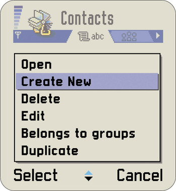
Figure 2.5: Series 60 option list
Used judiciously, differences in layouts can deliver helpful information; when the layout is distinctive enough, the user can determine the status of the phone with just a glance at the screen. Whereas most other texts are left-justified, the idle screen and main menu are centered, making them unique and easy to recognize. You can tell from a distance, without actually reading the text on the screen, when your phone is just sitting there idle. If it’s not, you might have a closer look and check whether you have received any messages or calls.
Although mobile phone menus look different (see the four styles compared in Figure 2.6), varying with the amount of information to be presented and its nature, all menus work the same way. Users scroll up and down the list and select an item. There is a way to back out of the list without making any selection and return to the previous state. For these actions the user needs a practical minimum of four keys:
-
A selection key for opening a new submenu, opening a menu item, or applying a function to a selected menu item
-
A scroll forward key for pointing at the next item in a menu
-
A scroll back key for pointing at the previous item in a menu
-
A backstep key for returning to a higher menu level
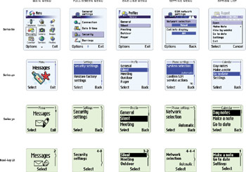
Figure 2.6: Examples of mobile phone menu layouts. Our approach aims at giving the hierarchical levels distinctive appearances to help users navigate the menu. This can usually be done, although the available means are limited. In some cases, the designer’s options are restricted by the content; if the menu item texts can’t be truncated to a couple of short words, the designer may need to choose a menu style that is not “correct” for the hierarchical level. Usually the design should prefer full-screen items in the top levels and switch to layouts with smaller items in deeper levels, but well-argumented exceptions to this do exist.
Depending on your UI style, the selection key or selection key and backstep key are realized with a softkey. The softkey is a button whose current function reads out on the bottom of the screen (see Figure 2.7). All modern Nokia phones have at least one softkey. (Chapter 3 guides you through the history of the one-softkey UI style.)
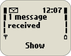
Figure 2.7: The label of a softkey identifies the current function of the key very clearly.
The advantage of a softkey is that it can be used for many different functions depending on context, improving flexibility in the UI without increasing the number of physical keys. As the user can always see the function assigned to the key indicated by a clear written word, usability should be as good or better than permanently labeled keys with their small and often ambiguous icons.
Another way to reduce the number of control keys in a menu UI is to make use of long key presses or double-key presses, but that wouldn’t be highly usable. Controls that rely on multiple keys or prolonged user touch must not be used for the most vital operations of the UI. Users would have difficulties in both discovering and adapting to them. Comfortable one-hand use has always been regarded as an important requirement for a product to be used in mobile situations.
Even though the menu-based user interface makes phones simple to access and accommodates new features easily, it has significant limits. Some of those are specific to small mobile devices:
-
The length and depth of menus increase with the number of features (see Chap. 12). The menu structure may become increasingly scattered and clumsy, while access to more peripheral functions, which still may be frequently employed by some users, becomes slower.
-
Menu browsing requires users to scroll through items one by one, looking for what they want. Frequently used sequences can be memorized, of course, and if the menu is small enough, checking items one by one is completely acceptable. It becomes less so with long lists that may not be organized to facilitate the user’s search, however. And making the user scroll through a menu while someone hangs on the line for a response is too much to ask. Patience will end and rules will change.
-
On a small screen displaying one item per line, the length of menu item names will influence the visual style of the menu, and because the word lengths depend on the language spoken, menu design and localization are intertwined.
-
As simple as the idea of softkey is, it requires the user to relate up to three UI items with each other: the selected menu item, the softkey label, and the key itself. This doesn’t always come off without a hitch.
[*]It should be noted that we are describing the classical mobile phone user interfaces, and not devices categorized as personal digital assistants. Still, many of the issues raised are relevant for a broader range of products than just phones.
|
|
 How Nokia Changed the Face of the Mobile Phone")
EAN: 2147483647
Pages: 142