Chapter 5: Forms
|
| < Day Day Up > |
|
Interactivity has always been an integral part of the Web, letting the user and site communicate through the exchange of information. Forms allow us to collect input from users in an organized, predetermined fashion, and have always been sort of an "anything goes" area when building websites. For instance, we'll discover that marking up a form can be handled in approximately 10,000 different ways. OK, perhaps not that many, but there are several options to consider as well as steps that we can take to ensure our forms are structured in a way that'll benefit both the user and site owner.
What are Our Options When Marking up a Form?
Let's take a look at four different ways to mark up the same, simple form—all of which achieve similar results. We'll go over each method and talk about the pros and cons that are involved.
Method A: Using a Table
<form action="/path/to/script" method="post"> <table> <tr> <th>Name:</th> <td><input type="text" name="name" /></td> </tr> <tr> <th>Email:</th> <td><input type="text" name="email" /></td> </tr> <tr> <th> </th> <td><input type="submit" value="submit" /></td> </tr> </table> </form>
Tables have long been used to mark up forms, and because of that frequent use, seeing forms laid out in this particular way has become familiar to us: right-aligned text labels in the left column, left-aligned form controls in the right column. Using a simple, two- column table is one of the easiest ways to achieve a usable form layout.
Some could argue that a table isn't necessary, while others believe that forms could be considered tabular data. We're not going to argue either side, but instead state that using a table is sometimes the best way to achieve certain form layouts—especially complex forms that involve multiple controls like radio buttons, select boxes, etc. Relying solely on CSS to control the layout of complex forms can be frustrating, and often involve adding extraneous <span> and <div> tags, with more code bloat than that of a table.
Let's take a look at Figure 5-1 to see how Method A would appear in a typical visual browser.

Figure 5-1: Method A as rendered in a browser
You can see that by using a table, the labels and form elements line up nicely. For such a simple form, though, I would probably opt to avoid the table altogether, in favor of something that requires less markup. Unless this particular layout is crucial to the visual design of the form, using a table here isn't necessary. There are also a few accessibility concerns we could address—and we will, while looking over the next two methods.
Method B: Tableless, but Cramped
<form action="/path/to/script" method="post"> <p> Name: <input type="text" name="name" /><br /> Email: <input type="text" name="email" /><br /> <input type="submit" value="submit" /> </p> </form>
Using a single paragraph and a few <br /> tags to separate the items is a passable solution—but could visually render a bit on the cramped side. Figure 5-2 shows how this would typically appear in a browser.
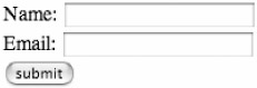
Figure 5-2: Method B as rendered in a browser
You can see that while we got away without using a table, it looks rather cramped and ugly. We also run into the problem of the form controls not lining up perfectly, as seen in Figure 5-2.
We could alleviate some of the crowdedness by adding some margins to the <input> elements using CSS like this:
input { margin: 6px 0; } The preceding would add a 6-pixel margin to both the top and bottom of each <input> element (the name, e-mail, and submit controls), spacing out the elements as seen in Figure 5-3.
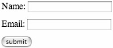
Figure 5-3: Method B with padding added to the input elements
While there's nothing particularly wrong with Method B, there are a few adjustments we can make to build a better form. And those adjustments are evident in Method C. So let's take a look.
Method C: Simple and More Accessible
<form action="/path/to/script" method="post"> <p><label for="name">Name:</label><br /> <input type="text" name="name" /></p> <p><label for="email">Email:</label><br /> <input type="text" name="email" /></p> <p><input type="submit" value="submit" /></p> </form>
I like Method C for several reasons. First off, for a simple form like this example, I find it convenient to contain each label and control in its own paragraph. When viewed unstyled, the default spacing of a paragraph should be enough to set the items apart in a readable way. Later, we could control precise spacing with CSS on <p> tags that are contained within our form.
We've even gone a step further and have given this form a unique, but boring, . So, that precise spacing I was just referring to could go something like this:
#thisform p { margin: 6px 0; } Essentially, we're saying that all <p> tags within this particular form should have top and bottom margins of 6 pixels—overriding the default margins that the browser imposes on paragraphs in the absence of any styling.
Another difference that Method C has over the previous two is that while each group (label and field) are wrapped in <p> tags, a <br /> puts each on its own line. Using a <br /> to separate the items gets around the issue of fields not lining up perfectly due to text labels of different lengths.
Figure 5-4 shows how Method C would appear in a visual browser, with the CSS applied to each <p> tag as mentioned earlier.
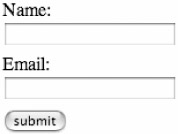
Figure 5-4: Method C as viewed in a browser, with CSS applied to <p> tags
Aside from the visual aspects of Method C, let's take a look at the most important advantages it has: in particular, an accessibility improvement.
The <label> Element
There are two steps to utilizing the <label> element for making your forms more accessible, and both are in place in Method C. The first step is to use <label> tags to associate the label text with its corresponding form control, whether it be a text field, text area, radio button, check box, etc. Method C uses <label> on the "Name:" and "Email:" headers to couple it with text input boxes that will contain that information.
The second step is adding the for attribute to the <label> tag as well as a matching id attribute to the form control it belongs to.
For instance, in Method C we wrap the <label> tag around Name: with the value of the for attribute that matches the value of the id for the text field that follows.
<form action="/path/to/script" method="post"> <p><label for="name">Name:</label> <br /> <input type="text" name="name" /></p> <p><label for="email">Email:</label><br /> <input type="text" name="email" /></p> <p><input type="submit" value="submit" /></p> </form>
Why <label>?
Perhaps you've heard others tell you that you should always add <label> tags to your forms. The important question to ask (always) is why you should use <label> tags.
Creating label/ID relationships allows screen readers to properly read the correct label for each form control—regardless of where each falls within the layout. That's a good thing. Also, the <label> tag was created to mark up form labels, and by utilizing it we're adding structure to the form by adding meaning to these components.
An additional benefit to using <label> tags when dealing with radio button or check box controls is that most browsers will toggle the control on or off when the user clicks the text contained within the <label>. This in turn creates a larger clickable area for the control, making it easier for mobility-impaired users to interact with the form (Mark Pilgrim, "Dive Into Accessibility," http://diveintoaccessibility.org/day_28_labeling_form_elements.html).
For example, if we add a check box option to our form that gives the user the option to "Remember this info," we can use the <label> tag like this:
<form action="/path/to/script" method="post"> <p><label for="name">Name:</label><br /> <input type="text" name="name" /></p> <p><label for="email">Email:</label><br /> <input type="text" name="email" /></p> <p><input type="checkbox" name="remember" /> <label for="remember">Remember this info?</label></p> <p><input type="submit" value="submit" /></p> </form>
By marking the check box option up this way, we've gained two things: Screen readers will read out the form control with the correct label (even though in this case, the label comes after the control), and the target for toggling the check box becomes larger, which now includes the text as well as the check box itself (in most browsers).
Figure 5-5 demonstrates how the form would appear in a browser, with the increased clickable area for the check box highlighted.
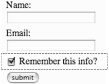
Figure 5-5: Example of check box option added with clickable text
Apart from tables and paragraphs, I'd like to show you one last method for marking forms—using a definition list.
Method D: Defining a Form
<form action="/path/to/script" method="post"> <dl> <dt><label for="name">Name:</label></dt> <dd><input type="text" id"name" name="name" /></dd> <dt><label for="email">Email:</label></dt> <dd><input type="text" name="email" /></dd> <dt><label for="remember">Remember this info?</label></dt> <dd><input type="checkbox" name="remember" /></dd> <dt><input type="submit" value="submit" /></dt> </dl> </form>
The last method we'll look at in regards to form layout involves the use of a definition list to define label and form control pairs. It's a somewhat controversial move—skirting the fringe of what a definition list is designed to do. But it's also a method that's gaining in widespread use, and one worthy of mentioning in this book.
Further ahead, in Chapter 8, we'll talk in more detail regarding definition lists—and the fact that they certainly are capable of more uses than most designers are aware of. Using a <dl> to mark up a form is a perfect example.
You'll notice in the code example that each form label is wrapped in a definition term tag (<dt>) followed by its associated form control wrapped in a definition description tag (<dd>). Doing this creates a pairing of label to form control, which when viewed in a browser without any style applied looks like Figure 5-6.
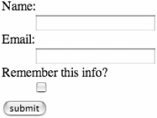
Figure 5-6: Default form layout using a definition list
By default, most visual browsers indent the <dd> element on its own line. Fantastic. Without adding any additional <p> or <br /> tags, we have a readable form layout for those browsing without CSS.
Defining Style
The simplest style we could add would be to easily remove the default indenting of <dd> elements within our form:
form dd { margin: 0; } The preceding snippet of CSS would render our Method D example as viewed in Figure 5-7.
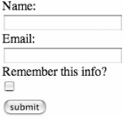
Figure 5-7: Definition list form example with <dd> margins removed
The table-like format of Method A could also be achieved by floating <dt> elements within our form:
form dd { margin: 0; } form dt { float: left; padding-right: 10px; } By floating the <dt> elements to the left, the form controls contained in <dd> tags will align themselves to the right, as seen in Figure 5-8. You'll notice that the form controls don't line up with each other perfectly—but at the very least this illustrates that while it's possible to use a <dl> tag to lay out a form, the layout doesn't have to put each element on its own line.
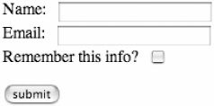
Figure 5-8: Form layout with floated <dt> elements
In fact, because of the presence of the <dl>, <dt>, and <dd> elements—which are in addition to the form <label> and <input> elements—you'll have plenty to work with in the way of elements that can be styled with CSS.
|
| < Day Day Up > |
|
EAN: 2147483647
Pages: 119