Putting the Art in Chart
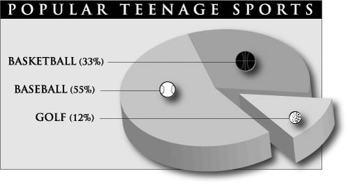
Putting the "Art" in ChartWe are bombarded with information on a daily basis. Whether it is from newspapers, the Internet, BlackBerrys, magazines, outdoor advertising, television, or radio, we can absorb only a limited amount. At the same time, certain bits of information require a degree of focus and attention in order for us to process and really understand them. Aware of the challenges, designers often turn to graphs or charts to present complicated information in a simpler manner. Also known as an infographic, a well-designed graph presents key data points in a visually stimulating way that quickly conveys a message to the reader (Figure 9.1). Graphs are often used in annual reports, business or sales presentations, and magazine or newspaper articles. Figure 9.1. In today's fast-paced work, graphs help people visualize and digest numerical data. In this example, the percentage of teens interested in golf is highlighted. A salesperson for golf equipment might use this to bring attention to growth in that segment. The use of graphs is a great way to communicate numeric information in a visual and graphical manner; when you use such a way to represent your data, you can turn a jumble of numbers into compelling data points. The important thing is to remember that a graph is meant to communicate information. As we'll see in this chapter, Illustrator offers many ways to control a graph's appearance, and it can be easy to get caught up in making a graph look so pretty that the reader misses its entire point.
The Anatomy of a GraphBefore we get into the specifics of creating and editing graphs, let's first explore how Illustrator constructs them. A graph itself can be made up of several different elements, including the chart itself, a value and category axis, and a legend. These elements are each created as individual groups so that they can be managed easily. A graph in Illustrator is a special kind of parent group that comprises the individual groups shown in Figure 9.2. Depending on the settings that you use, a graph can have all or just some of these groups. Figure 9.2. A graph in Illustrator is made up of many different parts.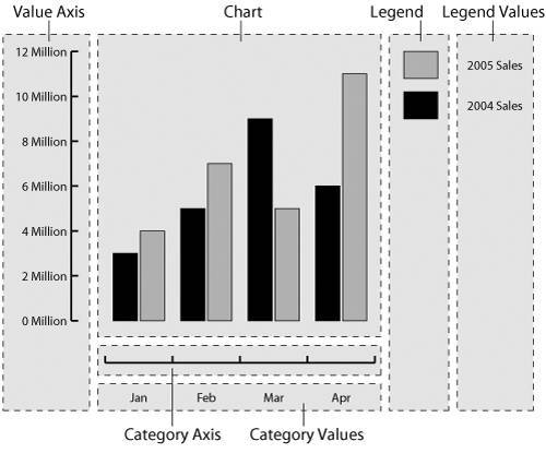 As long as the elements are contained by the special parent group, you can make edits to the graph data or the settings of the graph itself, and Illustrator updates the graph accordingly. However, if you remove the parent group (by choosing Object > Ungroup), the individual elements act like regular vector objects, and you can no longer edit the graph data. (See the section "Ungrouping a Graph," later in the chapter, where we discuss under what circumstances you would want to ungroup a graph.)
Creating a Graph in IllustratorCreating a graph in Illustrator is a two-step process. First, you specify a size for your graph (much like drawing a rectangle), and second, you specify the data for the graph.
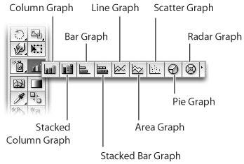
Choosing a Graph TypeCreating a graph in Illustrator is much like following a recipe. You take a few numbers here, a few values there, toss them together, and Illustrator produces a functional visual representation of your data. In the world of graphs, there are many different ways to present data. Illustrator has nine different ways; each of these is called a graph type.
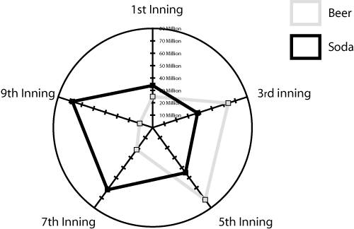
Specifying Graph DataWhen you create a graph in Illustrator, you are presented with the Graph Data window, which is the life and soul of a graph (Figure 9.13). After all, without any data, Illustrator can't draw a meaningful graph. If you've ever seen a spreadsheet before (like in Lotus 1-2-3 or Microsoft Excel), you'll recognize the vertical columns and horizontal rows of cells where you can specify data. You can click and drag the vertical lines to adjust the width of each row. This won't have any effect on the appearance of your graph, but it will allow you to view all of your data if they extend beyond the boundary of each cell. Figure 9.13. The Graph Data window contains the values that determine how a graph is drawn. If you've already created a graph and you've closed the Graph Data window, you can always reopen this window for further data editing. To do so, with a graph selected on your artboard, just choose Object > Graph > Graph Data; the Graph Data window will appear. Across the top of the Graph Data window are several items. A field where you can enter data for a selected cell (to select a cell, simply click it) appears along the entire top left side. Along the top right of the window are the following six icons, which offer additional functionality:
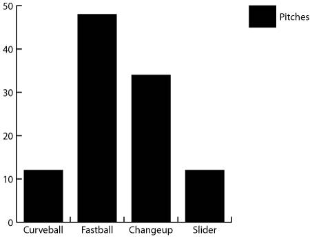
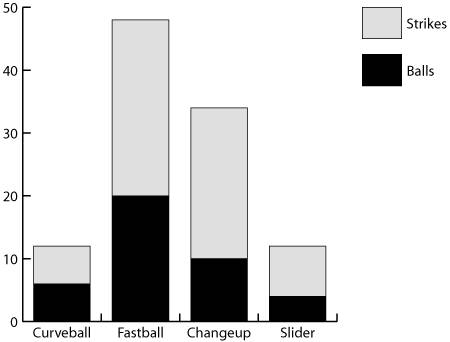
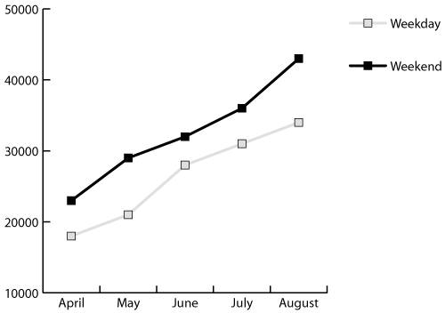
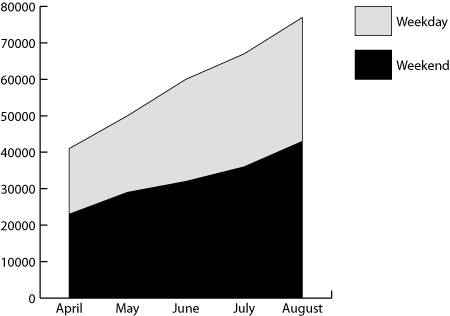
Formatting Data Within the Graph Data WindowAlmost as important as the data itself is the way that you actually enter it into the Graph Data window. The graph type that you choose and the way in which you format the values within the cells of the Graph Data window are the two items that most impact how Illustrator draws your graph. For example, if you just specify numeric values in the Graph Data window, Illustrator draws the graph correctly, but people who read your graph may not understand its significance. In order for a graph to be effective, a reader needs to understand what the values stand for. One way to help a reader make sense of a graph is by adding labels, which identify what a particular axis or data point represents. In the Graph Data window, you can specify labels simply by entering the text of the labels within the cells. If Illustrator sees a value that contains letters instead of numbers, it assumes the cell contains a label, and not a numerical value that affects the graph itself (Figure 9.14). In order to specify a number as a numerical value, you must enclose it in quotation marks. Figure 9.14. These two graphs represent the same data, but the bottom one has legend and category labels added to make the meaning of the graph immediately apparent.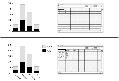 Customizing GraphsOnce you've created a graph, you can edit it and customize it to fit your needs. At any time, you can select a graph and open the Graph Data window where you can change the data. When you check the Apply button, your graph updates to reflect the new data.
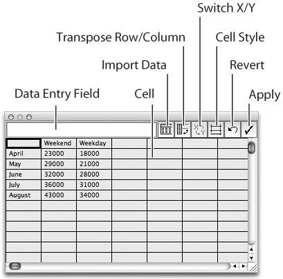
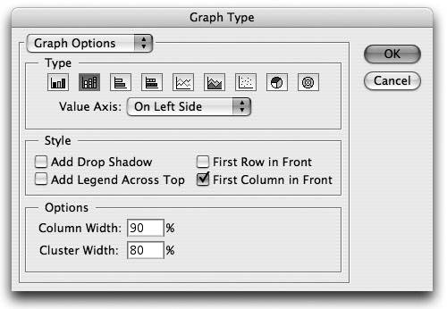
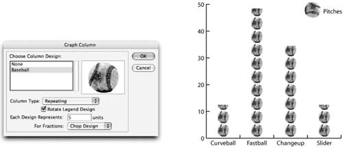
However, there can be more to a graph than just the data itself. For example, a graph has a category axis, a value axis, a legend, and other elements. To make adjustments to these settings, select a graph on the artboard and choose Object > Graph > Type to open the Graph Type dialog. Depending on the type of graph that you have chosen, the Graph Type dialog offers several panels with specific options (Figure 9.15, next page). Figure 9.15. Illustrator offers additional settings for how graphs appear through the Graph Type dialog. Each graph type maintains options specific to its type of graph. Utilizing Graph DesignsPurely from a numbers point of view, bars, lines, and squares get the point across when you're creating a graph. However, there's plenty of room for creativity when you're drawing graphs as well. Sometimes, a graphic can add a really nice touch to the overall appearance of a graph, and it can even make it easier to pick up on key data points. In Illustrator, custom art that is used instead of bars to display values in a graph is called a graph design. For the most part, graph designs behave much like patterns do. First, you define a graph design. Once defined, you can apply the graph design to a graph in your document. There are two kinds of graph designs in Illustrator: a Column graph design, which is used for drawing columns in column graphs; and a Marker graph design, which is used for drawing markers in line or scatter graphs. Here are the steps that you need to follow to create a graph design:
Now that you've created a graph design, here are the steps you need to follow in order to apply the graph style to your graph:
Ungrouping a GraphAt any time, you can decide to ungroup your graph, although if you do so, the graph is reduced to regular vector objects and is no longer editable as a graph object. Designers may ungroup a graph once they know the numbers won't change anymore. Once ungrouped, a designer can edit the objects freely. Raising the Bar with GraphsYou can take advantage of the graph feature in Illustrator in numerous ways. Once you've created a graph, you can use the Direct Selection tool to select individual parts of a graph and apply different fill or stroke attributes (by default, Illustrator generates graphs using different shades of gray). You can also apply other Illustrator features, such as Live Effects (like 3D or Scribble) or transparency. You can even use graph elements as masks for photographs.
In addition, you can use an Illustrator graph as a guide for more customized artwork. For example, you may want to create an intricate infographic using customized shapes. By creating a simple graph with real data, you can draw artwork in scale to depict numeric data in a visual way (Figure 9.18). Figure 9.18. Graphs don't have to be boring. Use Illustrator's feature set and your creativity to create graphs that demand attention. If bringing data into Illustrator isn't your cup of tea, you can use Excel to generate a graph, which you can then save as PDF from Excel (if you have Acrobat installed on your computer, you should have a utility called PDFMaker available from within Microsoft Office). Once you've created the PDF, open it in Illustrator, where you can customize it as needed (you won't be able to edit the graph data however). |

EAN: 2147483647
Pages: 147