Correct color with the Variations command
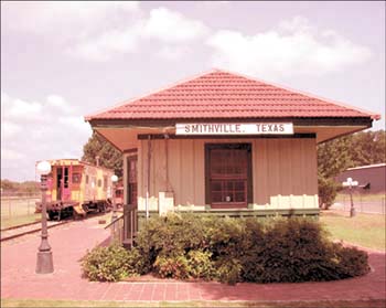
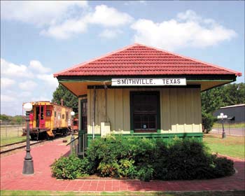
| It's no surprise that color correcting your digital images can be difficult. Trying to decide what needs to be adjusted in your image is almost as confusing as figuring out which tool you'll need to fix it. There are automatic color fixes in many different image-editing programs, but these "one-size-fits-all" adjustments often don't meet your needs. Photoshop has one of the most intuitive and efficient tools for making color corrections to your images. The Variations command is a quick way to adjust your images according to your own tastes, in a visual format that makes it easy to make the right choices. By using this image-editing tool, you'll be able to see what doesn't look quite right in your image and correct it, as we did in Figure A. Figure A.
Enjoy the viewBefore making any adjustments using the Variations command, it's important to get familiar with the Variations dialog box. To do so:
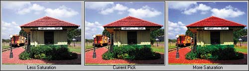
Note The Variations command works in the RGB, CMYK, and Grayscale color modes only. The lay of the landThe Variations dialog box is broken up into four main sections. The first section, in the upper-left corner, gives you two preview windows. The first is your original image, and it always remains the same. Use this image for comparison when making your adjustments. The second preview window, titled Current Pick, represents the current state of your image. As you make changes to your image, this preview is updated. Controls sectionThe next section includes all the controls for the Variations dialog box and is located in the upper-right corner. Here you can choose to adjust the Shadows (dark areas), Midtones (middle tones), or Highlights (light areas). You can also adjust the Saturation in your image, which is the intensity of your colors. You can control the intensity of the adjustment by moving the slider located below these options, which ranges from Fine to Coarse. Each tick mark represents a doubling of the adjustment amount and they add up quickly. Setting the slider for the second or third tick mark from the left works well, but you can experiment and see which setting works best for you. When you select the Show Clipping check box, the preview images display bright neon colors when image information is clipped. This means the image area has either gone completely white or completely black, which can look ugly both onscreen or when printed. It's a good idea to keep this option selected, and look out for the clipping indicator, as illustrated in Figure C. Figure C.
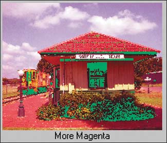
There are some other controls that let you accept or cancel your adjustments. You can also save your adjustment setting in case you find the perfect adjustment, and load it in when working on other images. It isn't something you'll use every day, but if you have a batch of images with the same color problem, it can save you a lot of time. Color balance sectionThe third section takes up the most room because it's where you'll do the most work. Here, your image is shown in the center with variations surrounding it. Under each of the variations, you can see what adjustment was made to it, whether it's More Red, More Green, or whatever. Clicking on one of these variations increases the level of that adjustment in all the images, but you can always refer to any of the three previews labeled Current Pick to see where you are. Contrast sectionThe last section is located on the right side of the dialog box and lets you change the contrast levels in the image. You might not think that contrast has much to do with color balance, but how bright or dark your image appears affects the intensity and tonal range of the colors in your image. Making adjustments using VariationsWhile you can make adjustments just by clicking around until things look good to you, there's a more structured approach that can help speed up things. Knowing where to start when color correcting an image is half the battle, so pay attention. You should make your adjustments starting with color, then moving on to contrast, and ending with saturation. To do so:
You'll now be able to see a larger version of your image and zoom in to specific areas to evaluate color. This option would be nice in the Variations dialog box, as it can be difficult to evaluate attributes such as shadows on a preview image that's only a fraction of the size of the original. However, the Variation command does a good job overall and offers quick color corrections without the fuss. Note For information on how to adjust saturation in an image, see the Problem : Solution "Mellow oversaturated colors" at the end of this chapter. The basics of color correctionThe Variations command provides an intuitive method for color correcting your images. You can also use it as a teaching tool by displaying how color changes interact. By watching your adjustments and following a pattern of editing, you can get a quick education on the basics of color theory. Then, you can better understand how various adjustments affect your images, making it easier to get perfect color. |
 Adjustments
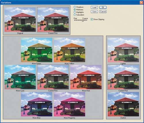
EAN: N/A
Pages: 105