Balancing Ragged Lines
It is often necessary to break display type: either at logical places for meaning and/or to achieve a visual balance. InDesign's Balance Ragged Lines feature goes some way towards achieving the latter and is useful to include as part of the style definition of headings, pull-quotes, and centered paragraphs. Using Balance Ragged Lines will reduce the amount of manual intervention (in the form of forced line breaks, or nonbreaking spaces), but you're still going to need to check your display type carefully for meaning.
Figure 8.15. Balance Ragged Lines applied locally from the Control palette and incorporated into a Paragraph Style definition.
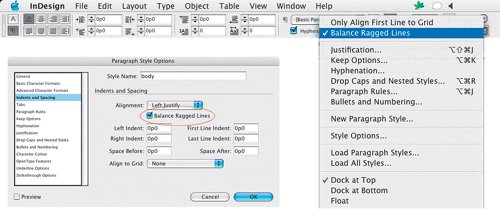
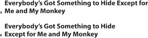
Figure 8.16. Unbalanced (example A); balanced (example B).
Balance Ragged Lines can also be used to adjust the line endings in left-aligned body text to produce a more even ragwhat you're aiming for is a gentle ripple down the edge of your page. Note that Hyphenation settings also play an important role in determining the way a paragraph rags (see Chapter 11: "Don't Fear the Hyphen") as does your chosen method of composition: Adobe Paragraph Composer or Adobe Single-line Composer. Balance Ragged Lines has no effect in justified text.
The line lengths in ragged type should be clearly irregular, i.e., they shouldn't look like carelessly set justified type. On the other hand, they shouldn't be so irregular that they create distracting shapes that impede fast reading.
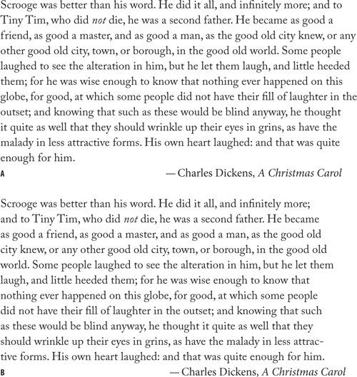
Figure 8.17. Balance Ragged Lines in body text. Both paragraphs are composed using the Adobe Paragraph Composer, and both permit hyphenation. Example A is without Balance Ragged Lines; example B has Balance Ragged Lines applied. Using Balance Ragged Lines for body text can yield unpredictable resultsit is best applied locally, or, if incorporated into a Paragraph Style definition, to paragraphs that typically run only a few lines.
Right Aligned Type |
Part I: Character Formats
Getting Started
- Getting Started
- An InDesign Type Map: Where to Find Stuff
- Viewing Your Page
- Creating a Typography Workspace
- Up Next
Going with the Flow
- Going with the Flow
- A Blank Sheet: Typing on Your Page
- Text Flow
- Threading Text Frames
- Using Placeholder Text
- Pasting Text
- Importing Word Text
- Up Next
Character Reference
- Character Reference
- Less is More, Maybe
- Type Anatomy
- Type Classification
- Character Formatting Options
- Readability
- Up Next
Getting the Lead Out
- Getting the Lead Out
- How Much Is Enough?
- (Not) Using Auto Leading
- Keep It Consistent, Except. . .
- Leading Menu Options and Keyboard Shortcuts
- See Also
- Up Next
Kern, Baby, Kern
- Kern, Baby, Kern
- When to Kern
- Metrics Kerning
- Optical Kerning
- Manual Kerning
- How Much to Kern
- Tracking
- When to Track
- Controlling Widows and Orphans
- Up Next
Sweating the Small Stuff: Special Characters, White Space, and Glyphs
- Sweating the Small Stuff: Special Characters, White Space, and Glyphs
- Typographers Quotes
- Apostrophes
- Dashes
- Ellipses
- End Marks
- White Space Characters
- The Glyphs Palette
- Footnotes
- Footnote Options
- Up Next
OpenType: The New Frontier in Font Technology
- OpenType: The New Frontier in Font Technology
- Ligatures
- Discretionary Ligatures
- Ordinals/Raised and Lowered Characters
- Swash Characters
- Fractions
- Oldstyle Figures
- Contextual Alternates
- Opticals
- Glyph Positioning
- Stylistic Sets
- Up Next
Part II: Paragraph Formats
Aligning Your Type
- Aligning Your Type
- Centering Type
- Clean Shaven or Rugged: Justified vs. Ragged Type
- How InDesign Justifies Type
- Balancing Ragged Lines
- Right-Aligned Type
- Optical Margin Alignment
- Indent to Here
- Vertical Alignment
- Up Next
Paragraph Indents and Spacing
First Impressions: Creating Great Opening Paragraphs
- First Impressions: Creating Great Opening Paragraphs
- Creating a Simple Drop Cap
- Drop Cap Aesthetics
- Tricks with Drop Caps
- Up Next
Dont Fear the Hyphen
Mastering Tabs and Tables
- Mastering Tabs and Tables
- Setting Tabs
- Creating Decimal Tabs
- Using Tab Leaders
- Reply Forms
- Numbered Lists
- Right Indent Tab
- Working with Tables
- Creating a Table
- Working with Rows and Columns
- Working with Table Cells
- Up Next
Part III: Styles
Stylin with Paragraph and Character Styles
- Stylin with Paragraph and Character Styles
- Creating Styles
- Applying Styles
- Editing Styles
- Redefining Styles
- Creating Default Styles
- A Typical Style Sheet
- Up Next
Mo Style
Part IV: Page Layout
Setting Up Your Document
- Setting Up Your Document
- Choosing a Page Size
- Determining Margins
- Determining Column Width
- Changing Columns
- Break Characters
- Page Numbers
- Section Markers
- Up Next
Everything in Its Right Place: Using Grids
- Everything in Its Right Place: Using Grids
- Things to Consider
- Your Grid Tool Kit
- Calculating the Height of the Type Area
- Align to Grid
- First Baseline Options
- Snap to Guides
- Up Next
Text Wraps: The Good, the Bad, and the Ugly
- Text Wraps: The Good, the Bad, and the Ugly
- Applying Text Wraps
- Wrapping Type Around Irregularly Shaped Graphics
- Text Wrap Preferences
- Ignoring Text Wrap
- Anchored Objects
- Up Next
Type Effects
EAN: 2147483647
Pages: 186
