How InDesign Justifies Type
Justification is achieved by varying the size of the word spaces on the lineor in the entire paragraphin an attempt to get even word and letter spacing, or at least word and letter spacing that looks even. If justification can't be achieved by adjusting the Word Spacing alone, then InDesign will adjust the Letter Spacing according to your minimum, desired, and maximum settings. After that, it moves on to your Glyph Scaling settings. Too much variation in word or letter spacing will cause the tight lines to look darker than the rest of your text and disturb the paragraph's rhythm. At the other extreme, if the word spacing is too big, you will get unsightly "rivers" of white running through your lines. This is particularly problematic when the columns are narrow and/or when the word spacing exceeds the leading, because the eye is tempted to read down through the gaps rather than from left to right.
Good type color is essential regardless of what alignment you are using, but it's harder to achieve in justified text, because the space left over at the end of the line has to be redistributed across the line to give you a smooth right margin. The more words you have in a line the easier it will be to get even word spacing. You get more words either by making your type smaller or your column wider. It's a balancing act because if you make your column too wide relative to your type size, you'll be swapping one evil for another (see Chapter 15: "Set Up").
Tip
To check for rivers, turn your page upside downwithout the distraction of actually reading the words, any problems should shout themselves out.
InDesign's Justification options can seem intimidating, but ultimately they are extremely logical. Using them well will make a dramatic difference in the appearance of your type.
Figure 8.7. Many rivers to cross. Word spacing and Letter Spacing too tight (example A) and too loose (example B).
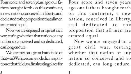
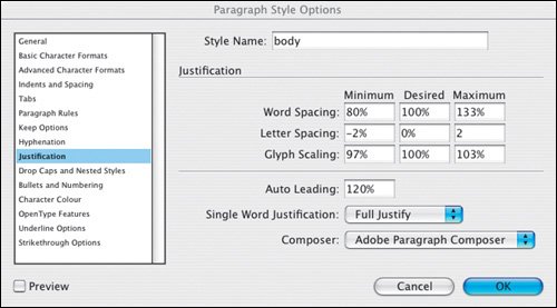
Figure 8.8. The Justification options specified as part of a style sheet definition.
Word Spacing
No prizes for guessing that this refers to the space between words, i.e., the width of space you get when you press the spacebar.
If you make your word spacing too tight, words will blend together making it hard for the eye to distinguish one from the next. At the other extreme, word spacing that's too loose creates unsightly blocks of white space between words, which makes reading groups of words more difficult.
Determining word spacing is more of an aesthetic consideration than an exact science. A good starting point is 100 percentthe width of the spaceband designed by the font designer. However, you may want to reduce this from 60 to 80 percent in the following circumstances:
- If you're working with condensed type.
- If the weight of your typeface is relatively light.
- If your typeface is tightly fit, i.e., if you are using tight letter spacing, you will want your word spacing to be correspondingly tight.
- If you're working with larger point sizes.
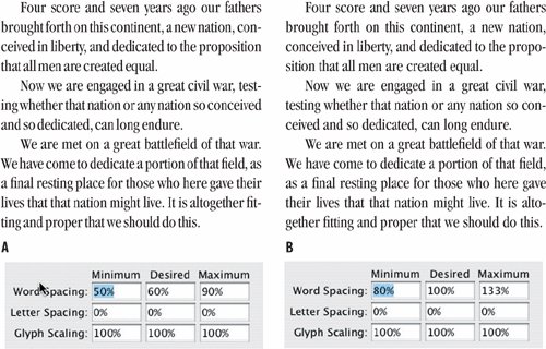
Figure 8.9. Tight word spacing (example A) and using the default values (example B). (ITC Garamond Book Condensed).
Letter Spacing
This is the distance between letters and includes any kerning or tracking values you may have applied. A character's width is determined not just by the character itself, but also by the space that the font designer adds around the characterknown as the side bearing.
A purist will tell you that come hell or high water all three values should be set to 0. That is, under no circumstances is any variation in letter spacing permissible. However, if you are working with a narrow measure you'll need to be more liberal with these settings. Depending on the font, you might try reducing the Desired Letter Spacing to 3, and set the minimum and maximum can be set to 5 and 0, respectively.
Figure 8.10. Letter Spacing: A slight adjustment to the Letter Spacing (example A) significantly improves the type color over example B, where InDesign has to rely solely upon the Word Spacing values to justify the type.
With both Word and Letter Spacing you need to find a balance between being strict and being reasonable. There's no point in specifying restrictive settings if your text-to-column width ratio makes it impossible for InDesign to honor these settings.
Glyph Scaling
Glyph Scaling is the process of adjusting the width of characters in order to achieve even justificationand a little glyph scaling goes a long way. Entering a value other than 100 percent for your Desired Glyph Scaling when working with ragged text is the same as entering a value for Horizontal Scaling. In other words, it's a bad idea. Glyph scaling might sound like the kind of crime that the Type Police will bust you for in an instant. But in reality, moderate amounts of glyph scaling cancombined with your other justification settingsimprove type color significantly. Moderation is the key: Keep your glyph scaling to 97, 100, 103 for Minimum, Desired, and Maximum, respectively. No one will ever know that you varied the horizontal scale of your type. They will, however, appreciate the splendidly even word spacing. Mum's the word.
Figure 8.11. Glyph Scaling: Allowing glyphs to scale to a small degree (example B) allows for more even justification.
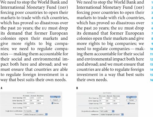
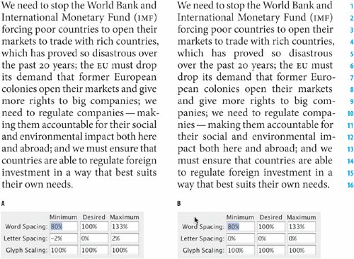
Figure 8.12. In example B, Letter Spacing and Glyph Scaling are combined with Word Spacing to produce an even type color.

The Adobe Paragraph Composer
The Adobe Paragraph Composer is the jewel in the crown of InDesign's typographic features. Before InDesign came along, page layout programs would compose paragraphs line by line. Because there was only a limited number of word spaces across which the extra space at the end of the line could be distributed, this often caused bad type color. Using the Adobe Paragraph Composer (it is the default choice of Composer), InDesign analyzes the word spaces across a whole paragraph, considering the possible line breaks, and optimizing earlier lines in the paragraph to prevent bad breaks later on. Not only does this mean fewer hyphens and better breaks where hyphens do occur, it also means better spacing. Because InDesign looks in the whole paragraph, there are more places where it can add or subtract an imperceptible amount of space. The default values of 80, 100, 133 for the Minimum, Desired, and Maximum word space allow the program enough latitude to distribute the space over a range of lines.
The Adobe Paragraph Composer works for both ragged and justified type, but it's with the latter that you really see its benefits.
Figure 8.13. Adobe Paragraph Composer
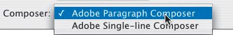
Figure 8.14. Show H&J Violations.
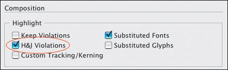
Show H J ViolationsAs absolutely fabulous as the Adobe Paragraph Composer is, you shouldn't expect miracles. good type color doesn't come easy, and you'll still have to fix some composition problems manually. This is where the preference show H&J Violations comes in handy. This composition preference allows you to easily identify the problems so that you can fix themby any means necessary. As a final reality check, it's important to keep in mind that even with the most carefully considered column widths, the most scientifically proven justification options, and the most judicious use of Indesign's Composition preferences, spacing problems will still occur from time to time. So don't fire the proofreader. |
Paragraph Composer WeirdnessIn InDesign CS, there were some problems with the Adobe Paragraph Composer refusing to let short words be pulled back to the previous line, even when there was room enough to accommodate them. This issue has been resolved in Indesign CS2. However, you will still find that when editing text that is composed using the Adobe Paragraph Composer, the type before and after the cursor will move. This is because, while you are editing the text, the paragraph is in progressInDesign is still figuring out how it can compose the spacing within the paragraph and adjusting spacing and line break on the fly. If it bothers you, you can always edit the type in the Story Editorchoose Edit > Story Editor, Cmd+Y (Ctrl+Y). |
Note
It's important to bear in mind that InDesign's Justification and Hyphenation features work in conjunction with each other. Good word spacing will not be achieved by the Adobe Paragraph Composer alone, but rather by combining it with the other justification features in InDesign's toolkit.
Adobe Single-Line Composer
If you're going for that retro look of bad word spacing circa 1994, then this is the option to choose. Otherwise it's second best to the Adobe Paragraph Composer.
Balancing Ragged Lines |
Part I: Character Formats
Getting Started
- Getting Started
- An InDesign Type Map: Where to Find Stuff
- Viewing Your Page
- Creating a Typography Workspace
- Up Next
Going with the Flow
- Going with the Flow
- A Blank Sheet: Typing on Your Page
- Text Flow
- Threading Text Frames
- Using Placeholder Text
- Pasting Text
- Importing Word Text
- Up Next
Character Reference
- Character Reference
- Less is More, Maybe
- Type Anatomy
- Type Classification
- Character Formatting Options
- Readability
- Up Next
Getting the Lead Out
- Getting the Lead Out
- How Much Is Enough?
- (Not) Using Auto Leading
- Keep It Consistent, Except. . .
- Leading Menu Options and Keyboard Shortcuts
- See Also
- Up Next
Kern, Baby, Kern
- Kern, Baby, Kern
- When to Kern
- Metrics Kerning
- Optical Kerning
- Manual Kerning
- How Much to Kern
- Tracking
- When to Track
- Controlling Widows and Orphans
- Up Next
Sweating the Small Stuff: Special Characters, White Space, and Glyphs
- Sweating the Small Stuff: Special Characters, White Space, and Glyphs
- Typographers Quotes
- Apostrophes
- Dashes
- Ellipses
- End Marks
- White Space Characters
- The Glyphs Palette
- Footnotes
- Footnote Options
- Up Next
OpenType: The New Frontier in Font Technology
- OpenType: The New Frontier in Font Technology
- Ligatures
- Discretionary Ligatures
- Ordinals/Raised and Lowered Characters
- Swash Characters
- Fractions
- Oldstyle Figures
- Contextual Alternates
- Opticals
- Glyph Positioning
- Stylistic Sets
- Up Next
Part II: Paragraph Formats
Aligning Your Type
- Aligning Your Type
- Centering Type
- Clean Shaven or Rugged: Justified vs. Ragged Type
- How InDesign Justifies Type
- Balancing Ragged Lines
- Right-Aligned Type
- Optical Margin Alignment
- Indent to Here
- Vertical Alignment
- Up Next
Paragraph Indents and Spacing
First Impressions: Creating Great Opening Paragraphs
- First Impressions: Creating Great Opening Paragraphs
- Creating a Simple Drop Cap
- Drop Cap Aesthetics
- Tricks with Drop Caps
- Up Next
Dont Fear the Hyphen
Mastering Tabs and Tables
- Mastering Tabs and Tables
- Setting Tabs
- Creating Decimal Tabs
- Using Tab Leaders
- Reply Forms
- Numbered Lists
- Right Indent Tab
- Working with Tables
- Creating a Table
- Working with Rows and Columns
- Working with Table Cells
- Up Next
Part III: Styles
Stylin with Paragraph and Character Styles
- Stylin with Paragraph and Character Styles
- Creating Styles
- Applying Styles
- Editing Styles
- Redefining Styles
- Creating Default Styles
- A Typical Style Sheet
- Up Next
Mo Style
Part IV: Page Layout
Setting Up Your Document
- Setting Up Your Document
- Choosing a Page Size
- Determining Margins
- Determining Column Width
- Changing Columns
- Break Characters
- Page Numbers
- Section Markers
- Up Next
Everything in Its Right Place: Using Grids
- Everything in Its Right Place: Using Grids
- Things to Consider
- Your Grid Tool Kit
- Calculating the Height of the Type Area
- Align to Grid
- First Baseline Options
- Snap to Guides
- Up Next
Text Wraps: The Good, the Bad, and the Ugly
- Text Wraps: The Good, the Bad, and the Ugly
- Applying Text Wraps
- Wrapping Type Around Irregularly Shaped Graphics
- Text Wrap Preferences
- Ignoring Text Wrap
- Anchored Objects
- Up Next
Type Effects
EAN: 2147483647
Pages: 186
