The Land of Happy Accidents: Layer Blending Modes and Opacity
| With blending modes you commonly arrive at fantastic results that are unexpected and unintentional. One of the great things about using layer blending modes and opacity sliders is that there's no penalty for experimentation. Blending mode and opacity changes are nondestructive so you can experiment to your heart's content without harming your image data. I will give definitions for what the different blending modes do, but it's a lot easier just to experiment. The possible combinations are infinite, which can be overwhelming. The good news is there are no rules. If it looks good, then it is good (and vice versa). Before we look at the layer blending modes, let's take a quick look at layer opacity and why there are two sliders.
When you are in the Move tool you can quickly change the opacity of a selected layer by using your number keys: 1 for 10%, 5 for 50%, 63 for 63%, etc. For 100% opacity press 0. Figure 3.18. Layer opacity. The opacity and fill opacity at 100% (example A). The opacity at 50%; note both the type layer and the layer effect (drop shadow) are both affected (example B). The opacity at 100% and the Fill Opacity at 0% (example C); note the type is affected but the shadow remains at 100%.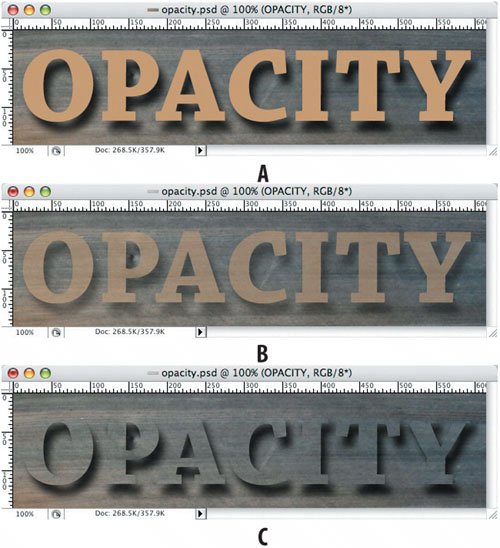 Using Blending ModesA layer's blending mode determines how its pixels blend with the pixels of any underlying layers. Combined with layer opacity, blending modes can be used to create myriad special effects. To give an idea of what's possible I've created a simple composition of a red rectangle on top of an image of the Grand Canyon and applied various blending modes to the red rectangle layer, all with an opacity of 100%. I've omitted showing blending modes that in some contexts have no effect, and those that, also in some contexts, differ from each other indistinguishably. Figure 3.19. Layer blending modes.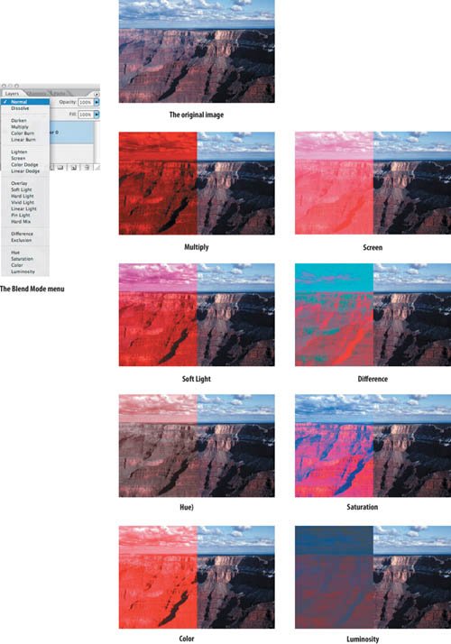 Using blending modes involves a certain amount of trial and error and serendipity. It's all about trying them. This book cover mock-up shows how applying blending modes to various color rectangles transforms an otherwise generic picture of the Golden Gate Bridge into something unique. Figure 3.20. Everyone who's ever been to San Francisco has this exact picture of the Golden Gate Bridge (example A). Placing an overlapping rectangle of color on separate layers (example B) and then experimenting with the blending modes of those layers helps to spice it up (example C).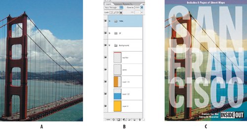 Darkening Blending Modes: Multiply, Darken, Color Burn, and Linear BurnAny of these blending modes produces a darker image. For my money Multiply is the most useful, and is the blending mode I use the most for compositing images, dropping out white or high-contrast details, and fixing overexposure. Multiplying any color with black produces black and multiplying any color with white leaves the color unchanged, making this blending mode invaluable for compositing images with handwriting or line drawing when you want the white areas to drop out. See Figure 3.21. Figure 3.21. The poem and the poppies are on separate layers (example A); choosing Multiply as the blending mode for the poem makes the paper drop out (example B).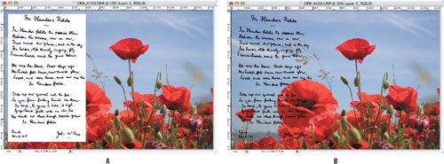 Multiply can also come to the rescue with exposure problems. A quick fix for an overexposed image is to make a copy of the layer and set the blending mode of the copy to Multiply, building tonal and color density in the too-light areas. If the effect is too strong, reduce the opacity of the copied layer; if it's not strong enough, make another copy. Figure 3.22. Fixing overexposed images. The original overexposed image (example A). The result of copying the background layer and setting its blending mode to Multiply with an opacity of 70% (example B). Darken uses the base or blend colorwhichever is darkeras the result color; working with a duplicate layer where the pixels are the same has no effect. Color Burn darkens and saturates. Linear Burn darkens the base color by decreasing the brightness. Lightening Blending Modes: Screen, Lighten, Color Dodge, Linear DodgeThis group of blending modes does the opposite of the correspondingly named blending modes in the previous group, with Screen being the opposite of Multiply. Where Multiply can be used to fix overexposure, Screen can be used to fix underexposure. I find Screen to be by far the most useful of the lightening blending modes. In the earlier example of the handwritten poem, to make the text white instead of black, we can invert the layer (Image > Adjustments > Invert or Command/Ctrl-I) and set the blending mode to Screen. Figure 3.23. The text turns white when the layer is inverted and the blending mode set to Screen.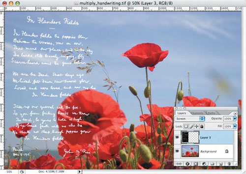 Because the black pixels of the blending layer have no effect on the layer below, using Screen is also an easy way to "select" subjects on a black background, like fireworks. If necessary, you can build density by duplicating the screened layer. Figure 3.24. Add some fireworks (example A). The result of changing the blending mode to screen, scaling, repositioning, and duplicating the Fireworks layer to build color density (example B).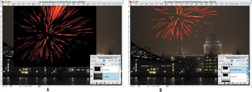 Figure 3.25. The original underexposed image (example A). The result of copying the background layer and setting its blending mode to Screen with an opacity of 70% (example B).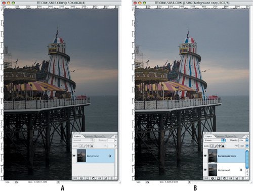 Contrast Blending ModesThese blending modes increase contrast. The Overlay mode either screens or multiplies colors, depending on the color of the pixels on the layer below, which means it makes darks darker and brights brighter, resulting in increased contrast. Overlay is useful when retouching imagessee "Dodging and Burning an Image" later in this chapter. Like Overlay, Hard Light increases contrast but the results are stronger, whereas using Soft Light gives a more subtle result. Vivid Light, Linear Light, Pin Light, and Hard Mix are seldom useful, but try them, you never know... Color Blending ModesThese blending modes affect the hue, saturation, or tonality of an image. Or to put it another way, they affect the color, the intensity of color, or the degree of lightness and darkness of an image. Hue changes the hue of the underlying image, but not the tonality or saturation. Saturation changes the saturation of the underlying image, but not the hue or tonality. Color affects the hue and saturation of the underlying image but not the tonality. Of this group Color is the heavy hitter and can be used to colorize images. While there are many ways to colorize Grayscale images (after you've converted them to RGB) or historic photos (see the following illustration), using layers and the Color blending mode is arguably the most intuitive. (See Chapter 5, "Adjustment Layers," for another approach to colorizing a photo.) Add layers as necessary, making their blending mode Color; then choose an appropriate foreground color and paint in that color with any of your painting tools. If necessary, use the selection tools to limit areas where the paint goes. Experiment with varying the layers' opacity as well as with the color. To quickly change the color of the paint on a layer, lock the transparency of that layer, select a new foreground color and press Option/Alt-Delete. Alternatively, you can press Option/Alt-Shift-Delete without having to first lock the layer transparency. Figure 3.26. I colorized this family photograph (example A) by painting on layers in the Color blending mode and varying the opacity of those layers (examples B and C).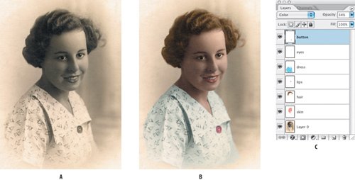 Luminosity affects the tonality of the underlying image, but not the hue or saturation. This is useful when using adjustment layers to make tonal changes to an image when you don't want to introduce any color shifts. For an example of using this blending mode, see "Adjustment Layers: Reasons to Be Cheerful" in Chapter 5, "Adjustment Layers." Layer groups have an additional blending mode, Pass Through. This is the default blending mode for layer groups and means that the group has no blending properties of its ownany adjustment layer, blending modes, or opacity changes applied to a group affect the way that group interacts with the layers below. Choosing a blending mode other than Pass Through means that the layers in the group are blended together first and then that composite group is blended with the rest of the image using the selected blending mode. Figure 3.27. Layer groups and blending modes. The blending mode of Group 1 is set to Pass Through, affecting the gap layer beneath (example A). The blending mode of Group 1 is set to Normal so that blending modes and opacity changes are restricted to the layers within the group (example B). In both examples, the blending modes of the "danger" and "no parking" layers are set to Multiply.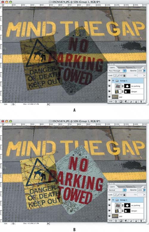 Comparative Blending ModesThese blending modes are used to compare one layer to another: Exclusion results in a color solarization effecthandy if you're in a psychedelic frame of mind, but not much use otherwise. Black pixels have no effect on the underlying image; white pixels invert the underlying image; and grays partially invert depending on their brightness. Difference lets you compare two images that look the same so you can spot the difference. For example, you know that one of the two versions of the same image has retouching applied, but you don't know where. Shift-drag one image on top of the other and change the blending mode of the top layer to Difference. All pixels that are the same will be black; any differences show up as nonblack pixels. Difference also has a rather esoteric but occasionally useful role in determining neutral grays when color-correcting images. See "Color Correction by the Numbers" in Chapter 5, "Adjustment Layers."
Note Switching color modes, for example, from RGB to CMYK, you may experience color shifts where you have applied blending modes. You can minimize this by making a copy of your RGB image (Image > Duplicate), then flattening this file before you convert to CMYK. Using Custom Blending OptionsThe Blending options in the Layer Styles dialog box let you control which pixels in the current layer stay visible and which pixels from the underlying layer show through the current layer. For example, you can drop out the blue pixels of the active layer or allow the red pixels from underlying layers to show through. Theoretically this means you can mask a layer based exclusively on the brightness of its pixels without having to dirty your hands making selections that define your mask by area. However, while it's fun to mess around with these options, I've never found much use for them. Masking "by the numbers" works only on specific types of images, those with distinct areas of pure colors. For example, dropping out blue might work fine if your sky is a pure blue and is the only blue in the image; if not, the effect is reminiscent of an early 1980s pop video, dropping not only the blues you don't want, but also those you do. You can refine the effect by holding down your Option/Alt key to split the sliders and define a range of partially blended pixels. But conventional layer masking techniques still give you more control. Furthermore, because the Layers palette doesn't show changes to layers made by using Blend If sliders, this approach is not as transparent (pun intended) as using layer masks, which we discuss in Chapter 4. Figure 3.28. Using the Blend If sliders to drop out the blue sky in the Brooklyn Bridge image (example A) and so reveal the sunset from the image below (example B). In the result shown (example C), the white slider has been dragged to the left and divided by holding down the Option/Alt key. This is effective in dropping out the sky, but unfortunately we also lose some of the flag. For the Brooklyn Bridge layer, blue pixels with a brightness value of 0-114 are shown; those with a value of between 115 and 164 are partially blended, and those with a value of between 165 and 255 are hidden (example D).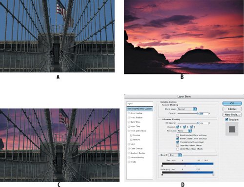 |
EAN: 2147483647
Pages: 93
- Chapter III Two Models of Online Patronage: Why Do Consumers Shop on the Internet?
- Chapter VI Web Site Quality and Usability in E-Commerce
- Chapter XII Web Design and E-Commerce
- Chapter XV Customer Trust in Online Commerce
- Chapter XVI Turning Web Surfers into Loyal Customers: Cognitive Lock-In Through Interface Design and Web Site Usability