Allowing Users to Enter Text Using a Text Box
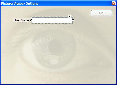
| A Label control is usually the best control for displaying text that a user can't change. However, when you need to enable users to enter or edit text, the text box is the tool for the job. If you've ever typed information on a form, you've almost certainly used a text box. Add a new text box to your form now by double-clicking the TextBox item in the toolbox. Set the text box's properties as follows:
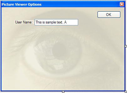
In previous versions of Visual C#, a new text box's Text property was always set to its default name. This required that you manually change the Text property for every new text box you added to a form. Fortunately, Microsoft changed this behavior, and you don't have to muck with the Text property unless you want to. Your form should now look like Figure 7.1. Figure 7.1. Labels and text boxes work well together. Although you'll leave the Text property of a text box empty 99% of the time, certain aspects of the text box are easier to understand when a text box contains text. For now, set the text box's Text property to This is sample text. Remember to press Enter or Tab to commit your property change. Specifying Text AlignmentBoth the Text Box and the Label control have a TextAlign property (as do many other controls). The TextAlign property determines the alignment of the text within the controlmuch like the justification setting in a word processor. You can select from Left, Center, and Right. Follow these steps to see how the TextAlign property works:
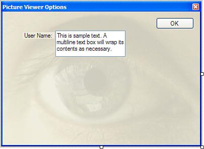
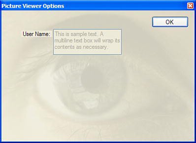
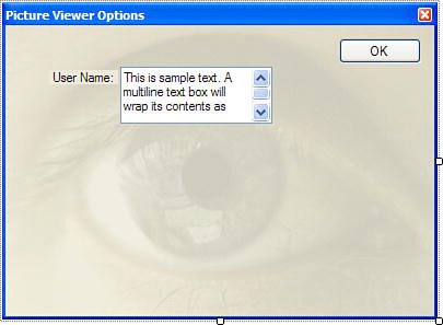
Creating a Multiline Text BoxHour 6, I talked about the sizing handles of a selected control. I mentioned how handles that can be sized are filled with white. If a corner or edge can't be resized, then no handle will appear at that corner or edge. Notice how only the left and right edges of the text box have white sizing handles. This means that you can adjust only the left and right edges of the control (you can alter only the width, not the height). This is because the text box is defined as a single-line text box, meaning that it will display only one line of text. What would be the point of a really tall text box that showed only a single line of text? To allow a text box to display multiple lines of text, set its Multiline property to True. Set the Multiline property of your text box to True now, and notice how all the sizing handles for adjusting the height become visible. Change the Text property of the text box to This is sample text. A multiline text box will wrap its contents as necessary. Press Enter or Tab to commit the property change. Notice how the text box displays only part of what you entered because the control simply isn't big enough to show all the text (see Figure 7.2). Change the Size property to 139,52, and you'll then see the entire contents of the text box (see Figure 7.3). Figure 7.2. A text box might contain more text than it can display. Figure 7.3. A multiline text box can be sized as large as necessary. There will be times when you won't want a user to be able to interact with a control. For example, you might implement a security model in an application, and if the user doesn't have the necessary privileges, you might not want the user to be able to alter data. The Enabled property, which almost every control has, determines whether the user can interact with the control. Change the Enabled property of the text box to False now, press F5 to run the project, and click Options to show the Options form. Although no noticeable change occurred in the control in Design view, there's a big change to the control at runtime: The text appears in gray rather than black, and the text box won't accept the focus or allow you to change the text (see Figure 7.4). Figure 7.4. You can't interact with a text box whose Enabled property is set to False. Stop the project now by choosing Debug, Stop Debugging from the menu, and then change the control's Enabled property back to true. Adding ScrollbarsEven though you can size a multiline text box, there still will be times when the contents of the control are more than can be displayed. If you believe that this is a possibility for a text box you're adding to a form, give the text box scrollbars by changing the ScrollBars property from None to Vertical, Horizontal, or Both. By the Way For a text box to display scrollbars, its Multiline property must be set to True. Also, if you set the ScrollBars property to both, the horizontal scrollbar won't appear unless you also set the WordWrap property to False. If you set WordWrap equal to True, text will always wrap to fit the control, so there will never be any text off to the right of the text box, and no need for a horizontal scroll bar. Change the ScrollBars property of your text box to Vertical and notice how scrollbars appear in the text box (see Figure 7.5). Figure 7.5. If a text box might contain a lot of text, give it a scrollbar. By the Way If you set a text box's AcceptReturn property to True, the user can press Enter to create a new line in the text box. When the AcceptTabs property is set to True, the user can press Tab within the control to create columns (rather than moving the focus to the next control). Limiting the Number of Characters a User Can EnterYou can limit the number of characters a user can type into a text box by using the MaxLength property. All new text boxes are given the default value of 32767 for MaxLength, but you can change this as needed. To see how this works, follow these steps:
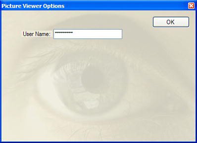
Now would be a good time to save your work. Creating Password FieldsYou've probably used a password field: a text box that displays an asterisk for each character entered. Any text box can be made a password field by assigning a character to its PasswordChar property. Select the PasswordChar property of the text box now and enter an asterisk (*) for the property value. Run the project once more and display the Options form. Next, enter text into the text box. Now an asterisk is displayed for each character you enter (see Figure 7.6). Although the user doesn't see the actual text contained in the text box, referencing the Text property in code always returns the True text. Figure 7.6. A password field displays its password character for all entered text. By the Way A text box displays password characters only if its Multiline property is set to False. Stop the project by choosing Debug, Stop Debugging from the menu. Delete the asterisk from the PasswordChar field and then save the project by clicking Save All on the toolbar. Understanding the Text Box's Common EventsYou'll rarely use the label's events, but you'll probably use text box events quite a bit. The text box supports many different events; Table 7.1 lists the events you're most likely to use regularly.
|
EAN: 2147483647
Pages: 248