Putting It All Together
3 4
So far, this chapter has explained a lot of rules and offered a lot of generic examples of those rules. In this section, you’ll put those rules to work by applying much of what you’ve just learned in a technique for coloring a command button.
If you’re an experienced Access user, you know that command buttons come in only one color: gray. However, you’re not stuck with dull command buttons. You can trick Access into displaying a command button in any color. In truth, the command button is still gray, but no one will know but you.
This technique uses three components: a command button, a rectangle, and a label control. All you really need is the rectangle to simulate a command button. However, this lone-rectangle approach has a number of limitations: First, Access doesn’t include a rectangle in the tab order. Second, you can’t assign a default value to a rectangle. Third, the rectangle offers fewer events than a command button offers. Fourth, it’s difficult to center the text between the top and bottom margins. If you don’t need any of these features, you might just as well use a colored rectangle and give it a Click event. Just keep in mind that the pseudo–command button will not have the same functionality that a true command button has.
To create the command button, follow these steps:
- Open a blank form, open the Toolbox, and deselect the Control Wizards tool if necessary.
- Insert a command button.
- Open the properties sheet if necessary, and click the Other tab. Name the command button cmdColor.
- Click the Format tab, and change the Transparent property from No to Yes.
- Click the Event tab, and then click the Builder button to the right of the OnClick property.
- Double-click Code Builder if Access displays the Choose Builder dialog box.
- In the form’s module, create the following procedure. Access supplies the Sub and End Sub statements. (The insertion point should be exactly where it needs to be so that you can type the assignment and MsgBox statements shown in the listing.)
Private Sub cmdColor_Click() recColor.SpecialEffect = 2 MsgBox "It worked!" recColor.SpecialEffect = 1 End Sub
This procedure simply changes the colored rectangle’s SpecialEffect property to give the pseudo–command button a just-clicked, or depressed, look. Then the MsgBox statement displays a simple message. Finally, the last statement returns the colored rectangle’s SpecialEffect property to its original state.
- Choose Debug, Compile to verify that your event procedure has no syntax errors. If Microsoft Visual Basic for Applications (VBA) returns a compilation error, correct the code as necessary. (The error is probably a simple typo.)
- Return to the form in Design view by closing or minimizing the Visual Basic Editor. Or simply click the appropriate Form icon on the taskbar. (It doesn’t matter whether you close the Visual Basic Editor at this point.)
For more information about creating event procedures, see Chapter 20, "Customizing Your Database Using VBA Code."
Now you’re ready to add the colored rectangle, which you can do by following these steps:
- Insert a rectangle anywhere in the form except directly on top of the command button.
Try to match the command button’s approximate size, but don’t worry if it isn’t exact. Later in this section, you’ll use some of the sizing techniques you learned earlier in this chapter to match the size of all three controls.
- Click the Other tab in the properties sheet, and name the new rectangle recColor.
- Click the Format tab, and then click the Builder button to the right of the Back Color property. Select a color from the Color palette (red in this example), and then click OK to return to the properties sheet.
- Select Raised from the Special Effect property.
The next procedure creates the label control. (If you don’t need a caption for your pseudo–command button, you can skip this part.)
To create the label, follow these steps:
- Insert a label control anywhere except on top of one of the other controls. Enter the text Pseudo as the label’s caption.
- Choose 12 from the Font Size control, and then click the Bold and Center buttons on the Formatting toolbar.
- Choose Format, Size, and then choose To Fit. The control will be just large enough to accommodate its text.
At this point, you have three controls, similar to those shown in Figure 8-28, which you can now stack and group.
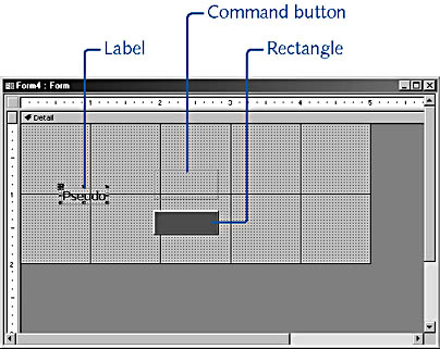
Figure 8-28. You need three components to create a colored command button.
First use any of the single control methods to size the command button. You can change the Width and Height properties or use the sizing handles. When the command button is the right size, move it to its permanent position. Make any adjustments necessary to position the command button exactly where you want it and make it the size you want before you continue.
You’re ready to size the rectangle now. The most precise method is to match the rectangle’s Width and Height properties to the command button’s Width and Height properties. To do so, select the command button (double-click if you need to open the properties sheet), and note the values for both properties. Then click the rectangle control, and enter those values. For example, if the command button were 1 inch wide and 0.25 inch deep, you’d enter 1" and 0.25" for recColor’s Width and Height properties. Alternatively, you could create a multiple selection containing both the command button and the rectangle and then use one of the Size formats: To Tallest, To Shortest, To Widest, or To Narrowest. If the rectangle doesn’t need to be exact, use the sizing handles. The Snap To Grid feature or the To Grid Size format might be useful here.
Now stack the rectangle on the command button. You can drag the rectangle if exact placement isn’t necessary. Just remember that the rectangle should completely cover the command button. Clicking any part of the invisible command button that extends beyond the visible rectangle will trigger the Click event, and you probably want to avoid that possibility.
If the precise placement of the command button is important, note the values of the command button’s Top and Left properties and then set the rectangle control’s Top and Left properties to the same values. Doing so automatically aligns the two controls. You can’t use the Format Align settings because these options won’t allow controls to overlap.
Now your colored command button is functional. On the Form Design toolbar, click View, and then click the pseudo–command button to display the simple message box shown in Figure 8-29.
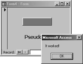
Figure 8-29. Clicking the colored command button displays a simple message box.
Although you could stop now, you probably want the colored command button to display a caption. That’s where the label control comes into play. Return to Design view, and drag the label control onto the stacked controls, centering it as best you can. This is another situation in which the Snap To Grid feature and the To Grid formatting option can help. However, there’s no direct way to automatically center the label control. You’ll just have to rely on a keen eye and the rulers. Remember to reapply the To Fit setting if you change the text. If you don’t, the text might appear off-center. If you can’t see the label’s text, select the label from the Object selector on the Form/Report Formatting toolbar and then choose Format, Bring To Front.
There’s one last procedure: You probably want to group the controls. That way, if you have to move the colored command button, you can move all the controls at once.
To create a control group, follow these steps:
- Click outside the stacked controls, and drag the mouse to create a temporary rectangle around the controls.
- Choose Format, Group.
- Save your work, and return to Form view to see the full effect, as shown in Figure 8-30.
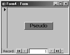
Figure 8-30. Creating this unique command button employs many of the design tools reviewed in this chapter.
caution
Don’t try to move the group with the group border showing. If you do, you’ll move only the individual control you clicked instead of moving the entire group.
EAN: 2147483647
Pages: 172