Panes
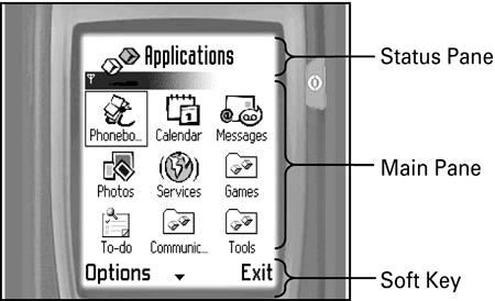
This section looks at the standard panes that make up a Series 60 application window ”namely, the status, main, and soft key panes, as shown in Figure 5-12. It will concentrate on the status pane, as this is of most interest to developers.
Figure 5-12. The standard panes.
Status Pane
The status pane occupies an area at the top of the screen and displays information regarding the status of the current application, and of the device itself. For example, it might show which tab of a tabbed view is currently selected or how much battery power is remaining.
 | The status pane can be hidden if full-screen mode is required ”for example, in a game application. For a true full-screen application, the soft key pane would also need to be hidden. |
The status pane itself is divided into the following subpanes:
-
Title Pane
-
Context Pane
-
Navigation Pane
-
Signal Pane
-
Battery Pane
-
Universal Indicator Pane (also known as the Small Indicator Pane)
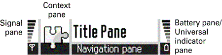
These parts are all shown in Figure 5-13.
Figure 5-13. The status pane subpanes.
| | The status pane has a different layout in idle mode. However, this does not affect the way you write code for populating the status pane. |
You can change the contents of the following panes in your application:
-
Title Pane ” This shows the application name by default. You can change it to either display your own text or display a bitmap image representing the title instead.
-
Context Pane ” Initially, the context pane shows the default application icon specified in the AIF, but you can change this to display a different icon if you wish.
-
Navigation Pane ” The main uses of the navigation pane are to display information about the current state of the application, and to indicate which view is currently being displayed. It is also used to help the user navigate within the application. The navigation pane is blank by default, but it can be decorated with tabs, a label, an image, an indicator, or a custom control. The type of control you use depends on the requirements of your application. For example, you could use tabs to represent different views within an application, use a label to represent a view of a calendar month, use a volume control indicator to control recording levels in a video application, and so on. You can add horizontal scroll adjusters programmatically ”for example, to allow horizontal scrolling through calendar months, or they may be added automatically by the framework ”for example, to control the volume indicator or to switch between application views when there are too many tabs to display at once.
The remaining panes are available only to system applications.
Status Pane Basics
This subsection looks at the StatusPane application, which shows how to change the visibility of the status pane and handle a change in the status pane size .
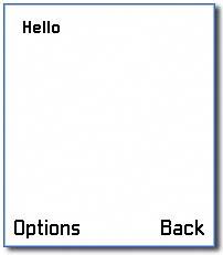
The StatusPane example simply displays " Hello " on the screen. The Options menu has an item, Toggle Visibility , which you can use to switch the visibility of the status pane on or off, as shown in Figures 5-14 and 5-15.
Figure 5-14. StatusPane ”visibility on.
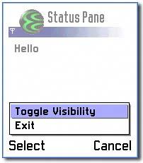
Figure 5-15. StatusPane ”visibility off.
Changing the Visibility of the Status Pane
To change the visibility of the status pane, you need to get a handle on it and then call its SwitchLayoutL() method. In the StatusPane example, this occurs when handling the Toggle Visibility item on the Options menu, in CStatusPaneAppUi::HandleCommandL() :
void CStatusPaneAppUi::HandleCommandL(TInt aCommand) { switch (aCommand) { case EStatusPaneToggleVisibility: { CEikStatusPane* statusPane = StatusPane(); if (statusPane->CurrentLayoutResId() != R_AVKON_STATUS_PANE_LAYOUT_EMPTY) { statusPane->SwitchLayoutL(R_AVKON_STATUS_PANE_LAYOUT_EMPTY); } else { statusPane->SwitchLayoutL(R_AVKON_STATUS_PANE_LAYOUT_USUAL); } break; } case EEikCmdExit: { Exit(); break; } default: break; } } In the StatusPane example, the Toggle Visibility menu item is defined using resources, with its command ID set to EStatusPaneToggleVisibility . On handling this command, you need to obtain a reference to the status pane by calling CAknAppUi::StatusPane() . This delivers a pointer to a CEikStatusPane , which can then be manipulated.
| | Although CAknAppUi::StatusPane() returns a pointer to a CEikStatusPane object, the CAknAppUi object maintains ownership. Therefore, it would be inappropriate to place the object on the cleanup stack. |
To make the status pane invisible in the StatusPane example, two methods are used:
-
CEikStatusPane::CurrentLayoutResId() ” This returns the resource ID for the current layout.
-
CEikStatusPane::SwitchLayoutL() ” This changes the status pane layout to the resource ID specified.
The resource ID R_AVKON_STATUS_PANE_LAYOUT_EMPTY specifies the status pane as "hidden", and the resource ID R_AVKON_STATUS_PANE_LAYOUT_USUAL specifies the status pane as shown with the standard layout. Note that the CEikStatusPane methods IsVisible() and MakeVisible() should not be used to test and set the visibility of the pane, as they will also hide the in-call icon.
Handling a Change in the Status Pane Size
By following the previous step, you will have all the code needed to switch the status pane's visibility on and off. However, if this code was executed, when the status pane was made invisible you would still be able to see the status pane from the previous screen. This is because the container would not have been resized ”that is, its SizeChanged() method would not have been called.
To ensure that this happens, you need to override the CAknView::HandleStatusPaneSizeChange() method in the view class. In the StatusPane example, this occurs in the CStatusPaneView1 class:
void CStatusPaneView1::HandleStatusPaneSizeChange() { iContainer->SetRect(ClientRect()); } The framework calls this method whenever the size of the status pane changes (that is, by changing its visibility or layout). When the status pane has been made invisible, the area available to the container will have increased.
You need to reset the rectangle for the container with the new client rectangle, forcing the container to redraw itself. You achieve this by calling the container's SetRect() method, passing in the client rectangle, which you can obtain using CAknView::ClientRect() . This will ensure that the container makes use of the area previously occupied by the status pane.
In the StatusPane example, the status pane is changed dynamically. It would also have been possible to set the status pane statically in the resource file by defining a STATUS_PANE_APP_MODEL and referring to it in the EIK_APP_INFO . This would set the status pane on application launch to the fields set in this resource. See the SDK documentation for further details of the fields that can be set in a STATUS_PANE_APP_MODEL resource.
 | The client rectangle is the area of the screen remaining after the status and soft key panes have been taken into account. |
Title Pane
By default, the title pane will show the application's name; however, you can change this to display a title of your choosing, or even an image. If your choice of title is too long to fit on one line, it will be displayed on two lines instead. If it is too long for two lines, then it will be truncated. You can also set the title to an empty string, in which case no title will be displayed.
Title Pane Basics
This subsection looks at the TitlePane example, which shows how to change the title pane text and display an image in the title pane. The title pane in the example initially displays the text "Title Pane". The Options menu has an item, Title Text, which you use to change the text displayed in the title pane, as shown in Figure 5-16.
Figure 5-16. TitlePane menu.
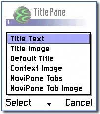
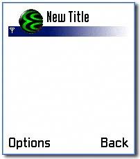
Figure 5-17 shows the application with new title pane text.
Figure 5-17. Status pane with a new title.
Changing the Title Pane Text
The TitlePane example demonstrates how to change the text displayed in the title pane. It accomplishes this when handling the Title Text item on the Options menu, in CTitlePaneAppUi::HandleCommandL() :
[View full width]void CTitlePaneAppUi::HandleCommandL(TInt aCommand) { switch (aCommand) { // change the title pane text case ETitlePaneSetTitleText: { TUid titlePaneUid; titlePaneUid.iUid = EEikStatusPaneUidTitle; CEikStatusPane* statusPane = StatusPane(); CEikStatusPaneBase::TPaneCapabilities subPane = statusPane->PaneCapabilities(titlePaneUid); // if we can access the title pane if (subPane.IsPresent() && subPane.IsAppOwned()) { CAknTitlePane* titlePane = (CAknTitlePane*) statusPane->ControlL(titlePaneUid); // read the title text from the resource file HBufC* titleText = StringLoader::LoadLC(R_TITLE_TEXT); // set the title pane's text titlePane->SetTextL(*titleText); CleanupStack::PopAndDestroy(titleText); } break; } ...
As shown previously, the first required task is to get a pointer to the status pane. Afterward, the existence and readiness of the title pane must be verified . This can be accomplished by calling the pane's PaneCapabilities() method, and passing it the title pane's ID, which provides a TPaneCapabilities object. Then the TPaneCapabilities::IsPresent() method can be used to find out if the title pane is present, and TPaneCapabilities::IsAppOwned() can be used to find out if the title pane can be modified by the application. You can obtain information about any of the status pane's subpanes by calling the status pane's PaneCapabilities() method, passing it the appropriate ID.
Once the title panes is known to be present and ready for modification, it can then be accessed by calling the status pane's ControlL() method, passing it the title pane's ID. As with the status pane, although a pointer to the CAknTitlePane is returned, there is no transfer of ownership. Therefore, there is no need to use the cleanup stack.
Now that a pointer to the title pane has been obtained, it can be used to set the text it displays. Before doing that, however, it is first necessary to obtain a pointer to the desired text. This pointer is then passed into title pane's SetText() method. The SetText() method takes ownership of its argument, so you don't have to worry about deleting the pointer yourself. Alternatively, the SetTextL() method could have been used, which makes a copy of its argument instead of taking ownership. It is then up to the application to delete the text when appropriate.
| | To reset the title pane back to its default value (that is, to the application's name), call the title pane's SetTextToDefaultL() method. |
Displaying an Image in the Title Pane
The process for getting the title pane to display an image is similar to that used to modify the text it displays. This occurs when handling the Title Image item on the Options menu, in CTitlePaneAppUi::HandleCommandL() :
[View full width]void CTitlePaneAppUi::HandleCommandL(TInt aCommand) { switch (aCommand) { ... // display a bitmap in the title pane case ETitlePaneSetTitleImage: { TUid titlePaneUid; titlePaneUid.iUid = EEikStatusPaneUidTitle; CEikStatusPane* statusPane = StatusPane(); CEikStatusPaneBase::TPaneCapabilities subPane = statusPane->PaneCapabilities
As before, the first step is to obtain a pointer to the status pane and check that the title pane is present and that it can be modified ”only then is a pointer to the title pane itself acquired . The next step is to load a suitable image and tell the title pane to display it. This is accomplished by first creating a bitmap and then passing the bitmap to the title pane's SetPicture() method. The SetPicture() method will take ownership of the bitmap passed to it.
Changing the Title Pane Text Using Resources
As well as setting the title pane's contents dynamically, you can also set them in the resource file. You achieve this by specifying a TITLE_PANE resource, such as:
// Title Pane containing text RESOURCE TITLE_PANE r_my_title_pane { txt = TITLE_TEXT; } The txt field allows you to specify the text to be displayed in the title pane. In the TitlePane example, TITLE_TEXT is #defined in the localization file:
... #define TITLE_TEXT "New Title" ...
Localization is covered in further detail in Chapter 4.
Your TITLE_PANE resource should then be referenced from the status pane resource, which in turn needs to be referenced from the EIK_APP_INFO resource:
RESOURCE EIK_APP_INFO { status_pane = r_my_status_pane; } RESOURCE STATUS_PANE_APP_MODEL r_my_status_pane { panes = { SPANE_PANE { id = EEikStatusPaneUidTitle; type = EAknCtTitlePane; resource = r_my_title_pane; } }; } Displaying an Image in the Title Pane Using Resources
You can define an image to be displayed in the title pane by specifying the bmpfile , bmpid and bmpmask fields in the TITLE_PANE structure. The bmpfile field identifies a .mbm file from which to obtain the image. The bmpid field specifies the index of the bitmap to use from the multibitmap file, and the bmpmask field specifies the index of the mask to use, if needed:
// // Title Pane containing image // RESOURCE TITLE_PANE r_my_title_pane { bmpid = EMbmMyBitmapIndex; bmpmaskid = EMbmMyBitmapMaskIndex; bmpfile = "\system\apps\myapplication\myapplication.mbm"; } The SDK documentation contains further details of all the API methods available in the CAknTitlePane class. Chapter 11 contains more information on .mbm files.
Context Pane
The context pane, by default, will display the current application's icon, as specified in the AIF file. If this doesn't suit your needs, then the icon displayed can easily be changed. The process for doing this is similar to that used to change the title pane's contents.
Context Pane Basics
This subsection continues looking at the TitlePane example, showing how to change the image displayed in the context pane. The context pane in the example initially displays the default image. The Options menu has an item, Context Image , which you use to change the image displayed in the context pane. Figure 5-18 shows the title pane with a new context image.
Figure 5-18. Context pane displaying a new image.

The code that handles the image change resides in CTitlePaneAppui::HandleCommandL() . This function is called when the user selects the Context Image item on the Options menu:
[View full width]void CTitlePaneAppUi::HandleCommandL(TInt aCommand) { switch (aCommand) { ... // display a bitmap in the context pane case ETitlePaneSetContextImage: { TUid contextPaneUid; contextPaneUid.iUid = EEikStatusPaneUidContext; CEikStatusPane* statusPane = StatusPane(); CEikStatusPaneBase::TPaneCapabilities subPane = statusPane->PaneCapabilities
First, you obtain a pointer to the status pane and use this to check that the context pane exists and that applications can interact with it. Then you obtain a pointer to the context pane, and use this to change the icon displayed by calling the SetPicture() method, passing it a bitmap.
Displaying an Image in the Context Pane Using Resources
Alternatively, you can also set the context icon in the resource file by specifying a CONTEXT_PANE resource. This works in the same way as the TITLE_PANE resource. The bmpfile field identifies an .mbm file from which to obtain the image. The bmpid field specifies the index of the bitmap to use from the .mbm file, and the bmpmask field specifies the index of the mask to use, if needed:
RESOURCE CONTEXT_PANE r_my_context_pane { bmpid = EMbmMyBitmapIndex; bmpmaskid = EMbmMyBitmapMaskIndex; bmpfile = "\system\apps\myapplication\myapplication.mbm"; } The SDK documentation contains further details of all the API methods available in the CAknContextPane class.
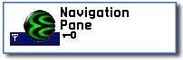
Navigation Pane
The navigation pane's main purpose is to display information to the user about the application's current view and state, as well as to help the user navigate around the application. The navigation pane is empty by default, but you can use it to display tabs, a label, an image, indicators, or custom controls. As the following code from the TitlePane example demonstrates, in order to decorate the navigation pane with controls, you need to use either a CAknNavigationControlContainer object in your code, or a NAVI_DECORATOR resource in your resource file.
Tabs
You can use the navigation pane to display tabs, as shown in Figure 5-19. This provides the user with information about the views available in your application, with the currently highlighted tab representing the current view. Each tab can display text, an image, or both.
Figure 5-19. Navigation pane displaying tabs.

This subsection continues looking at the TitlePane example, showing how to display tabs in the navigation pane and how to switch between tabs when the user presses the Left or Right direction keys. Initially, the navigation pane in the TitlePane example is empty. The Options menu has an item, NaviPane Tabs , which you use to display tabs in the navigation pane.
Displaying Tabs in the Navigation Pane
This occurs when handling the NaviPane Tabs item on the Options menu, in CTitlePaneAppUi::HandleCommandL() :
[View full width]void CTitlePaneAppUi::HandleCommandL(TInt aCommand) { switch (aCommand) { ... // display two tabs in the navigation pane case ETitlePaneSetNaviPane: { TUid naviPaneUid; naviPaneUid.iUid = EEikStatusPaneUidNavi; CEikStatusPane* statusPane = StatusPane(); CEikStatusPaneBase::TPaneCapabilities subPane = statusPane->PaneCapabilities
First a pointer to the navigation pane is obtained by calling the status pane's ControlL() method, passing the navigation pane's ID as an argument. After checking that the navigation pane exists and that applications can interact with it, the navigation pane's CreateTabGroupL() method is then used to create a new navigation decorator that contains a tab group. You can then use this tab group to add tabs to the navigation control.
In the TitlePane example, two tabs are added to the tab group, and the first tab is set to be active using the SetActiveTabByIndex() method. This highlights the tab with the specified index, which in this case is the first one. Finally, the tab group is pushed onto the navigation pane's object stack. You must do this for the tab group to actually appear on the navigation pane.
It is also possible to display a bitmap in a tab. To achieve this, use the appropriate overload of the AddTabL() method:
... // load the bitmap to be displayed in the tabs CFbsBitmap* bitmap = iEikonEnv->CreateBitmapL(KTitleBitMapFile, EMbmTitlepaneTab); // display a bitmap in the tab tabGroup->AddTabL(tabId++, bitmap); ...
Here, the bitmap variable is a pointer to a bitmap of type CFbsBitmap* .
You can control the number and size of the tabs displayed on the navigation pane by using the CAknTabGroup::SetTabFixedWidthL() method. This allows you to have anywhere between one and four tabs displayed on the navigation pane, and these can be either long or short tabs. The type of tabs you use will depend on the information you want to display in them. Long tabs have more space, making it easier to display text. When using long tabs, however, the currently highlighted tab will obscure most of the area available for the remaining tabs. This means that the user will not be able to see the text or images contained in the other tabs. Short tabs, on the other hand, have a much more limited amount of space available, but they will not obscure the other tabs, giving the user a better view of the available options.
Although you are limited to displaying a maximum of four tabs on the navigation pane at any point in time, you can actually have more tabs than this. Scroll indicators will automatically be displayed if there are more tabs available than are displayed on the navigation pane. The user will then be able to scroll to any of the available tabs. It is generally recommended, though, that you keep the total number of tabs low ”six tabs is the recommended maximum.
| | In Series 60 1.x, tabs always appear in a left-to-right order. The leftmost tab is always the first tab, and the rightmost is always the last tab. Series 60 2.x provides support for bidirectional text (in other words, support for languages that read right-to-left ), which means that the order of tabs may be reversed , depending on the locale. When the tabs are reversed (mirrored), they are traversed from right-to-left. In order to support bidirectional text, you should now pass key events on to the tab group, and then let the tab group notify your application if the view changes, rather than handle tab changes yourself. The old key-handling logic will still work in Series 60 2.x if used, but tabs won't be mirrored correctly if a mirrored language is used. |
It is up to you to implement the code allowing the user to switch between tabs. For example:
TKeyResponse CTitlePaneAppUi::HandleKeyEventL( const TKeyEvent& aKeyEvent, TEventCode aType) { if (iTabDecorator == NULL) { return EKeyWasNotConsumed; } CAknTabGroup* tabGroup = (CAknTabGroup*)iTabDecorator->DecoratedControl(); if (tabGroup == NULL) { return EKeyWasNotConsumed; } return tabGroup->OfferKeyEventL(aKeyEvent, aType); } This function checks whether the navigation decorator exists, then obtains the tab group from it. If either of these operations fails, it means that a tab group is not available, and that the control event cannot be processed by this function. In this case, the function then returns EKeyWasNotConsumed . Otherwise, the key press is passed on to the tab group, and it will handle switching tabs.
| | The application UI's HandleKeyEventL() method will be called if none of the controls on the Control Stack consume the event. See the CAknTabGroup help page in the SDK documentation for a full list of methods available. |
The NavigationPane example illustrates how to display tabs, a label, or an image in the navigation pane using resources, as shown in Figure 5-20.
Figure 5-20. Navigation pane display options in NavigationPane.
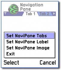
The navigation pane in the NavigationPane example initially displays two tabs that are defined using resources. The Options menu also has a Set NaviPane Tabs item, which you can use to display the tabs in the navigation pane.
Displaying Tabs in the Navigation Pane Using Resources
The NavigationPane example shows you how to display tabs in the navigation pane using a resource file, as shown in the following code snippets taken from NavigationPane.rss . First, the status_pane field is defined in the application resource:
RESOURCE EIK_APP_INFO { status_pane = r_navigationpane_status_pane; } Then the status pane itself is defined:
RESOURCE STATUS_PANE_APP_MODEL r_navigationpane_status_pane { panes = { SPANE_PANE { id = EEikStatusPaneUidNavi; type = EAknCtNaviPane; resource = r_navigationpane_navi_tabgroup; } }; } Finally the navigation pane resource is defined:
RESOURCE NAVI_DECORATOR r_navigationpane_navi_tabgroup { type = ENaviDecoratorControlTabGroup; control = TAB_GROUP { // display two tabs tab_width = EAknTabWidthWithTwoTabs; active = 0; tabs = { TAB { id = ENavigationPaneTab1; txt = TAB1_TEXT; }, TAB { id = ENavigationPaneTab2; txt = TAB2_TEXT; } }; }; } You can define tabs that will appear upon application startup in the resource file with a NAVI_DECORATOR resource. The tab_width field allows you to specify the number and width of the tabs that will appear. The active field specifies the index of the tab that will be initially highlighted. The tabs field then specifies all the tabs, their IDs, and contents. You can specify text content using the txt field. If you want to display images as well as, or instead of, text, then you need to use the bmpfile , bmpid and bmpmask fields. These work in the same way as in the TITLE_PANE resource described previously. The bmpfile field identifies an .mbm file from which to obtain the image. The bmpid field specifies the index of the bitmap to use from the .mbm file, and the bmpmask field specifies the index of the mask to use, if needed.
As well as dynamically creating the tabs in your application and defining the tabs in the resource file, you can also create tabs at runtime using a resource specified in the resource file. To achieve this, you first need to specify a TAB_GROUP resource in your resource file:
RESOURCE TAB_GROUP r_navigationpane_tabgroup { tab_width = EAknTabWidthWithTwoTabs; // display two tabs active = 0; tabs = { TAB { id = ENavigationPaneTab1; txt = TAB1_TEXT; }, TAB { id = ENavigationPaneTab2; txt = TAB2_TEXT; } }; } You can then read this resource from your code by using a tresourceReader object:
[View full width]void CNavigationPaneAppUi::HandleCommandL(TInt aCommand) { switch (aCommand) { // display a tab group in the navigation pane from a resource case ENavigationPaneSetNaviPane: { TUid naviPaneUid; naviPaneUid.iUid = EEikStatusPaneUidNavi; CEikStatusPane* statusPane = StatusPane(); CEikStatusPaneBase::TPaneCapabilities subPane = statusPane->PaneCapabilities
Here, the TAB_GROUP resource specified previously is used to create the tabs that will appear on the navigation pane. This avoids having to create each tab dynamically.
After creating a TResourceReader object, the control environment's CreateResourceReaderLC() method is called. This method will read the specified resource from the resource file, set its resource reader, and then push the reader onto the cleanup stack. This reader is then used to create a tab group by calling the navigation pane's CreateTabGroupL() method, which creates a new navigation decorator containing the tab group. Then the reader that was pushed onto the cleanup stack is removed and destroyed , before pushing the newly created navigation decorator onto the navigation pane's object stack.
Labels
You can use the navigation pane to display a label. This is usually employed as an alternative to using tabs and views. One example of this is a calendar application, where you can display dates on a month-by-month basis, and have a label telling the user which month is currently displayed. The label can contain as much text as you wish, but if the label is too long to fit in the navigation pane, then it will be truncated.
This subsection continues looking at the NavigationPane example, showing how to display a label in the navigation pane using resources, as shown in Figure 5-21.
Figure 5-21. Navigation pane displaying a label.

The Options menu has an item, Set NaviPane Label , which you use to display a label in the navigation pane.
Displaying a Label in the Navigation Pane Using Resources
You can specify a label for the navigation pane in the resource file using the NAVI_LABEL resource. This resource has a single field, txt , which specifies the text to appear in the navigation pane, as shown in NavigationPane.rss :
RESOURCE NAVI_LABEL r_navigationpane_navi_text { txt = LABEL_TEXT; } This resource can then be read in your application and used to set the navigation pane's label:
[View full width]void CNavigationPaneAppUi::HandleCommandL(TInt aCommand) { switch (aCommand) { ... // display a label in the navigation pane from a resource case ENavigationPaneSetNaviPaneLabel: { TUid naviPaneUid; naviPaneUid.iUid = EEikStatusPaneUidNavi; CEikStatusPane* statusPane = StatusPane(); CEikStatusPaneBase::TPaneCapabilities subPane = statusPane->PaneCapabilities
This code is very similar to that used to create a tab group from a resource. The only differences are that when the CreateResourceReaderLC() method is called, the name of the NAVI_LABEL resource is used, and instead of calling the navigation pane's CreateTabGroupL() method, the CreateNavigationLabelL() method is called instead.
| | If, instead of creating the navigation label from a resource file, you need to create the text for the label dynamically, you can use the overloaded version of CreateNavigationLabelL() that takes a const TDesC& argument. |
Images
You can also use the navigation pane to display an image.
This subsection continues looking at the NavigationPane example, showing how to display an image in the navigation pane using resources, as shown in Figure 5-22.
Figure 5-22. Navigation pane displaying an image.
The Options menu has an item, Set NaviPane Image , which you use to display an image in the navigation pane.
Displaying an Image in the Navigation Pane Using Resources
You can specify an image for the navigation pane in the resource file using the NAVI_IMAGE resource. This resource has three fields: bmpfile specifying a .mbm file to use, bmpid specifying the index of the bitmap to use within the .mbm file, and bmpmask optionally specifying the index of the mask to use within the .mbm file. The following code snippet is taken from NavigationPane.rss :
... RESOURCE NAVI_IMAGE r_navigationpane_navi_image { bmpfile = "z:\system\data\avkon.mbm"; bmpid = EMbmAvkonQgn_stat_keyguard; } ... This code uses one of the standard images provided by Series 60. The bmpfile field specifies the .mbm file's location, and the specific bitmap to use from the file is specified by the bmpid field. Note that the bmpfile here is hard-coded to the z: drive, as it is a system file ”if you were using your own bitmap file, then the drive letter would be omitted, and the file would be loaded from the drive that the application is installed on. (Ideally you would use BaflUtils::GetSystemDrive() rather than hardcoding z: , but that would require a custom resource reader and unnecessarily complicate the example!)
| | The full list of images provided by Series 60 can be found in the system header file \epoc32\include\avkon.mbg , or can be viewed using the mbmviewer described Chapter 2. |
The process for dynamically displaying an image in the navigation pane is very similar to that used for displaying a label ”the only difference is that you call the CreateNavigationImageL() method, passing it the bitmap to use instead of the CreateNavigationLabelL() method:
[View full width]void CNavigationPaneAppUi::HandleCommandL(TInt aCommand) { switch (aCommand) { ... // display an image in the navigation pane from a resource case ENavigationPaneSetNaviPaneImage: { TUid naviPaneUid; naviPaneUid.iUid = EEikStatusPaneUidNavi; CEikStatusPane* statusPane = StatusPane(); CEikStatusPaneBase::TPaneCapabilities subPane = statusPane->PaneCapabilities
Indicators
The navigation pane can also contain indicators. These are used to inform the user that they can scroll left and right in tabbed windows , when there are more tabs than will fit on the screen; or in a volume control to change the current volume.
This subsection continues looking at the TitlePane example, showing you how to display a volume indicator in the navigation pane, as shown in Figure 5-23.
Figure 5-23. Navigation pane displaying a volume indicator.

Initially, the navigation pane in the TitlePane example is empty. The Options menu has an item, NaviPane Indicator , which you use to a volume indicator in the navigation pane. The following code demonstrates the addition of the volume control:
[View full width]void CTitlePaneAppUi::HandleCommandL(TInt aCommand) { switch (aCommand) { ... // display a volume control in the navigation pane case ETitlePaneSetNaviPaneIndicator: { TUid naviPaneUid; naviPaneUid.iUid = EEikStatusPaneUidNavi; CEikStatusPane* statusPane = StatusPane(); CEikStatusPaneBase::TPaneCapabilities subPane = statusPane->PaneCapabilities
Again, this code is very similar to previous examples. After obtaining a pointer to the status pane, the CreateVolumeIndicatorL() method is called, in order to create the volume control. This method takes an argument that specifies what type of volume indicator you want to create. In this case, the R_AVKON_NAVI_PANE_VOLUME_INDICATOR type is used. You can also use the R_AVKON_NAVI_PANE_RECORDER_VOLUME_INDICATOR , which will display a microphone icon next to the volume bar, and R_AVKON_NAVI_PANE_EARPIECE_VOLUME_INDICATOR , which will display a headphones icon next to the volume bar. Then the newly created decorator is pushed onto the navigation pane's object stack.
Finally, the current volume level is increased by one. This is accomplished by calling the volume control's DecoratedControl() method and casting the result to a CAknVolumeControl* to obtain a pointer to the control itself. Then the volume control's Value() method is called to get the current volume. This will return a TInt representing the current setting. To increase the volume by one, the SetValue() method is called, passing it the current volume increased by one.
Main Pane
The main pane is the main area of the screen where an application is displayed. This area can be freely used by applications to display their data, and the layout of this area is up to the application designer. The Series 60 UI Style Guide in the SDK documentation provides guidelines on the layout of the main pane.
Soft Key Pane
The soft key pane, also known as the control pane, displays the labels that are associated with the soft keys. These tell the user what pressing a given soft key will do. The soft key pane also displays the scrolling indicator arrows used when there is a control displayed that can be scrolled. The Menus section of this chapter contains more information on how to define the soft keys.
EAN: 2147483647
Pages: 139