Viewing and Analyzing Data with Data Analyzer
Now that you understand the basic Microsoft Data Analyzer user interface and know how to create a view, you will learn how to analyze the OLAP data by changing the display to answer important business questions.
If you open the ![]() CarSales.max file that you created in the previous section, you will notice four dimension panes: Car Information, Sales Geography, Sales Staff, and Time.
CarSales.max file that you created in the previous section, you will notice four dimension panes: Car Information, Sales Geography, Sales Staff, and Time.
The first behavior to understand when working with dimension panes is that the information displayed in each pane is synchronized with the other panes. For example, if you rest your mouse pointer on the member bar labeled 101 in the Sales Staff dimension pane, you will discover that sales manager number 101 was responsible for $9,234,000 in car sales for both 2001 and 2002. Now, in the Time dimension pane, click the 2002 member bar once. Notice that the 2002 member bar changes color, the 2001 member bar turns into a striped bar to indicate that it is not included in any data results, and the member bars in the other dimension panes change lengths and colors. By selecting a member bar in one dimension pane, members in the other dimension panes change to reflect the data that relates to that member. To prove this, rest your mouse pointer on the 101 member bar in the Sales Staff dimension pane again. You will discover that the car sales change to $4,683,000 and that the text Time: 2002 has been added to the information tip to indicate that this fact applies only to 2002.
To reset the lengths and colors in a Data Analyzer view, do one of the following:
-
Close and reopen the view file
-
Click Default Members on each visible dimension pane’s toolbar
-
Right-click a blank area of each visible dimension pane, point to Go To, and click Default Members
To select multiple members in a dimension pane, you can click the first member, hold down the Ctrl key, and then click the other members; if the members are next to each other, you can click the first member, hold down the Shift key, and click the last member. You can also select all of a dimension pane’s members by clicking Filter By All Visible Members in the dimension pane’s toolbar.
The second thing to understand is how to navigate up and down the levels in a dimension. To do so, you click the Drill Up or Drill Down button to navigate to the next highest or next lowest level, respectively. You can double- click a member to show the member’s child members. You can also go directly to a specific level by right-clicking a blank area in a dimension pane, pointing to Go To, and then clicking the level’s name.
| Tip | Although no element in the dimension pane easily identifies a child member’s parent or child members, you can right-click a blank area in a dimension pane and then point to Go To to see how a dimension’s levels are related to each other. You can also point to Drill Up To to see higher levels or point to Drill Down To to see lower levels in a dimension pane. |
Third, you should understand how to change the colors of the bars and pie slices. To do so, on the View menu, click Color Scale. The Color Scale dialog box appears, as shown in Figure 9-5.
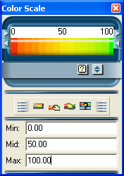
Figure 9-5: The Color Scale dialog box.
| Tip | If you do not see the buttons in the Color Scale dialog box that are shown in Figure 9-5, click the Color Scale dialog box’s Manual button. |
From left to right, the Color Scale dialog box’s buttons are:
-
Reset Values According To Data, which resets the colors based on the numbers you type in the Min, Mid, and Max boxes. (See the next bullet point.)
-
Automatic Mode. Switch To Manual Goal Settings, which displays the Min, Mid, and Max boxes. In these boxes, you can specify the data values on which to base the red, yellow, and green colors that are displayed in the bars and pie chart slices. To switch back to having Data Analyzer automatically decide on the meanings of the colors, click the Manual Mode. Switch To Automatic Goal Settings button.
-
Change The Meaning Of Green And Red, which determines whether low, middle, or high values are “good,” or green. Green might not always signify a high number. For instance, in measuring manufacturing defects, green should probably represent lower numbers.
-
Change Color Scheme determines whether colors are based on filtered members (Use Highest And Lowest Values Of Significant Selected Members Only) or whether colors are based on all members in all of the dimensions (Choose Absolute High And Low Values).
Finally, you need to know how to quickly change which dimensions are displayed, as well as what the colors represent. To do so, on the Edit menu, click Change View. The Define View dialog box appears. On the Dimensions tab, shown in Figure 9-6, you can add or remove specific dimension panes by selecting or clearing the check box for a dimension. Use the controls on the Measures tab, shown in Figure 9-7, to change the type of display and what the view’s bar lengths, pie-slice sizes, and colors represent. (I’ll discuss the Define View dialog box’s Template Measures tab later in this chapter.)
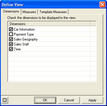
Figure 9-6: The Define View dialog box’s Dimensions tab.
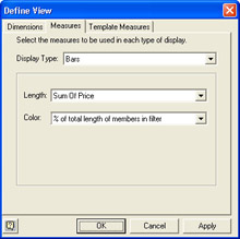
Figure 9-7: The Define View dialog box’s Measures tab.
Your Turn
In this exercise, you will practice changing a view to answer simple business questions. To begin this exercise, open the ![]() CarSales.max file, located in Chap09 folder, or open the
CarSales.max file, located in Chap09 folder, or open the ![]() CarSales.max file that you created earlier in this chapter.
CarSales.max file that you created earlier in this chapter.
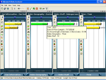
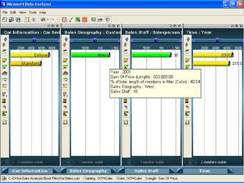
What was the total car sales figure for 2001 in Washington State? To answer this question, click the 2001 member bar in the Time dimension pane and then click the Drill Down button in the Sales Geography dimension pane. Rest your mouse pointer on the WA member bar. The total car sales figure is $3,132,000, as shown in Figure 9-8.
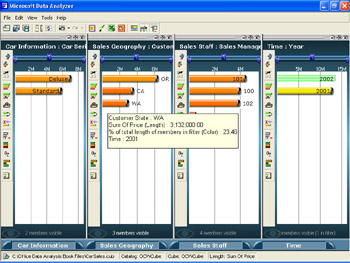
Figure 9-8: Car sales for 2001 in Washington State.
For each of the car series, which car type sold the most in 2002 for salesperson 8 in all states combined? To answer this question, first click the Default Members button in each of the dimension pane’s toolbars. In the Time dimension pane, click the 2002 member bar. In the Sales Staff dimension pane’s toolbar, click Drill Down, and then click the 8 member bar. In the Car Information dimension pane’s toolbar, click Drill Down and notice that the sport utility car type sold the most in both the deluxe and standard car series, as shown in Figure 9-9.
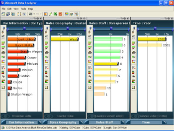
Figure 9-9: Top car types sold in 2002 for salesperson number 8.
Now change the meaning of green and red. First, click the Default Members button in each of the dimension pane’s toolbars. On the View menu, click Color Scale. Next click Automatic Mode. Switch To Manual Goal Settings. Type 0 in the Min box, type 50 in the Mid box, and type 100 in the Max box, and then close the Color Scale dialog box. Notice the color changes on your computer’s monitor, similar to Figure 9-10.
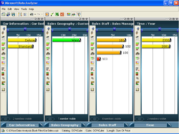
Figure 9-10: Color changes where 0 percent of the total lengths of the members in the filter are red and 100 percent is green.
Who were the top three salespeople for the West region for 2001? To answer this question, click the Default Members button on each dimension pane’s toolbar. Next, in the Time dimension pane, click 2001. In the Sales Staff dimension pane’s toolbar, click Drill Down, and then click Filter By Criteria. In the box next to the In Top list, type 3, and then click OK. Salespeople 6, 2, and 3 had the top sales in 2001, as shown in Figure 9-11.
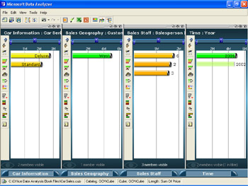
Figure 9-11: Top three salespeople for the West region in 2001.
Now see whether you can change the view to arrive at the correct answer to these additional business questions:
Which year was better in terms of overall car sales for salesperson number 10? Answer: 2002. (See Figures 9-12 and 9-13.)
9-12: Overall car sales for salesperson 10 in 2002.
9-13: Overall car sales for salesperson 10 in 2001.
In which state were the most overall car sales for 2001? Answer: Oregon. (See Figure 9-14.)
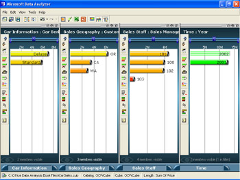
Figure 9-14: Overall car sales for 2001 by state.
Which salesperson sold the most deluxe sedans in California in 2002? Answer: Salesperson number 3. (See Figure 9-15.)
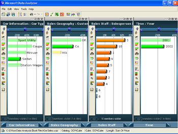
Figure 9-15: Deluxe sedan sales for California in 2002 by salesperson.
Which salesperson sold the most blue colored cars overall in Washington? Answer: Salesperson number 2. (See Figure 9-16.)
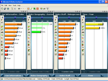
Figure 9-16: Overall blue car sales in Washington by salesperson.
EAN: 2147483647
Pages: 137
- OSPF PE-CE Routing Protocol Overview, Configuration and Verification
- Option 4: Non-VPN Transit Provider
- MPLS QoS Operating Modes
- MPLS Features and Case Studies
- Case Study 2: Implementing Multi-VRF CE, VRF Selection Using Source IP Address, VRF Selection Using Policy-Based Routing, NAT and HSRP Support in MPLS VPN, and Multicast VPN Support over Multi-VRF CE