Creating Advanced Interfaces with Forms
A Form is a screen that can include an arbitrary collection of user-interface controls, called items. In a movie ticket reservation MIDlet, you might use a form to allow the user to enter a date and a Zip code on one screen.
Keep in mind that the minimum screen size for a MID is 96 × 54 pixels. You can't fit a whole lot on a screen this size, nor should you try to. Forms that don't fit on the screen will automatically scroll as needed, so your MIDlet will be able to show forms, regardless of the screen size. Scrolling forms tend to be confusing to users, however, so you should keep your forms as small as possible.
The javax.microedition.ldcui.Form class itself is fairly simple. One way to create a Form is by specifying a title:
public Form(String title)
In essence, a Form is a collection of items. Each item is represented by an instance of the Item class. If you have all the items ahead of time, you can pass them to Form's other constructor:
public Form(String title, Item[] items)
As a subclass of Screen, Form inherits both a title and a ticker. Given the small screen size of a MID, however, you may want to avoid using a ticker with your forms.
Form's grandparent class, Displayable, gives Form the capabilities of displaying commands and firing command events. Again, you should probably keep commands simple with forms; in many cases a Next and a Back will probably be sufficient.
Managing Items
Items may be added and removed, even while the Form is showing. The order of items is important, as well; most MIDP implementations will display a form's items top to bottom, scrolling the form as needed if there are more items than available screen space.
To add an Item to the bottom of a form, use one of the append() methods. The first one can be used to add any Item implementation. The second two append() methods are strictly for convenience; behind the scenes, a StringItem or an ImageItem will be created for you.
public int append(Item item) public int append(String str) public int append(Image image)
Every item in a form has an index. You can place an item at a specific index (replacing the previous item at that index) using the method:
public void set(int index, Item item)
Alternately, if you'd like to add an item somewhere in the middle of the form, just supply the desired index for the new item to the insert() method. Subsequent items will move up by one index.
public void insert(int index, Item item)
To remove an item from a form, use delete().
public void delete(int index)
If you forget what you put in a form, you can find out the number of items and retrieve them with the following methods:
public int size() public Item get(int index)
The Item Pantry
The MIDP specification includes a handy toolbox of items that can be used to build forms. I'll cover each of them briefly in this section and show how some of them look in Sun's MIDP reference implementation.
The Item Class
All of the items that can be added to forms descend from the javax.microedition.lcdui.Item class. Item doesn't specify much, just a getLabel() and setLabel() method. All Items have a string label, although it may or may not be shown by the specific subclass.
StringItem
StringItem represents a simple text label. Although it has both a label and a value, the two are indistinguishable in Sun's J2MEWTK implementation. For example, consider the following code:
Form form = new Form("FormTitle"); StringItem stringItem = new StringItem("Label", "Value"); form.append(stringItem); The form produced by this code (plus a Back command) is shown in Figure 6-3.
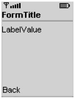
Figure 6-3: A form with a single StringItem and a Back command
You can use null for the StringItem's label or value to indicate that it should not be shown on the screen. StringItem inherits setLabel() and getLabel() methods from Item. It also includes getText() and setText() methods for accessing and adjusting the string value.
TextField
TextField represents an editable string. Figure 6-4 shows a TextField with a label of TextFieldTitle and a value of text.
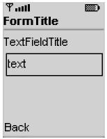
Figure 6-4: A form with a single TextField and a Back command
When the user selects the TextField, an editing screen is shown (although it's up to the implementation to decide exactly how to allow editing). The editing screen in Sun's J2MEWTK emulator is just a TextBox, as shown in Figure 6-5. Choosing the Save command returns the user to the form with the new text. Choosing Back returns the user to the form, canceling changes.
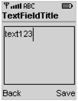
Figure 6-5: Editing a TextField
TextFields can limit input. The following constants are defined:
-
ANY allows any type of input.
-
NUMERIC restricts the input to numbers.
-
PHONENUMBER requires a telephone number.
-
EMAILADDR input must be an e-mail address.
-
URL input must be a URL.
-
PASSWORD entered characters are not shown, generally represented by asterisks.
These input types might look familiar; they're the same ones used by TextBox, which I covered in the previous chapter. As with TextBox, PASSWORD can be combined with other types using the OR operator.
To create a TextField, you need to supply the label, text value, maximum length, and input constraints.
public TextField(String label, String text, int maxSize, int constraints)
For an initially empty TextField, pass null for the text parameter.
ImageItem
Forms can also contain images, which are represented by instances of ImageItem. ImageItems have several pieces of associated data:
-
A label may be displayed with the image.
-
The layout determines the placement of the image.
-
Alternate text is displayed if the image cannot be shown.
To create an ImageItem, just supply the Image that is to be displayed, the label, layout, and alternate text.
ImageItem defines constants for the layout parameter. The simplest thing is to specify the default value, LAYOUT_DEFAULT. If you need more control, combine a horizontal value with a vertical value. The horizontal values are LAYOUT_LEFT, LAYOUT_CENTER, and LAYOUT_RIGHT. The vertical values are LAYOUT_NEWLINE_BEFORE and LAYOUT_NEWLINE_AFTER.
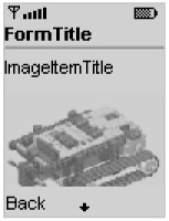
Figure 6-6: An ImageItem shown in 4-bit grayscale
DateField
DateField is an extremely handy mechanism by which users can enter dates, times, or both. It's up to the implementation to determine some reasonable way for users to enter dates and times; you, as the MIDlet programmer, can simply use DateField and not worry about the implementation.
To create a DateField, specify a label and a type. Three constants in the DateField class describe the different types:
-
DATE displays an editable date.
-
TIME displays an editable time.
-
DATE_TIME displays both a date and a time.
DateField provides two constructors. The first uses the default time zone, while the second allows you to specify a TimeZone explicitly:
public DateField(String label, int mode) public DateField(String label, int mode, TimeZone timeZone)
In essence, a DateField is an editor for a java.util.Date. As you saw in Chapter 4, Dates represent points in time. DateField takes the role of translating between a Date and strings that humans can read, much like the Calendar class. You can set or get the Date represented by the DateField using the following methods:
public Date getDate() public void setDate(Date date)
In the J2MEWTK emulator, a DateField appears as shown in Figure 6-7a. Note that if you do not initialize the Date before showing the DateField, it will appear unitialized, as shown in Figure 6-7b.
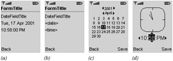
Figure 6-7: DateField in Sun's J2MEWTK emulator
When the user selects either the date or time portion of the DateField and selects it for editing, the MIDP implementation provides some kind of appropriate editor. Sun's reference implementation provides the editors shown in Figure 6-7c and Figure 6-7d.
Gauge
A Gauge represents an integer value. It's up to the implementation to decide how to display itself. In Sun's MIDP implementation, a Gauge appears as shown in Figure 6-8.
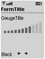
Figure 6-8: A Gauge
The value of the Gauge can be retrieved and modified with the getValue() and setValue() methods. This value runs from 0 to a variable maximum value. The maximum for the Gauge can be retrieved and modified with the getMaxValue() and setMaxValue() methods.
The visual appearance of the Gauge is an approximation of the Gauge's value. The Gauge shown in Figure 6-8 could, for example, have a value of 7 and a maximum of 10, or perhaps a value of 42 and a maximum of 61.
In an interactive Gauge, the user can modify the value. Again, it's up to the implementation to decide exactly how this works. In Sun's reference implementation, the left and right navigation buttons can be used to modify a Gauge's value.
Now that you understand everything about Gauges, you'll understand the constructor:
public Gauge(String label, boolean interactive, int maxValue, int initialValue)
For example, the following code creates an interactive Gauge with a maximum value of 24 and an initial value of 2:
Gauge g = new Gauge("Power", true, 24, 2);
ChoiceGroup
The final class in the Form arsenal of Items is ChoiceGroup. ChoiceGroup offers a list of choices. It is very similar to javax.microedition.lcdui.List, which was described at the beginning of this chapter. This similarity is more than coincidental; ChoiceGroup and List both implement the Choice interface, which is the wellspring of all of the instance methods in both classes.
If you read the section about List, you already know almost everything you need to know to use ChoiceGroup, because the instance methods work exactly the same way.
ChoiceGroup features the following constructors:
public ChoiceGroup(String label, int choiceType) public ChoiceGroup(String label, int choiceType, String[] stringElements, Image[] imageElements)
The choiceType should look familiar; it can be either EXCLUSIVE, MULTIPLE, or IMPLICIT, the constants defined in the Choice interface. In fact, ChoiceGroup's constructors work exactly like List's constructors. The ChoiceGroup appears like any other element in the Form; Figure 6-9 shows an example.
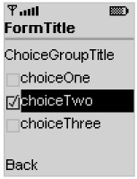
Figure 6-9: A MULTIPLE ChoiceGroup in a Form
Understanding Form Layout
Forms are mostly vertical beasts. In general, items added to a form will appear in a vertical stack. If the items don't all fit on the screen, the form allows the user to scroll as needed.
The exceptions to this rule are StringItems and ImageItems. These items may be laid out left-to-right if there is enough space on the screen. However, it's up to the implementation to decide exactly how a form is laid out. In the J2MEWTK 1.0.1 emulator, StringItems and ImageItems are always stacked vertically.
Responding to Item Changes
Most items in a Form fire events when the user changes them. Your application can listen for these events by registering an ItemStateListener with the Form using the following method:
public void setItemStateListener(ItemStateListener iListener)
ItemStateListener is an interface with a single method. This method is called every time an item in a Form is changed:
public void itemStateChanged(Item item)
The following example creates a Form with two items, an interactive Gauge and a StringItem. As you adjust the Gauge, its value is reflected in the StringItem using the ItemStateListener mechanism.
import javax.microedition.midlet.*; import javax.microedition.lcdui.*; public class GaugeTracker extends MIDlet implements ItemStateListener { private Gauge mGauge; private StringItem mStringItem; public GaugeTracker() { int initialValue = 5; mGauge = new Gauge("GaugeTitle", true, 10, initialValue); mStringItem = new StringItem(null, "[value]"); itemStateChanged(mGauge); } public void itemStateChanged(Item item) { if (item == mGauge) mStringItem.setText("Value = " + mGauge.getValue()); } public void startApp() { Form form = new Form("GaugeTracker"); // Now add the selected items. form.append(mGauge); form.append(mStringItem); form.setItemStateListener(this); Display.getDisplay(this).setCurrent(form); } public void pauseApp() {} public void destroyApp(boolean unconditional) {} } Team-Fly |
EAN: 2147483647
Pages: 129
- Chapter III Two Models of Online Patronage: Why Do Consumers Shop on the Internet?
- Chapter V Consumer Complaint Behavior in the Online Environment
- Chapter VIII Personalization Systems and Their Deployment as Web Site Interface Design Decisions
- Chapter XIII Shopping Agent Web Sites: A Comparative Shopping Environment
- Chapter XIV Product Catalog and Shopping Cart Effective Design