Creating a Title
| [ LiB ] |
Creating a Title
Although I have spent the last chapters praising all of Avid Xpress Pro's great features, it's time to explore one of the weak areas of this software: the Title tool. Yes, it certainly can add titles, make alpha channels, and now even add soft shadows, but it does not compare to all the advantages of using software like Boris FX, Adobe's Photoshop, or After Effects. If you plan on creating very complex graphics and titles, I suggest you add these applications to your arsenal. If basic lower-third titles and bullet lists are all you need to create, Avid Xpress Pro will do just fine. If you do plan on using other programs, it's extremely easy to import items into your Avid Xpress Pro software.
The Title Tool Components
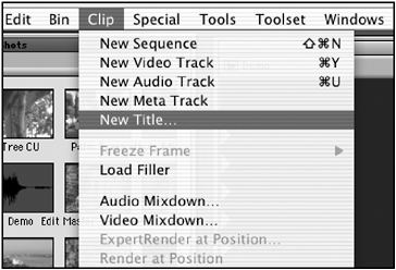
Before you launch the Title tool, place the Position Indicator in the Timeline on a frame that will be your reference when building your title. Avid Xpress Pro uses this frame as your background when you build the title. Once you decide which frame you like, choose New Title from the Clip menu (see Figure 10.1).
Figure 10.1. From the Clip menu, you can access the Title tool.
The Title tool opens and the frame you parked on becomes the background. Two new menu options also appearObject and Alignment. To further explore this tool, I have divided the Title tool into five sections (see Figure 10.2).
Figure 10.2. The complete Title tool, which is divided into five segments.
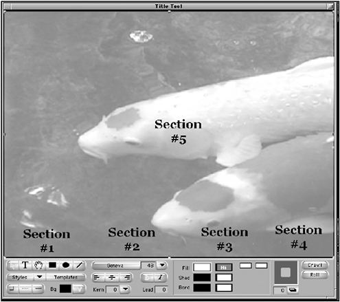
Section 1 handles all the tools and styles you can use. Section 2 deals with your fonts and their placements. Section 3 is where you can change the color and opacity of an item or of text. The fourth area is simply used for shadow adjustments and the last section, section 5, is where you'll create all your graphic elements.
Safe Title Area
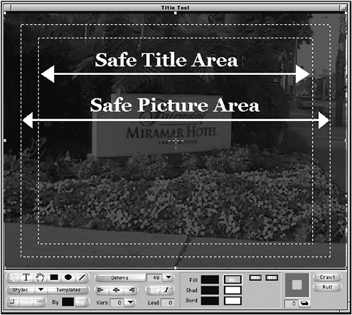
Before you begin creating any text items in the Title tool, you'll need to know exactly how far your text or object can come to the edge of the frame. When you watch television, you are not viewing the entire screen. When you're working in the Title tool, you do see the entire image. Avid Xpress Pro allows you to see an outline of where you can place type. This helps guarantee that type will be displayed correctly when you record your finished show back to tape. This is called the Safe Title area . If it's not already on when you opened the Title tool, choose Safe Title Area/Global Grid from the Object menu. Two small dotted lines are displayed inside the image of the Title tool. The outside line is considered the Safe Picture area; anything inside of this area will be displayed on a standard television. The inside line is the Safe Tile area ; any titles or graphics created inside of this area will be displayed on a standard television (see Figure 10.3).
Figure 10.3. Safe Title and Safe Picture areas.
Creating Text, a Square, and a Circle
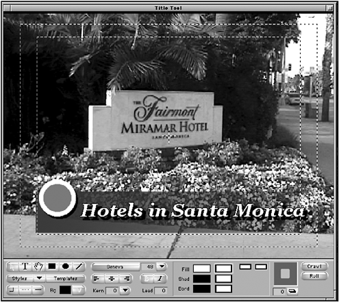
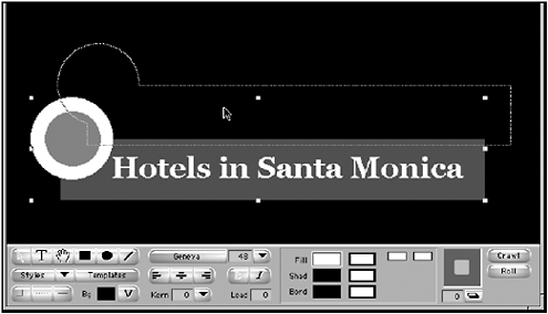
To begin creating text or an object in the Title tool, first choose which tool you'll need. For this example, you'll create some text, and then a box and circle to place the text on. The final graphic will look like Figure 10.4.
Figure 10.4. This is the finished lower third graphic built in the Title tool.
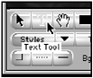
In section one of the Title tool, select the Text tool (see Figure 10.5).
Figure 10.5. The Text tool is used to create text.
Move the cursor into the video area of the Title tool and click where you want to start creating text. Do not be so concerned with the exact placement of the text, because you can make any adjustments after the text has been created. When you click in the window, a cursor will appear.
You can begin typing; again don't be worried about the font, its size, or color. These are adjustments that can be made after you create your text.
Once you've created the text, it's time to create the rectangle or box that will be displayed behind the text. In the tool section of the Title tool, choose the Square and Rectangle tool. Move your cursor into the picture area, and then click and drag to draw a rectangle that covers the screen from one side of the safe title area to the next . As of now, you're not concerned with the rectangle's color, placement, or shadow. So now you've created two items for your final graphic (see Figure 10.6).
Figure 10.6. With the Square and Rectangle tool, you can draw a rectangle from one side of the screen to the other.
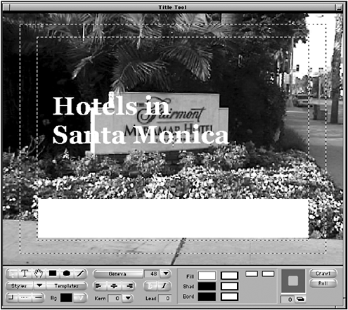
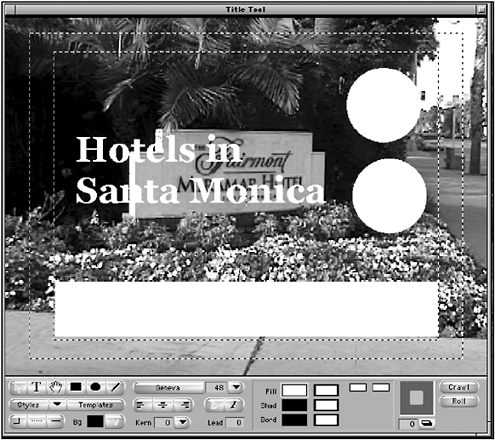
You'll merge these two items together shortly. Now let's make the circle portion of your finished graphic. Choose the Circle tool from the tool portion of the Title tool. Again, move your cursor into the video portion of the Title tool, and then click and drag the cursor to draw a circle. For the graphic you're building in this example, click on the circle and press Command+C (Macintosh) or Control+C (Windows) to copy the circle. Then press Command+V (Macintosh) or Control+V (Windows) to paste another circle. If you cannot see the second circle, it might be positioned directly above the first one. Choose the Pointer tool and click in the middle of the circle and drag the new circle off to the side. Your Title tool should now have four elements in itthe text, a rectangle, and two circles (see Figure 10.7).
Figure 10.7. The Title tool now has the four elements you created.
NOTE
 TIP
TIP
When you draw squares and circles, hold down the Shift key to constrain their size. This prevents you from drawing ovals and rectangles when you want to create circles and squares.
Font Selection and Adjustments
Avid Xpress Pro allows a variety of adjustments that can be made to text. They include changing the font, the point size of the font, making text italic and/or bold, as well as adjusting how close the letters are to each other and the spacing between lines. All these adjustments are found in one area of the Title tool (see Figure 10.8).
Figure 10.8. You can make all necessary font adjustments with these tools.

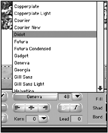
First, select the text you want to modify. You'll see a bounding box appear around the text. This bounding box allows you to resize and adjust how the text is displayed. With the text selected, click on the Font Selection button to see a list of all the fonts available. All the fonts loaded in your computer's font folder will be available (see Figure 10.9).
Figure 10.9. Every font stored on your computer is available to use with Avid Xpress Pro.
If you choose a different font that is larger than the first font you used, your text might start to wrap to a second line (see Figure 10.10). To adjust this, click and drag on one of the handles of the bounding box to resize the text's area.
Figure 10.10. When you change fonts, it's possible your text will display on multiple lines. In this example, the text went from two lines to three.

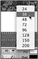
To change the size of your text, either click on the Font Point Size window and type in a value or click on the Font Size menu and choose one of the preset font sizes (see Figure 10.11).
Figure 10.11. You can change the size of the font with the Font Point Size window or using the Font Size menu.
The three buttons below the Font Selection area allow you to right-, center-, or left-justify your text. This justification is based solely on the size of the bounding box, not in relation to the screen. If you want to center an object or text in the screen, select the text and open the Alignment menu.
Choose Center in Frame Horiz or Center in Frame Vert. These commands will position any text or object in the center of the screen, ignoring the bounding box. If you need to move an object or text item from the middle of the screen to a new position, hold down the Shift key as you drag the item. This constrains the object from moving out of the center.
The two buttons next to the justification buttons are for changing your text from normal to bold, italic, or both.
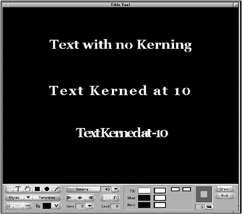
The next two adjustments are kerning and leading. Kerning determines how close the letters are to each other. Look at the following examples of different kerning values (see Figure 10.12).
Figure 10.12. Use kerning to add more space between letters.
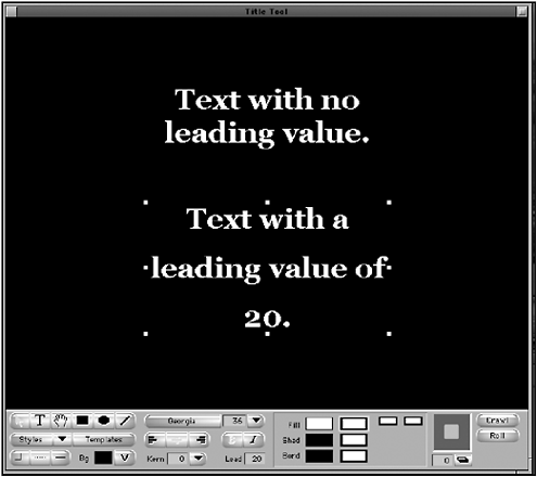
The Lead value determines the space between sentences when your text becomes two or more lines (see Figure 10.13).
Figure 10.13. Leading adjusts the space between sentences.
Alignment of Objects
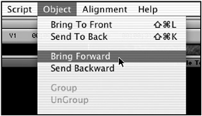
Once you've determined how you want the text to look, it's time to position all the objects. To move objects, select the Pointer tool and click on them and drag them to the desired position. As you position your objects, you'll notice that certain items are on top of each other. To move objects from underneath other objects, click the top object or the bottom object and choose either Bring to Front or Send to Back from the Object menu. If you need to make more adjustments, choose Bring Forward or Send Backward from the Object menu. This will change the order of how the objects relate to each other (see Figure 10.14).
Figure 10.14. You can move objects forward and backward.
Once you have placed objects, you can lock them in position and/or group several items together. For example, let's say you've positioned all the elements exactly where you want them. You can then press Command+A (Macintosh OS) or Control+A (Windows) to select all the items. Then choose Lock from the Object menu. The locked items cannot be moved or edited.
If you have created several items you want to move or position together, select all the items and choose Group from the Object menu. This will group all the items into one bounding box, which can then be positioned wherever you want (see Figure 10.15).
Figure 10.15. Several items are in this title but because they are grouped, you can move them as one item.
NOTE
TIP
If you want to make slight adjustments to a title or object, select the item and use the arrow keys on your keyboard to make small adjustments. You can also use a grid to position items. Click on the Alignment menu and choose Show Alignment Grid. A small grid will be displayed over the video. If you choose Align to Grid, selected items will "snap" to grid lines as you position them. This can be very helpful when you're building a list or a bullet page.
Adding a Border and a Shadow
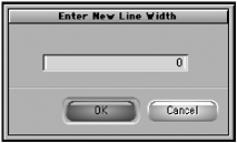
To make a graphic pop out on the screen, it helps to add an outline and add a shadow to display some depth to your graphics. Adding these elements inside the Title tool is easy and certainly adds to your text and graphics. With the text highlighted, choose the Border Width tool from the Title tool and select one of the preset borders. If you want to create a custom size, select the three dashes and type in your own value (see Figure 10.16).
Figure 10.16. You can type in your own value to determine how much border you want on your text.
Notice how the text stands out with a border. Generally, you want to have a very thin border. To remove a border, select the Border Width tool, and choose the first option. It will remove the border.
NOTE
TIP
If you to need to point something out in a frame, draw a line to the object and click on the icon next to the Border Width tool. Select an arrow as the end of the line you drew.
To add a shadow, select the text and click and drag inside the Shadow Depth and Direction box. As you drag your cursor, you'll notice you can adjust the direction of the shadow and determine how far it falls from the text. For the depth, you can also type in a value, but how boring is that when you can simply click and drag? The Shadow Depth Selection box is helpful when trying to match two objects with the same shadow.
There are two kinds of shadows you can choose from in the Shadow Direction and Depth box. Your shadows can either be depth shadows or drop shadows. Click on the Drop and Depth Shadow button underneath the Shadow Depth and Direction box (see Figure 10.17). Notice the difference in Figure 10.18.
Figure 10.17. The Shadow Depth and Direction box.
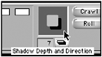
Figure 10.18. Notice the difference between a depth shadow and a drop shadow.

Soft Shadows
Your shadows on both text and objects can be softened to give a different appearance. Select the item you've added a shadow to and choose Soft Shadow from the Object menu. Type in a value between 4 and 40 and click Apply.
NOTE
TIP
If you apply a soft shadow that has color and add a lot of softness, you can create a simple glow effect around your text or objects.
Adding Color to Text and Objects
Once you've created the text and/or any graphical objects in the Title tool, you can add solid or gradient colors to the text or object. Avid Xpress Pro gives you several options for applying preset and custom colors. In the third section of the Title tool, you can select the color that will fill the text or graphic object, determine the color of the shadow, and set the color of the border (see Figure 10.19).
Figure 10.19. You can change the color of the shadow, the border, and the fill.
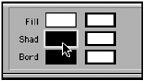
To change the color of a graphic, the shadow color, or the border color, follow these steps:
-
Select the object or the text you want to change.
-
Click on the Fill Color Selection box. Instead of holding down the mouse button to keep this window open, simply click and drag the cursor through the window. It becomes a tear-off menu, which you can place anywhere on the screen.
-
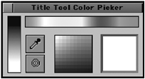
You'll notice you have several color options (see Figure 10.20).
Figure 10.20. There are a variety of options when you want to select a color.
-
The easiest method is to move your cursor to the colored strip at the top of the box.
-
A second method is to select the color wheel icon. This will open the color wheels and color selection window that is part of the operating system of your computer.
-
Another method involves using the Eyedropper tool. Select the Eyedropper icon and move it over the video background. The Eyedropper will change to the colored pixel the tip is over. After you click the Eyedropper tool, this will be your new fill color.
This same method applies for adding a color to a shadow or a border. Just make sure the object is selected first. Of course, the object or text must have a shadow or border for you to apply a color.
NOTE
![]() CAUTION
CAUTION
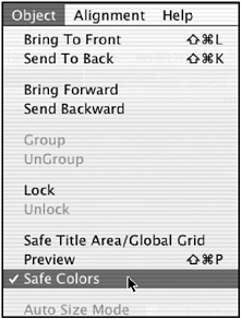
Try to stay away from very bright or very saturated colors such as red and blue. These colors tend to " bleed " when viewed on a standard television. To ensure you're using safe colors, make sure you have Safe Colors selected from the Object menu (see Figure 10.21). Yet even with this selection on, still try to avoid rich colors like bright reds and blues.
When working in the Title tool, always keep the Safe Colors option on.
Applying a Gradient
After the color has been applied to your text or object, you'll see the color displayed in the Color Selection box and two new boxes will appear to the right. These two boxes allow you to set a gradient. As a default they will display the same color as the fill box (see Figure 10.22).
Figure 10.22. These two colored boxes allow you to add a gradient to your text or to an object.
When you click on one of the boxes, you'll see the same color options you did when you applied the fill color. After you select a different color in either of the boxes, a larger square will appear below your gradient boxes. This box allows you to change the direction of the gradient. Click on the box and move your cursor around. You'll notice that the direction of the gradient changes. For this example, I made the bottom circle light blue with a gradient to white. Click on the second circle, choose a color, and make it smaller by clicking on its bounding box and shrinking it. Place one circle on top of the other. The circle portion of the graphic is complete (see Figure 10.23).
Figure 10.23. The circle for the background now has a gradient.

Changing the Opacity Values
As when selecting a color, you can use Avid Xpress Pro to change the transparency or opacity of text and/or a graphical object. You can also apply a gradient.
-
Select the item you want to add some transparency to. This example uses the long rectangle box created previously.
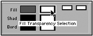
-
Click on the box next to the Fill Color Selection box; it's called the Fill Transparency Selection (see Figure 10.24). Unlike the Color Selection box, it's not a tear-off menu.
Figure 10.24. These boxes adjust the transparency levels of text or objects.
-
Click on the Fill Transparency Selection box and then click on the small button inside this box and drag it to the right and left. Notice that the transparency values change.
-
To add a gradient, select the first gradient box next to the main transparency box and make an adjustment. For the graphic you're building here, start with a total opaque level and then adjust the second box to be totally transparent. The effect looks like a paintbrush that started full of paint and faded as it painted across the screen (see Figure 10.25).
Figure 10.25. The finished effect has a transparent rectangle underneath the text.

Preview Mode
As you work in the Title tool, you'll notice that the text is has jagged edges. This is called aliasing . To preview the type with anti-aliasing, turn on the Preview mode. Choose Preview from the Object menu. The title will now be displayed as it will in the sequence. The reason this option is not on as a default is due to the amount of time it can take to redraw items in the Title tool.
Saving a Style
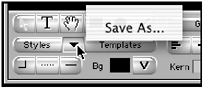
When working with text, many times you'll need to create separate pages, which share the same values of previously built pages or graphics. Avid Xpress Pro makes this option easy by allowing you to save a style of type, in fact, save several styles of type. Once you create a font style you like, for example, and have adjusted its border size, color, its shadow and depth, you can save it as a template you'll use later for graphics or for an entirely new project. Click on the text you created in the Text tool and click the down arrow next to the Styles button in the lower-left corner of the Title tool (see Figure 10.26).
Figure 10.26. Click on this button to save a style.
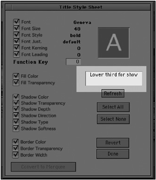
A dialog box will open displaying all the attributes you applied to that particular font. The default name is whatever font you used. Click on the name area to rename this style (see Figure 10.27).
Figure 10.27. This dialog box allows you to select which attributes you want to apply to this style and rename the style.
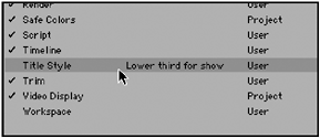
Once you have saved the style, it will be available to you in two areas. If you click on the Styles button, you'll see examples of the font style you created. If you click on the arrow again, you'll see a list of styles available to you. These styles are also displayed in the Settings tab on the Project window. Click the Project window and click on the Settings tab. Scroll down and you'll see the style has been saved as a setting. You'll also notice that this is a User setting, which means you can apply this style to any type regardless of which project you're editing (see Figure 10.28).
Figure 10.28. When a style is created, it is saved as a user setting.
| [ LiB ] |