Section 9.5. DataList Control
The toolbox provides a DataList control for creating templated lists of data. A templated list is one in which you control the HTML used to render the list by defining templates: HTML that describes how to display one item in the list.
|

There are seven different templates available for defining the appearance of a DataList control, listed in Table 9-3. Of those templates, all but the ItemTemplate are optional.
Table 9-3. DataList templates
| Template name | Description |
|---|---|
| AlternatingItemTemplate | Provides content and layout for every other item. If not defined, then the ItemTemplate will be used for every item in the DataList . |
| EditItemTemplate | Provides content and layout for the item currently being edited. If not defined, then the ItemTemplate will be used for the currently edited item. |
| FooterTemplate | Provides content and layout for the footer. If not defined, then the DataList will not have a footer. |
| HeaderTemplate | Provides content and layout for the header. If not defined, then the DataList will not have a header. |
| ItemTemplate | Required. Default definition for every item's content and layout. |
| SelectedItemTemplate | Provides content and layout for the currently selected item. If not defined, then the ItemTemplate will be used. |
| SeparatorTemplate | Provides content and layout for the separator between items. If not defined, then item separators will not be used. |
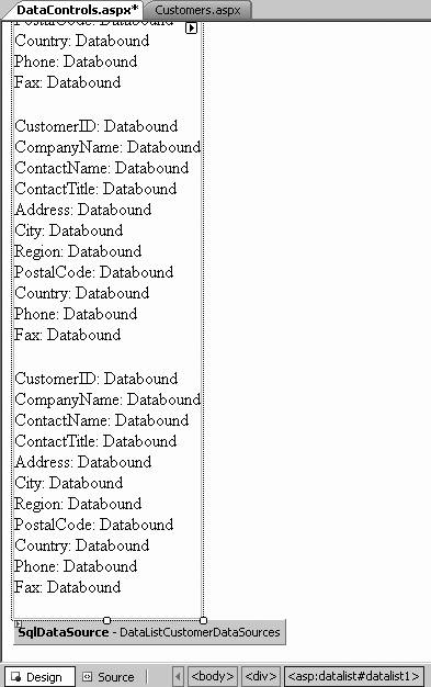
To get started with the DataList control, create a new application ( WebNorthWind-DataControls ) or add a page to your existing application named DataControls . Drag a DataList control onto the form. In Design view, the smart tag opens, offering you an opportunity to choose a Data Source. Choose New Data Source for this exercise, and choose SQL Database, naming the new data source DataListCustomerDataSources . Use your existing connection to NorthWind, and specify that you want all the fields in the Customers table. When you finish, the DataList will be populated with labels that represent the field names and labels that are bound to the data control, as shown in Figure 9-21.
Figure 9-21. DataList bound to data control
If you click on Source, you will see that the DataList has been defined with a number of attributes to identify its data source:
<asp:DataList runat ="server" ID="DataList1" DataKeyField="CustomerID" DataSourceID="DataListCustomerDataSources"> Between the opening and closing tags of the DataList is an <ItemTemplate> tag that defines how each item will be displayed. In the default <ItemTemplate> tag, each column is represented by literal text, and the bound value is represented by a Label control whose Text property is created using the Eval method passing in the name of a column in the underlying data, as in the following:
<asp:Label ID="CustomerIDLabel" runat="server" Text= '<%# Eval("CustomerID") %> ' > </asp:Label>
|
There are a number of ways to improve the look and feel of this control. First, you can return to Design view, and click the Auto Format... link to choose a scheme (such as Classic). Doing so adds a number of styles to the DataList :
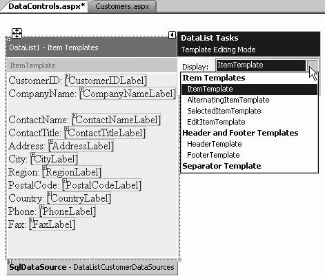
<asp:DataList runat="server" ID="DataList1" DataKeyField="CustomerID" DataSourceID="DataListCustomerDataSources" CellPadding ="4" ForeColor="#333333"> <ItemTemplate> ... <! ItemTemplates here --> ... </ItemTemplate> <FooterStyle BackColor="#507CD1" Font-Bold="True" ForeColor="White" /> <SelectedItemStyle BackColor="#D1DDF1" Font-Bold="True" ForeColor="#333333" /> <AlternatingItemStyle BackColor="White" /> <ItemStyle BackColor="#EFF3FB" /> <HeaderStyle BackColor="#507CD1" Font-Bold="True" ForeColor="White" /> </asp:DataList> In addition, you may return to the smart tag, and this time choose Edit Templates. This changes the smart tag to Template Editing Mode (which continues until you click the link End Template Editing) and offers you a drop-down to choose which template you want to edit, as shown in Figure 9-22.
Figure 9-22. Editing the templates
You are now free to manipulate the template by expanding or moving the various elements within the templates, adding new controls, and so forth.
As an alternative, you may add or edit templates directly in the content file. The technique you choose is a matter of personal preference. Each template supports its own style object, which can be set at design time and modified at runtime.
By default, each item is displayed below the next , in a vertical column. You may modify this by setting the Repeat Direction property of the DataList from Vertical to Horizontal and by setting the number of columns by setting the RepeatColumns property, as shown in Figure 9-23.
Figure 9-23. Data list column layout

Some of the commonly used properties not inherited from the Control or WebControl classes to control the appearance and behavior of the DataList control are listed in Table 9-4.
Table 9-4. DataList properties not inherited from WebControl
| Property | Type | Get | Set | Values | Description |
|---|---|---|---|---|---|
| Caption | String | | | Text rendered to an HTML caption element. | |
| CaptionAlign | TableCaptionAlign | | | Bottom , Left , NotSet , Right , Top | Specifies placement of the caption element. |
| CellPadding | Integer | | | Number of pixels between a cell 's contents and its border. | |
| CellSpacing | Integer | | | Number of pixels between the cells of the grid. | |
| DataKeyField | String | | | Specifies the key field in the data source. | |
| DataKeys | DataKeyCollection | | A collection of the key values of each record. | ||
| DataMember | String | | | Specifies the data member in a multimember data source. | |
| DataSource | Object | | | Specifies the data source for the control. | |
| EditItemIndex | Integer | | | The zero-based index of the item currently selected for editing. If no items are selected for editing, or to unselect an item, set the value to -1 . | |
| EditItemStyle | TableItemStyle | | Derived from the WebControls.Style class, the style properties for the item currently selected for editing. | ||
| FooterStyle | TableItemStyle | | Derived from the WebControls.Style class, the style properties for the footer section. | ||
| GridLines | GridLines | | | Both , Horizontal , None , Vertical | Specifies which gridlines to display. The default is None . |
| HeaderStyle | TableItemStyle | | Derived from the WebControls.Style class, the style properties for the header section. | ||
| Items | DataListItem-Collection | | A collection of all the items in the control. | ||
| ItemStyle | TableItemStyle | | Derived from the WebControls.Style class, the default style properties for each item in the control. | ||
| RepeatColumns | Integer | | | Specifies the number of columns to display. | |
| RepeatDirection | RepeatDirection | | | Horizontal , Vertical | If Horizontal , items will be displayed left to right, then top to bottom. If Vertical , items will be displayed top to bottom, then left to right. Default is Vertical . |
| RepeatLayout | RepeatLayout | | | Flow , Table | If Flow , items will be displayed without a table structure, otherwise with a table structure. Default is Table . |
| SelectedIndex | Integer | | | The zero-based index of the currently selected item. If no items are selected, or to unselect an item, set the value to -1 . | |
| SelectedItem | DataListItem | | Returns the item currently selected. | ||
| SelectedItemStyle | TableItemStyle | | Derived from the WebControls.Style class, the default style properties for the selected item in the control. | ||
| SelectedValue | Object | | Returns the currently selected item. | ||
| SeparatorStyle | TableItemStyle | | Derived from the WebControls.Style class, the default style properties for the separators between items. | ||
| ShowFooter | Boolean | | | true , false | Specifies if a footer is to be displayed. Default is TRue . Only relevant if FooterTemplate property is not null . |
| ShowHeader | Boolean | | | TRue , false | Specifies if a header is to be displayed. Default is TRue . Only relevant if HeaderTemplate property is not null . |

In addition, the DataList has a number of events to which you will want to respond. Some of the most important are listed in Table 9-5.
Table 9-5. DataList events
| Event | Event argument | Event argument properties | Description |
|---|---|---|---|
| DataBinding | EventArgs | None | Raised when the control binds to a data source (inherited from Control ). |
| DeleteCommand | DataListcommandEventArgs | CommandArgument , CommandName | Raised when the Delete button is clicked. |
| EditCommand | DataListcommandEventArgs | CommandArgument , CommandName | Raised when the Edit button is clicked. |
| Init | EventArgs | None | Raised when the control is initialized (inherited from Control ). |
| ItemCommand | DetailsViewCommandEventArgs FormViewCommandEventArgs | CommandArgument , CommandName , CommandSource | Raised when a button in the control is clicked. |
| ItemCreated | EventArgs | none | Raised after all the rows in the control are created. |
| ItemDataBound | DataListItemEventArgs | Item | Raised on binding to data. |
| PreRender | EventArgs | none | Raised just before the control is rendered to the Page (inherited from Control ). |
| UpdateCommand | DataListcommandEventArgs | CommandArgument , CommandName | Raised when the Update button is clicked. |
9.5.1. Editing Items in List Controls
The ListControl provides support for editing items in place. To accomplish this, you must add an EditItemTemplate to your DataList . You can do this by copying the ItemTemplate and pasting it as EditItemTemplate in the content file ( unfortunately , you cannot use Drag and Drop to add an EditItemTemplate ), and then using Search and Replace (within the selected EditItemTemplate ) to replace Label with Textbox (replace the control and the ID):
<EditItemTemplate> CustomerID: <asp: TextBox runat="server" Text='<%# Eval("CustomerID") %>' ID="CustomerIDTextBox" /> Second, you must provide a way to enter Edit mode from your existing ItemTemplate . The easiest way is to add a button to the ItemTemplate . Set the button's CommandName attribute to "edit" to cause the list to fire the EditCommand event, for which you can then create a handler:
<ItemTemplate> <!-- the rest of the ItemTemplate in here --> <asp:Button runat="server" ID="ItemEditButton" Text="Edit" CommandName="edit" /> </ItemTemplate>
|
The EditCommand event handler receives a DataListCommandEventArgs object as its second parameter. The DataListCommandEventArgs contains an Item property, representing the list item the user wants to edit. The DataListItem returned by the Item property has an ItemIndex property, which you'll assign to the EditItemIndex property of the DataList . You'll then rebind the DataList :
protected void DataList1_EditCommand( object source, DataListCommandEventArgs e ) { DataList1.EditItemIndex = e.Item.ItemIndex; DataBind( ); } As you can see, it sounds harder than it is.
You'll want to add buttons to your EditItemTemplate to handle the Update (save changes) and Cancel commands, which will raise the UpdateCommand and CancelCommand events respectively:
<EditItemTemplate> <!-- the rest of the EditItemTemplate in here --> <asp:Button runat="server" ID="ItemSaveButton" Text="Save" CommandName="update" /> <asp:Button runat="server" ID="ItemCancelButton" Text="Cancel" CommandName="cancel" /> </EditItemTemplate>
|
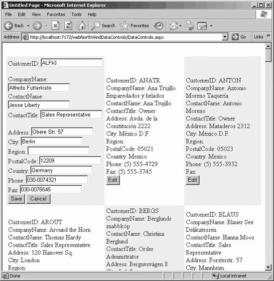
Run the application and click the Edit button. You'll see the selected item switch to your EditItemTemplate view, as shown in Figure 9-24.
Figure 9-24. DataList control in Edit mode
You can use other kinds of controls besides textboxes. For example, for some data items, a set of radio buttons or a checkbox might be a more appropriate choice. If you wish to control the data entry, you might use a drop-down list that is bound to data (perhaps from another table in the database).
9.5.2. Deleting Items from a List Control
To allow your user to delete a record, add a Delete button to the ItemTemplate :
< <asp:Button runat="server" ID="ItemDeleteButton" Text="Delete" CommandName="delete" />
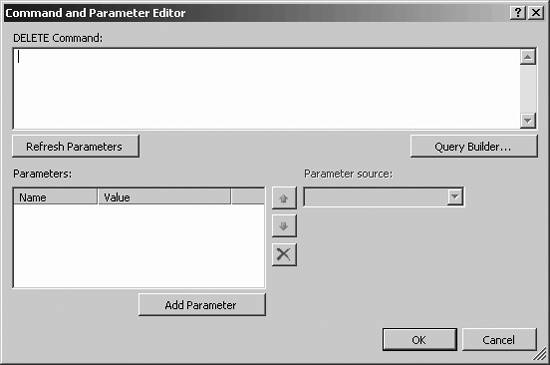
You'll need to add another data source control to the page to handle the Delete command (name it DataListCustomerDeleteDataSource ). Set the Delete command by clicking on the DeleteQuery property in the Properties window of the new data source, which brings up the Command and Parameter Editor , as shown in Figure 9-25.
Figure 9-25. Command and Parameter Editor
Enter the delete command:
delete from Customers where CustomerID = @CustomerID
Click on the Add Parameter button and add the parameter CustomerID . (You do not enter an @ character as part of the parameter.)
You need to create a Select command for your control to ensure it is properly connected when you call Delete. Thus, the complete source code for your new SqlDataSource object should look like this:
<asp:SqlDataSource ID="DataListCustomerDeleteDataSource" runat="server" ConnectionString="<%$ ConnectionStrings:NorthwindConnectionString %>" SelectCommand="Select * from Customers" DeleteCommand="Delete from Customers where CustomerID = @CustomerID"> <DeleteParameters> <asp:Parameter Name="CustomerID" /> </DeleteParameters> </asp:SqlDataSource>
|
Create an event handler for the DeleteCommand event, as you created a handler for the Edit event. Here are the steps:
-
Get the record ID from the selected record (the one whose Delete button was pushed ).
-
Get the parameter from the Parameters collection of the new data source object.
-
Set the parameter's DefaultValue to the record ID of the record to be deleted.
-
Call Delete on the data source.
-
Rebind the DataList .
These five steps are shown in Example 9-6.
Example 9-6. Deleting a record from a DataList
protected void DataList1_DeleteCommand( object source, DataListCommandEventArgs e ) { // (1) Get the recordID from the selected item string recordID = ( DataList1.DataKeys[e.Item.ItemIndex] ).ToString( ); // (2) Get a reference to the customerID parameter System.Web.UI.WebControls.Parameter param = DataListCustomerDeleteDataSource.DeleteParameters["CustomerID"]; // (3) Set the parameter's default value to the value for // the record to delete param.DefaultValue = recordID; // (4) Delete the record DataListCustomerDeleteDataSource.Delete( ); // (5) Rebind the list DataBind( ); } The first line is a bit tricky. Let's break this out into a number of substeps to make it easier to understand.
You are given a DataListCommandEventArgs object ( e ) as a parameter. That DataList-CommandEventArgs instance has an Item property of type DataListItem , which you can assign to a variable theItem .
// get the Item property from the parameter DataListItem theItem = e.Item;
You can ask that DataListItem for its ItemIndex (the index into the list for the selected item):
// get the itemIndex from the Item int itemIndex = theItem.ItemIndex;
Next, you can ask the DataList for its collection of DataKeys . Set the DataKeyField attribute of the list:
<asp:DataList DataKeyField="CustomerID"
This collection contains all the CustomerIDs , one for each row:
// Get the DataKeys collection from the Data List DataKeyCollection keyCollection = DataList1.DataKeys;
With a reference to that collection and the index, you can extract the contents of the key collection at that index. What you get back is of type Object .
// Get the object stored at the ItemIndex inside the collection object theRecordAsObject = keyCollection[itemIndex];
You know what you have is a string, so you can cast that returned object to string:
// Cast the result from object to string string recordID = theRecordAsObject.ToString( );
All of this work is done in the first line of the method:
string recordID = ( DataList1.DataKeys[e.Item.ItemIndex] ).ToString( );
The second line asks the DataListCustomerDeleteDataSource to index into its DeleteParameters property, which returns a collection of parameters, for the parameter whose name is " CustomerID ," and return a reference to that parameter:
System.Web.UI.WebControls.Parameter param = DataListCustomerDeleteDataSource.DeleteParameters["CustomerID"];
You can search using an ordinal, so you could rewrite this line this way:
System.Web.UI.WebControls.Parameter param = DataListCustomerDeleteDataSource.DeleteParameters[0];
Using the name of the parameter is clearer.
The third line sets the DefaultValue property of this parameter to the recordID you extracted earlier. The fourth line calls the Delete method on the data source, and the final line rebinds the control, now missing the record you've deleted.
If you try this, it will almost certainly fail. The problem is that almost all the customer records have orders associated with them, and the NorthWind database is set up to prevent deleting any customer who has associated orders, to avoid data corruption.
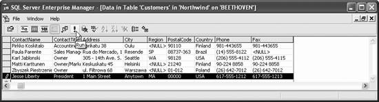
You can work around this by creating a new customer using SQL Server Enterprise Manager, as shown in Figure 9-26.
Figure 9-26. Creating a dummy record
Once this record is added, place a break point on the first line of your new event handler ( DataList1_DeleteCommand ) and run the application. Scroll down to the new record you've added and click the Delete button.
Once the button is clicked, your application will stop at the break point you've set. As you step through, you can see that the record ID retrieved matches the record that you've asked to delete, and once the method completes, you can scroll down and see that the record has been deleted (which you can verify directly in the database).
EAN: 2147483647
Pages: 173