The Unified Control and Adapter Architecture
| Effectively, the new page framework in version 2.0 works like the special MobilePage class that is used in the MMIT for version 1.x. It does so using a page adapter that exposes a full range of information about the capabilities of the current client. This information includes things like the device type and version, the kind of markup language it expects to receive, and more detailed data such as the screen size, support for scripts, cookies and frames , and much more. Then, each control that will produce output tailored for the device uses a control adapter that generates the appropriate markup output to suit the current device. This process is often referred to as adaptive rendering . Externally, to the developer, very little changes other than the addition of a few extra properties on the controls and a change of the control name prefix for the mobile controls from mobile to asp . This unified architecture therefore provides several advantages.
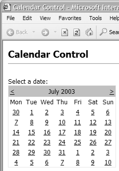
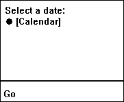
As an example of how adaptive rendering works, take a look at the ASP.NET code in Listing 10.1, which displays some text and uses a Calendar control to provide a date selection feature. Listing 10.1 Using an ASP.NET 2.0 Calendar Control <%@ Page Language="VB" %> <html> <head> <style> .Normal {font-family:Arial; font-size:xsmall} </style> </head> <body> <form runat="server"> <p class="Normal"> Select a date:<br /> <asp:Calendar id="MyCal" cssClass="MyStyle" runat="server" /> </p> </form> </body> </html> You can see that it uses only "ordinary" HTML, including the <html> and <body> elements, a style definition, and two ASP.NET server controls. There is the Calendar control itself plus a <form> control that the Calendar requires to perform postbacks when a date is selected or the month is changed. Both of these server controls are standard ASP.NET 2.0 controls. When viewed in an ordinary HTML browser, the page generates standard HTML (see Listing 10.2). We've removed some of the sections that are not pertinent to our discussion for clarity. Listing 10.2 The Output from the Calendar Control in Internet Explorer <html> <head> <style> .Normal {font-family:Arial; font-size:xsmall} </style> </head> <body> <form name="_ctl0" method="post" action="test2.aspx" id="_ctl0"> ... <p class="Normal"> Select a date:<br /> <table id="MyCal" class="MyStyle" cellspacing="0" cellpadding="2" border="0" style="border-width:1px;border-style:solid;border- collapse:collapse;"> <tr><td colspan="7" style="background-color:Silver;"> <table class="MyStyle" cellspacing="0" border="0" style="width:100%;border-collapse:collapse;"> <tr><td style="width:15%;"> <a href="javascript:__doPostBack('MyCal','V1155')" style="color:Black"><</a></td><td align="Center" style="width:70%;">April 2003</td><td align="Right" style="width:15%;"> <a href="javascript:__doPostBack('MyCal','V1216')" style="color:Black">></a></td> ... </table> </p> </form> </body> </html> Figure 10.1 shows that this gives the kind of output you would expect in Internet Explorer. Figure 10.1. The Calendar control viewed in Internet Explorer However, if you open the same page in a mobile device, WML output is generated. You'll see output like that shown in Figure 10.2 (depending on which emulator you are using). Selecting the [Calendar] link causes the control to provide a multistep menu for selecting the date you need. Figure 10.2. The Calendar control viewed in a mobile device The point to note is that while the original page was written as though we expected the client to accept HTML (e.g., we enclosed the page content in an <html> element and used the standard ASP.NET Form and Calendar server controls rather than those from the MMIT), the output has been converted automatically into the correct WML syntax for our mobile phone client. Listing 10.3 shows the actual WML sent to an emulator client. Listing 10.3 The Output from the Calendar Control in a Mobile Device Emulator<?xml version='1.0'?> <!DOCTYPE wml PUBLIC '-//WAPFORUM//DTD WML 1.1//EN' 'http://www.wapforum.org/DTD /wml_1.1.xml'> <wml> <head> <meta http-equiv="Cache-Control" content="max-age=0" forua="true"/> </head> <card> <onevent type="onenterforward"> <refresh> <setvar name="mcsvt" value="" /> <setvar name="mcsva" value="" /> </refresh> </onevent> <onevent type="onenterbackward"> <refresh> <setvar name="mcsvt" value="" /> <setvar name="mcsva" value="" /> </refresh> </onevent> <p> Select a date:<br/> <anchor title="Go"> Calendar <go href="/test/test2.aspx?__ufps=309633" method="post"> <postfield name="__EVENTTARGET" value="MyCal" /> <postfield name="__EVENTARGUMENT" value="1" /> </go> </anchor> </p> </card> </wml> It's clear that the controls, including the Page itself, have recognized the device andthrough adaptive renderinghave generated the correct output to create the equivalent functionality in the mobile device. There is the correct DOCTYPE to identify the document type, and the <html> and <body> elements have been replaced by the appropriate <wml> and <card> elements. And the great thing is that it all happened automatically. There are no references to the MMIT in the source code for the page, no controls from the MMIT mobile namespace, and no code to tailor the output to suit this type of client. This hugely powerful built-in feature of the page and control framework in ASP.NET 2.0 makes it a lot easier to create pages that work in different types of devices without having to explicitly design for this. For example, if you were using the MMIT in ASP.NET version 1.x, you would have to specifically avoid using any HTML-specific elements that cause a syntax error in a WML device and use the specific MMIT controls instead of the ASP.NET core controls. Browser DefinitionsOne of the issues discovered with the MMIT was that it added extremely large sections of browser definitions to the machine.config file. This could make working with machine.config cumbersome and also made simple updates to the definitions more complex than it really should be. In version 2.0, all browser definitions (including definitions for specific WAP gateways) have been moved to separate files that have the .browser file extension. They are stored in the $windir\Microsoft.NET\Framework\[version]\Config\Browsers\ folder of the machine. These browser definition files follow the general format shown in Listing 10.4. Listing 10.4 The General Format of a Browser Definition File<browsers> <browser id=" device-name " parentID=" family-type-to-inherit-from "> <identification> <!-- Specifies how to identify this browser --> </identification> <capture> <!-- Specifies additional header values to capture --> </capture> <capabilities> <!-- Specifies capabilities values to set --> </capabilities> <controlAdapters> <!-- Specifies control adapters to use for this browser --> </controlAdapters> <sampleHeaders> <!-- Specifies sample headers for this browser --> </sampleHeaders> </browser> </browsers> All these files are compiled into a single compact representation when the Framework is installed. If a definition is updated, recompilation must be manually initiated by running the aspnet_regbrowsers.exe utility. This utility is installed along with the Framework. To use it, you just specify the location of the folder containing the browser definition files: aspnet_regbrowsers.exe browsers-folder An interesting possibility arising from this is that automated updates to browser definitions will be much easier to implement and might even become part of the Framework process in time.
The BrowserCapabilities ClassAlthough the plumbing and implementation of the device detection system is different from version 1.0, its use is familiar in version 2.0. The current Request ( HttpRequest ) class exposes an instance of the Http BrowserCapabilities class through its Browser property. This means that you can still write code that interrogates the browser capabilities properties, just as in version 1.0: Dim sPlatform As String = Request.Browser("Platform") Page Design and Device SupportUnder the unified control and adapter architecture, all the ASP.NET standard server controls will change their behavior and the markup they generate depending on the type of device accessing the page. So does this mean that you can now build pages and even complete Web sites or applications that will work on any device? The answer is "yes," butto a greater extentyou probably won't want to. The reason has to do with the design of the page and how well it matches the devices it will be viewed on. Although the new 2.5G and 3G cellular phones are appearing, with increased bandwidth and screen size, the fundamental issues are related more to the actual rendered page versus available screen size, as well as the input devices available on the client. For example, a common design for pages aimed at the traditional Web browser is multiple columns , separate navigation bars at the top or left, and a multitude of small text links or clickable images. This kind of page generally depends on the use of a mouse to navigate. On the latest cellular phones there is generally no mouse, though there may be some kind of navigation pad. However, the majority of mobile phone devices use only simple text, perhaps up to 20 characters per line over six lines, and may not even be able to display images. So, while a Label , Hyperlink , or Textbox control can modify its behavior to suit the device and the markup language required, there is no real possibility of designing the layout of the entire page so that it "works" (in the usability sense) on all devices. And this is not the aim of the unified control and adapter architecture. Instead, it does allow you to build pages using the same techniques, tools, and programming model, but you will generally have to implement different versions of your Web applications to suit the different major categories of devices you want to support (probably one version for ordinary Web browsers and one version for mobile devices). Device FiltersEven though the controls automatically tailor their output to suit the current device, it's useful to be able to adjust the output in specific ways to suit your own requirements. In version 2.0 of ASP.NET, this is accomplished by filtering on specific devices or on classes of devices. All you have to do is prefix a property or attribute within a control declaration with the device class or name. For example, if there is a browser definition with id="Nokia" (which matches any Nokia device), you can change the text and display style of a Label control for devices of this type simply by adding the device-specific attributes (see Listing 10.5). Listing 10.5 Using Device-Specific Attributes to Change Behavior<asp:Label id="MyLabel" runat="server" Text="Welcome to our site" Nokia:Text="Time to upgrade your Nokia phone!" cssClass="StandardStyleClass" Nokia:cssClass="SpecialNokiaStyleClass" /> Device-Specific TemplatesIt's also possible to use the same approach to change the output from bound controls. A good example is where you want to display data in an HTML table. However, most mobile devices do not support tables, so the output has to be formatted in a different way for these devices. And, due to the limited screen area, you often need to provide more compact output, perhaps by omitting some of the columns. The code in Listing 10.6 shows this concept in action, with browser definitions for the general device categories HtmlBrowsers and Wml Browsers . The HeaderTemplate , ItemTemplate , and FooterTemplate for the Repeater control contain different output, depending on which of these categories the current device falls into. Listing 10.6 Using Device-Specific Templates to Change Behavior<asp:Repeater runat="server" ...> <HtmlBrowsers:HeaderTemplate> <table> <tr><td>UserName</td><td>Address</td><td>Phone</td></tr> </HtmlBrowsers:HeaderTemplate> <HtmlBrowsers:ItemTemplate> <tr> <td><%# Container.DataItem("UserName") %></td> <td><%# Container.DataItem("Address") %></td> <td><%# Container.DataItem("Phone") %></td> </tr> </HtmlBrowsers:ItemTemplate> <WmlBrowsers:ItemTemplate> <asp:Panel runat="server"> <%# Container.DataItem("UserName") %> <%# Container.DataItem("Phone") %> </asp:Panel> </WmlBrowsers:ItemTemplate> <HtmlBrowsers:FooterTemplate> </table> </HtmlBrowsers:FooterTemplate> </asp:Repeater> An alternative approach is to set the values of control properties dynamically at runtime. For example, to change the text displayed in a Label control if the current device matches the filter WmlBrowsers , you can simply use code like that shown in Listing 10.7. Listing 10.7 Changing the Output Dynamically at Runtime MyLabel.Text = "Welcome to our site" If Request.Browser.IsType("WmlBrowsers") Then MyLabel.Text = "Call us now on your mobile phone!" End If When multiple browser definitions or device filters match the current client, the one that specifies the device with the most precision is chosen , though the settings specified in definitions from which this one inherits are also available if not overridden. For example, an Ericsson T86 phone will expose all the properties defined for a browser definition named Ericsson T86 plus any that are not overridden here from a general definition aimed at all Ericsson devices, as well as any that are exposed from the WmlBrowsers definition.  |
- ERP Systems Impact on Organizations
- Context Management of ERP Processes in Virtual Communities
- Data Mining for Business Process Reengineering
- Relevance and Micro-Relevance for the Professional as Determinants of IT-Diffusion and IT-Use in Healthcare
- Development of Interactive Web Sites to Enhance Police/Community Relations