Controls and Attributes Specific to Mobile Devices
| As you've just seen, most of the ASP.NET server controls within version 2.0 of the .NET Framework can modify their output to suit different types of devices. So the techniques for using the controls that you saw in earlier chapters are identical when building pages targeted at mobile devices. However, several controls are specific to mobile devicesin particular devices that have built-in phone capabilities. These controls consist of:
We'll look at each of these controls and attributes next to see what they do and how they are used. Also remember that a couple of the standard ASP.NET 2.0 controls from the WebControls namespace are specifically designed to better support mobile and WML-based devices such as cellular phones, in addition to the other new features they offer aimed at traditional client devices.
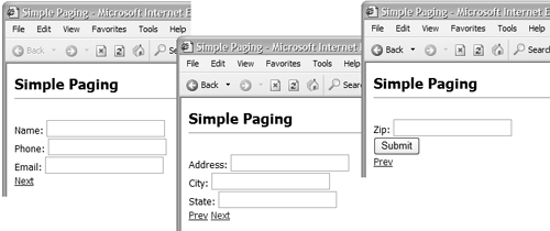
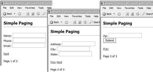
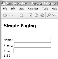
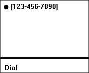
We describe these two controls in detail in Chapter 12. The System.Web.UI.WebControls.Pager ControlAlthough the Pager control can be used in pages that target any type of browser or other client device, it is generally most useful for small-screen devices. These devices, particularly mobile phones, have extremely limited memory capacity and a slow bandwidth connection, so it is good practice to minimize the amount of content sent to the device for each "screen" (or page) displayed. One way to minimize the content when there is a lot of information to display is to separate it into individual pages and provide Next and Previous buttons so that the user can navigate from one page to the next. However, this often involves considerable extra coding. In ASP.NET 2.0, the new Pager control can handle all the issues of creating the appearance of separate pages from a single source page. The Pager control is placed within an ASP.NET page and its Control ToPaginate property set to the id of a container control on the page (which must have the runat ="server" attribute). A common approach is to use the Pager control to paginate the contents of a <form> . In Listing 10.8, the <form> contains eight <div> controls and one <p> control. Each of these <div> and <p> controls contains one or more child controls. Listing 10.8 Using a Pager Control with a <form>... <form id="MyForm" runat="server"> <div runat="server"> <asp:Label Text="Name:" runat="server" /> <asp:Textbox id="txtName" runat="server" /> </div> <div runat="server"> <asp:Label Text="Phone:" runat="server" /> <asp:Textbox id="txtPhone" runat="server" /> </div> <div runat="server"> <asp:Label Text="Email:" runat="server" /> <asp:Textbox id="txtEmail" runat="server" /> </div> <div runat="server"> <asp:Label Text="Address:" runat="server" /> <asp:Textbox id="txtAddress" runat="server" /> </div> <div runat="server"> <asp:Label Text="City:" runat="server" /> <asp:Textbox id="txtCity" runat="server" /> </div> <div runat="server"> <asp:Label Text="State:" runat="server" /> <asp:Textbox id="txtState" runat="server" /> </div> <div runat="server"> <asp:Label Text="Zip:" runat="server" /> <asp:Textbox id="txtZip" runat="server" /> </div> <div runat="server"> <asp:Button Text="Submit" runat="server" /> </div> <p> <asp:Pager id="MyPager" ControlToPaginate="MyForm" ItemsPerPage="6" runat="server" /> </p> </form> ... After the Submit button comes the declaration of the Pager control. The ControlToPaginate attribute specifies the <form> as the container control whose content (the controls that are direct children of the container being paginated ) will be divided into separate pages. The number of controls that will appear on each page is controlled by the ItemsPerPage property, here set to 6 using the ItemsPerPage attribute. That's all you need to do to provide pagination of the output. In a browser and in a mobile device, the output now consists of three separate screens, with the Next and Prev buttons displayed automatically at the appropriate times. Figure 10.3 shows the results in Internet Explorer, and Figure 10.4 shows the same page viewed in a mobile device emulator. Figure 10.3. The Pager control viewed in Internet Explorer Figure 10.4. The Pager control viewed in a mobile device emulator We see three screens because ItemsPerPage applies to the maximum number of pageable controls that are to be paged irrespective of whether they are top-level controls. The <div> control is not a pageable control, whereas the Label , Textbox , and Button are. Therefore we see three Label controls and three Textbox controls for screens one and two, and a Label , Textbox , and Button for screen three. The <div> control ensures that controls within it aren't split between pages; thus changing ItemsPerPage to 5 would show not five controls on the first page but only four. You can also put more than one Pager control on a page if you wish. This might be useful if you want the Next and Prev links to appear at the top and bottom of the listyou just insert them into the page at the points you want their output to appear. Note that you must set their ItemsPerPage attributes to the same value. Displaying Page NumbersThe Pager control exposes properties named CurrentPage and PageCount so you can easily indicate to users where they are in the set of pages by displaying these values (see Listing 10.9). Listing 10.9 Displaying the Page Number and Page Count with the Pager Control... <p> <asp:Pager id="MyPager" ControlToPaginate="MyForm" ItemsPerPage="6" runat="server" /> </p> <p> Page <% = MyPager.CurrentPage + 1 %> of <% = MyPager.PageCount %> </p> </form> The PageCount property is read-only, but you can set the CurrentPage property in code to force a specific page to be displayed. However, notice that the pages are numbered from 0we add 1 to the value of the CurrentPage property in the code in Listing 10.9 so that it displays the page numbers as 1, 2, and 3 (which tends to be more intuitive for users). The screenshot in Figure 10.5 shows the values of CurrentPage and PageCount when we add to the page the highlighted code shown previously. Figure 10.5. Displaying the page number and page count Alternatively, you can force the Pager control to display a list of all the available page numbers as hyperlinks so that users can jump directly to any one of them. All that's required is to add the Mode attribute with the value NumericPages : <asp:Pager id="MyPager" ControlToPaginate="MyForm" Mode="NumericPages" ItemsPerPage="6" runat="server" /> Figure 10.6 shows how this looks in Internet Explorer, and the result is much the same in a mobile device. As you can see from the screenshot, the page numbers now show the "proper" values, indexed from 1. Figure 10.6. Displaying the page numbers as hyperlinks To control how many page numbers are displayed in this mode, change the PageButtonCount property from its default of 10 . The usual format of three dots after the last page number shown (or before the first one) signifies that there are more pages available:
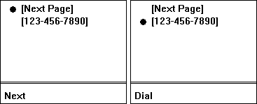
You can also set the Mode property to PagerMode.NumericPages at runtime, or you can set it to PagerMode.NextPrev to display the default Next and Prev buttons. And you can change the text displayed in NextPrev mode by setting the NextPageText and PrevPageText properties to different String values or by adding the NextPageText and PrevPageText attributes to the control declaration (see Listing 10.10). Listing 10.10 Changing the Default Properties of the Pager Control<asp:Pager id="MyPager" ControlToPaginate="MyForm" ItemsPerPage="6" runat="server" NextPageText="More" PrevPageText="Back" /> Page WeightingsSo far, all the examples we've shown set a specific value for the ItemsPer Page property of the Pager control. This is fine if each item takes up roughly the same amount of vertical space on the page. However, if they don't, the lengths of the pages will vary even when each one contains the same number of items. To get around this, the Pager control can use weightings to determine where the page breaks should occur. Page weightings are automatically used if you don't specify a value for the ItemsPerPage attribute when declaring the Pager control and don't set the ItemsPerPage property at runtime. If the controls used within the container control implement the I PaginationInfo or IItemPaginationInfo interfaces, they can be assigned specific weights for their ItemWeight property. Otherwise, the Pager control uses the number of contained controls for each top-level item to work out the weightings. (The default is 100 , but this can be changed by setting the DefaultItemWeight property of the Pager control.) Then, taking into account the value of the container control's Available Weight property, the Pager control can calculate where to place the page breaks. Keeping Child Controls TogetherThe IPaginationInfo interface exposes a property named Paginate Children . When this is set to True (the default varies depending on the control type), the pagination process will break up the pages between the child controls of the same top-level item. When set to False , all child controls are kept together for each top-level item in the container control that is being paginated. The Panel control is probably the most suitable server control to act as the parent container in this case. For plain HTML controls, the <div> control, as shown previously, also keeps child controls together. Pager Control EventsLike most server controls, the Pager control raises a series of events that can be handled by code in your page. The Paginated event occurs after the control has figured out what is located on the current page, so code here can discover the number of pages and the controls that are on this page before it is renderedand even change the output by assigning new values to the control properties. Custom PagingThe final topic we consider here for the Pager control is the way you can abandon the built-in pagination features and instead create build routines and UIs to suit your own specific requirements. This requires more effort, but it does allow you to exert full control over the way it works. The Pager control can be wired up to separate controls that will activate the Next and Back operations. Any control that exposes the Command Name property (e.g., Button , LinkButton , or ImageButton ) is an ideal candidate: <asp:Button runat="server" CommandName="Prev" Text="Previous" /> ... <asp:Button runat="server" CommandName="Next" Text="Next" /> Simply set the CommandName attribute to the same value as the NextPageCommandName and PrevPageCommandName properties of the Pager control, and they will automatically cause the postback that moves to the next or previous page. The default values for the NextPageCommandName and PrevPageCommandName properties of the Pager control are Next and Prev , respectively, but you can change this if you need to wire the buttons up to different instances of the Pager control. The PhoneLink ControlOne useful technique in voice-enabled devices such as mobile phones is to provide a link that dials a specified number when activated. A PhoneLink control to achieve this is part of the MMIT, and an equivalent is now part of the core controls set in ASP.NET 2.0. The PhoneLink control has a property named PhoneNumber , which specifies the number to be dialed when activated. It also supports the display and formatting properties that are standard for the controls that inherit from WebControl , plus the SoftKeyLabel attribute that we discuss in more detail later. <asp:PhoneLink cssClass="Normal" id="Phone1" runat="server" PhoneNumber="123-456-7890" /> In a device that does not support voice calls, the control will usually just render the phone number in the page as text within an HTML anchor element: <a id="Phone1" class="Normal">123-456-7890</a> However, in a voice-enabled device, the output is a hyperlink that specifies the protocol wtai: , which initiates a voice call. Notice how the number in the href attribute below is prefixed with a special URL as well, which is used by the phone to make the connection, and the number has all non-numeric formatting characters removed: <a href="wtai://wp/mc;1234567890">123-456-7890</a> The result in a mobile device emulator is shown in Figure 10.7. Figure 10.7. The PhoneLink control in a mobile device emulator The SoftKeyLabel AttributeSome of the interactive controls in the ASP.NET 2.0 WebControls namespace ( mainly link and button controls) have the SoftKeyLabel attribute. This can be set programmatically or declaratively through the SoftKeyLabel attribute. The value is a String displayed by many mobile devices that have soft-key buttons (usually located just below the screen). It provides a useful hint to users about which button to press to activate or interact with the control. As an example, the code in Listing 10.11 creates a page containing a Hyperlink and a PhoneLink control. Both of these controls carry a definition of the SoftKeyLabel attribute. Listing 10.11 Using the SoftKeyLabel Attribute <%@ Page Language="VB" %> <html> <head> <style> .Heading {font-family:Arial; font-size:xsmall; font-weight:bold} .Normal {font-family:Arial; font-size:xsmall} </style> </head> <body> <form runat="server"> <asp:Hyperlink cssClass="Normal" id="Link1" runat="server" Text="Next Page" NavigateUrl="nextpage.aspx" SoftKeyLabel="Next" /> <br /> <asp:PhoneLink cssClass="Normal" id="Call1" runat="server" PhoneNumber="123-456-7890" SoftKeyLabel="Dial" /> </form> </body> </html> When viewed in a cellular phone, the value of the SoftKeyLabel is displayed above the soft-key button as each control receives the focus, making it easy to see what each one does (see Figure 10.8). Figure 10.8. The results of setting the SoftKeyLabel attribute |