Web Part Basics
| Web Parts are special controls that are designed to provide the user with discrete units of functionality that can be placed on a page in virtually any location. A discrete unit of functionality essentially means that the Web Parts are designed to perform specific tasks such as displaying an inbox, providing a task list, displaying the current weather, and so on. Web Parts are not entire applications encapsulated in a control. The suite of Web Part tools allows the developer to quickly and easily create pages (called Web Part Pages) that host Web Parts. Such pages can allow users to control the layout by dragging and dropping Web Parts to move them into the location that the user chooses. Users can also control Web Part properties; they can minimize or even close Web Parts just as they would manipulate Windows on their desktop. All of this functionality is virtually free for the developer utilizing the Web Parts suite of controls and ASP.NET 2.0. There are many reasons to use Web Parts. If you want to provide your users with functionality, but you want your users to be able to choose what data is presented to them, and how that data is presented to them, Web Parts will definitely provide you with a huge boost in productivity, time to market, and application functionality. Web Parts make use of the personalization provider to store personalization data. When a Web Part is added to a page, it contains both shared data and personalization data. This means that a control can have a set of properties that are shared among all users. When a user chooses to customize that Web Part, his personalization data overrides the shared data, creating user-specific settings. For example, you could create a Weather Web Part that has a shared setting of ZipCode that defaults to the ZIP code of the website's headquarters. When users choose to customize that Web Part with their own ZIP code, they create a user-specific setting that overrides the shared default. Figure 26.1 shows a conceptual mock-up of what a sample Web Part Page might look like. The page has been divided into zones in which Web Parts can reside. The page in Figure 26.1 has Web Parts for displaying news, weather, a to-do list, the user's inbox, and a site navigation control. A fully functioning Web Part Page containing these Web Parts would allow the user to choose which parts were visible, where those parts sat on the page, and even things like whether the part should display a header or a border. If the Web Part had custom properties (such as the ZIP code for local weather), the user could also choose to supply that information. Figure 26.1. A Web Part Page conceptual diagram.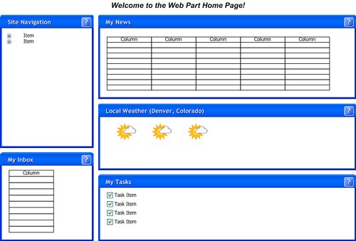 Several controls and classes provide the core framework for Web Parts. Table 26.1 contains a list of the key component controls required to make the Web Parts functionality possible.
Additional controls are used in conjunction with the ones listed in Table 26.1, but the ones in Table 26.1 are the controls you should be concerned with at the top level. The key to working with Web Parts is in knowing what they can and cannot do. Every time you add a server or user control into a ZoneTemplate within a WebPartZone, that control is encapsulated within a GenericWebPart control. Before you start coding your own Web Parts and working with them, you should know how this class works, because it and the WebPart class form part of the foundation of the Web Parts framework. The GenericWebPart class is generated at runtime to allow user controls and other non-Web Part controls to have access to Web Part functionality. Table 26.2 and 26.3 show some of the common properties and methods of the WebPart class, the class from which all Web Parts (including GenericWebPart) inherit.
|
EAN: 2147483647
Pages: 298