| With the graph now drawing the data properly, you need to add the various labels, as well as modify the existing text sprites being used for the title and distance indicators. Let's start by adding a few lines of Lingo that will change the graph title when the display method is called. 1. | Open the main script and add the following three lines of code to the beginning of the display method.
1 mList = ["January","February","March","April","May","June", ¬ "July","August","September","October","November","December"] 2 mString = mList[_global.theMonth] 3 member("graph title").text = mString && string(_global.theYear)
Now, when display is called, the correct month and year will be shown as the title of the graph. The next step is to change the text fields on the left side of the graph to show the correct range for the distances being shown. For this you need to take the maximum distance being graphed and divide into quarters appropriately.
| 2. | After the line that calculates the distanceScaler, add the following Lingo.
the floatPrecision = 0 member("100per").text = string(maxDist) member("75per").text = string(maxDist * .75) member("50per").text = string(maxDist * .50) member("25per").text = string(maxDist * .25)
Because you need the maximum distance (maxDist), you added the code after the section that finds the maximum distance and calculates the distanceScaler.
Director's floatPrecision property is somewhat strange in that it can't be accessed from the DOM, as you might expect: _movie.floatPrecision. I am sure that in the next version of Director it will be added, but for now you need to use the syntax shown. By setting the floatPrecison to 0, any numbers that are displayed within text members will have their decimal places removed, and be shown as integers. Note that setting the floatPrecision does not affect calculations, only the display of numbers.
Once the floatPrecision has been set, the text sprites, along the left side, are set to the appropriate percentages of the total distance.
Next, let's add numbers at the bottom of the graph, under each bar, that will indicate which day of the month is being graphed. To do this, you'll set the text of one single text cast member, and then copy pixel the text from the member, directly onto the Stage.
| 3. | Within the display method, add the following Lingo, just after the comment line that reads "code for day text goes here".
--code for day text goes here member("holder").text = string(curDate) member("holder").foreColor = 0 member("holder").fontSize = 12 member("holder").fontStyle = [#bold] r = member("holder").rect destRect = rect(startPos, bottomPos + 8, startPos + r.width, ¬ bottomPos + 8 + r.height) _movie.stage.image.copyPixels(member("holder").image, destRect, r)
Note that these seven lines of code need to be placed before the line that increments startPos, or the text won't appear in the correct location.
First, the text of the holder member is set to the current date. Next, the foreColor property of the text is set to zero, making it white, and then the fontSize is set to 12. Next, the fontStyle property is set to #bold. Setting the font properties like this is necessary because you'll be using the same holder member to draw the average text with, and that text will be drawn black and in a smaller font size, and not in bold. If you fail to reset it each time you use it, you run the risk of accidentally using old settings.
The rect of the text member is then stored in the local variable r. This is done because the height and width of the member are used in the next line that creates the destRect, and storing the text member's rect in a variable saves a little space.
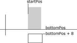
Notice that the destination rectangle (destRect) is based on the startPos of the bar being drawn. It also starts 8 pixels below the bottomPos, placing it just under the graph's zero line.

The height and width of the destRect are the same height and width of the holder text member. Once the destRect is calculated, the copyPixels method is used to copy the image of the text member into the destination rectangle within the Stage image.
One great thing about copying the image of a text member is that an alpha channel is auto matically created, making the text appear nicely cut out over the underlying Stage image.
| 4. | Rewind and play the movie and issue the showMonth("B") in the Message window.
The graph now draws in and displays the date for each day being graphed under the zero line, as expected.
The last thing to do before wrapping up this lesson is to add text labels to the average speed circles, so that you know what each average actually is.
| 5. | Stop the movie and open the main script. Within the repeat loop that draws the average circles, add the following Lingo, immediately after the line that states "code for average text goes here".
--code for average text goes here member("holder").text = string(avgList[cnt]) member("holder").foreColor = 255 member("holder").fontSize = 10 member("holder").fontStyle = [#plain] r = member("holder").rect destRect = rect(startPos, circleTop, startPos + r.width, ¬ circleTop + r.height) _movie.stage.image.copyPixels(member("holder").image, destRect, r)
This code is nearly identical to the code used to draw in the dates under the graph. The difference being that here, you're using black text and a font size of only ten points, and also using a plain fontStyle, as opposed to using bold.
| 6. | Rewind and play the movie and enter showMonth("B") into the Message window.

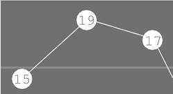
As you can see from this enlarged image, the average speed text doesn't quite fit in the circles like it's supposed to. You can fix that by slightly modifying the destination rect destRect.
| 7. | Stop the movie and modify the line that creates the destRect so that it shifts the text left and down one pixel, as shown.
destRect = rect(startPos - 1, circleTop + 1, startPos + r.width - 1, ¬ circleTop + r.height + 1)

The number placement is much better now, but feel free to tweak it to your liking.
The graph is finished and you're ready to move on to the next lesson, where you'll implement the graph into the main application.
Before moving on, however, you may want to try a couple of things. First of all, try adding a black outline around the bars and circles to make them stand out better. You can do this to both of them with just a single line of code. You can even go so far as to add shadows to the graph by drawing the same items, but slightly offset.
|
|


