9.1. Charting 101 Excel provides a dizzying number of different chart types, but they all share a few points in common. This section introduces you to basic Excel charting concepts that apply to almost all types of charts; it also shows you how to create a few basic charts. At the end of this chapter, you'll take a chart-by-chart tour of each and every one of Excel's many chart types. To create a chart, Excel needs to translate your numbers into a graphical representation. The process of drawing numbers on a graph is called plotting. Before you plot your information on a chart, you should make sure you've laid your data out properly. Here are some tips: Structure your data in a simple grid of rows and columns. Don't include blank cells between rows or columns. Include titles, if you'd like them to appear in your chart. You can use category titles for each column of data (placed atop each column), and an overall chart title (placed just above the category-title row).
Tip: You can also label each row by placing titles in the far-left column, if it makes sense. For example, if you're comparing the sales numbers for different products, list the name of each product in the first column on the left, with the sales figures in the following columns.
If you follow these guidelines, you can expect to create the sort of chart shown in Figure 9-1.
Note: Every chart you create in Excel appears in the middle of your spreadsheet, as shown in Figure 9-1. But a lot of the figures in this bookFigure 9-16, for exampleshow only the chart (and not the spreadsheet that surrounds it). These chart-only figures should make concentrating on chart-specific details easier.
To create the chart shown in Figure 9-1, Excel performs a few straightforward steps (you learn the specifics of how to actually create this chart in the next section). First, it extracts the text for the chart title from cell A1. Next, it examines the range of data (from $14,000 to $64,000) and uses it to set the value scale (also called the y-axis or vertical scale). Notice that the scale starts at $0 and stretches up to $80,000 in order to give your data a little room to breathe. (You could configure these numbers manually, but Excel automatically makes common-sense guesses like these by looking at the data you're asking it to chart.) After setting the vertical scale, Excel adds the labels along the bottom axis (also known as the x-axis or category axis), and draws the columns of appropriate height. Figure 9-1. This worksheet shows a table of data and a simple column chart based almost entirely on Excel's standard chart settings. 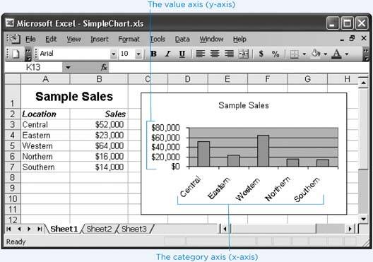
9.1.1. Embedded and Standalone Charts The chart in Figure 9-1 is an embedded chart. Embedded charts appear in a worksheet in a floating box alongside your data. You can move the chart by dragging the box around your worksheet, although depending on where you drag it, you may obscure some of your data. Your other option is to create a standalone chart, which looks the same but occupies an entire worksheet. That means that Excel places your chart data and your chart on separate worksheets. Usually, you use an embedded chart if you want to create printouts that combine both your worksheet data and one or more charts. On the other hand, if you want to print the charts separately, it's more convenient to use standalone charts. That way, you can print an entire workbook at once and have the charts and the data on separate pages.
Tip: If you use embedded charts, you still have the option of printing just the chart, sized so that it fills a full sheet of paper. Simply select the chart and then choose File  Print. If you create a standalone chart, you dont have a choiceExcel always prints your chart on a separate page. Print. If you create a standalone chart, you dont have a choiceExcel always prints your chart on a separate page.
9.1.2. The Chart Wizard So how do you create a chart like the one shown in Figure 9-1? Easyuse Excel's Chart Wizard. The Chart Wizard helps you create any type of Excel chart quickly by guiding you through several steps. In each step, you specify different options that Excel needs in order to create your chart. The following steps get you started with the Chart Wizard. As you may notice, these steps don't dig into every nook and cranny of chart configuration. Instead, you'll revisit the more advanced options throughout this chapter.
Tip: Don't worry if these steps make you feel like you're breezing through the Chart Wizard. Even if you don't end up with the chart looking exactly like you want, Excel lets you configure all the chart options after it's created the chart.
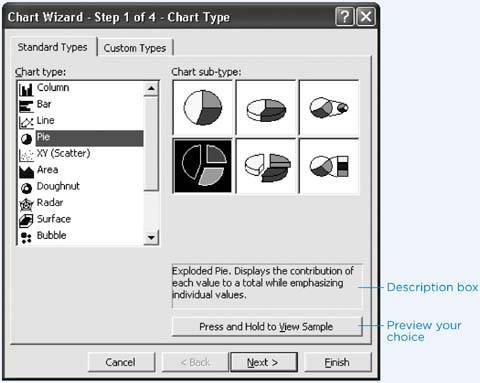
Select the range of cells that includes the data you want to chart, including the column and row headings and any chart title. For speedier chart building, all you have to do is position your cursor somewhere inside the table of data you want to chart. Excel then automatically selects the range of cells that it thinks make up the table. Of course, it never hurts to remove the possibility for error by explicitly selecting what you want to use before you get started. If you were using the data shown in Figure 9-1, for example, you'd select cells A1 to B7. Select Insert  Chart, or click the Chart Wizard button on the Standard toolbar, if its visible. (The Chart Wizard button looks like a miniature column chart.) Chart, or click the Chart Wizard button on the Standard toolbar, if its visible. (The Chart Wizard button looks like a miniature column chart.) The Chart Wizard appears, with a list of different chart types (as shown in Figure 9-2). This step is the first of four steps in the Chart Wizard, but you can click Finish at any time to skip all the remaining steps and just build the chart based on the choices you've made so far; Excel makes the rest of the decisions for you. Figure 9-2. In this example, Pie is the chosen chart type.  From the "Chart type" list on the left, choose a type of chart, and then, on the right, click the picture of the subtype you want. Excel provides 14 chart types for your viewing pleasure (and a few more variations if you click the Custom Types tab). Under each chart choice are yet more subtypes. For example, if you select the Pie type, Excel displays six subtypes in the "Chart sub-type" box. You can choose an ordinary pie chart, a 3-D pie chart, an "exploded" pie chart (where the pieces are separated), and an advanced pie chart that details a single slice by using another, smaller pie chart or a column. When you click one of these subtypes, Excel gives a brief description of the chart in the box underneath the Sample window. The "Press and Hold to View Sample" button lets you preview your choice: simply click (and don't let go of the mouse button) to have Excel show a preview using the currently selected data. The different chart types are explained in more detail later in this chapter. For now, it's best to stick to some of the more easily understood choices, like Bar, Column, or Pie. Remember, the chart choices are just the starting point, as you'll still be able to configure a wide range of details that control things like the titles, colors, and overall organization of your chart.
Tip: When you click the button labeled "Press and Hold to View Sample," the preview appears right in the Chart Wizard window, so you need to keep the button pressed down for as long as you want to see the preview. It's definitely not intuitive, but it's a great way to check out the different chart options.
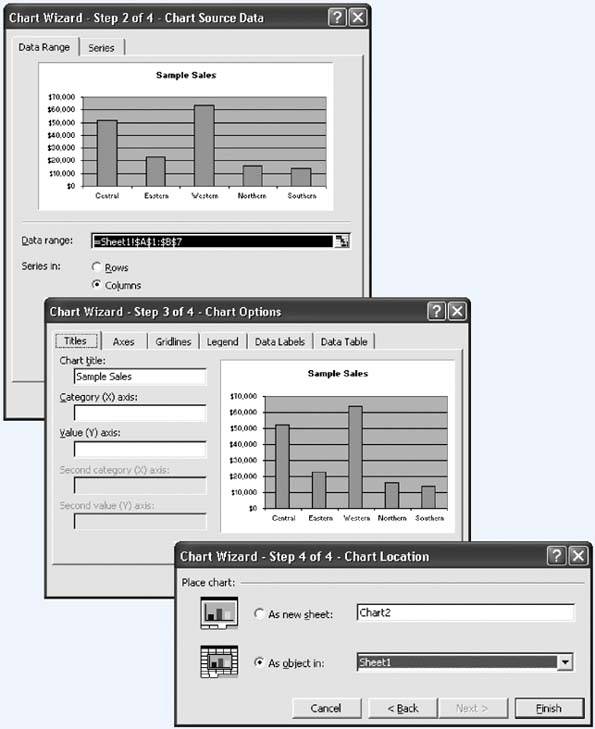
Click Next to move to step 2 of the wizard, where you specify the data you want to chart (Figure 9-3, top). Excel displays a preview of your chart choice and highlights the cells that it's using for the chart with a dotted marquee border (affectionately known as "marching ants"). You can click the worksheet and expand, shrink, or move the selection if necessary. You can also use the options in this step to change how Excel interprets the data you want to chart. This step isn't necessary if you've arranged your data in a simple table, following the guidelines suggested earlier, but it can be important if your worksheet uses a slightly unusual layout. You'll dig further into this issue of data selection on Section 9.2.3. Click Next to move to step 3 of the wizard, where you can configure every other chart option (Figure 9-3, middle). The options that you see in this step depend on the type of chart you've chosen. For example, if you're creating a pie chart, you see only options for configuring the text in the chart labels, title, and legend. If you're creating a column chart, on the other hand, you see these options along with additional tabs for setting the scale and configuring how gridlines are drawn. Even without your input, Excel usually makes commonsense choices, so you can often build a chart without needing to tweak any of these options. Click Next to move to step 4 of the wizard, where you choose a location for the new chart (Figure 9-3, bottom). You have two options for placing charts: on a new chart worksheet (choose "As new sheet") or embedded in the current worksheet (choose "As object in"). If you choose "As new sheet," you must also enter a name for the chart worksheet you want Excel to put the chart in. Excel creates a new chart worksheet with this name and places the chart there. (If you type in the name of a chart worksheet that already exists, Excel places the chart thereuseful if you want to place two charts on the same chart worksheet.) The new chart worksheet appears in front of the worksheet that contains the chart data. (You can always move the chart worksheet to a new position in your workbook by dragging the chart worksheet's tab.) If you choose "As object in," you must choose one of the worksheets in your workbook. Initially, Excel selects the sheet that contains the chart data. Figure 9-3. Three important Chart Wizard steps.  Click Finish to create the chart. Excel inserts the chart into a new worksheet or alongside your data.
Tip: If it's a Monday and it's raining and you don't want to make any choices, you can actually build a chart with one key press. Just highlight your data and press F11. This step creates a column chart on a new worksheet. Although you can't undo this operation, you can always delete the new chart worksheet and start over. To do so, just right-click the chart worksheet tab and select Delete.
|

 Print. If you create a standalone chart, you dont have a choiceExcel always prints your chart on a separate page.