Using the Chart Component
The Chart Component brings much of the PivotChart report features that you learned about in Chapter 4 to Web pages. Just like PivotChart reports, a Chart Component can synchronize its data and layout characteristics to match a linked PivotTable Component on the same Web page. Figure 6-19 shows a sample of the Chart Component.
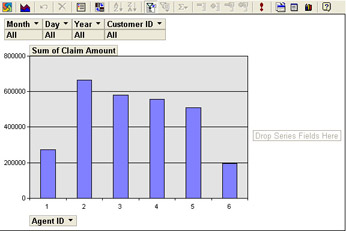
Figure 6-19: The Office XP Chart Component.
Here’s a list of some of the controls on the PivotTable Component’s toolbar, which is shown in Figure 6-20:

Figure 6-20: The Microsoft Office XP Chart Component’s toolbar.
-
Show/Hide Legend shows or hides the chart legend.
-
By Row/Column changes the emphasis on which aspects of data you want to compare by changing which parts of your data appear as categories and which appear as series.
-
AutoFilter places an arrow in each nondetail field. Clicking the arrow displays a list of values that you can use to select items that match filter conditions.
-
AutoCalc adds a field to the Chart field list that represents a summarization such as Sum, Min, Max, Average, and so on. This field can be dragged to the Data area of the Chart Component.
-
Drill Out removes detailed information for a particular item.
-
Drill Into focuses on more detailed information for a particular item.
Note The Office 2000 Chart Component does not support a toolbar.
The tabs on the Chart Component’s Commands And Options dialog box at design time again include a series of options and settings that affect the data displayed in the chart. Some of the tabs aren’t visible unless you are working with a specific aspect of the chart. Some of the main tabs in the dialog box are shown in Figure 6-21.
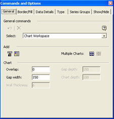
Figure 6-21: The Office XP Chart Component’s Commands And Options dialog box at design time.
-
The General tab selects chart items and determines widths, depths, and thicknesses of chart display elements.
-
The Border/Fill tab determines the display of the chart borders and background fill.
-
The Data Details tab defines data source connectivity information.
-
The Type tab determines the chart display type.
-
The Series Groups tab determines the behaviors of series fields and axes.
-
The Show/Hide tab displays or hides chart display elements.
-
The Conditional Format tab colors chart display elements based on data values.
-
The Line/Marker tab changes the display of chart lines and data markers.
-
The Axis tab changes the display of ticks, grid lines, and axes.
-
The Scale tab changes the behavior and order of crossing axes and timescales.
The Chart Component displays many of the same tabs in the Commands And Options window at run time.
| Note | The Office 2000 Chart Component’s Property Toolbox looks slightly different from the Office XP Chart Component’s Commands And Options dialog box, but many of the features are the same. To display the Office 2000 Chart Component’s Property Toolbox in design time, right-click a blank area of the Chart Component and click Property Toolbox. The Office 2000 Chart Component does not support a run-time version of the Property Toolbox. |
Linking a Chart Component to data is slightly different from linking a PivotTable Component to data or importing data into a Spreadsheet Component. To link a Chart Component to data you use the Chart Wizard at design time. The Chart Wizard opens another version of the Commands And Options dialog box, which provides the Data Source tab on which you complete the information about the data you are linking to.
| Note | For the Office 2000 Chart Component, you link to existing data when you create the Chart Component through the Chart Wizard. You cannot switch to another data source unless you create another Chart Component from scratch. |
Analyzing Chart Component Data
The Chart Component allows you to switch its chart type and also to sort, filter, insert summary functions, and drill into or out of data.
| Note | The rest of the procedures and exercises in this section can be performed only in Office XP. |
To change a Chart Component’s chart type, on the Chart Component’s toolbar, click the Chart Type button. Then select the new chart type.
Your Turn
In this exercise, you will change the chart type from a column chart to a line chart.
-
Click anywhere inside the
 Sales.htm file’s Chart Component.
 -
On the Chart Component’s toolbar, click the Chart Type button.
-
Click SmoothLine, and then click the sample chart for “Smooth Line. Displays Trend Over Time or Categories,” the first item in the first row on the Type tab.
-
Compare your results to Figure 6-22.
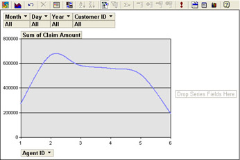
Figure 6-22: The smooth line chart type.
To return to the original chart type, in the Commands And Options dialog box, click Column and then click the sample chart for “Clustered Column. Compares Values Across Categories.”
To sort data in a Chart Component, select the detail items by which you want to sort and then click the Sort Ascending or Sort Descending button.
Your Turn
In this exercise, you will display claim totals in descending order, from left to right, on the Chart Component.
-
On the
 Sales.htm file’s Chart Component, click inside a column.
 -
On the Chart Component’s toolbar, click the Sort Descending button. Compare your results to Figure 6-23.
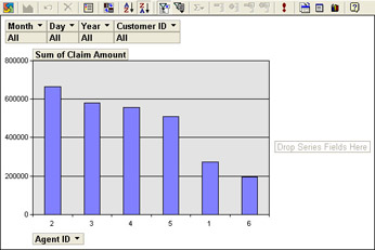
Figure 6-23: Claim totals in descending order from left to right.
To filter data in a Chart Component, click the arrow next to the field name you want to filter by. Select or clear the check boxes to display or hide matching items. Then click OK. Select or clear the All check box to display or hide all of the items.
Your Turn
In this exercise, you will display only December’s claim totals in the Chart Component.
-
In the
 Sales.htm file’s Chart Component, click the arrow next to the Month field.
 -
Clear the All check box, select the 12 check box, and click OK. Compare your results to Figure 6-24, which shows the claims amounts sorted in ascending order by agent ID.
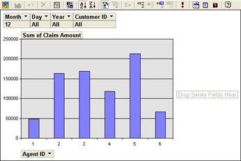
Figure 6-24: Claim totals for December only.
To undo the filter, click the arrow next to the Month field, select the All check box, and then click OK.
To show the top or bottom number of items in a Chart Component, click the detail item for which you want to show the top or bottom items. On the Chart Component’s toolbar, click the Show Top/Bottom Items button, point to the Show Only The Top or Show Only The Bottom, and then click the number of items you want to show. Use the Other menu option to provide more specific top and bottom criteria.
Your Turn
In this exercise, you will display the three agents with the lowest total claim amounts.
-
In the
 Sales.htm file’s Chart Component, click a column.
 -
On the Chart Component’s toolbar, click Show Top/Bottom Items, point to Show Only The Bottom, and then click Other.
-
In the Display The list, select Bottom.
-
In the Items list, type 3.
-
In the Based On list, select Sum Of Claim Amount.
-
Close the Commands And Options window.
-
Click a column, and on the Chart Component toolbar, click the Sort Descending button. Compare your results to Figure 6-25.
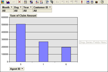
Figure 6-25: Bottom three agents as determined by total claims for all months.
To restore the chart’s full data, click the Show Top/Bottom Items button and then click Show All.
To insert a summary function into a Chart Component, click the detail field for which you want to insert a function. Click the AutoCalc button, and then click the summary function (Sum, Count, Min, Max, and so on).
Your Turn
In this exercise, you will display in the Chart Component the total number of claims processed by each agent.
-
In the
 Sales.htm file’s Chart Component, click the Sum Of Claim Amount field.
 -
On the Chart Component’s toolbar, click the AutoCalc button and then click Count. Compare your results to Figure 6-26.
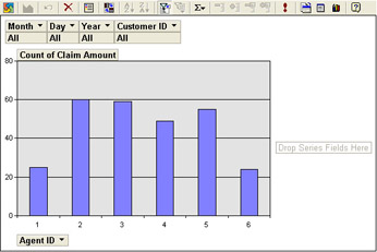
Figure 6-26: Number of claims processed by agent.
To return back to where you started, open the Commands And Options dialog box, click the Format tab, click a number in the vertical axis, and then select Currency in the Number list. Click the Count Of Claim Amount field, click the AutoCalc button, and then click Sum.
To show or hide detailed data (to drill out of or into data) in a Chart Component, click the item on the category axis that you want to examine. On the Chart Component’s toolbar, click Drill Out or Drill Into.
Your Turn
In this exercise, you will drill into claim details for agent 5.
-
In the
 Sales.htm file’s Chart Component, drag the Month and Day fields next to the Agent ID field.
 -
In the category axis, click the number 5.
-
On the Chart Component’s toolbar, click the Drill Into button.
-
On the category axis, click the number 12.
-
On the Chart Component’s toolbar, click the Drill Into button again.
-
Click the arrow next to the Agent ID field, clear the All check box, check the 5 check box, and then click OK. Compare your results to Figure 6-27.
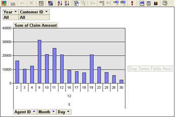
Figure 6-27: December claim amounts by day for agent 5.
Additional Office XP Chart Component Features
The Office XP Chart Component includes some features that the Office 2000 Chart Component does not support, such as a built-in datasheet and direct data binding. This section briefly describes these features.
Built-In Datasheet
The data source for a Chart Component is usually a database table or query, or data from another Web Component on the Web page. You can also create a Chart Component that gets its data from values you supply in a datasheet attached to the component.
To specify a datasheet as the Chart Component’s data source, click Chart Wizard on the Chart Component’s toolbar. On the Data Source tab, click Data Typed Into A Datasheet. Click the Data Sheet button, and then enter data for the category and the series of values. After typing values for the chart, press Enter to create additional rows and columns for chart values.
Direct Data Binding
Similar to the Spreadsheet Component, the Chart Component can connect to data stored in databases such as SQL Server 2000. To bind a Chart Component in this manner, click the Data Source tab in the Chart Component’s Commands And Options dialog box. Click Data From A Database Table Or Query, and then click the Connection button. On the Data Details tab, type the connection string for the data source, or click Edit and follow the directions in the dialog box to connect to the data source you want to use. If necessary, type the command text or SQL string you want to use to retrieve specific data in the Command Text Or SQL box.
EAN: 2147483647
Pages: 137