Scatter Plots
|
| < Day Day Up > |
|
To create a scatter plot, select Graphs → Scatter Plot. Select Two-Dimensional... or Three-Dimensional... to create a two-dimensional or three-dimensional scatter plot of the data in the current table.
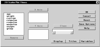
Figure 5.31: 2-D Scatter Plot Dialog
If you specify more than one variable for any of the axes, one plot is produced for each combination of variables.
You must specify one or more x-axis variables and one or more y-axis variables. For three-dimensional plots, you must specify one or more z-axis variables.
For a two-dimensional scatter plot, specify a class variable to define subgroups. Each level of the class variable is represented by a different symbol on the scatter plot.
Two-Dimensional Scatter Plot Options
In two-dimensional plots, you can specify the point color and connecting lines as well as control the tick marks on the axes. Click on the Display button to specify these display options.
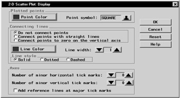
Figure 5.32: 2-D Scatter Plot- Display Dialog
Click on the Point Color button to choose the point color. Click on the arrow next to Point symbol: to choose the symbol.
Under Connecting lines, specify whether the points are to be unconnected or connected to each other or the vertical axis, and specify the line color and style. Click on the Line Color button to specify the line color to be used for connecting points. Click on the arrows next to Line width: to specify the width of the line used to connect points. Under Line style, specify the style of the line used to connect points.
Under Axes, click on the up and down arrows to increase or decrease the number of minor horizontal and vertical tick marks. Select the check box to add reference lines at major tick marks.
Three-Dimensional Scatter Plot Options
In three-dimensional plots, you can control the appearance of the points as well as the tilt and rotation of the plot. You can also control the tick marks on the axes.
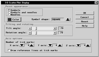
Figure 5.33: 3-D Scatter Plot- Display Dialog
Under Point appearance, specify whether the points should be represented by symbols, needles, or both. Click on the Color button to specify the color for point symbols and needles. Click on the arrow next to Symbol shape: to specify the symbol for the points.
Under Tilting and rotating, move the bars next to Tilt angle: and Rotation angle: to specify the tilt angle and rotation angle for the plot.
Under Axis options, click on the arrows to specify the number of x-axis, y-axis, and z-axis tick marks. Click on the box next to Draw reference lines at tick marks to request that reference lines be drawn at each tick mark.
Scatter Plot Titles
Click on the Titles button to display the Titles dialog.
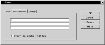
Figure 5.34: Titles Dialog, 3-D Scatter Plot Tab
In the Global tab, you can specify titles that are displayed on all output. These titles are saved across Analyst sessions.
In the Scatter Plot tab, you can specify titles for the scatter plot. Select the box next to Override global titles to exclude the global titles from the scatter plot results.
In the Settings tab, you can specify whether or not to include the date, the page numbers, and a filter description.
Scatter Plot Variables
Click on the Variables button to display the Scatter Plot Variables dialog.
BY group variables separate the data set into groups of observations. Separate analyses are performed for each group, and a separate plot is displayed for each analysis. For example, you could use a BY group variable to perform separate analyses on females and males. Specify BY group variables by selecting them in the candidate list and clicking on the BY Group button.
Example: Create a 2-D Scatter Plot
Open the Fitness Data Set
In this example, you use the Fitness data set as the basis of your scatter plot. If you have not already done so, open the Fitness data set by following these steps:
-
Select Tools → Sample Data...
-
Select Fitness.
-
Click OK to create the sample data set in your Sasuser directory.
-
Select File → Open By SAS Name...
-
Select Sasuser from the list of Libraries.
-
Select Fitness from the list of members.
-
Click OK to bring the Fitness data set into the data table.
Specify Scatter Plot Variables
To specify the variables to be plotted, follow these steps:
-
Select Graphs → Scatter Plot → Two-Dimensional...
-
Select age from the candidate list, and click X Axis to make age in years the x-axis variable.
-
Select runtime from the candidate list, and click Y Axis to make minutes to run 1.5 miles the y-axis variable.
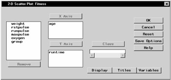
Figure 5.35: Scatter Plot Variables
Specify Scatter Plot Display Options
To specify your scatter plot display options, follow these steps:
-
Click on the Display button to display the Scatter Plot Display dialog.
-
Under Plotted points, click on the Point Color button. Select Red from the list of colors to make your scatter plot points red. Click OK.
-
Click on the down arrow next to Point symbol: and select DOT from the list. This makes your scatter plot points display as dots.
-
Under Axes, select Add reference lines at major tick marks. This displays a grid on the scatter plot by which you can orient the points on the axes.
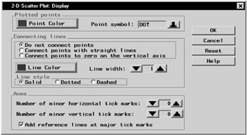
Figure 5.36: Display Options -
Click OK to save your display changes.
Specify Scatter Plot Titles
To specify the titles for your scatter plot, follow these steps:
-
Click on the Titles button in the Scatter Plot dialog.
-
In the Scatter Plot tab, type Age versus Runtime in the first field.
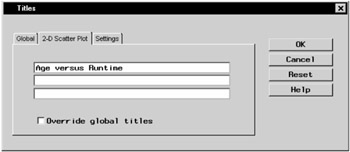
Figure 5.37: Scatter Plot Title -
If you did not change the global title in the first exercise in this chapter, click on the Global tab. Type Fitness Report in the first field. This global title is saved across all Analyst sessions until you change it.
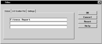
Figure 5.38: Global Title -
Click OK to save your title changes.
Generate Scatter Plot
To display your scatter plot, click OK in the Scatter Plot dialog.
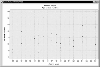
Figure 5.39: 2-D Scatter Plot
|
| < Day Day Up > |
|
EAN: 2147483647
Pages: 116