Applying Character and Paragraph Specifications
Photoshop gives you two palettes that expand your capabilities for generating text above and beyond those readily available in the Tool palette. In these palettes you ll find controls for character and paragraph specifications and a compete set of Asian character controls. To access the palettes, select the Type tool and click the Palettes button in the Options bar. The Character and Paragraph palettes appear.
The Character Palette
This palette consolidates all the character attributes into one floating palette. To access the Character palette (see Figure 8.13), you can either choose Window ’ Character or, with the Type tool selected, click the Palettes button ![]() in the Options bar.
in the Options bar.
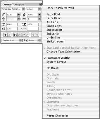
Figure 8.13: The Character palette
For most changes to the Character palette settings, you can click the Commit (check mark) button at the right end of the Options bar to apply your edits or the Cancel button if you change your mind. For most settings, pressing Return/Enter, choosing another tool, or targeting another layer will commit your changes. You can designate the following characteristics on the Character palette:
Size To designate the size in points prior to typing, enter a value or choose a size from the list. If the text has already been entered, highlight the text and then enter or choose a value.
Kerning This setting is measured in thousandths of an em space. (An em space is a standard for type measurement. The width of an em space depends on the size of the text; it s usually about the width of the letter m. ) The Metrics setting uses the font s default spacing. To kern manually, place your insertion point between the two characters and enter a value or choose a width from the list. Negative values decrease the spacing between characters ; positive values increase the spacing.
| Note | If you need to work with other units when setting type, enter the number and then the unit abbreviation or name ”inches (in), millimeters (mm), pixels (px), and so forth. Photoshop will automatically convert the value into the current type units specified in the preferences. |
Tracking This option is akin to kerning and is also measured in thousandths of an em space. To change tracking, highlight the text, and then enter a value or choose a width from the list. As with kerning, negative values decrease the space between characters, and positive values increase the space.
Leading This is measured in points from baseline to baseline. To change the leading, highlight the text, and then enter a value or choose one from the list.
Vertical/Horizontal Scale This is measured as a percentage of normal scale. To change the horizontal or vertical scale, highlight the text and enter a value.
Baseline Shift This is measured in points. To change the baseline shift, highlight the text, and then enter a value or choose one from the list.
Color To change the color, click the swatch and choose a color from the Color Picker.
Style These icons let you apply faux styles to your type. They include bold, italic, all caps, small caps, superscript, subscript, underline, and strikethrough .
Language You can choose a language for hyphenation and spelling conventions on selected characters.
Anti-Alias Redundant with the anti-alias option on the Options bar, this feature lets you choose an anti-alias method from the menu.
The Character Palette Menu
Click the arrow in the upper-right corner of the Character palette to access more commands and options for your type characters:
Faux Styles If you don t have a bold or italic type font, you can apply a faux style by choosing Faux Bold or Faux Italic.
Case Click on a case icon before typing: All Caps, Small Caps, Subscript, or Superscript. Or click on the icon after it has been entered by highlighting all or part of the text on a Type layer. This option is also available on the palette interface by clicking one of the icons. (Selecting Small Caps will have no effect on text that was originally typed as capital letters .)
Superscript, Subscript, Underline, and Strikethrough These traditional type styles are repeated in the palette menu. Superscript and subscript characters are smaller and shifted above or below the text baseline, respectively. Underline places a line of corresponding weight beneath the character, and Strikethrough places a line in the horizontal center of the characters.
Standard Vertical Roman Alignment Select the Standard Vertical Roman Alignment option to rotate a vertical character 90 degrees to be horizontal. This option is available only for vertical text; otherwise , it will be grayed out in the pull-down menu.
Change Text Orientation This option changes all the text on a layer to a vertical orientation if the type is horizontal, or horizontal if the type is vertical.
Fractional Widths The spacing between characters varies, with fractions of whole pixels between certain characters. Most of the time, fractional character widths provide the best spacing. Fractional widths, however, can cause small type to run together, making it difficult to read. To turn off this option so that the type is displayed in whole-pixel increments , choose Fractional Widths from the palette menu and clear the option.
System Layout This feature disables fractional-width spacing and the anti-aliasing option that might be applied to the text.
No Break Use No Break to prevent selected words from breaking at the end of lines, to preserve the intended meaning of these words.
The following features are only available on OpenType fonts as opposed to TrueType or PostScript Type One fonts) These items are will be grayed out unles your font supports them.
Old-Style Numerals If your font provides them, you can use old-style typographic numerals by choosing Old Style from the Character Palette menu.
Ordinals Ordinals are decorative characters that are often used on as paragraph markers, on title pages and as text dividers , or as bands and borders. Ordinals may include natural forms like flowers and leaves , or bullets, brackets, and contemporary graphic decorations.
Swash Swash capitals originated during the Italian Renaissance as calligraphy and were adopted as letterforms in the early sixteenth century. Swash capitals are used for expressive passages of text, or for titles and signs. They add a touch of elegance and refinement to the page.
Titling Titling capitals are ornate, inline, white- stroked or refined versions of regular capitals. They are used in all-capital settings or as initial capitals. Fonts with titling capitals may often include figures, monetary symbols, punctuation, and accented characters. Sometimes titling capitals are reversed and used as drop caps in book chapters or related paragraphs.
Connection Forms Some script typefaces use connecting forms to link characters together.
Stylistic Alternates Open Type fonts sometimes offer more than one option for a letterform . Choose this option to access the alternate characters.
Ornaments Some typefaces have ornamental characters. This option enables you to choose them.
Ligatures A ligature is a set of two characters that that replaces certain character combinations, such as fl and fi , to avoid spacing conflicts. You can add ligatures for a better appearance if your font supports them.
Discretionary Ligatures Discretionary ligatures are extra ligatures that aren t in widespread use, such as ¾ t. In order to use this feature, the font must support these ligatures.
Fractions This feature enables you to enter fractions if the font you are using supports them.
Reset Character Click this item to reset the Character palette to the defaults.
The Paragraph Palette
The Paragraph palette (see Figure 8.14) specifies options for an entire paragraph, which is defined by Photoshop as one or more characters followed by a hard return. Each line of text entered at a point is a separate paragraph because it s separated by a return. Photoshop won t wrap multiple lines in one paragraph unless you resize it with a bounding box.
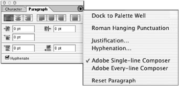
Figure 8.14: The Paragraph palette
You can access the Paragraph palette by choosing Window ’ Paragraph. Or, with the Type tool selected, click the Palettes button on the Options bar and then click the Paragraph tab.
Selecting Paragraphs
You can format a single paragraph, multiple paragraphs, or all paragraphs in a Type layer.
| To Format This: | Do This: |
|---|---|
| A single paragraph | Choose the Type tool and click between any two characters in a paragraph. |
| Multiple paragraphs | Select the Type tool and drag to highlight the text range of the paragraphs you want to select. |
| A Type layer | Target the Type layer that you want to affect in the Layers palette. |
Aligning and Justifying Type
You can align text to one edge or justify text to both edges. You can align point text and paragraph text; you can justify paragraph and path text but not point text.
To specify alignment for horizontally oriented text, click the Left Align, Center, or Right Align icons at the top of the Paragraph palette. For vertically aligned type, these become Top Align, Center, and Bottom Align.
In order to justify type, it has to be paragraph text (that is, in a bounding box) or path text (on a vector path or shape). When you choose a justification icon, the text is spread out so that both the left and right edges of the text align. The icons offer four options for aligning the last line of horizontally oriented type (Justify Last Left, Center, or Right, or Justify All) and, again, four options for vertically oriented type (Top, Center, Right, and Justify All).
Indenting Paragraphs
An indent is the space between the text and the insertion point or the edge of the bounding box. You specify a paragraph indent by entering a value in the indention fields. You can specify a left, right, or first-line indent:
-
Indent Left Margin indents the whole paragraph from the left edge of the bounding box.
-
Indent Right Margin indents the whole paragraph from the right edge of the bounding box.
-
Indent First Line indents the first line of text in the paragraph relative to the left indent.
Adding Space Before and After
Enter a value in the Add Space Before Paragraph or Add Space After Paragraph fields to add space between paragraphs. The values entered will be the units specified in the Units & Rulers preferences (described in Chapter 4, Navigation: Know Where to Go ).
The Paragraph Palette Menu
Click the arrow in the upper-right corner of the Paragraph palette to access commands that affect the punctuation, justification, hyphenation, and flow of the text.
Dock to Palette Well
This feature places the Paragraph Palette in the palette well for easy access.
Roman Hanging Punctuation
The Roman Hanging Punctuation option enhances the alignment of text by placing punctuation marks outside the margin. You can affect the following punctuation marks when this option is active: periods, commas, single and double quotation marks, apostrophes , hyphens, en and em dashes, colons, and semicolons.
To hang punctuation marks, choose Roman Hanging Punctuation from the Paragraph Palette pull-down menu.
Justifying Text
Justification determines word- and letter-spacing defaults on justified text. To set justification options, choose Justification from the Paragraph Palette menu. The dialog box in Figure 8.15 appears.
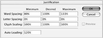
Figure 8.15: Use this dialog box to set justification options.
| Note | Justification options are applied to the entire paragraph. If you want to increase or decrease space for a few characters, use the Kerning or Tracking functions. |
For the Word Spacing, Letter Spacing, and Glyph Spacing options, Photoshop will space text in order to stay between the Minimum and Maximum values, and will try to come as close to the Desired value as possible while balancing all the settings. The values you end up with are chosen not only by the spacing options, but also by factors such as the hyphenation settings and font size.
-
Word Spacing specifies the amount of space between words when the spacebar is pressed. Values range from 0% to 1000%; at 100% no additional space is added to the default spacing of the specified font.
-
Letter Spacing determines the normal distance between letters, which includes kerning and tracking values. Values range from 0 to 500%; at 100% no additional space is added to the default spacing of the specified font.
-
Glyph Scaling scales the actual width of characters to justify them. Input a Minimum value (50%), a Desired value, and a Maximum value (200%) to fit characters into a justified line of text.
-
Auto Leading is the normal distance between baselines of text ”120% of the font size by default; enter a different value if desired.
-
Preview lets you see the result of your specification in selected text before closing the dialog box.
Hyphenating Text
Hyphenation options determine where a word breaks to be hyphenated. To activate automatic hyphenation, choose the Hyphenate check box from the Paragraph palette. To set the following hyphenation options, choose Hyphenation from the palette pull-down menu to bring up the dialog box in Figure 8.16:
-
Words Longer Than specifies the minimum length, in letters, of a word to be hyphenated.
-
After First specifies the minimum number of letters at the beginning of a word before a hyphen.
-
Before Last specifies the minimum number of letters at the end of a word after a hyphen.
-
Hyphen Limit is the number of consecutive lines that can contain hyphens.
-
Hyphenation Zone is the distance at the end of a line of unjustified text that will cause a word break.
-
Hyphenate Capitalized Words does just that. Turn off this option to be sure headlines are not hyphenated. This works only with the Single-Line Composer.
-
Preview lets you see the result of your specifications on selected paragraphs before closing the dialog box.
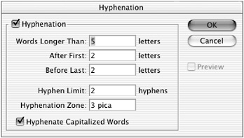
Figure 8.16: The Hyphenation dialog box
Composing Text Lines
Composing methods determine possible line breaks, based on the hyphenation and justification settings. There are two composition methods and one option to choose from:
-
The Single-Line Composer composes text one line at a time. The result is more consistent spacing within a line but less consistent spacing and hyphenation among multiple lines. This option is preferable if you want to manually compose your type.
-
The Every-Line Composer looks ahead five lines to determine the line breaks. The result is more consistent spacing and less hyphenation. The Every-Line Composer is selected by default.
-
Reset Paragraph sets the paragraph to its previously formatted state before attributes from the Paragraph palette are applied.
Working with Asian Characters
If you have the proper fonts installed, Photoshop can manage Chinese, Japanese, and Korean text. To access these options in the Character and Paragraph palettes, choose Edit (Windows) Photoshop (Macintosh) ’ Preferences ’ General ’ Show Asian Text Options.
Tsume
The majority of Asian characters are monospaced , meaning that all the characters are the same width when using horizontal text and the same height when using vertical text. You can enter a percentage in the Tsume field in the Character palette (see Figure 8.17) to specify a character width for selected text. This decreases the size of each character but increases the proportional spacing between characters.
Figure 8.17: Specify a character width in the Tsume field.
Tate-chuu-yoko
The tate-chuu-yoko system (also called kumimoji and renmoji ) flips certain nontextual items. You can improve the readability of vertical text by rotating numerals and acronyms so that they are horizontally oriented. To do this, highlight the characters that you want to rotate and choose Tate-chuu-yoko from the Character Palette pull-down menu.
Japanese Composition
Spacing for Asian characters, numbers , and line breaks that can be applied to your Asian type fonts are determined by the following options, which are based on Japanese text standards.
MOJIKUMI
Mojikumi determines the composition of Japanese text, including character spacing between punctuation, symbols, and numbers, based on composition rules set forth in the Japanese Industrial Standards (JIS #4051).
Photoshop includes several mojikumi sets from which you can choose. They are accessible from the Paragraph palette s Mojikumi pop-up list.
KINSOKU SHORI
You can choose different methods for processing line breaks. Kinsoku shori are characters that cannot begin or end a line, based on composition rules set forth in the Japanese Industrial Standards. Choose JIS Weak or JIS Maximum from the Kinsoku Shori pop-up list. Oidashi and oikomi are line-break rules as applied to kinsoku shori:
-
Oidashi is push-out line breaking, which increases the number of characters on a line by reducing the space between letters.
-
Oikomi is push-in line breaking, which decreases the number of characters on a line by increasing the space between letters.
You can choose either of these options from the Paragraph Palette pull-down menu. A check mark indicates which option is selected.
Hanging Asian Punctuation
You can specify hanging punctuation in Asian text. Using hanging punctuation (called burasagari ) forces punctuation marks to be placed outside the indent margins and evens the edges of the paragraph. Choose Burasagari from the Paragraph Palette menu. If the check box is selected, it is active.
EAN: 2147483647
Pages: 355