7.4 Displaying Message Boxes
| < Day Day Up > |
TechniqueUse the static method Show defined within the MessageBox class. This method is overloaded several times, allowing you to customize the display of the message as you see fit. The simplest message box contains a single string parameter denoting the message to display. To add a caption to the message box, insert an additional string parameter. You can control which buttons are displayed in the third parameter by using the MessageBoxButtons enumerated data type. You can use a fourth parameter to display an icon. You specify this icon using a value from the MessageBoxIcon enumerated data type. To specify the default button, use a value from the MessageBoxDefaultButton enumerated data type as the fifth parameter. Finally, you specify additional options in the sixth parameter by using the logical or operator ( ) on values within the MessageBoxOptions enumeration. Table 7.1 shows the possible values for the enumerated data types discussed in this recipe. Table 7.1. MessageBox Enumerated Data Types
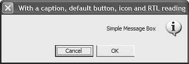
CommentsSometimes, all you need to do is display a simple message to the user or ask her a simple question. Message boxes handle this task, freeing you from having to create new forms. The MessageBox class contains a single static method, as well as the standard System.Object methods , named Show . There are 12 overloaded versions of this method corresponding to the level of customization you want to perform on the message box. In its most basic form, a message box can contain a single message and an OK button to close the message box. To show a message box with a single message, use the Show method with a single string parameter, and if you want to display a caption on the message box, create a second string parameter for that purpose: MessageBox.Show( "Simple Message Box" ); MessageBox.Show( "Simple Message Box", "With a caption" ); As mentioned earlier, you can customize the message box further by controlling the types of buttons and icons displayed, controlling which button is the default button, and specifying different message-box options. Based on the buttons that you elected to display on the message box, the value returned will be a value from the DialogResult enumerated data type. You can compare the value returned from the Show method with a value from the DialogResult type to determine the action performed by the user. The following code listing displays a message box using all the available customization options. Figure 7.2 shows the resulting message box: if( MessageBox.Show( "Simple Message Box", "With a caption, default button, icon and RTL reading", MessageBoxButtons.OKCancel, MessageBoxIcon.Information, MessageBoxDefaultButton.Button2, MessageBoxOptions.RtlReading MessageBoxOptions.RightAlign ) == DialogResult.Cancel ) { return; } Figure 7.2. The MessageBox.Show method contains several overloaded methods to customize the display of the message box. |
| < Day Day Up > |
EAN: 2147483647
Pages: 440