Section 5.4. Organization Structures
5.4. Organization StructuresOrganization structure plays an intangible yet very important role in the design of web sites. Although we interact with organization structures every day, we rarely think about them. Movies are linear in their physical structure. We experience them frame by frame from beginning to end. However, the plots themselves may be nonlinear, employing flashbacks and parallel subplots. Maps have a spatial structure. Items are placed according to physical proximity, although the most useful maps cheat, sacrificing accuracy for clarity. The structure of information defines the primary ways in which users can navigate. Major organization structures that apply to web site and intranet architectures include the hierarchy, the database-oriented model, and hypertext. Each organization structure possesses unique strengths and weaknesses. In some cases, it makes sense to use one or the other. In many cases, it makes sense to use all three in a complementary manner. 5.4.1. The Hierarchy: A Top-Down ApproachThe foundation of almost all good information architectures is a well-designed hierarchy or taxonomy.[||] In this hypertextual world of nets and webs, such a statement may seem blasphemous, but it's true. The mutually exclusive subdivisions and parentchild relationships of hierarchies are simple and familiar. We have organized information into hierarchies since the beginning of time. Family trees are hierarchical. Our division of life on earth into kingdoms, classes, and species is hierarchical. Organization charts are usually hierarchical. We divide books into chapters into sections into paragraphs into sentences into words into letters. Hierarchy is ubiquitous in our lives and informs our understanding of the world in a profound and meaningful way. Because of this pervasiveness of hierarchy, users can easily and quickly understand web sites that use hierarchical organization models. They are able to develop a mental model of the site's structure and their location within that structure. This provides context that helps users feel comfortable. Figure 5-11 shows an example of a simple hierarchical model.
Figure 5-11. A simple hierarchical model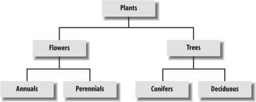 Because hierarchies provide a simple and familiar way to organize information, they are usually a good place to start the information architecture process. The top-down approach allows you to quickly get a handle on the scope of the web site without going through an extensive content-inventory process. You can begin identifying the major content areas and exploring possible organization schemes that will provide access to that content. 5.4.1.1. Designing taxonomiesWhen designing taxonomies on the Web, you should remember a few rules of thumb. First, you should be aware of, but not bound by, the idea that hierarchical categories should be mutually exclusive. Within a single organization scheme, you will need to balance the tension between exclusivity and inclusivity. Taxonomies that allow cross-listing are known as polyhierarchical. Ambiguous organization schemes in particular make it challenging to divide content into mutually exclusive categories. Do tomatoes belong in the fruit, vegetable, or berry category? In many cases, you might place the more ambiguous items into two or more categories so that users are sure to find them. However, if too many items are cross-listed, the hierarchy loses its value. This tension between exclusivity and inclusivity does not exist across different organization schemes. You would expect a listing of products organized by format to include the same items as a companion listing of products organized by topic. Topic and format are simply two different ways of looking at the same information. Or to use a technical term, they're two independent facets. See Chapter 9 for more about metadata, facets, and polyhierarchy. Second, it is important to consider the balance between breadth and depth in your taxonomy. Breadth refers to the number of options at each level of the hierarchy. Depth refers to the number of levels in the hierarchy. If a hierarchy is too narrow and deep, users have to click through an inordinate number of levels to find what they are looking for. The top of Figure 5-12 illustrates a narrow-and-deep hierarchy in which users are faced with six clicks to reach the deepest content. In the (relatively) broad-and-shallow hierarchy, users must choose from 10 categories to reach 10 content items. If a hierarchy is too broad and shallow, as shown in the bottom part of Figure 5-12, users are faced with too many options on the main menu and are unpleasantly surprised by the lack of content once they select an option. Figure 5-12. Balancing depth and breadth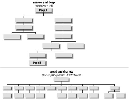 When considering breadth, you should be sensitive to people's visual scanning abilities and to the cognitive limits of the human mind. Now, we're not going to tell you to follow the infamous seven plus-or-minus two rule.[#] There is general consensus that the number of links you can safely include is constrained by users' abilities to visually scan the page rather than by their short-term memories.
Instead, we suggest that you:
Consider the National Cancer Institute's award-winning main page, shown in Figure 5-13. It's one of the government's most visited (and tested) pages on the Web, and the portal into a large information system. Presenting information hierarchically at the page level, as NCI has done, can make a major positive impact on usability. Figure 5-13. The National Cancer Institute groups items within the page There are roughly 75 links on NCI's main page, and they're organized into several key groupings:
These 75 links are subdivided into eight discrete categories, with a limited number of links per category. In contrast to breadth, when considering depth, you should be even more conservative. If users are forced to click through more than two or three levels, they may simply give up and leave your web site. At the very least, they'll become frustrated. An excellent study conducted by Microsoft Research suggests that a medium balance of breadth and depth may provide the best results.[**]
For new web sites and intranets that are expected to grow, you should lean toward a broad-and-shallow rather than a narrow-and-deep hierarchy. This allows for the addition of content without major restructuring. It is less problematic to add items to secondary levels of the hierarchy than to the main page for a couple of reasons. First, the main page serves as the most prominent and important navigation interface for users. Changes to this page can really hurt the mental model users have formed of the web site over time. Second, because of the main page's prominence and importance, companies tend to spend lots of care (and money) on its graphic design and layout. Changes to the main page can be more time consuming and expensive than changes to secondary pages. Finally, when designing organization structures, you should not become trapped by the hierarchical model. Certain content areas will invite a database or hypertext-based approach. The hierarchy is a good place to begin, but it is only one component in a cohesive organization system. 5.4.2. The Database Model: A Bottom-Up ApproachA database is defined as "a collection of data arranged for ease and speed of search and retrieval." A Rolodex provides a simple example of a flat-file database (see Figure 5-14). Each card represents an individual contact and constitutes a record. Each record contains several fields, such as name, address, and telephone number. Each field may contain data specific to that contact. The collection of records is a database. Figure 5-14. The printed card Rolodex is a simple database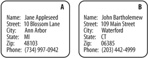 In an old-fashioned Rolodex, users are limited to searching for a particular individual by last name. In a more contemporary, computer-based contact-management system, we can also search and sort using other fields. For example, we can ask for a list of all contacts who live in Connecticut, sorted alphabetically by city. Most of the heavy-duty databases we use are built upon the relational database model. In relational database structures, data is stored within a set of relations or tables. Rows in the tables represent records, and columns represent fields. Data in different tables may be linked through a series of keys. For example, in Figure 5-15, the au_id and title_id fields within the Author_Title table act as keys linking the data stored separately in the Author and Title tables. So why are database structures important to information architects? After all, we made a fuss earlier in the book about our focus on information access rather than data retrieval. Where is this discussion heading? In a word, metadata. Metadata is the primary key that links information architecture to the design of database schema. It allows us to apply the structure and power of relational databases to the heterogeneous, unstructured environments of web sites and intranets. By tagging documents and other information objects with controlled vocabulary metadata, we enable powerful searching, browsing, filtering, and dynamic linking. (We'll discuss metadata and controlled vocabularies in more detail in Chapter 9.) Figure 5-15. A relational database schema (this example is drawn from an overview of the relational database model at the University of Texas at Austin)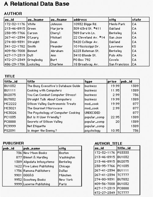 The relationships between metadata elements can become quite complex. Defining and mapping these formal relationships requires significant skill and technical understanding. For example, the entity relationship diagram (ERD) in Figure 5-16 illustrates a structured approach to defining a metadata schema. Each entity (e.g., Resource) has attributes (e.g., Name, URL). These entities and attributes become records and fields. The ERD is used to visualize and refine the data model before design and population of the database. Figure 5-16. An entity relationship diagram showing a structured approach to defining a metadata schema (courtesy of InterConnect of Ann Arbor)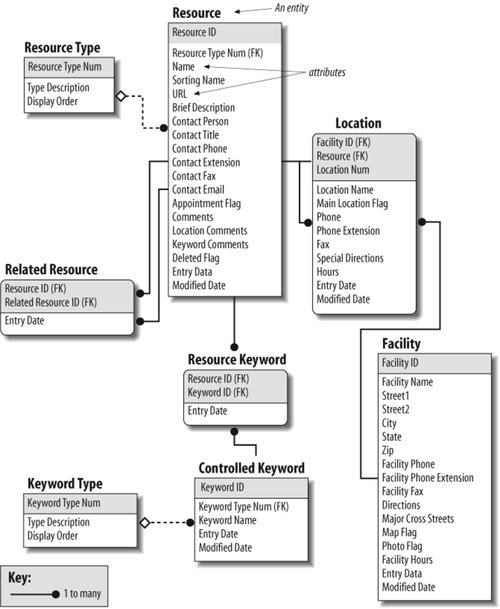 We're not suggesting that all information architects must become experts in SQL, XML schema definition, the creation of entity relationship diagrams, and the design of relational databasesthough these are all extremely valuable skills. In many cases, you'll be better off working with a professional programmer or database designer who really knows how to do this stuff. And for large web sites, you will hopefully be able to rely on Content Management System (CMS) software to manage your metadata and controlled vocabularies. Instead, information architects need to understand how metadata, controlled vocabularies, and database structures can be used to enable:
The database model is particularly useful when applied within relatively homogeneous subsites such as product catalogs and staff directories. However, enterprise controlled vocabularies can often provide a thin horizontal layer of structure across the full breadth of a site. Deeper vertical vocabularies can then be created for particular departments, subjects, or audiences. 5.4.3. HypertextHypertext is a relatively recent and highly nonlinear way of structuring information. A hypertext system involves two primary types of components: the items or chunks of information that will be linked, and the links between those chunks. These components can form hypermedia systems that connect text, data, image, video, and audio chunks. Hypertext chunks can be connected hierarchically, non-hierarchically, or both, as shown in Figure 5-17. In hypertext systems, content chunks are connected via links in a loose web of relationships. Figure 5-17. A network of hypertextual connections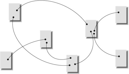 Although this organization structure provides you with great flexibility, it presents substantial potential for complexity and user confusion. Why? Because hypertext links reflect highly personal associations. As users navigate through highly hypertextual web sites, it is easy for them to get lost. It's as if they are thrown into a forest and are bouncing from tree to tree, trying to understand the lay of the land. They simply can't create a mental model of the site organization. Without context, users can quickly become overwhelmed and frustrated. In addition, hypertextual links are often personal in nature. The relationships that one person sees between content items may not be apparent to others. For these reasons, hypertext is rarely a good candidate for the primary organization structure. Rather, it can be used to complement structures based upon the hierarchical or database models. Hypertext allows for useful and creative relationships between items and areas in the hierarchy. It usually makes sense to first design the information hierarchy and then identify ways in which hypertext can complement the hierarchy. |
EAN: 2147483647
Pages: 194