Manipulating Perception and Illusion
As you spend time analyzing motion in the real world and motion in more stylized animations, you will become more aware of some of the tricks that your eyes can play on you. Animators, like magicians, know how to take advantage of people's often-unreliable perception to create illusions. By understanding how the audience's eyes and minds put visual information together to "see" things, clever performers and designers are able to convince the audience that they're seeing something that may not actually be happening.
Another interesting phenomenon that makes an animator's job a little easier is referred to as suspension of disbelief. This is something you participate in whenever you really want to believe you're seeing something — children are often the best at this. When you push doubt aside, your eyes can be very forgiving as your brain works even harder to compensate for any gaps that may spoil the illusion or the spectacle that you want to believe in.
Some visual tricks in animation have been used so consistently that people now expect them as conventions, instead of seeing them as poorly rendered versions of a real-life motion. Most people recognize that a swirling cyclone of lines, with hands and feet or other objects occasionally popping out of it, is usually a fight. The oval blur or circular scribble at the bottom of a character's legs is not a cloud, but, in fact, their feet spinning extra fast. Lines radiating from an object don't mean that it is spiky; instead, they can mean that it is shiny or hot or even smelly. (One old standby cartoon convention is a light bulb appearing over a character's head when she suddenly gets an idea.) Figure 10-1 shows a sequence by animator Richard Bazley that uses the simple but effective technique of blurred lines to simulate motion that is faster than the eye can see. This classic device can be modified to show rockets blasting off or wind rushing by or any object moving so quickly that it becomes a blur.
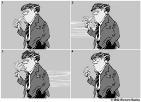
Figure 10-1: Blurred lines in an animation effectively communicate the idea of wind or fast-moving elements rushing by.
| On the CD-ROM | We have included .swf files for most of the examples we discuss in this chapter on the CD-ROM. Because the figures only show a few frames from an animation, you can get a better idea of how a motion plays by reviewing the files in the ch10 folder of the CD-ROM. We thank animators Richard Bazley, Tom Winkler, and Sandro Corsaro for kindly sharing some of their expert examples with us. |
There are innumerable examples of cartoon tricks, but the main thing to keep in mind is that you don't have to draw every detail of a movement to make it convincing. Instead, it's better to find ways that you can exaggerate the motion to make it more expressive. A well-executed illusion will save you time drawing and will also make your animation more fun to watch.
Viewpoint, Framing, and Depth
By thinking of the Flash stage area as a camera viewfinder rather than as a sketch pad, you'll be able to start crafting the various scenes in your animation to have some of the same expressive qualities as shots from a well-edited film. The ability to manipulate the viewpoint is one of the strongest storytelling devices available to filmmakers and animators alike. Audiences have come to accept (and expect) seeing things from new angles and perspectives. Screen images have evolved from the basic wide-angle, theater-audience perspective of early film to the spinning, time-defying, 360-degree Matrix views of action — don't be afraid to push your "camera" beyond the limits of normal human perception. Choosing how you will frame animation can have as much of an effect on your audience as the actual content in each scene. The traditional bird's-eye or mouse's-eye reconsideration of viewpoint is as effective in a digital design as it is in sketches or drawings. Try to use your content to inspire a framing strategy that adds both interest and meaning to your designs.
Depth is another key element to consider when composing a scene and choosing a viewpoint. Traditional animators are cautious to avoid awkward line intersections caused by overlapping elements. When the lines from two different elements bump into each other unintentionally, it can make a drawing look flat — this is known as a tangent. Tangents interrupt the illusion of depth created by scaling and layering elements in a composition. The main thing to avoid is an overly busy layout that may confuse the viewer's understanding of the picture plane. Try to keep elements that are meant to be behind or in front of other elements from looking as though they are joined or existing uncomfortably in the same space. Add a little more separation between elements to maintain visual clarity.
With careful planning, overlapping elements add depth to your designs. Notice in Figure 10-2 that overlapping the larger figure on the right with the border helps it jump into the fore-ground, whereas overlapping the smaller figure on the left makes it hard to tell which element is supposed to be in front.
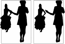
Figure 10-2: Overlapping should be planned (as shown in the example on the right) to avoid tangents that may flatten out the depth of the composition (as shown on the left).
Another common device used to add depth to a scene is to choose a viewpoint that enables you to add a natural frame or border around the image. By giving viewers a reference point for where they are located in the plane of the image, you can exaggerate the feeling of depth. In drawing or painting, windows are often used to frame a view in the distance, but in animation, you can find more original frames by choosing unique viewpoints. In a scene from Richard Bazley's animated film The Journal of Edwin Carp, he uses the view from the back of a police van to add depth to a simple composition of two characters talking. Imagine how much flatter and less interesting the scene shown in Figure 10-3 would be if the characters were not framed by the outline of the van.
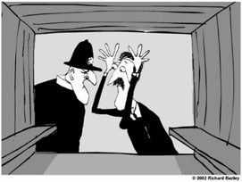
Figure 10-3: By using a clever but logical framing device, Richard Bazley has added a great deal of depth to this animated scene.
In another scene, Bazley uses the convention of a character running into the camera to enhance the feeling of panic as Edwin Carp's mother runs down a hallway. As shown in Figure 10-4, by using an extreme viewpoint, Bazley makes a simple scene more humorous and dramatic while still being very efficient with his artwork.
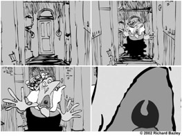
Figure 10-4: By using an extreme viewpoint, an otherwise simple Motion tween can add drama and humor to a scene.
Anticipation
Anticipation is one of the primary techniques used to give animation personality and life. If you haven't spent much time studying animation, it's easy to overlook, but animation without anticipation appears robotic. Anticipation communicates the organic tension that exists in real life motion. Visualize a baseball pitcher winding up before he throws a fastball. If the ball just flew out of his hand without his body first coiling back to gather force, you wouldn't have the visual information to understand that the force was transferred from the pitcher's body to the ball. It would appear that the ball just suddenly had the capability to fly on its own. Figure 10-5 shows a classic example of anticipation as a character gathers force before launching into a run.
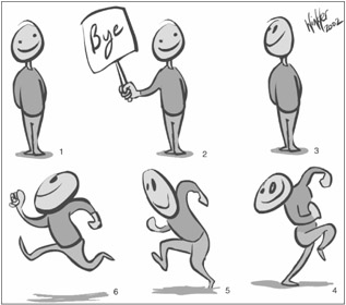
Figure 10-5: By winding up before taking off in a run, a character communicates the urgency and force behind his movement.
The principle of anticipation can be used to add extra life to almost any motion. Picture how an element would gather force before jumping into the main movement, and then add a drawing or two to exaggerate that movement in your animation. Generally, anticipation can be communicated by reversing the main motion for a few frames before and after a tween (or frame-by-frame sequence). For example, if an item is going to move to the left, have it back up a little to the right first, and then after it stops moving to the left, have it stagger back a little to the right before reaching its final resting point. If an item is going to suddenly get larger, have it shrink just a little first before popping up to the larger size, and then allow the item to grow just a little beyond the final size so that it can appear to settle into the final size at the end of the animation. These inverted motions at the beginning and ending of an animated sequence are also referred to as bounces, because they can be compared to the motion of a ball bouncing. Depending on the effect you're trying to achieve, bounces can be very small and subtle or extremely exaggerated. Figure 10-6 illustrates how a small bounce can be added to give anticipation and follow-through to an animated head turn. This same kind of bounce works equally well on eye blinks and on almost any other small movement that needs a little extra life.
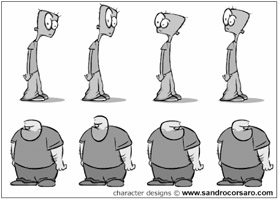
Figure 10-6: Subtle bounces add anticipation and follow-through to head turns and other movements.
Although you may not at first be conscious of these extra movements when you watch a cartoon, it is one of the conventions that an audience associates with polished, professional animation. If you start to watch carefully for anticipation and follow-through motions, you'll see them on nearly every movement in well-crafted animations.
Secondary Motion
Of course, some items don't need to bounce like a ball, but instead, should flap or float as they move. Though it's helpful to keep the pattern of a bounce in mind, the modified patterns that you apply to items to visually show the forces of acceleration or gravity in motion is called overlapping action. A single object or character can have multiple overlapping actions — overlapping action added to smaller details of an item are also called secondary motion. After you've planned the basic motion pattern of your main element, consider how you can add life and detail to your animation with overlapping action and secondary motion.
Figure 10-7 shows an example of an animation with overlapping action added to a character's belly as he runs. Secondary motion has been added by also animating the character's hat with overlapping action. The combination of these smaller motion patterns with the pattern of the basic run cycle makes the animation dynamic and gives the character personality.
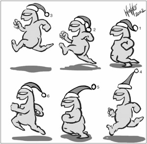
Figure 10-7: Overlapping action and secondary motion add life and personality to animation.
| Web Resource | Expert animator Richard Bazley provided suggestions for efficient and engaging animation in a tutorial he contributed to the Macromedia Flash MX 2004 Bible (Wiley, 2004). This tutorial is archived online for readers who wish to learn more about specialized animation techniques. Go to www.flashsupport.com/archive. One of the things you will notice about Bazley's work is that he often adds frame-by-frame secondary motion to make simple tweened animation more dynamic and lifelike. |
EAN: 2147483647
Pages: 395