Designing and Aligning Elements
After you've drawn some lines or shapes, you'll want to organize them in your layout. Flash provides some useful tools to help with moving or modifying elements that are familiar if you've worked in other graphics programs. Aside from using the Flash Grid and manually placed Guides with various snap settings to control your layout, you can quickly access the Align panel or the Info panel to dynamically change the placement of elements on the Stage. The Transform panel is the most accurate way to modify the size, aspect ratio, rotation, and even the vertical or horizontal "slant" of an element.
The precise alignment possible with panels and snapping controls is especially helpful if you're working with detailed artwork or multiple shapes that need to be arranged in exact relation to each other.
Simplifying Snapping Settings
There are five independent snapping settings in Flash. Snapping is a feature that gives you guidance when moving elements on the Stage and helps to align elements accurately in relation to each other, to the drawing grid, to guides, or to whole pixel axis points. The five different snapping controls can be turned on and off in the View ð Snapping submenu or in the new Edit Snapping dialog box (shown in Figure 5-42), launched by choosing View ð Snapping ð Edit Snapping (Ctrl+/ or z+/).
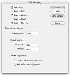
Figure 5-42: You can control Snapping settings in the new Edit Snapping dialog box.
You can tell that an item is snapping by the appearance of dotted guide lines, as shown in the Snap Align example (see Figure 5-43), or by the appearance of a small circle beside the Selection tool arrow cursor, as shown in the Snap to Object and Snap to Grid examples (see Figure 5-44 and Figure 5-45). For best control of snapping position, click and drag from the center point or from an outside edge of an element.
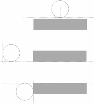
Figure 5-43: Snap Align guides give visual feedback for various alignment settings.
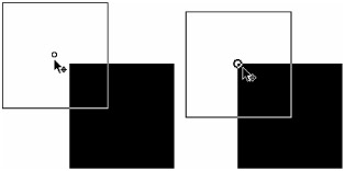
Figure 5-44: Snap to Objects indicated by a change in the size of the center point (or corner point) "o" icon as an item is moved to overlap with another item
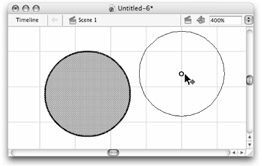
Figure 5-45: The snap icon as it appears when an element is dragged onto a grid line with Snap to Grid turned on (snapping works regardless of whether the grid is visible or not)
The five main snapping modes are adjusted and applied as follows:
Snap Align
This feature gives you relative visual alignment guides as you move elements on the Stage. You'll either love or hate this option because it's the most "interactive" of all the snapping settings. The controls for Snap Align are in the Advanced settings of the Edit Snapping dialog box (shown in Figure 5-42). By default, Snap Align is set to display visual guides to alert you when an element is within 18 pixels of the Movie border (aka the Stage edge), or within 0 pixels of another element in your layout.
As you move an element around on the Stage you will see dotted lines (see Figure 5-43) that alert you when the edge of the element is exactly 18 pixels from the edge of the Stage, or 0 pixels from the next closest fixed element. The dotted guide lets you know when the edges of the two elements are touching (or perfectly aligned), either vertically or horizontally. Modify the Movie border settings to change the alert or alignment distance between elements and the edge of the Stage. Modify the Horizontal or Vertical Snap tolerance settings to change the alert distance between elements. If you also want to see guides when elements are aligned to the center point of other elements, select the Horizontal or Vertical Center alignment check boxes.
| Tip | If you change the Horizontal or Vertical Snap Align settings to show a dotted line when an item is a specific distance from another item (such as 10 pixels — this was the default setting in Flash MX 2004), you will still see the dotted line show up when the items are touching or within 0 pixels of each other. The fixed-distance Snap Align cue can be very helpful if you are trying to arrange items but you need them to be more than 0 pixels apart. |
Snap to Objects
The Snap to Objects setting is a toggle that causes items being drawn or moved onscreen to snap to or align with other items on the Stage. Click the magnet icon in the Tools panel to turn snapping on or off (Shift+Ctrl+/ or Shift+z+/), or choose View ð Snapping ð Snap to Objects (a check mark is displayed next to the command if it's on). To control the tolerance of the magnet or the "stickiness" of the snap, use the Connect Lines setting found in Edit ð Preferences ð Drawing (or in OS X, Flash ð Preferences ð Drawing). By default, the Connect Lines tolerance is set at Normal. To make the magnet stronger, change the tolerance to Can be distant; to make it less strong, use Must be close. The Connect Lines control will help you to connect lines cleanly when drawing shapes or outlines.
As shown in Figure 5-44, Object snapping is indicated by the "o" icon near the center point as an item is moved from its original position (left). When the item is dragged close enough to another item to snap to it, the "o" icon gets slightly larger, which indicates to you to release the mouse (right). This same visual cue will work if you drag an item by a corner point rather than from a center point. Ovals can be aligned to the center point or to any point along their outer edge.
Snap to Grid
snap to Grid (Ctrl+Shift+' [apostrophe] or z+Shift+' [apostrophe]) is an option available under View ð Snapping ð Snap to Grid, which will help to align elements to guides or to the background grid. If Snap to Grid is turned on, elements show the snap icon by the Arrow cursor when you drag them close to a line in your grid, whether the grid is visible or not.
To control the tolerance of this snapping feature, use the settings found under View ð Grid ð Edit Grid (Ctrl+Alt+G or z+Option+G). The Grid Settings dialog box also includes check boxes for Snap to Grid and View Grid — these just give you another way to turn these tools on or off. Adjust the default horizontal and vertical spacing of the grid lines by entering new pixel values in the text fields. The first three settings in the Snap Accuracy menu are the same as those for Snap to Object, but there is an additional setting, Always Snap, which constrains elements to the grid no matter where you drag them. Figure 5-45 shows the default 18-pixel gray grid as it displays when it's made visible (View ð Grid ð Show Grid) with the Stage view zoom at 400 percent.
Snap to Guides
As we described in the previous chapter, guides are vertical or horizontal visual alignment tools that can be dragged onto the Pasteboard or Stage when Rulers are visible: Choose View ð Rulers (Ctrl+Alt+Shift+R or z+Option+Shift+R). If Snap to Grid is turned on when you drag guides out, they will be constrained to the grid; otherwise you will be able to place guides anywhere. After guides are set, they will be visible even if you turn Rulers off; to toggle guide visibility use View ð Guides ð Show Guides (Ctrl+; [semicolon] or z+; [semicolon]). As shown in Figure 5-46, Snap to Guides enables you to align an element to a guide, even if it is not aligned with the grid.
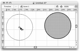
Figure 5-46: The snap icon as it appears when an element is dragged onto a guide with Snap to Guides turned on
| Note | Snap to Guides is independent of Snap to Grid, but guides can be placed only outside the grid when Snap to Grid is turned off. |
| Tip | Rulers have to be visible to drag a guide onto the Stage, but after guides are placed, rulers can be turned off and guides will still be visible. |
Snap to Pixels
Snap to Pixels is the only "global" setting that causes all elements to align with a one-pixel grid that is only visible when the View scale is set to 400 percent or greater. This setting does not necessarily help you to align elements with each other, but it does help to keep elements from being placed "between pixels" by constraining movement of elements on the X and Y axes to whole pixels, rather than allowing decimals. There is no shortcut key for turning Snap to Pixels on, but you can always toggle it on and off from the View menu by checking or unchecking View ð Snapping ð Snap to Pixel. Figure 5-47 shows how the pixel grid displays when the View scale is at 400 percent. Items are constrained to whole pixel axis points if they are dragged from the center or from an outside edge.
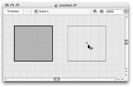
Figure 5-47: The pixel grid visible when View scale is at 400 percent or higher with Snap to Pixels turned on
| Caution | If an item is positioned between pixels — for example if the X, Y position is 125.5, 200.5 — the Snap to Pixel feature will not correct the position to a whole pixel value. Snap to Pixels only constrains the movement of items to whole pixel values. Thus, the item example given here could only be dragged to a new location by moving in whole pixel values; so it might end up at a new location such as 130.5, 225.5. If you want to keep items aligned to whole pixel values, use the input fields in the Property inspector to manually enter a starting location with whole pixel X, Y values — then use the Snap to Pixel option to keep items aligned with the one pixel grid. |
| Tip | When you are working with an oval or other nonsquare polygon, you will notice that the X, Y values in the Property inspector may still show decimal pixel values even when Snap to Pixels is turned on. If you use the Info panel to change the shape's registration point from the default top-left setting to the center (click the center square in the Registration grid), you will have more success positioning and tracking the shape with whole pixel values. |
Design Panels
When you are drawing in Flash, the design panels — Align, Info, and Transform — can be your best friends. Use the Align panel to align, regularize (match the sizes of), or distribute several items on Stage, either relative to each other or to the Stage area. Use the Info panel to modify the coordinates and dimensions of an item. Or use the Transform panel to scale, rotate, and skew an item.
In Flash 8, the Align panel (Ctrl+K or z+K), the Info panel (Ctrl+I or z+I), and the Transform panel (Ctrl+T or z+T) are grouped into a tabbed panel by default that will launch when you select any of the individual panels from the Window menu. It is handy to have these panels in a tabbed group, but if you prefer to work with them as single floating panels, use the Group…with ð New panel group command to separate the panels.
The Align Panel
The Align panel (Ctrl+K or z+K), shown in Figure 5-48, is one of many features for which you'll be grateful every time you use it. It enables you, with pixel-perfect precision, to align or distribute items relative to each other or to the Stage.
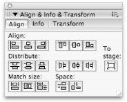
Figure 5-48: Use the Align panel to both size and arrange items with ease.
The Align panel has five controls. The icons on the buttons show visually how selected items can be arranged:
-
To stage: On the far right, you will notice a To stage button. When this button is selected, all adjustments are made in relation to the full Stage. To stage is actually a toggle you can turn on or off at any time — it will retain the last chosen state even if the panel is closed and reopened.
-
Align: There are six buttons in this first control. The first group of three buttons is for horizontal alignment, and the second group of three is for vertical alignment. These buttons align two or more items (or one or more items with the Stage) horizontally (top, middle, bottom) or vertically (left, middle, right).
-
Distribute: This control also has six buttons: three for horizontal distribution and three for vertical distribution. These buttons are most useful when you have three or more items that you want to space evenly (such as a row of menu items). These buttons distribute items equally, again vertically or horizontally. The different options enable you to distribute from edge to edge, or from item centers.
-
Match size: This control enables you to force two or more items of different sizes to become equal in size, and match items horizontally, vertically, or both.
-
Space: This option enables you to space items evenly, again, vertically or horizontally. You may wonder how this differs from Distribute. Both are similar in concept, and if your items are all the same size, they will have the same effect. The difference becomes more apparent when the items are of different sizes:
-
Distribute evenly distributes the items according to a common reference (top, center, or bottom). For example, if one item is larger than the others, it may be separated from the other items by less space, but the distance between its top edge and the next item's top edge will be consistent with all the selected items.
-
Space ensures that the spacing between items is the same; for example, each item might have exactly 36 pixels between it and the next.
-
To align an item to the exact center of the Stage, do the following:
-
Click to select the item that you want to center.
-
Click the To Stage toggle in the Align panel.
-
Click the Align horizontal center button.
-
Click the Align vertical center button.
The Info Panel
Use the Info panel (Ctrl+I or z+I), shown in Figure 5-49, to give precise coordinates and dimensions to your items. Type the values in the fields provided, and by default your item will be transformed relative to its top-left corner.
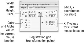
Figure 5-49: Use the Info panel options to change the location and appearance of an item.
| Caution | The registration point set in the Registration grid is actually a global setting that "sticks" even after you close the panel and change tools. Once you change the registration point from top-left to center, any new shapes or symbols that you create will automatically have a center registration point. In most cases, it is best to stick with the default top-left registration point because this is the standard for items that are loaded or positioned with ActionScript. Changing the registration point on one item back to top-left will not have any effect on other items that were created with a center registration point. |
The Info panel has these controls:
-
Width: Use this numeric entry field to alter the width of a selected item.
-
Height: Use this numeric entry field to alter the height of a selected item.
Tip Units for both Width and Height are measured in the units (pixels, inches, points, and so on) set in the Ruler Units option of the Document Properties dialog box found under Modify ð Document (Ctrl+J or z+J). Note, however, that upon changing the unit of measurement, the item must be deselected and then reselected in order for these readouts to refresh and display in the current units.
-
Registration grid: The Registration grid is located just to the left of the numeric entry fields that are used for adjusting the X and Y location of any selected item. This grid consists of nine small squares. Together, these squares represent an invisible bounding box that encloses the selected item. Every shape created in Flash, even circles, resides within an imaginary rectangular bounding box that includes the extremities of the shape. The Registration grid enables you to position the selected item relative to either the upper-left corner or the center of its bounding box. Click either square to define which origin point to use for position or size adjustments.
Note The X (horizontal) and Y (vertical) coordinates are measured from the upper-left corner of the Flash Stage, which is the origin with coordinates 0,0.
-
X: Use this numeric entry field to either read the X coordinate of the item or to reposition the item numerically, relative to the center point on the X (or horizontal) axis.
-
Y: Use this numeric entry field to either read the Y coordinate of the item or to reposition the item numerically, relative to the center point on the Y (or vertical) axis.
-
RGBA: This sector of the Info panel gives the Red, Green, Blue, and Alpha values for graphic items and groups at the point immediately beneath the cursor. Values for symbols, the background, or interface elements do not register.
-
+ X: / + Y: This sector of the Info panel gives the X and Y coordinates for the point immediately beneath the cursor — including offstage or Pasteboard values. A negative X value is to the left of the Stage, whereas a negative Y is located above the Stage.
To scale or reposition an item, select the item and then open the Info panel with shortcut keys or by choosing Window ð Info:
-
Choose to scale or reposition the item relative to either the center or the upper-left corner. (The selected square turns black to indicate that it is selected.)
-
To work relative to the center, select the center square of the Registration grid.
-
To scale relative to the upper-left corner, click the top-left square of the Registration grid.
-
-
To scale the item numerically, enter new values in the Width and Height fields, and then click elsewhere or press Enter to apply the change.
-
To reposition the item numerically, enter new values in the X and Y fields (located in the upper half of the panel), then either press Enter or click outside the panel to apply the change.
The Transform Panel
The Transform panel (Ctrl+T or z+T) gives you precise control over scaling, rotating, and skewing an item. With this panel, instead of making adjustments "by eye" — that may be imprecise — you enter numeric values in the appropriate fields and apply them directly to the selected item. As shown in Figure 5-50, the value fields in the Transform panel make it easy to modify the size and position of an element. However, once transformations are applied to an ungrouped shape or line, these numbers reset when the shape is deselected.
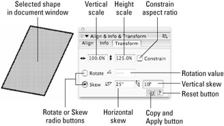
Figure 5-50: Use the Transform panel to scale, rotate, and skew items.
| Tip | If you're using the Property inspector to resize an item by pixel values, you'll appreciate the constrain option. When an item is selected on the Stage, a small lock icon appears beside the Width and Height fields in the Property inspector. Click the lock to preserve the aspect ratio of an element as you enter a new value for width or height. |
Some other powerful transform options are available from the Tools panel and from the Transform submenu of the Modify menu. We explain these more-complex editing tools in Chapter 9, "Modifying Graphics." However, the best place to start with transform options is the Transform panel, and these options are applied as follows:
-
Scale: Use this to size the selected item by percentage. Enter a new number in the Scale field and press the Enter key. The shape scales to the specified percentage of its original size. To constrain the shape to its current proportions, click the Constrain check box. After a line or shape is deselected, the values in the Transform panel reset. The quickest way to get back to the original settings is to immediately use Edit ð Undo (Ctrl+Z or z+Z) until it is reset. You can also get back to the original size mathematically by applying a new percentage that compensates for the changes you made before deselecting the item.
Tip When you are using the Transform panel with groups and symbol instances, you can reference or reset the original settings, even after the item has been deselected. We explain making and using symbols in Chapter 6, "Symbols, Instances, and the Library."
-
Rotate: Click the radio button and then specify a rotation for the selected item by entering a number in the Rotate field. Press the Return or Enter key to apply the change to the selected item. The item will be rotated clockwise around its center point. To rotate an item counterclockwise, enter a negative number in the Rotate field.
-
Skew: Items can be skewed (slanted in the horizontal or vertical direction) by selecting the Skew radio button, and then entering values for the horizontal and vertical angles. Press the Return or Enter key and the item will be skewed to the values entered.
-
Copy and Apply transformation: Press this button and Flash makes a copy of the selected item (including shapes and lines) with all transform settings that have been applied to it. The duplicate is pasted in the same location as the original — select it with the Selection tool and move it to a new position to separate it from the original. Your original is left unchanged.
-
Reset: This button, at the bottom-right corner of the panel, removes all transformation settings for a selected object. You can always use the Reset button for instances, groups, or type blocks to get back to 100-percent scale with no rotation or skew. However, after a shape or line is deselected, this button does not work. For shapes, this is really more like an "Undo All" button than a Reset button.
The Edit Menu
We discuss many of the commands in the Edit menu in Chapter 4, "Interface Fundamentals," but some of these commands can be helpful for creating or modifying graphics and are worth mentioning again here:
-
Undo: When you make a mistake, before you do anything else, apply this command to get back to where you started. The default number for combined Undos that Flash remembers is 100; the maximum number is 300. Because Undo "memory" occupies system memory, you can set this level much lower if you find you don't rely on it. This setting is controlled in the General tab of the Flash Preferences dialog box.
New Feature In Flash 8, it is now possible to switch the Undo behavior from Document-level (Flash MX 2004-style) to Object-level (legacy Flash-style). Document-level Undo stores a combined history stack for all items in the current document, while Object-level Undo stores individual history stacks for each item stored in the Library. The benefit of using Document-level Undo (the default setting for Flash 8) is that more commands or editing steps can be undone. For a complete list of steps that cannot be undone if you opt to use Object-style Undo (including most Create and Delete commands in the Library panel), refer to the section on Using the Undo, Redo, and Repeat menu commands in the Using Flash booklet in the Help panel. The Undo behavior and the number of undo steps that you wish to buffer are controlled in the General section of the Preferences dialog box: File ð Preferences or Flash ð Preferences.
Note Undo does not transcend Focus: You cannot Undo work on the Stage from the ActionScript panel — you must first return focus to the Stage to exercise Undo.
-
Redo: The anti-Undo, this redoes what you just undid.
-
Repeat: If you have not just used Undo, you will see this as an option that enables you to "double" whatever edit you may have made, or to apply it to another item.
Cross-Reference The History panel provides a flexible, nonlinear option for backtracking or repeating steps as you create and edit graphics. You can also use the History panel in conjunction with the Commands menu to track and save authoring steps that you can archive and reuse. We discuss these features in Chapter 9, "Modifying Graphics."
-
Cut: This removes any selected item(s) from the Document window and places it on the Clipboard.
-
Copy: This copies any selected item(s) and places it on the Clipboard, without removing it from the Document window.
-
Paste in Center: Disabled if nothing has been copied or cut, this command pastes items from the Clipboard into the currently active frame on the currently active layer. You can also paste text into panel value fields.
Note The Paste in Center command places items in the center of the currently visible area in the Document window, not in the center of the Stage. Double-click the Hand icon in the Tools panel to center the Stage in the Document window before using Paste in Center if you want the pasted item to be placed in the center of the Stage.
-
Paste in Place: This is like Paste, except that it pastes the object precisely in the same area of the Stage (or Work area) from which it was copied (but it can be on a new Layer or Keyframe).
-
Paste Special (PC only): This is a Windows-only menu that enables some specialized copying of content into Flash. This is not recommended when working in a cross-platform environment because it is platform specific and limits how the document can be edited on other platforms.
-
Clear: This removes a selected item(s) from the Stage without copying it to the Clipboard.
-
Duplicate: This command duplicates a selected item or items, without burdening the Clipboard. The duplicated item appears adjacent to the original.
-
Select All: This selects all items in the Document window in the currently active keyframe of the project.
-
Deselect All: This deselects all currently selected items.
-
Find and Replace: This command launches a powerful new option that enables you to specify elements in a current Flash document or Scene and modify them with settings you choose in the Find and Replace dialog box. For more detailed information on using the Find and Replace command, refer to Chapter 9, "Modifying Graphics."
-
Find Next: This is a shortcut that searches through a Flash document or Scene and finds the next item that matches the criteria set in the Find and Replace dialog box.
-
Timeline: This submenu provides access to the most common commands used to modify frames in the Timeline: Cut Frames, Copy Frames, Paste Frames, Clear Frames, Remove Frames, and Select All Frames. These commands are also available in the contextual menu on any frame in the Timeline.
-
Edit Symbols: Select an instance of a symbol and choose this command to modify the content of the symbol in Edit mode, an edit space that is independent from the Stage. For more about symbols and editing symbols, refer to Chapter 6, "Symbols, Instances, and the Library."
-
Edit Selected: This command is only enabled if a group or symbol is selected on the Stage. It makes a selected group or symbol available in Edit mode. This same kind of edit space is invoked for symbols by choosing Edit Symbol.
-
Edit in Place: This command opens a selected group or symbol in a separate tab of the Document window (shown in the location label area of the Document window), and enables you to edit this group or symbol while still seeing the other elements on the Stage, dimmed in the background for reference.
Tip Double-clicking a group or symbol on the Stage with the Selection tool has the same result as choosing the Edit in Place command.
-
Edit All: From Edit mode, Edit All is used to go back to editing the main Flash scene. You can also do this by clicking on the Scene location label of the Document window.
EAN: 2147483647
Pages: 395