Adding Controls and Components
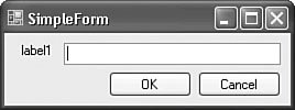
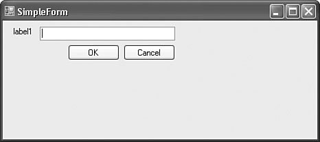
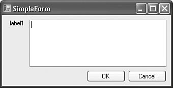
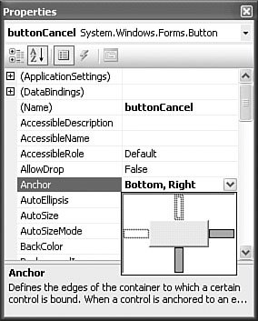
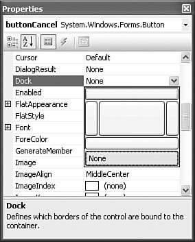
| When you are building a form-based application, the user interface design really involves three separate tools within Visual Studio: the Forms Designer tool, which provides the canvas for the form; the Toolbox, which contains the controls to be placed onto the canvas; and the property browser, which is used to affect the form and its child controls, appearance, and behavior. This triad of IDE tools provides the key to rapid form construction with Visual Studio, especially as it relates to building a form's content. The term control technically refers to any .NET object that implements the Control class. In practice, we use the term to refer to the visual controls hosted by a form. This is in contrast to a component, which has many of the same characteristics of a control but doesn't expose a visual interface. A Button is an example of a control; a Timer is an example of a component. Controls and components alike live in the Toolbox window (see additional coverage of the Toolbox in Chapter 6). Adding either a control or component to a form is as easy as dragging its likeness from the Toolbox and dropping it onto the form's surface. After you place a control on a form, the Windows Forms Designer will paint the control onto the form to give you a WYSIWYG view of how the form will look at runtime. As we noted in Chapter 6, components are handled in a slightly different fashion. The Forms Designer has a special region called the component tray; any components placed onto the form are represented here. This allows you to interact in a point-and-click fashion with the component as you would with a control but doesn't place a representation onto the form itself because a component has no visual aspect to it. Figure 14.5 highlights the component tray area of the Windows Forms Designer. Figure 14.5. The component tray. Tip The Toolbox is customizable: You can add or remove controls from the Toolbox within any of the Toolbox tabs. Right-click anywhere in the interior of the Toolbox window and select Choose Items. This launches the Choose Toolbox Items dialog box; from here, you can select or deselect the Toolbox control population. If a control doesn't show up in the .NET Framework Components tab or the COM Components tab of the dialog box, you can browse to the control's assembly and add it directly. Control Layout and PositioningWhen a few controls are on a form, the Windows Forms Designer has a few functions designed to automate common layout tasks, such as aligning a group of controls vertically to one another. We again refer you to Chapter 6 to see how you can leverage these productivity tools. But these layout functions, although nice from a design perspective, do nothing for you at runtime. As previously noted, controlling runtime behavior within its parent form is an important area that needs attention if you are to implement your form according to your design intent. That is, you not only want controls to look a certain way, but you also want them to act a certain way when the form is resized. The simplest way to underscore the issue presented during a form resize is to look at a few figures. Figure 14.6 shows the simplest of forms: a label, a text box, and OK and Cancel buttons. The controls on the form have been carefully placed to maintain equal spacing, the controls are nicely aligned in the vertical and horizontal planes, and in short, this form looks just like the developer intended it to look. Figure 14.6. Controls aligned on a form. But then a user becomes involved. Figure 14.7 shows the results of resizing the form horizontally and vertically. Figure 14.7. Form resize effects on design. This appearance is clearly not what was intended; the nice clean design of the form has failed to keep up with the form's size. Perhaps the user resized the form in an attempt to get more room to type in the text box. Or perhaps the user tiled this application's window with other applications, causing its size to change. Whatever the reason, it is clear that further intervention by the developer is needed to keep the design "valid," regardless of the size of the form. Just by viewing the before and after figures, you can decide on a strategy and answer the question "What should happen when a user resizes the form?" Figure 14.8 is a snapshot of the ideal; the text box has "kept pace" with the resize by horizontally extending or shrinking its width. The command buttons have kept their alignment with one another and with the text box, but they have not altered their overall dimensions. Plus, the label has stayed in its original location. Figure 14.8. Reacting to a form resize. Every form object has a resize event that fires whenever the form boundary size changes (most commonly as the result of a user dragging the form's border to increase or decrease the size of the form). Because every control has positioning properties such as Top, Left, Height, and Width, you could implement a brute-force approach to achieving the form in Figure 14.8. By writing several lines of code for each control, you can manually move or redimension the controls in response to the form size and the position of the other controls. But this approach is tedious at best and results in brittle code that has to be touched every time the layout and placement of controls are tweaked. Thankfully, the Visual Studio Windows Forms Designer, in conjunction with some standard control properties, allows you to take all of the common resize optimizations into account during the layout of the form. By anchoring and docking your controls, you can dictate their position relative to one another and to their position within the borders of the form. AnchoringAnchoring, as its name implies, is the concept of forcing a control's left, top, right, or bottom border to maintain a static, anchored position within the borders of the form. For instance, anchoring a label control to the top and left of a form (this is the default) will cause the label to maintain its exact position regardless of how the form is resized. Each control's Anchor property can be set to any combination of Top, Left, Bottom, and Right. The control's property browser provides a convenient property editor widget, shown in Figure 14.9, which graphically indicates the sides of the control that are anchored. Figure 14.9. Setting the Anchor property. Anchoring opposite sides of a control has an interesting effect. Because each side must maintain its position relative to the sides of the form, the control itself will stretch either vertically or horizontally depending on whether the Top and Bottom or Right and Left anchors have been set. In fact, this is the exact behavior you want with the text box: You want its width and height to adjust whenever the form is resized. By anchoring all sides of the control, you get the behavior shown in Figure 14.8; the control has automatically adjusted its dimensions with no code required from the developer. Note By default, controls are typically anchored on their top and left sides. You may be wondering what happens if no anchors are specified at all. In that case, the control will maintain its exact position regardless of form resize actions. This is, in effect, the same behavior as top and left anchors would have because forms have their top, leftmost points as their "origin." Anchoring also solves the positioning problem with the command buttons. If you change their Anchor property to Bottom, Right, they will anchor themselves to the bottom right of the form, which is consistent with their recommended placement on a form. Because you aren't anchoring opposing sides of the control, you aren't forcing the buttons to resize; they are merely repositioned to keep station with the right and bottom edge of the form. Contrast this with the anchoring performed for the text box: Because you anchored all sides, you are not only keeping a uniform border between the edge of the text box and the form, but you are also causing the text box to stretch itself in both dimensions. DockingFor the simple form in Figure 14.8, you can implement the majority of your layout logic using the Anchor property. But if you refer to the overall plan for the CSR screen (see Figure 14.1), you can see that you have some positioning needs that would be cumbersome to solve using anchors. For instance, the data entry region of the form should automatically expand vertically and horizontally to fill any space left between the list of requests, the status bar, and the command bar. This is where the concept of docking comes to the rescue. Docking is used to either stick a control to a neighbor control's edge or the form's edge, or it is used to force a control to fill all of the available space not taken by other controls. As with the Anchor property, the property browser provides a graphical tool to set a control's Dock property (shown in Figure 14.10). Figure 14.10. Setting the Dock property. Control Auto ScalingThe Windows Forms engine supports the capability to dynamically adjust a control's dimensions in order to preserve its original design proportions. This capability is useful if the form or control is displayed at runtime on a system with different display characteristics (resolution, DPI, and so on) than the system the form or control was designed on. A simple example of this occurs when an application that uses a reasonable 9-point font during design becomes almost unusable when displayed on a system whose default font size is larger. Because many UI elements auto-adjust based on the font of their displayed text (such as window title bars and menus), this can impact nearly every visual aspect of a form application. Controls in .NET 2.0 support two properties that enable them to counter these issues automatically without a lot of developer intervention: AutoScaleMode and AutoScaleDimensions. AutoScaleMode specifies an enumeration value indicating what the scaling process should use as its base reference (DPI or resolution). Table 14.2 shows the possible AutoScaleMode values.
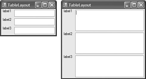
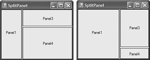
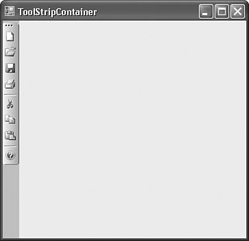
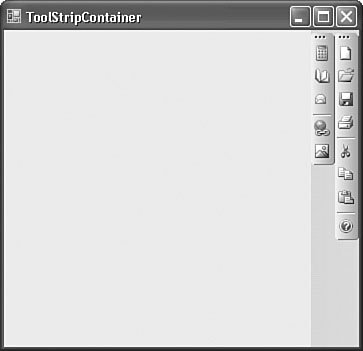
AutoScaleDimensions sets the dimensions (via a SizeF structure) that the control was originally designed to. This could refer to a font size or the DPI. Using ContainersContainers are .NET controls designed to hold other controls. You can use containers in conjunction with the Anchor and Dock control properties to create intricate design scenarios. Although there are various container controls, the ones most applicable to control layout are the FlowLayoutPanel, TableLayoutPanel, and SplitContainer classes. Both the TableLayoutPanel and FlowLayoutPanel classes derive from the more generic Panel class. The Panel class provides very high level capabilities for grouping controls. This is beneficial from a placement perspective because you can aggregate a bunch of controls into one group by positioning them within a panel. This way, you can act on them as a group; for instance, disabling a panel control will disable all of its child controls. The TableLayoutPanel and FlowLayoutPanel build on that functionality by also providing the capability to dynamically affect the positioning of their child controls. The TableLayoutPanelConsider a series of labels and text boxes for entering address information. They are typically arrayed in a column-and-row fashion. The TableLayoutPanel is ideal for implementing this behavior because it automatically forces the column and row assignment that you make for each of the controls. Figure 14.11 shows a series of label and text box controls embedded within a TableLayoutPanel. Notice that resizing the form (and thus the panel, which is docked to fill the form interior) causes the panel's controls to auto-adjust their alignment. Figure 14.11. The TableLayoutPanel. If an item within one of the cells extends beyond the cell's boundaries, it will automatically overflow within the cell. This provides you with the same layout capabilities that HTML provides for web browserbased interfaces. Note When a control is added to a TableLayoutPanel, it is decorated with five additional properties: Cell, Column, Row, ColumnSpan, and RowSpan. These properties can be used to change the control's row/column position within the layout panel at runtime. The ColumnSpan and RowSpan properties are used the same way as their namesakes in the HTML world. In .NET, controls that imbue other controls with additional properties are called extender providers. The FlowLayoutPanelThe FlowLayoutPanel has a simpler layout algorithm: Items are ordered either vertically or horizontally by wrapping control sets across rows or columns as needed. The two screens shown in Figure 14.12 illustrate the effect of resizing a flow layout panel containing a series of radio buttons. Figure 14.12. The FlowLayoutPanel.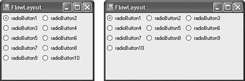 The SplitContainerThe SplitContainer control is a much enhanced alternative to the original Splitter control included with .NET 1.0/1.1/Visual Studio 2003. This control represents the marriage of two panels and a splitter; the splitter separates the two panels either horizontally or vertically and allows a user to manually adjust the space (in the horizontal or vertical) that each panel consumes within the overall container. Figure 14.13 shows the versatility of this control; two split containers, one embedded within a panel hosted by the other, are used to provide both vertical and horizontal resizing capabilities for the panels on a form (panel 2 isn't visible because it is the panel functioning as the container for the split container with panels 3 and 4). By dragging the split line to the right of panel 1, you can increase or decrease the horizontal real estate it occupies on the form. The same is true for the split line between panel 3 and panel 4: Dragging this will adjust the ratio of space that both panels vertically occupy in relation to one another. Figure 14.13. Resizing with the SplitContainer: a horizontal SplitContainer embedded in a vertical SplitContainer. The ToolStripContainerMany applications support the ability to drag and dock a toolbar, menu, and the like to any side of a form: top, bottom, left, or right. Visual Studio itself is an example of just such an application. By grabbing and dragging a Visual Studio toolbar, you can reposition it, for example, to the left side of the form. The ToolStripContainer control enables this functionality in your applications as well; it is a combination of four panels, each positioned on the four different edges of the containing form. These panels are used to host ToolStrip controls (more on these in a bit) andat runtimeallow users to move tool strips within and between the four panels. Note Although the ToolStripContainer provides a convenient vehicle for snapping tool strips to the sides of a form, there is unfortunately no built-in support for "floating" tool strips. The design experience is simple: You can shuffle controls around to the four different panels depending on where you want them positioned within the parent form. Figure 14.14 shows a ToolStripContainer in design mode. The smart tag offers up control over the visibility of the top, left, right, and bottom panels. Each panel is hidden by default. You can click on any of the arrows on the sides of the container to expand the corresponding panel and give you room to place tool strips within the panel. Figure 14.14. ToolStripContainer in design mode.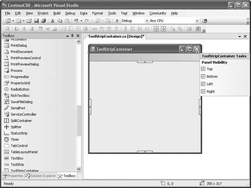 Although it is convenient to be able to place items in a ToolStripContainer within the designer, the real benefit that you get from the control is the automatic support for dragging and dropping between panels at runtime. This means that, without writing a single line of layout or positioning code, you have enabled functionality that allows users to place their menus or toolbars wherever they want within the form. Figure 14.15 shows a toolbar, hosted in a ToolStripContainer, which has been redocked from the top panel to the left panel at runtime. Figure 14.15. A toolbar repositioned within a ToolStripContainer. Multiple ToolStrip controls can also be stacked within any of the given panels in the ToolStripContainer. Figure 14.16 shows multiple command bars stacked within the rightmost panel. As noted later in the chapter, a control's z-order dictates its place within the stack. Figure 14.16. Multiple toolbars stacked within the same panel. Note The sharing of spacevertically or horizontallywithin a tool strip container is sometimes referred to as rafting: The tool strip controls are free to float anywhere within the panel. There are a few other intricacies involved with form/control layout and positioning, but we have now covered the basics. With these concepts in hand and a general design for your form, you can start using the Windows Forms Designer. Control Appearance and BehaviorA control's appearance is set via the same set of basic properties used to control form appearance: items such as ForeColor, BackColor, and Font all make an appearance on most controls. Visual StylesOne item of interest, however, is the capability for a control to automatically alter its appearance to conform to the currently selected "Desktop Theme" if running on Windows XP. This capability is enabled by calling the Application.EnableVisualStyles method. Figure 14.17 shows a form without visual styles enabled (left) alongside one with visual styles enabled (right). Figure 14.17. The effects of Application.EnableVisualStyles. Tab OrderBy default, the order in which the controls on a form receive focus (tab order) is the same as the order in which they were placed on the form. To explicitly set the tab order for all of the controls on a form, the IDE has a tab order selection mode. To enter tab order selection mode, select View, Tab Order from the menu. The Windows Forms Designer will annotate every control on the form with a number. This number represents that control's position within the overall tab order for the form. To set the tab order that you want, just click sequentially on the controls; their tab order number will automatically change as you click. ToolTipsToolTips are small "balloons" that display text as a user moves his or her cursor over a control. Typically, they are used to provide helpful hints or descriptions of a control's purpose, action, and so on. ToolTips are implemented with the ToolTip class and can be assigned to controls at design time. The ToolTip class is an example of an extender provider (see the previous note on extender providers in our discussion on the TableLayoutPanel control). When you add a ToolTip component to a form, every control on the form will now implement a ToolTip property that is used to assign a ToolTip to that specific control. For illustration, if you wanted to add a ToolTip to a ToolStrip button, you would first drag the ToolTip component over to the form from the Toolbox. You would then select the ToolStrip button that you want to add the ToolTip to, and you would set its ToolTip property to reference the ToolTip instance on your form. Working with ToolStrip ControlsMany of the standard, core visual elements of a form will be realized with ToolStrip controls. A ToolStrip control functions as a container for other controls that derive from ToolStripItem; it can host various types of controls: buttons, combo boxes, labels, separators, text boxes, and even progress bars. The ToolStrip class itself is used to directly implement toolbars on a form and also functions as a base class for the StatusStrip control and the MenuStrip control. ToolStrip controls come with an impressive list of built-in capabilities. They intrinsically support, for example, dragging an item from one tool strip to another, dynamically reordering and truncating items in the tool strip as users resize the strip or its parent form, and fully supporting different OS themes and rendering schemes. All of the different flavors of the ToolStrip control have some common traits:
From the initial form design, you know that you will need menus, toolbars, and status bars, so the ToolStrip control and its descendants will play a crucial role. Creating a MenuMenuStrip controls enable you to visually construct a form's main menu system. Dragging and dropping this control from the Toolbox onto the blank form will automatically dock the menu strip to the top of the form (see Figure 14.18). Figure 14.18. A menu positioned on the form. After you place this control on the form, selecting the MenuStrip control will activate the smart tag glyph (smart tags are covered in Chapter 7, "Working with Visual Studio's Productivity Aids"). Clicking on the smart tag allows you to quickly do three things:
Leveraging the ability to automatically equip a menu strip with a standard set of menus shaves a few minutes of design time off the manual approach. Figure 14.19 shows the result. Figure 14.19. Menu with standard items. Not only has the designer inserted the standard File, Edit, Tools, and Help top-level menu items, but it has also inserted subitems below each menu. Table 14.3 indicates the exact menu structure that results from using the menu's Insert Standard Items feature.
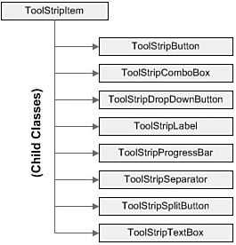
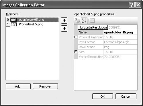
If you want to manually add additional menu items into the menu strip, you can use the placeholder block within the menu strip labeled with the text "Type Here." Every time you type in the placeholder block, additional placeholders become visible, and a menu item is added to the menu strip (see Figure 14.20). Figure 14.20. Manually adding menu items.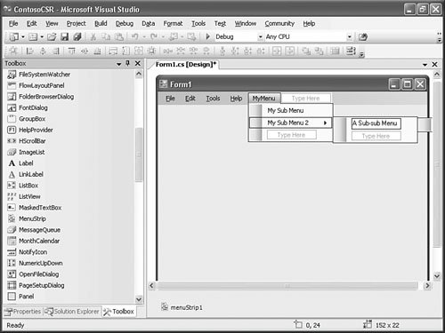 Creating a ToolbarThe next item up for inclusion on the form is a toolbar. Toolbars in .NET 2.0 are implemented directly with ToolStrip controls. As mentioned before, ToolStrip controls can host a variety of child controls; each inherits from the ToolStripItem base class. Figure 14.21 shows the controls that can be implemented inside a tool strip. Figure 14.21. Classes inheriting from ToolStripItem. In fact, the interactive layout features of the tool strip work the same way as the menu strip: Dragging the control onto the form will result in a blank ToolStrip control docked to the top of the form just under the existing menu control, and you can quickly add a roster of standard items to the tool strip by using its smart tag and selecting Insert Standard Items. Note Controls use the concept of z-order to determine their "depth" on the form. If two controls occupy the same space on a form, the control's individual z-order determines which of the two controls is on top and which is on the bottom. You control this layering in the IDE by right-clicking a control and using the Send To Back and Bring To Front menu commands. Z-order plays an important role in the placement of docked controls. Docked controls are arrayed in increasing order of their z index on the form. For instance, if you select the ToolStrip and issue the Send To Back command, the order of the MenuStrip and ToolStrip containers will be altered to place the ToolStrip first (at the top of the form) and the MenuStrip second (just below the ToolStrip instance). Figure 14.22 shows the in-progress form with the added ToolStrip control. Figure 14.22. Main form with complete menu and toolbar.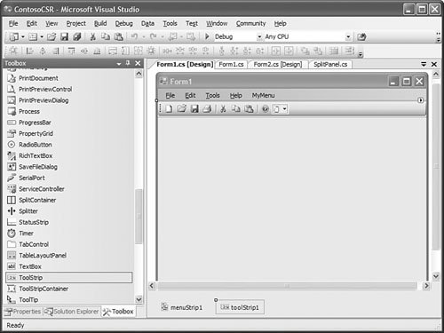 If you wanted to enable users to drag and drop the toolbar or menu onto one of the form's four sides, you would use the ToolStripContainer. In fact, there is a shortcut option here: You can take any of the ToolStrip controls currently on the form and add them to a ToolStripContainer with just a couple of clicks of the mouse. One of the items available via a tool strip's smart tag is the command Embed in a ToolStripContainer. If you issue this command against the toolbar that you just added to the sample form, Visual Studio will do two things for you: It will add a ToolStripContainer to the form, and it will place the selected ToolStrip into the container, specifically, in the top panel of the ToolStripContainer. Creating a Status BarStatus bars provide the user feedback on an application's current status, progress within an action, details in context with an object selected on a form, and so on. The StatusStrip control provides this functionality in .NET 2.0/Visual Studio 2005, and it supplants the StatusBar control found in previous versions. As with the other ToolStrip descendants, the StatusStrip control functions as a container; its ability to host labels in addition to progress bars, drop-downs, and split buttons makes it a much more powerful control than the StatusBar. Figure 14.23 shows the fictional Contoso CSR form with a StatusStrip docked at the bottom of the form. In design mode, you see a drop-down button that holds a selection for each of the four supported child controls. For the purposes of this demonstration prototype, add a label control to report general application status and an additional label and progress bar to be used if you run into any long-running retrieval or edit operations. Figure 14.23. StatusStrip in design mode.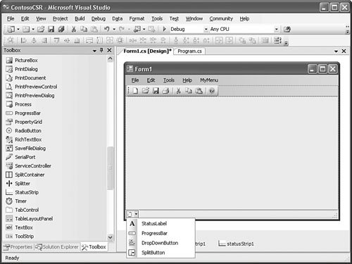 By default, child controls will be added in a left-to-right flow layout pattern within the StatusStrip pattern. With just six clicks (two per item), you can add these controls to the strip. The in-place editing capabilities are great for quickly building out the look and feel of the strip; for greater control of the strip's child controls, you can use the Items Collection Editor dialog box. Note By right-clicking on any of the StatusStrip child controls and selecting Convert To, you can quickly change the type of the control. For instance, if you have a label control currently on the strip but you really want a drop-down button, you right-click the label and select Convert To, DropDownButton. This saves you the hassle of deleting the control and adding a new one. Editing the StatusStrip ItemsYou use the StatusStrip's smart tag and select Edit Items to launch the Items Collection Editor dialog box. The editor provides direct access to all of the hosted control's properties and also allows you to edit, delete, and reorder items within the status strip (see Figure 14.24). Figure 14.24. The Items Collection Editor.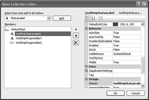 By tweaking some properties here, you can improve the layout and appearance of your items. Figure 14.25 shows the default layout of the controls you added; ideally, you want the progress bar and its label control to sit at the far right of the status strip and the status label to sit at the far left to consume any remaining space. Figure 14.25. Default StatusStrip items. To make this happen, you need to set the Spring property to TRue for the leftmost label. This will cause the label to expand and contract to fill the available space on the status strip. Next, set its TextAlignment property to situate the text to the left of the label region and change the Text property to something more appropriate. Figure 14.26 shows the fruits of our labor. Figure 14.26. Final StatusStrip look and feel. Displaying DataSo far, we have only touched on form elements that provide the basic framework user navigation, status, commands, and so on. However, the capability to access, display, and edit data from an underlying data store (relational or otherwise) is the real value of an application like the fictional Contoso CSR application. We'll touch on the details of working with databases in the next chapter; here, we will describe some of the basic controls used to display data in a form. Hierarchical DataThe treeView control is ideal for presenting data with hierarchical relationships and is thus a good candidate for housing the list of order records (which can be grouped by different criteria). First, add a SplitContainer control. This will partition the leftover interior space in the form into two discrete panels. Yet another panel will house the search function for orders; this will be docked to the top of the left split panel. A TReeView will dock-fill the remainder of this leftmost panel, and the right panel will house the data fields (text boxes, labels, radio buttons, and so on) for an individual CSR record. TReeView controls present data as a list of nodes; each node can serve as a parent for additional nodes. Typically, with applications that front a database, you would build the contents of the treeView by binding to a resultset from the database, or by programmatically looping through the resultset and adding to the treeView's node list through its API. But you also have control over the TReeView content in the designer by launching the TreeNode Editor. The TreeNode EditorThe TreeNode Editor (see Figure 14.27) is a dialog box that acts much the same as the Items Collection Editor examined previously. It enables you to add, edit, and remove items from the treeView control. You launch the editor dialog box by selecting Edit Nodes from the TReeView's smart tag. Figure 14.27. Using the designer to edit notes in the tree view.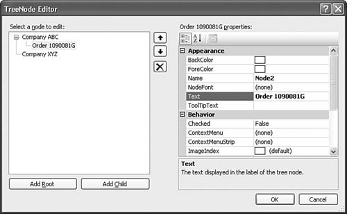 Using the Add Root and Add Child buttons, you can insert new nodes into the tree's data structure at any given nesting level. Figure 14.27 shows manually inserted nodes with test data so that you can get an idea of what the order list would look like using the company as a parent node and order instances as child nodes under the corresponding company. Each item, or node, in the treeView consists of two parts: an image and text. The image is optional; if you want the ability to attach an icon to a node, you start by first assigning an ImageList control to the treeView control. Using an ImageListImageList controls function as an image provider for other controls. They maintain a collection of Image objects that are referenced by their ordinal position or key within the collection. Any control that provides an ImageList property can reference an ImageList component and use its images. ListView, ToolStrip, and treeView are some examples of controls that can leverage the ImageList component. Note Visual Studio 2005 ships with a large library of images that you can use with the treeView or any other control that requires these types of standard graphics such as toolbars and menus. By default, the image files are placed in C:\Program Files\Microsoft Visual Studio 8\Common7\VS2005ImageLibrary. An ImageList doesn't have a visual presence on a form; in other words, you can't see the ImageList itself. Its sole use is as a behind-the-scenes component that feeds images to other controls. Dropping an ImageList onto the designer will put an instance of the component in the component tray (see Figure 14.28). You can then use the Images Collection Editor dialog box to add, edit, and remove the images hosted by the component. Changing the images associated with the image list will automatically change the images used by any controls referencing the ImageList. Figure 14.28. An ImageList added to the Forms Designer.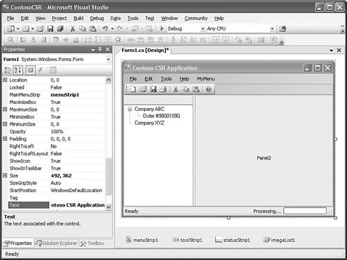 Figure 14.29 shows a few images added for use in the treeView control. To enable the treeView to use these images, you have to do two things:
Figure 14.29. An ImageList added to the Forms Designer. With the ImageList component in place and the TReeView dropped in the SplitContainer's left panel, the form is almost there from a design perspective. The remaining piece is the series of fields that will display the data for a record selected in the treeView control. You could add this piece by just dragging a bunch of text boxes and labels over into a TableLayoutPanel and then docking the whole mess in the open SplitContainer panel. But because you really want to treat this as one cohesive unit to simplify positioning, eventual data binding, and so on, you will instead create a user control for displaying a CSR record. Tabular DataThe DataGridView control is the premium Visual Studio 2005 control for displaying data in a tabular format. It provides a row/column format for displaying data from a wide variety of data sources. Figure 14.30 shows a DataGridView with its smart tag menu opened; the smart tag menu provides fast access to the column properties of the grid control and also allows you to directly bind the DataGridView to a data source. Figure 14.30. The DataGridView control.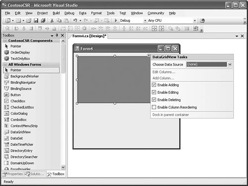 Data SourcesThe DataGridView control supports a variety of possible data sources. For instance, scenarios like displaying name/value pairs from a collection are supported, in addition to mainstream support for datasets returned from a relational data store. If you select a data source for the grid, a column will be added to the grid for every column that appears in the data source, and the row data will automatically be provided inside the DataGridView control. Data can be displayed in the grid control in an "unbound" mode as well; using the grid's row/column API, you can programmatically define the structure of the grid and add data to it at runtime. Cell TypesEach individual cell in a DataGridView functions as if it is an embedded control. Each cell can express the underlying data that it contains in various ways; check boxes, drop-downs, links, buttons, and text boxes are all supported cell types. In addition to the data visualization possibilities, each cell also has its own set of events that can be hooked within your code. For example, you can hook the mouse enter and leave events for a specific cell. We cover this control in depth in Chapter 15, "Working with Databases." |
EAN: 2147483647
Pages: 195