Section 8.15. Color Balance
8.15. Color BalanceIf all you ever shoot is black-and-white photos, then Exposure/Levels or Brightness/ Contrast may be all you ever need. If you're like most people, though, you're also concerned about a little thing called color. One of the most common failings of digital cameras (and scanners , too) is that they don't capture color very accurately. Digital photos sometimes have a slightly bluish or greenish tinge, producing dull colors, lower contrast, and sickly looking skin tones.
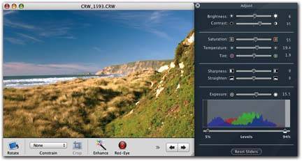
In fact, the whole thing might have a faint green or magenta cast. Or maybe you just want to take color adjustment into your own hands, not only to get the colors right, but to also create a specific mood for an image. Maybe you want a snowy landscape to look icy blue so friends back home realize just how darned cold it was! The Adjust panel offers three sliders that wield power over this sort of thing: Tint, Temperature, and Saturation. And it offers two ways to apply such changes: the manual way and the automatic way. 8.15.1. Manual Color AdjustmentThese three sliders in the middle of the Adjust Palette provide you with plenty of color adjustment power. In particular, the Tint and Temperature sliders govern the white balance of your photo. (Different kinds of lightfluorescent lighting, overcast skies, and so onlend different color casts to photographs. White balance is a setting that eliminates or adjusts the color cast according to the lighting.) For best results, start at the bottom slider and work your way upward.
8.15.2. Automatic Color CorrectionDragging the Tint, Temperature, and Saturation sliders by hand is one way to address color imbalances in a picture. But there's an easier way: iPhoto also contains a fairly secret feature that adjusts all three sliders automatically . Technically, this tool is a gray balance adjuster. It relies on your ability to find, somewhere in your photo, an area of what should appear as medium gray. If you can adjust the color balance so that this spot does in fact appear the correct shade of gray, iPhoto can take it from thereit can adjust all of the other colors in the photo accordingly , shifting color temperature, tint, and saturation, all with a single click. This trick works amazingly well on some photos. Before you use this feature, though, make sure you've already adjusted the overall exposure of the photo, using the steps described on the previous pages. Next, scan your photo for an area that should appear as a neutral gray. Slightly dark grays are better for this purpose than bright, overexposed grays. (See Figure 8-11.) Once you've found such a spot, Instantly, iPhoto automatically adjusts the color-balance sliders to balance the overall color of the photo. If you don't like iPhoto's correction, choose Edit Thankfully, there's a good way to check how well iPhoto corrected the image. Find a spot in the picture that should be plain white. If it's clean (no green or magenta tint), you're probably in good shape; if not, undo the gray balance adjustment and try again on another area of gray. Tip: If you're a portrait photographer, you can use the gray-balance control to correct skin tones with almost magical efficiency. The trick is to plan ahead by stashing a photographer's gray card somewhere in the composition (somewhere that can be cropped out of the final print). Make sure the gray card receives about the same amount of lighting as the subject.Later, when you're adjusting the image in iPhoto, you can
|
 Undo and try again on a different gray area.
EAN: 2147483647
Pages: 314