8.2. Using the Graphics Object
| < Day Day Up > |
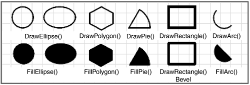
| Let's look at the details of actually drawing with the Graphics object. The Graphics class contains several methods for rendering basic geometric patterns. In addition to the DrawLine method used in previous examples, there are methods for drawing rectangles, polygons, ellipses, curves, and other basic shapes. In general, each shape can be drawn as an outline using the Pen class, or filled in using the Brush class. The DrawEllipse and FillEllipse methods are examples of this. Let's look at some examples. Basic 2-D GraphicsFigure 8-6 demonstrates some of the basic shapes that can be drawn with the Graphics methods. The shapes vary, but the syntax for each method is quite similar. Each accepts a drawing object either a pen or brush to use for rendering the shape, and the coordinates that determine the size and positions of the shape. A Rectangle object is often used to provide a shape's boundary. Figure 8-6. Basic 2-D shapes
The following code segments draw the shapes shown in Figure 8-6. To keep things simple, the variables x and y are used to specify the location where the shape is drawn. These are set to the coordinates of the upper-left corner of a shape. Pen blkPen = new Pen(Brushes.Black,2 ); // width=2 // Set this to draw smooth lines g.SmoothingMode = System.Drawing.Drawing2D.SmoothingMode.AntiAlias; // (1) Draw Circle and Draw Filled Circle Rectangle r = new Rectangle(new Point(x,y),new Size(40,40)); g.DrawEllipse(blkPen, r); g.FillEllipse(Brushes.Black,x,y+60,40,40); // (2) Draw Ellipse and Filled Ellipse int w = 60; int h= 40; Rectangle r = new Rectangle(new Point(x,y),new Size(w,h)); g.DrawEllipse(blkPen, r); r = new Rectangle(new Point(x,y+60), new Size(w,h)); g.FillEllipse(Brushes.Red, r); // (3) Draw Polygon Point pt1 = new Point(x, y); Point pt2 = new Point(x+22, y+12); Point pt3 = new Point(x+22, y+32); Point pt4 = new Point(x, y+44); Point pt5 = new Point(x-22, y+32); Point pt6 = new Point(x-22, y+12); Point[] myPoints = {pt1, pt2, pt3, pt4, pt5, pt6}; g.DrawPolygon(blkPen, myPoints); // Points would be changed so as not to draw over // original polygon g.FillPolygon(Brushes.Black, myPoints); // (4)Draw Pie Shape and filled pie Rectangle r = new Rectangle( new Point(x,y),new Size(80,80)); // Create start and sweep angles int startAngle = 0; // Clockwise from x-axis int sweepAngle = -60; // Clockwise from start angle g.DrawPie(blkPen, r, startAngle, sweepAngle); g.FillPie(Brushes.Black, x,y+60,80,80,startAngle, sweepAngle); // (5) Draw Rectangle and Rectangle with beveled edges blkPen.Width=5; // make pen thicker to show bevel g.DrawRectangle(blkPen,x,y,50,40); blkPen.LineJoin = LineJoin.Bevel; g.DrawRectangle(blkPen,x,y+60,50,40); // (6) Draw Arc and Filled Pie startAngle=45; sweepAngle=180; g.DrawArc(blkPen, x,y,40,40,startAngle, sweepAngle); g.FillPie(Brushes.Black, x,y+60,40,40,startAngle,sweepAngle); These code segments illustrate how easy it is to create simple shapes with a minimum of code. .NET also makes it easy to create more complex shapes by combining primitive shapes using the GraphicsPath class. Creating Shapes with the GraphicsPath ClassThe GraphicsPath class, which is a member of the System.Drawing.Drawing2D namespace, is used to create a container for a collection of primitive shapes. Succinctly, it permits you to add basic shapes to its collection and then to treat the collection as a single entity for the purpose of drawing and filling the overall shape. Before looking at a code example, you should be aware of some of the basic features of the GraphicsPath class:
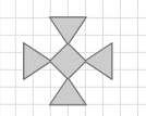
The following code creates and displays the Infinity Cross shown in Figure 8-7. It is constructed by adding five polygons to the GraphicsPath container object. The Graphics object then draws the outline and fills in the cross. // g is the Graphics object g.SmoothingMode = SmoothingMode.AntiAlias; // Define five polygons Point[] ptsT= {new Point(120,20),new Point(160,20), new Point(140,50)}; Point[] ptsL= {new Point(90,50),new Point(90,90), new Point(120,70)}; Point[] ptsB= {new Point(120,120),new Point(160,120), new Point(140,90)}; Point[] ptsR= {new Point(190,90), new Point(190,50), new Point(160, 70)}; Point[] ptsCenter = {new Point(140,50), new Point(120,70), new Point(140,90), new Point(160,70)}; // Create the GraphicsPath object and add the polygons to it GraphicsPath gp = new GraphicsPath(); gp.AddPolygon(ptsT); // Add top polygon gp.AddPolygon(ptsL); // Add left polygon gp.AddPolygon(ptsB); // Add bottom polygon gp.AddPolygon(ptsR); // Add right polygon gp.AddPolygon(ptsCenter); g.DrawPath(new Pen(Color.Red,2),gp); // Draw GraphicsPath g.FillPath(Brushes.Gold,gp); // Fill the polygons Figure 8-7. Infinity Cross
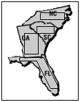
Instead of drawing and filling each polygon separately, we use a single DrawPath and FillPath statement to do the job. The GraphicsPath class has several methods worth exploring AddCircle, AddArc, AddEllipse, AddString, Warp, and others for applications that require the complex manipulation of shapes. One of the more interesting is the transform method that can be used to rotate or shift the coordinates of a DrawPath object. This following code segment offers a taste of how it works. A transformation matrix is created with values that shift the x coordinates by 50 units and leave the y coordinates unchanged. This TRansform method applies the matrix to the DrawPath and shifts the coordinates; the shape is then drawn 50 units to the right of the first shape. Matrix translateMatrix = new Matrix(); translateMatrix.Translate(50, 0); // Offset x coordinate by 50 gp.Transform(translateMatrix); // Transform path g.DrawPath(Pens.Orange,gp); // Display at new location Hit Testing with ShapesOne of the reasons for placing shapes on a form is to permit a user to trigger an action by clicking a shape as if she had clicked a button. Unlike a control, you cannot associate an event with a shape. Instead, you associate a MouseDown event with the container that holds the shape(s). Recall that a MouseDown event handler receives the x and y coordinates where the event occurs. After it has these, it is a simple process to use the rectangle and GraphicsPath methods to verify whether a point falls within their area: bool Rectangle.Contains(Point(x,y)) bool GraphicsPath.IsVisible(Point(x,y)) To illustrate, consider an application that displays a map of US states and responds to a click on a state by displaying the name of the state capital. The map image is placed in a PictureBox, and rectangles and polygons are drawn on the states to set up the hit areas that respond to a MouseDown event. Figure 8-8 shows how the picture box's paint handler routine draws rectangles on three states and a polygon on Florida. (Of course, the shapes would not be visible in the actual application.) To respond to a pressed mouse key, set up a delegate to call an event handler when the MouseDown event occurs: this.pictureBox1.MouseDown += new MouseEventHandler(down_Picture); Figure 8-8. Hit test example
The following code implements event handler logic to determine if the mouse down occurs within the boundary of any shape. private void down_Picture( object sender, MouseEventArgs e) { // Rectangles and GraphicsPath gp are defined // as class variables if (rectNC.Contains(e.X,e.Y) ) { MessageBox.Show("Capital: Raleigh"); } else if(rectSC.Contains(e.X,e.Y)) { MessageBox.Show("Capital: Columbia");} else if(rectGA.Contains(e.X,e.Y)) { MessageBox.Show("Capital: Atlanta");} else if(gp.IsVisible(e.X,e.Y)) {MessageBox.Show("Capital: Tallahassee");} } After you have a basic understanding of how to create and use shapes, the next step is to enhance these shapes with eye catching graphical effects such as gradients, textured colors, and different line styles and widths. This requires an understanding of the System.Drawing classes: Pen, Brush, and Color. PensThe Graphics object must receive an instance of the Pen class to draw a shape's outline. Our examples thus far have used a static property of the Pens class Pens.Blue, for example to create a Pen object that is passed to the Graphics object. This is convenient, but in many cases you will want to create your own Pen object in order to use non-standard colors and take advantage of the Pen properties. Constructors: public Pen (Color color); public Pen (Color color, single width); public Pen (Brush brush); public Pen (Brush brush, single width); Example: Pen p1 = new Pen(Color.Red, 5); Pen p2 = new Pen(Color.Red); // Default width of 1 The constructors allow you to create a Pen object of a specified color and width. You can also set its attributes based on a Brush object, which we cover later in this section. Note that the Pen class inherits the IDisposable interface, which means that you should always call the Pen object's Dispose method when finished with it. Besides color and width, the Pen class offers a variety of properties that allow you to control the appearance of the lines and curves the Pen object draws. Table 8-1 contains a partial list of these properties.
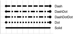
Let's look at some of the more interesting properties in detail. DashStyleThis property defines the line style, which can be Solid, Dash, Dot, DashDot, DashDotDot, or Custom (see Figure 8-9). The property's value comes from the DashStyle enumeration. Pen p1 = new Pen(Color.Black, 3); p1.DashStyle = DashStyle.Dash; g.DrawLine(p1,20,20,180,20); Figure 8-9. DashStyles and LineCaps
StartCap and EndCapThese properties define the shape used to begin and end a line. The value comes from the LineCap enumeration, which includes ArrowAnchor, DiamondAnchor, Round, RoundAnchor, Square, SquareAnchor, and triangle. Examples of the DiamondAnchor and RoundAnchor are shown in Figure 8-9. The following code is used to create the lines in the figure: Graphics g = pictureBox1.CreateGraphics(); Pen p1 = new Pen(Color.Black, 5); p1.StartCap = LineCap.DiamondAnchor; p1.EndCap = LineCap.RoundAnchor; int yLine = 20; foreach(string ds in Enum.GetNames(typeof(DashStyle))) { if (ds != "Custom") // Ignore Custom DashStyle type { // Parse creates an enum type from a string p1.DashStyle = (DashStyle)Enum.Parse( typeof(DashStyle), ds); g.DrawLine(p1,20,yLine,120,yLine); g.DrawString(ds,new Font("Arial",10),Brushes.Black, 140,yLine-8); yLine += 20; } } The code loops through the DashStyle enumeration and draws a line for each enum value except Custom. It also uses the DrawString method to display the name of the enumeration values. This method is discussed in Chapter 9. BrushesBrush objects are used by these Graphics methods to create filled geometric shapes: FillClosedCurve FillEllipse FillPath FillPie FillPolygon FillRectangle FillRectangles FillRegion All of these receive a Brush object as their first argument. As with the Pen class, the easiest way to provide a brush is to use a predefined object that represents one of the standard colors for example, Brushes.AntiqueWhite. To create more interesting effects, such as fills with patterns and gradients, it is necessary to instantiate your own Brush type. Unlike the Pen class, you cannot create an instance of the abstract Brush class; instead, you use one of its inheriting classes summarized in Table 8-2.
Note that all Brush classes have a Dispose method that should be called to destroy the Brush object when it is no longer needed. The two most popular of these classes are HatchBrush, which is handy for creating charts, and LinearGradientBrush, for customizing the background of controls. Let's take a closer look at both of these. The HatchBrush ClassAs the name implies, this class fills the interior of a shape with a hatched appearance. Constructors: public HatchBrush(HatchStyle hStyle, Color forecolor) public HatchBrush(HatchStyle hstyle, Color forecolor, Color backcolor) Parameters:
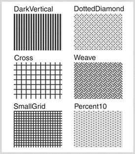
The predefined HatchStyle patterns make it a simple process to create elaborate, multi-color fill patterns. The following code is used to create the DarkVertical and DottedDiamond rectangles at the top of each column in Figure 8-10. Graphics g = pictureBox1.CreateGraphics(); // Fill Rectangle with DarkVertical pattern Brush b = new HatchBrush(HatchStyle.DarkVertical, Color.Blue,Color.LightGray); g.FillRectangle(b,20,20,80,60); // Fill Rectangle with DottedDiamond pattern b = new HatchBrush(HatchStyle.DottedDiamond, Color.Blue,Color.LightGray); g.FillRectangle(b,120,20,80,60); Figure 8-10. Using HatchBrush with some of the available hatch styles
The LinearGradientBrush ClassIn its simplest form, this class creates a transition that takes one color and gradually blends it into a second color. The direction of the transition can be set to horizontal, vertical, or any specified angle. The location where the transition begins can be set to a focal point other than the beginning of the area to be filled in. In cases where the gradient must be tiled to completely fill an area, options are available to control how each repeat is displayed. These options can be confusing, so let's begin with how to create a gradient brush and then work with examples that demonstrate the more useful properties and methods of the LinearGradientBrush class. Constructors: public LinearGradientBrush(Rectangle rect, Color color1, Color color2, LinearGradientMode linearGradientMode) public LinearGradientBrush(Rectangle rect, Color color1, Color color2, float angle) Parameters:
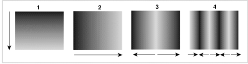
There is no substitute for experimentation when it comes to understanding graphics related concepts. Figure 8-11 shows the output from filling a rectangle with various configurations of a LinearGradientBrush object. Here is the code that creates these examples: // Draw rectangles filled with gradient in a pictureBox Graphics g = pictureBox1.CreateGraphics(); Size sz = new Size(100,80); Rectangle rb = new Rectangle(new Point(20,20),sz); // (1) Vertical Gradient (90 degrees) LinearGradientBrush b = new LinearGradientBrush(rb,Color.DarkBlue,Color.LightBlue,90); g.FillRectangle(b,rb); rb.X=140; // (2) Horizontal Gradient b = new LinearGradientBrush(rb,Color.DarkBlue, Color.LightBlue,0); g.FillRectangle(b,rb); rb.Y = 120; rb.X = 20; // (3) Horizontal with center focal point b = new LinearGradientBrush(rb,Color.DarkBlue, Color.LightBlue,0); // Place end color at position (0-1) within brush b.SetBlendTriangularShape(.5f); g.FillRectangle(b,rb); Figure 8-11. LinearGradientBrush examples: (1) Vertical, (2) Horizontal, (3) Focus Point, (4) Tiling
The main point of interest in this code is the use of the SetBlendTriangularShape method to create the blending effect shown in the third rectangle in Figure 8-11. This method takes an argument between 0 and 1.0 that specifies a relative focus point where the end color is displayed. The gradient then "falls off" on either side of this point to the start color. The fourth rectangle in the figure is created by repeating the original brush pattern. The following code defines a small gradient brush that is used to fill a larger rectangle: // Tiling Example create small rectangle for gradient brush Rectangle rb1 = new Rectangle(new Point(0,0),new Size(20,20)); b = new LinearGradientBrush(rb,Color.DarkBlue, Color.LightBlue,0); b.WrapMode = WrapMode.TileFlipX; // Fill larger rectangle with repeats of small gradient rectangle g.FillRectangle(b,rb); Notice how the light and dark colors are reversed horizontally before each repeat occurs: [light-dark][dark-light]. The WrapMode property determines how the repeated gradient is displayed. In this example, it is set to the WrapMode enum value of TileFlipX, which causes the gradient to be reversed horizontally before repeating. The most useful enum values include the following:
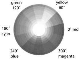
Creating a Multi-Color GradientIt takes only a few lines of code to create a LinearGradientBrush object that creates a multi-color gradient. The key is to set the LinearGradientBrush.InterpolationColors property to an instance of a ColorBlend class that specifies the colors to be used. As the following code shows, the ColorBlend class contains an array of colors and an array of values that indicate the relative position (0 1) of each color on the gradient line. This example creates a gradient with a transition from red to white to blue with white in the middle. b = new LinearGradientBrush(rb,Color.Empty,Color.Empty,0); ColorBlend myBlend = new ColorBlend(); // Specify colors to include in gradient myBlend.Colors = new Color[] {Color.Red, Color.White, Color.Blue,}; // Position of colors in gradient myBlend.Positions = new float[] {0f, .5f, 1f}; b.InterpolationColors = myBlend; // Overrides constructor colors Colors.NET implements the Color object as a structure that includes a large number of colors predefined as static properties. For example, when a reference is made to Color.Indigo, the returned value is simply the Indigo property. However, there is more to the structure than just a list of color properties. Other properties and methods permit you to deconstruct a color value into its internal byte representation or build a color from numeric values. To appreciate this, let's look at how colors are represented. Computers as opposed to the world of printing use the RGB (red/green/blue) color system to create a 32-bit unsigned integer value that represents a color. Think of RGB as a three-dimensional space with the red, green, and blue values along each axis. Any point within that space represents a unique RGB coordinate value. Throw in a fourth component, the alpha value that specifies the color's transparency and you have the 4-byte AlphaRGB (ARGB) value that defines a color. For example, Indigo has RGB values of 75, 0, 130, and an alpha value of 255 (no transparency). This is represented by the hex value 4B0082FF. Colors can also be represented by the HSL (hue/saturation/luminosity) and HSB (hue/saturation/brightness) color spaces. While RGB values follow no easily discernible pattern, HSL and HSB are based on the standard color wheel (see Figure 8-12) that presents colors in an orderly progression that makes it easy to visualize the sequence. Hue is represented as an angle going counterclockwise around the wheel. The saturation is the distance from the center of the wheel toward the outer edge. Colors on the outer edge have full saturation. Brightness measures the intensity of a color. Colors shown on the wheel have 100% brightness, which decreases as they are darkened (black has 0% brightness). There is no standard for assigning HSB/HSL values. Programs often use values between 0 and 255 to correspond to the RGB numbering scheme. As we will see, .NET assigns the actual angle to the hue, and values between 0 and 1 to the saturation and brightness. Figure 8-12. Color wheel
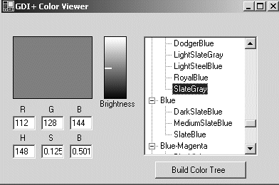
How to Create a Color ObjectThe Color structure provides three static methods for creating a Color object: FromName, FromKnownColor, and FromArgb. FromName takes the name of a color as a string argument and creates a new struct: Color magenta = Color.FromName("Magenta"). The name must match one in the KnownColor enumeration values, which is an enumeration of all the colors represented as properties in the Color and SystemColor structures. FromKnownColor takes a KnownColor enumeration value as its argument and produces a struct for that color: Color magenta = Color.FromKnownColor(KnownColor.Magenta); FromArgb allows you to specify a color by RGB and alpha values, which makes it easy to change the transparency of an existing color. Here are some of its overloads: // (r, g, b) Color slate1 = Color.FromArgb (112, 128, 144); // (alpha, r, g, b) Color slate2 = Color.FromArgb (255, 112, 128, 144); // (alpha, Color) Color lightslate = Color.FromArgb(50, slate2 ); Examining the Characteristics of a Color ObjectThe Color structure has four properties that return the ARGB values of a color: Color.A, Color.R, Color.G, and Color.B. All of these properties have a value in the range 0 to 255. Color slateGray = Color.FromArgb(255,112,128,144); byte a = slateGray.A; // 255 byte r = slateGray.R; // 112 byte g = slateGray.G; // 128 byte b = slateGray.B; // 144 The individual HSB values of a color can be extracted using the Color.GetHue, GetSaturation, and GetBrightness methods. The hue is measured in degrees as a value from 0.0 to 360.0. Saturation and brightness have values between 0 and 1. Color slateGray = Color.FromArgb(255,112,128,144); float hue = slateGray.GetHue(); // 210 degrees float sat = slateGray.GetSaturation(); // .125 float brt = slateGray.GetBrightness(); // .501 Observe in Figure 8-12 that the hue of 210 degrees (moving clockwise from 0) falls between cyan and blue on the circle which is where you would expect to find a slate gray color. A Sample Project: Building a Color ViewerThe best way to grasp how the color spaces relate to actual .NET colors is to visually associate the colors with their RGB and HSB values. .NET offers a ColorDialog class that can be used to display available colors; however, it does not identify colors by the system-defined names that most developers work with. So, let's build a simple color viewer that displays colors by name and at the same time demonstrates how to use the GDI+ types discussed in this section. Figure 8-13 shows the user interface for this application. It consists of a TReeView on the right that contains all the colors in the KnownColor enumeration organized into 12 color groups. These groups correspond to the primary, secondary, and tertiary[1] colors of the color wheel. In terms of hues, each section is 30 degrees on the circle. The interface also contains two panels, a larger one in which a selected color is displayed, and a smaller one that displays a brightness gradient for the selected color. This is created using a multi-color gradient comprising black and white at each end, and the color at a focus point determined by its Brightness value. The remainder of the screen displays RGB and HSB values obtained using the properties and methods discussed earlier.
Figure 8-13. Example: Color viewer demonstrates working with colors and gradients
The code for this application is shown in Listings 8-2 and 8-3. The former contains code to populate the treeNode structure with the color nodes; Listing 8-3 shows the methods used to display the selected color and its color space values. The routine code for laying out controls on a form is excluded. Listing 8-2. Color Viewer: Populate treeNode with All Colors using System.Drawing; using System.Windows.Forms; using System.Drawing.Drawing2D; public class Form1 : Form { public Form1() { InitializeComponent(); // Lay out controls on Form1 // Set up event handler to be fired when node is selected colorTree.AfterSelect += new TreeViewEventHandler(ColorTree_AfterSelect); BuildWheel(); // Create Parent Nodes for 12 categories } [STAThread] static void Main() { Application.Run(new Form1()); } // Parent Nodes in TreeView for each segment of color wheel private void BuildWheel() { TreeNode tNode; tNode = colorTree.Nodes.Add("Red"); tNode = colorTree.Nodes.Add("Orange"); tNode = colorTree.Nodes.Add("Yellow"); // Remainder of nodes are added here .... } private void button1_Click(object sender, System.EventArgs e) { // Add Colors to TreeNode Structure // Loop through KnownColor enum values Array objColor = Enum.GetValues(typeof(KnownColor)); for (int i=0; i < objColor.Length; i++) { KnownColor kc = (KnownColor) objColor.GetValue(i); Color c = Color.FromKnownColor(kc); if (!c.IsSystemColor) // Exclude System UI colors { InsertColor(c, c.GetHue()); } } } private void InsertColor(Color myColor, float hue) { TreeNode tNode; TreeNode cNode = new TreeNode(); // Offset is used to start color categories at 345 degrees float hueOffset = hue + 15; if (hueOffset >360) hueOffset -= 360; // Get one of 12 color categories int colorCat = (int)(hueOffset -.1)/30; tNode = colorTree.Nodes[colorCat]; // Get parent node // Add HSB values to node's Tag HSB nodeHSB = new HSB(hue, myColor.GetSaturation(), myColor.GetBrightness()); cNode.Tag = nodeHSB; // Tag contains HSB values cNode.Text = myColor.Name; int nodeCt = tNode.Nodes.Count; bool insert=false; // Insert colors in ascending hue value for (int i=0; i< nodeCt && insert==false ;i++) { nodeHSB = (HSB)tNode.Nodes[i].Tag; if (hue < nodeHSB.Hue) { tNode.Nodes.Insert(i,cNode); insert = true; } } if (!insert) tNode.Nodes.Add(cNode); } public struct HSB { public float Hue; public float Saturation; public float Brightness; public HSB(float H, float S, float B) { Hue = H; Saturation = S; Brightness = B; } } // ---> Methods to Display Colors go here } When the application is executed, the form's constructor calls BuildWheel to create the tree structure of parent nodes that represent the 12 color categories. Then, when the Build Color Tree button is clicked, the Click event handler loops through the KnownColor enum value (excluding system colors) and calls InsertColor to insert the color under the correct parent node. The Tag field of the added node (color) is set to an HSB struct that contains the hue, saturation, and brightness for the color. Nodes are stored in ascending order of Hue value. (See Chapter 7, "Windows Forms Controls," for a discussion of the TReeNode control.) Listing 8-3 contains the code for both the node selection event handler and for ShowColor, the method that displays the color, draws the brightness scale, and fills all the text boxes with RGB and HSB values. Listing 8-3. Color Viewer: Display Selected Color and Values private void ColorTree_AfterSelect(Object sender, TreeViewEventArgs e) // Event handler for AfterSelect event { // Call method to display color and info if (e.Node.Parent != null) ShowColor(e.Node); } private void ShowColor(TreeNode viewNode) { Graphics g = panel1.CreateGraphics(); // Color panel Graphics g2 = panel2.CreateGraphics(); // Brightness panel try { // Convert node's text value to Color object Color myColor = Color.FromName(viewNode.Text); Brush b = new SolidBrush(myColor); // Display selected color g.FillRectangle(b, 0,0,panel1.Width,panel1.Height); HSB hsbVal= (HSB) viewNode.Tag; // Convert hue to value between 0 and 255 for displaying int huescaled = (int) (hsbVal.Hue / 360 * 255); hText.Text = huescaled.ToString(); sText.Text = hsbVal.Saturation.ToString(); lText.Text = hsbVal.Brightness.ToString(); rText.Text = myColor.R.ToString(); gText.Text = myColor.G.ToString(); bText.Text = myColor.B.ToString(); // Draw Brightness scale Rectangle rect = new Rectangle(new Point(0,0), new Size(panel2.Width, panel2.Height)); // Create multi-color brush gradient for brightness scale LinearGradientBrush bg = new LinearGradientBrush(rect, Color.Empty, Color.Empty,90); ColorBlend myBlend = new ColorBlend(); myBlend.Colors = new Color[] {Color.White, myColor, Color.Black}; myBlend.Positions = new float[]{0f, 1-hsbVal.Brightness,1f}; bg.InterpolationColors = myBlend; g2.FillRectangle(bg, rect); // Draw marker on brightness scale showing current color int colorPt = (int)((1 hsbVal.Brightness)* panel1.Height); g2.FillRectangle(Brushes.White,0,colorPt,10,2); b.Dispose(); bg.Dispose(); } finally { g.Dispose(); g2.Dispose(); } } The code incorporates several of the concepts already discussed in this section. Its main purpose is to demonstrate how Color, Graphics, and Brush objects work together. A SolidBrush is used to fill panel1 with a color sample, a gradient brush creates the brightness scale, and Color properties provide the RGB values displayed on the screen. |
| < Day Day Up > |