Creating Custom Color Schemes
Creating Custom Color Schemes
Throughout this course, you have used one of Publisher s predefined color schemes to save time and ensure a professional look. However, if you always use Publisher s color schemes, your publications might start to look canned. As you get more comfortable using Publisher, you can experiment with your own color combinations to give your publications a unique look. In this topic, we show you how to customize a color scheme.
Changing the Colors in a Color Scheme
The easiest way to come up with a custom color scheme is to select one that is close to what you want and then modify it. Let s get going:
1. Switch to the foreground, and press F9 to zoom to 100% .
2. On the Format menu, click Color Schemes to display the Color Schemes task pane.
3. Scroll through the list of colors, and click Sunrise .
Publisher applies the new color scheme to the active publication, and you see the results immediately in the right pane. You want to change some of the colors in this scheme.
4. Click the Custom color scheme link at the bottom of the Color Schemes task pane.
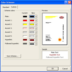
Publisher displays the Custom tab of the Color Schemes dialog box, as shown in this graphic:
| |
If you plan to print in color, the colors you use in your publications are just as important as the fonts you use. Like fonts, different colors can send different messages to your audience. For example, cool colors such as green, blue, and violet are associated with oceans and pastoral settings and can connote peace and tranquility. Warm colors such as red, orange, and yellow, on the other hand, are associated with fire and heat and can connote aggression and intensity. You also need to be aware of the following factors when selecting colors for a publication:
-
Use cool colors, which tend to recede, as background colors. Use warm colors, which tend to advance, to call attention to specific items.
-
Use muted colors in the background and bright colors in the foreground.
-
Avoid placing red and green next to each other. People who are color-blind might not be able to distinguish between them.
-
Use color to make information easier to interpret. For example, format positive numbers in blue and negative numbers in red.
-
Resist the temptation to overload your publications with color. Instead, select color to focus attention on a few key areas.
| |
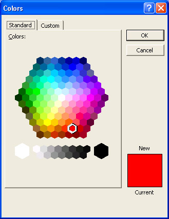
5. Click the down arrow to the right of the New box in the Accent 1 row, and click More Colors .
The Standard tab of the Colors dialog box appears, as shown in this graphic:
| |
The Custom tab of the Color Schemes dialog box displays the main color in the active color scheme, as well as five accent colors, a hyperlink color, and a followed hyperlink color. (A followed hyperlink is a link on a Web page that has been clicked, or followed.) You can use the New box adjacent to each color to change the color in the Current box. Changing any scheme color in this dialog box changes the corresponding color in your publication.
| |
Publisher displays a hexagonal palette of basic colors and indicates the current Accent 1 color with a white border.
6. Click the burgundy color (the third choice at the very bottom of the hexagon palette), and click OK .
7. Click the down arrow to the right of the New box in the Accent 2 row, click More Colors , click the light orange color (the third choice in the next-to-bottom row of the hexagon), and click OK .
Adding a Custom Color to the Color Scheme
If the Standard tab of the Colors dialog box doesn t provide exactly the color you want, you can move to the Custom tab to define the color. Follow these steps to add a custom color:
1. In the open Color Schemes dialog box, click the down arrow to the right of the New box in the Accent 3 row, click More Colors , and then click the Custom tab.
The Custom tab displays the options shown in this graphic:
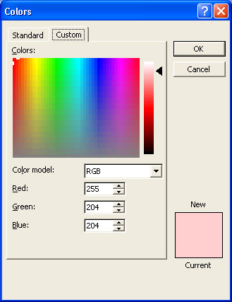
On this tab, Publisher displays a color scale so that you can select the color you want more precisely.
2. Half-hidden at the top of the color scale is a cross hair. Point to it, and drag it anywhere in the box.
When you release the mouse button, Publisher displays the color beneath the cross hair in the top half of the New box. It also enters its red, green, and blue values ”the proportions of those colors used to make the selected color ”and identifies the luminance, or intensity, of the color on the vertical scale to the right of the Colors box.
3. Drag the arrow next to the vertical luminance scale up and down, noting the changes in the New box.
4. Take a little time to explore the Custom tab further. Then, when you re ready, use the arrows at the end of the Red , Green , and Blue boxes (or type the numbers in directly) to specify these settings:
| Red | 106 |
| Green | 161 |
| Blue | 104 |
As you enter each setting, the positions of the cross hair and the vertical luminance scale arrow change, as does the color in the New box.
5. Click OK to select the new color and return to the Color Schemes dialog box.
6. Click the down arrow to the right of the New box in the Accent 4 row, click More Colors , and click the Standard tab.
7. Click the second brown choice in the bottom row of the hexagon, and click OK in the Colors dialog box and then OK in the Color Schemes dialog box.
Elements in the publication that were already formatted with the Accent colors have been updated to reflect the new color scheme.
8. Close the Color Schemes task pane.
Applying Colors from the Color Scheme
After you have created a new color scheme, you can apply its colors just as you would those of Publisher s built-in color schemes. Let s apply colors from the new color scheme to a few elements in the press release template:
1. Click the PRESS RELEASE frame, and select its text.
2. Click the down arrow to the right of the Font Color button on the Formatting toolbar, and click the green color box ( Accent 3 , or the fourth box in the colors row).
3. Scroll to the row of dots in the first column, and click the dots to select them.
4. Click the down arrow to the right of the Fill Color button on the Formatting toolbar, and click the red color box ( Accent 1 , or the second box in the colors row).
| |
In some programs, you specify a color by changing the settings for hue, saturation, and luminance. When you specify a custom color in Publisher, you can change the hue and saturation of the color by dragging the cross hair in the color scale. To change the hue, drag the cross hair horizontally across the scale. To change the saturation, drag the cross hair vertically.
| |
| |
When you create a custom color scheme, Publisher automatically saves the new scheme as (Custom) in the list of color schemes. However, the custom scheme is available only to the current publication. To save the scheme for use in other publications, open the publication containing the custom color scheme, and click Color Schemes on the Format menu to display the Color Schemes task pane. With (Custom) selected in the Apply a color scheme list, click the Custom color scheme link. Click the Save Scheme button on the Custom tab of the Color Schemes dialog box, type a name for the color scheme, click OK, and then click OK again. The custom scheme is then added to the list of color schemes available for use in any publication.
| |
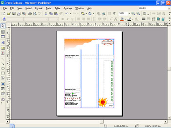
5. Change the zoom setting to Whole Page .
| Information about | Effect of color, page 161 |
Publisher gives you a bird s-eye view of the new color scheme in place, as shown in this graphic:
EAN: N/A
Pages: 76