| To be able to develop sophisticated Windows applications, you must become familiar with the capabilities of a variety of controls and support classes available in .NET. We begin by examining some of the properties that are common to all controls. We will continue this discussion in Chapters 8 and 12. But your investigation shouldn't end after you read these chapters. You should spend time reading the .NET Framework documentation Help that is provided with VB.NET. Common Properties The Control class defines many properties that are common to all controls: -
The Enabled property indicates whether the control is enabled. -
The Font property indicates the font used by the control. -
The Location property indicates the location of the control on the form. -
The Size property indicates the size of the control. -
The TabIndex property indicates the position of the control in the form's tab order. -
The TabStop property indicates the whether control has a tab stop. -
The Text property indicates the text displayed by the control. -
The Visible property indicates whether the control is visible. Each specific control defines additional properties and methods unique to that control. We have already discussed the Label , TextBox , Button , ErrorProvider and ToolTip controls. In this section, will discuss some of the other controls that are commonly used in Windows applications. Using a Radio Button with a Group Box The RadioButton control is used to allow users to select an option from a set of mutually exclusive options. When the user selects one radio button within a group, the other radio buttons clear automatically. All radio button controls within a given container constitute a group. Usually, a programmer will use a GroupBox control to group the radio buttons that work together.  | In the program StylesOfGreetings\Step 1 , we use radio buttons to select the style of the greeting that will be displayed. Figure 7-28 illustrates the result of running this program. | Figure 7-28. Using the RadioButton control to provide options. 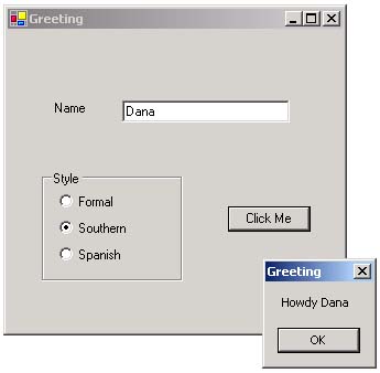 Step 1: Drawing the Radio Button Group To design this form, you must place the radio buttons in a logical grouping. The GroupBox is typically used for this purpose. The GroupBox control must be drawn first, then each radio button can be drawn and moved into the area within the group box. If you have two group boxes that each contain several radio buttons, both groups of buttons would be mutually exclusive. In this application, the properties were set as shown in Table 7-4. Table 7-4. Property Values for the StylesOfGreetings Application (Step 1) | Control Type | Name | Text | Other Properties | | Label | lblName | Name | | | Textbox | txtName | (blank) | | | GroupBox | txtCity | Style | | | RadioButton | rdoFormal | Formal | Checked: True | | RadioButton | rdoSouthern | Southern | | | RadioButton | rdoSpanish | Spanish | | | Button | btnClickMe | Click Me | | | Form | MainWindow | Greeting | AcceptButton: btnClickMe | Step 2: Determining Which Radio Button is Selected Next, we added code in the btnClickMe's Click event. In this handler, you can use the radio button's Checked property to determine if it selected. The code is shown below: Private Sub btnClickMe_Click(ByVal sender As Object, _ ByVal e As System.EventArgs) Handles btnClickMe.Click Dim s As String If rdoFormal.Checked = True Then s = "Hello " ElseIf rdoSouthern.Checked = True Then s = "Howdy " Else s = "Hola " End If s = s & txtName.Text MessageBox.Show(s, "Greeting") End Sub  | 
