Applying Tints
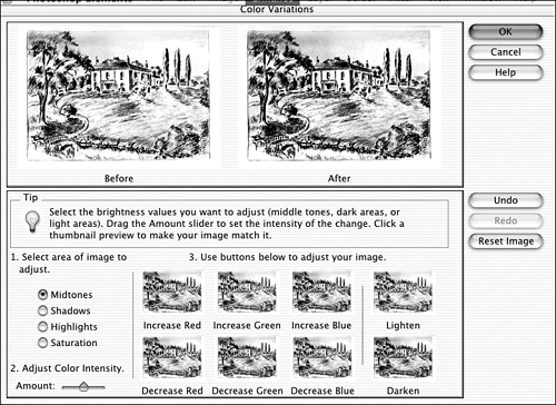
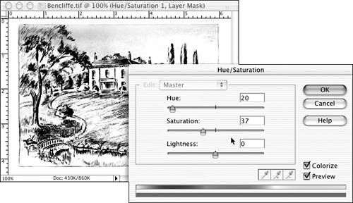
| Working with strictly black-and-white images can get boring. Sometimes it's fun to turn the black into a different color , especially if the image is a drawing, map, or other line art. Here's a quick trick I often use on grayscale images, using the Color Variations dialog box we discussed near the beginning of this chapter. First, change the color mode from grayscale to RGB (Image, Mode, RGB). Then, choose Enhance, Adjust Color, Color Variations, as I have in Figure 24.52. (Be sure you look at this in the color section.) Figure 24.52. Even though there's no color in the picture, Variations tries to add some. With the Midtones option selected, choose any one of the thumbnails that you like. I chose Decrease Green, which gave me a sort of purple-toned image. You can also lighten or darken the picture if necessary. Click OK to save the change. The result is a line drawing with a "color look." The capability to create duotones isn't included in Elements, although it is in Photoshop. A duotone adds a color to black, or combines any two colors, giving you a much richer-looking image. It's commonly used to replace sepia in a corrected black-and-white photo. Several pages back, I showed you one way to re-create that sepia look using the Colorize option in the Hue/Saturation dialog box. Here's a way to get a duotone effect in Elements:
|
EAN: 2147483647
Pages: 349
- The Effects of an Enterprise Resource Planning System (ERP) Implementation on Job Characteristics – A Study using the Hackman and Oldham Job Characteristics Model
- Distributed Data Warehouse for Geo-spatial Services
- Data Mining for Business Process Reengineering
- Intrinsic and Contextual Data Quality: The Effect of Media and Personal Involvement
- Relevance and Micro-Relevance for the Professional as Determinants of IT-Diffusion and IT-Use in Healthcare