Golden Mean: Method and creativity combined to create typographic balance
|
| Douglas Bowman, Designer www.csszengarden.com/017 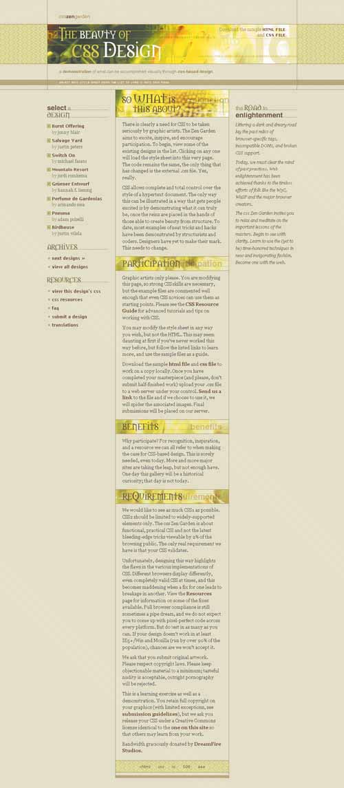 WHEN SITTING DOWN to work on his contribution to the CSS Zen Garden, designer Douglas Bowman recognized that even though he wasn't designing a full-scale project, the process he was following was essentially the same one he uses for larger, real-world projects. Golden Mean demonstrates how typography is as much a part of the Web design workflow as it is with any other form of graphic arts, and that design is a combination of inspiration, technical details, and process. Selecting TypeHaving already spent time thinking through the content and ideology behind the actual page, and sketching out potential layouts for it, Bowman was ready to dig into the typography. While type choices might seem to have secondary importance to such elements as imagery and color use, experienced designers are well aware that successful design is the culmination of many factors. One of those factors is the impact of type. Even though it is often subliminal or subtle to most people, type choice influences a design in profound ways. Type can inspire a wide range of moods, including:
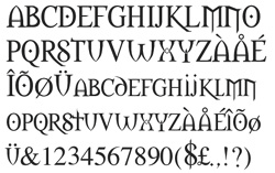
If there's an emotion you can add, it's highly likely there's a typeface or combination of faces that can evoke that emotion. Because of this critical impact, it behooves the designer to explore type options for a given design with as much sincerity and creativity as possible. Experimenting in IllustratorTo make his type selection, Bowman turned to Adobe Illustrator. He used the software along with his considerable knowledge of typography to match the faces to the graceful mood he wished to express in his design. FIGURE 1 is extracted from the original experiments that Bowman did for Golden Mean. Looking for something that he believed to best characterize clever, fun, and unique design took some time. Notice, though, that he used the actual headers from the site: "CSS Zen Garden" and "The Beauty of CSS Design." Previewing with the actual type you're setting helps you to visualize not only the typeface itself, but the overall context, too. Figure 1. Experimenting with numerous typefaces in the process of developing Golden Mean.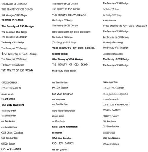 Note Illustrator is a vector-based drawing program. Many Web designers will mockup a layout and make their type choices first in Illustrator, then move them to Adobe Photoshop to integrate and rasterize the results for use on the Web (both programs are included in Adobe Creative Suite). Macromedia's equivalent offering, Freehand, is included in its Studio MX suite of products. See www.adobe.com/products/creativesuite/main.html and www.macromedia.com/software/studio for more details. Finally, Bowman settled on Morpheus, available as a free download from Kiwi Media (www.kiwi-media.com/fonts.html) (FIGURE 2). He was taken with specific aspects of the face. Study the typeface for these features:
Figure 2. The Morpheus typeface. Finding the TensionBowman also required a contrasting typeface to create some visual tension, and spark further interest in the overall look. He chose Helvetica to use alongside Morpheus. Helvetica is a quintessentially modern sans-serif typeface that contrasts well with Morpheus; a bridge between a gothic mood and a modern one is created, which adds a lot of appeal to the work (FIGURE 3). Other contrasts with typeface include mixing Verdana, a sans-serif face, with a lowercase serif face, Georgia, in the link lists (FIGURE 4). To ensure the links remained lowercase, Bowman used the text-TRansform property with a value of lowercase as follows: #linkList #lselect a.c:link, #linkList # #lselect a.c:visited { display:inline; font-family:Georgia,Serif; font-weight:normal; color:#616623; background-color:transparent; text-transform:lowercase; } Figure 3. Header from Golden Mean combining Morpheus and Helvetica. Figure 4. Verdana and Georgia in use in the link list. Note that all the Georgia type is set to lowercase, while the Verdana face is set in normal, title case. Other options for the text-transform property include capitalize, which will automatically capitalize the first character of each word, and uppercase, which places all the text in capitals. Georgia is also used for primary body text (FIGURE 5) and in italicized form for the preamble, broadening the variety and scope of type in Golden Mean even further. Figure 5. Notice the use of normal and italic Georgia in the body and preamble sections, as well as the graphic type choices within the headers.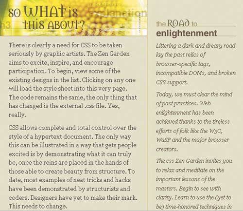 Control Over Anti-AliasingIf you examine the graphic type itself, you'll notice that it appears crisp and clean. If you've ever wondered why certain graphic type appears fuzzy on the Web, there are several reasons. First, the graphic might be set improperly from the start, or not optimized efficiently. But another reason is anti-aliasing. Anti-aliasing is the process through which software softens the pixilated curves in type by introducing halftone colors to smooth jagged edges. Typesetting software offers powerful tools to help you achieve a great end product, but designers interested in getting a crisper, cleaner output take care to dig a little deeper and control anti-aliasing wherever necessary. The smaller the type size, the more important this becomes. No stroke or curve within a typeface (and a face like Morpheus has a lot of them) can be reduced to smaller than a single pixel. The process of anti-aliasing adds more toned pixels at a smaller size, which creates unwanted blur. It's possible to use the kern function of any major graphics program to subtly adjust the letterform spacing for more acceptable anti-aliasing results. More information on anti-aliasing and kerning is available at Web Page Design for Designers (www.wpdfd.com/wpdtypo3.htm). Tip While you should feel free to experiment with multiple type families and faces, typically speaking it takes a very experienced type designer to get away with using multiple families well. This is especially true when mixing more than one family. When in doubt, simplicity is always a good option. Getting into TypographyIf all of this talk about typography is making you hungry for more information, don't worry! There's an abundance of excellent material in both print and online form. BooksThe next time you are out and about, stop by your favorite bookstore and spend some time in the design section. You're sure to find any number of typerelated books. Some will be historical, others will be about type design, and still others will feature the work of a particular type designer. Simply begin looking through those books that you find intriguingjust like viewing source in HTML and CSS, it's an excellent way to become exposed to methods and ideas with which you might be unfamiliar. Be sure to check out the following books by the excellent author, Robin Williams:
Tip A helpful article detailing this technique and providing additional insight is "Type: the Extra Mile" (www.mezzoblue.com/archives/2004/01/18/type_the_ext). More advanced designers will appreciate a range of books about type. Here are some especially worthwhile ones:
Online Type ResourcesIf you'd rather surf the Web for type, be sure you've got plenty of time on your hands. The Web is filled with a wide range of type resources, from online type foundries to helpful histories, tutorials, and interviews. Simply doing a Google search for typography, type foundries, and so forth will bring up more options than you can deal with in a day. To get you started, here are a few favorite resources:
A proper typographic education is a lifelong process, but that's no reason to be discouraged. The more knowledge you're armed with, the better results you'll experience in your individual works. Balance Is KeyAristotle tells us that "moderation in all things" is a wise way to live. While design sometimes should be extreme, for most designers working in the professional world, balance is key. The contrasting typefaces and letterforms of Golden Mean make it clear that finding the right mix of typographic expression helps Web designers achieve that desirable balance pointthe literal golden mean where a design achieves its practical goals while communicating a lasting and refined visual message. |

|
EAN: N/A
Pages: 117