Dead or Alive: Grace and gravity in typographic design
|
| Michael Pick, Designer www.csszengarden.com/009 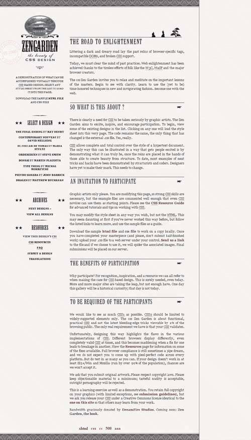 WHILE THINKING ABOUT potential submission ideas for the CSS Zen Garden, Michael Pick was driven by a desire to do something "kind of funny and a little bit strange," which led to his approach in Dead or Alive. Pick's idea was to contrast the old West with the world of the Japanese samurai, creating an intriguing historical difference. To carry the old West theme, Pick relied on Western-style typography, with a variety of interesting flourishes. The resulting submission is typographically subtle and offers us some excellent insight into designing with type. Decorative FlourishesOne of the most compelling visual aspects of Dead or Alive is the use of typographic flourishes, referred to as dingbats. Traditionally floral or ornamental symbols, digital dingbats typically follow a theme of some sort. Some examples:
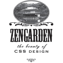
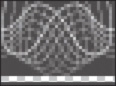
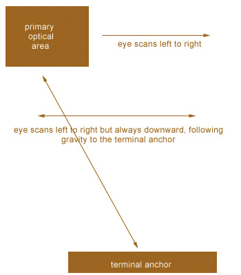
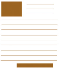
FIGURE 1 shows five examples of dingbat themes. Figure 1. Dingbat fonts typically follow a theme. Pick was able to extend his Western theme in Dead or Alive through the addition of dingbat glyphs and with graphic trimmings that help the design come across as sophisticated and complete. The first place we see this is in the logo (FIGURE 2). Accompanied by Westernstyle type, an image of a pagoda is placed in an oval area resplendent with curlicues and embellishments. The result helps the thematic contrast of the old West with historical Japan, and offers shape and flow to the overall look. Figure 2. The decorative logo for Dead or Alive. The five-pointed star of a sheriff's badge is a very familiar symbol in Westerns. In the link lists, the headers are styled with five-pointed stars and a dingbat separator (FIGURE 3). Figure 3. Headers in the link lists are styled with stars and a dingbat separator. Moving over to the body of the design, we find several more intriguing decorative pieces. First, the top header within the body has a unique treatment using images of samurai and a bonsai tree (FIGURE 4). Figure 4. The top header depicts samurais and a bonsai tree. In subsequent headers, the Western theme dominates, with a pointing-hand dingbata familiar symbol in Western-style design (FIGURE 5). Figure 5. Additional headers stick to a Western style. Two other decorative pieces strengthen and round out the work. At the top and bottom of the design area is a repeating image that creates a beautiful pattern reminiscent of currency and stock-certificate design (FIGURE 6). Finally, a postal mark bearing the mikepick.com domain adds a subtle embellishment with a bit of humor, too (FIGURE 7). Figure 6. This repeating image creates an intriguing pattern (image magnified). Figure 7. Postal mark used as a watermark for the page (image darkened). Without the use of dingbats and embellishments, pulling off the thematic contrast in this design would have been difficult. It shows that designers can benefit greatly from well-placed embellishments, which significantly enhance a design and its message. Typographic LayoutWe talk quite a bit about layout as it pertains to where various page elements go, but there's also plenty of scientific and anecdotal information regarding the placement of type elements within a design. Optical BehaviorThe human eye manages the process of reading in a very specific way. Typographers encourage designers to ensure that their type works in tandem with the human eye and does nothing to disturb the natural optical response to words. The only exception to this would be when a designer purposely tries to cause a disruption. Otherwise, following the optical behavior is important. In languages that are read left to right, a specific scanning pattern occurs when a person begins to read a page. This is true of both printed pages and Web pages. A dominant theory in typography is that that the eye will gravitate naturally to the top-left corner, which is referred to as the primary optical area. The eye then moves across to the right, sweeps down and across to the next line, and continues to make its way down the page. Throughout this process, the eye is grounded in what is referred to as the terminal anchor, the lowest point within the design. Ideally, designs that are meant for practical rather than experimental purposes will always acknowledge this optical behavior and do nothing to disrupt it (FIGURE 8). Figure 8. Diagram of optical behavior when reading a page. Note Of course, languages that aren't read left to right will result in different optical behaviors. With languages such as Hebrew or Arabic, which are both read right to left, it's logical to approach the optical response as being opposite: The scanning begins at the top-right corner and works its way across and down. Using Gravity to Lead the EyeThe process of drawing the eye down is referred to as gravity. Just as gravity pulls us physically downward, so is the eye drawn down to the natural conclusion of a visual design. Given this information, it makes sense that logos are typically placed in the primary optical area (the top-left corner) and that text and design elements create a terminal anchor at the bottom of the design. There are some hot spots along the way, usually wherever the eye lands to the right before resetting to the left side of the page. If we were to imagine a layout that follows this idea, we'd end up with a template for an ideal visual layout (FIGURE 9). Dead or Alive is a great example of a design that allows the human eye to flow with nothing to disrupt it. Figure 9. Blocked-out template sample of a layout that respects optical behavior. Avoiding Comprehension ProblemsAnother concern in typography is ensuring that people comprehend the message being presented via the words. Again, an exception would be an experimental design where the message is an emotional response to the image, rather than the meaning of the words contained within it. Header TextHeader text is of course used to denote sections within a document. As we've seen in Dead or Alive, the way headers are styled can add meaning for the visitor as well as strengthen the design itself. Some guidelines for working with headers effectively:
Another interesting factor in header design is the influence of punctuation, particularly the period. Typically speaking, you'll want to avoid the use of a period at the end of your header. A period finalizes an idea, whereas the role of a header is to introduce an idea (FIGURE 10). Figure 10. Headers in Dead or Alive have no punctuation other than the question mark in this one instance. Along with the pointing hand, they assist in leading the eye to subsequent body text. Body TextBody text is the text that makes up the majority of your editorial content. Body text is meant to be reador at the very least scannedby the reader. However, following poor typographic practices can lead to a degradation of the message. To work effectively with body text, consider these guidelines:
Accent TextAccent text allows for a little more flexibility than header and body text, which are the most critical for comprehension. Accent text is the text used in sidebars, block quotes, and captions. When working with accent text, consider the following:
A point of usability also comes up when we think about how much text to allow on a page. Most readers don't like clicking a "next" link more than they have to. A fine balance must be struck between the right amount of body text and the point when it makes sense to move to another page. Thoughtful Type, Graceful DesignDead or Alive is a graceful design. Its grace comes from the attention Michael Pick paid to small details, embellishing his design with appropriate and interesting facets such as dingbat glyphs. Add to that the solid typographic practices he used, and the strength of Dead or Alive is in its subtle, powerful simplicity. |


|
 Visual Enlightenment for the Web")
EAN: N/A
Pages: 117