Si6: The trouble with fonts, and how to cope with that trouble
|
| Shaun Inman, Designer www.csszengarden.com/044  DESIGNER SHAUN INMAN created si6 to take advantage of a grid structure. Three columns are implied in the design by imaginary type boundaries. The subtle lines interspersed amongst lines of text form complex relationships between the headers in the left column and the paragraphs they summarize in the main body's middle column. The type itself was carefully adjusted to fit on top of a background of image-based underlines. Constructing pixel-reliant text in this way resulted in a highly polished visual, but one that breaks easily if the user resizes their browser text (which may be necessary due to the small font size and low contrast.) Limited Font ChoicePerhaps the most irksome problem with type design on the Web, and certainly the least likely to change anytime soon, is that the list of usable fonts is both small and unpredictable, given that users can so easily customize which fonts they have installed on their computer. Except for type in Flash animations or embedded in objects like images, all Web-based type relies on the fonts installed on the end user's computer. Most users aren't designers, so their list of fonts very rarely contains more than whatever comes installed with their operating system and various software packages. Microsoft Office users, for example, will have a wider variety of fonts to choose from than users without Office. Tip Microsoft provides a list of the fonts that come with its various applications (www.microsoft.com/typography/fonts/default.aspx). Because users may opt to remove or simply not install fonts, there's still no guarantee that they will have the font installed. Windows and Mac OS X each have a different list of commonly installed fonts. There is some overlap, but if you take into account Unix variants (including Linux), it becomes clear that the only sure thing is that there are no certainties. TABLE 1 lists a few of the more common fonts on each platform.
Tip A survey of commonly available fonts was begun in 2001. Though it can't be seen as canonical due to an unknown degree of error in the responses, it does serve as a useful basis for comparison. For more on the survey, see the "Code Style Font Sampler" (www.codestyle.org/css/font-family). In 1996 Microsoft released a set of fonts specifically designed for onscreen use. These core Web fonts were distributed widely as a download from the Web; today, they usually get installed with Microsoft products. Included in the core Web fonts pack are those shown in TABLE 2.
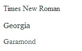
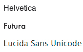
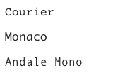
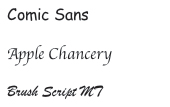
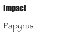
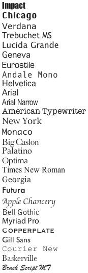
It's generally considered safe to rely on these fonts for your design, but again, there are no sure things when it comes to type on the Web. And this is precisely the reason why CSS has a way of specifying multiple fonts as well as a generic family to fall back on if none of the other fonts are available. Note Unfortunately, the core Web fonts were discontinued as an official free download from Microsoft in 2002, but they live on (thanks to the generous original licensing terms) at http://corefonts.sourceforge.net. Since the page is meant for Linux users, finding the Windows versions is a bit trickylook for the "Original unaltered .exe files". Generic Font FamiliesInman wanted si6 to be rendered in the Mac-based Geneva typeface. Since he was aware of the limitations of selecting type that isn't available on Windows computers, he also included alternate choices in his list of preferred fonts: body { font: 9px/16px Geneva,Arial,Tahoma,sans-serif; } In this declaration, the first two values set the font's size (9px) and line height (16px), and then backup fonts are listed in order of preference (FIGURE 1). If a browser can't find Geneva, it will look for Arial next, and then Tahoma, and as a final measure in case none of these are available, it will use whatever the browser has specified as its default sans-serif font. Figure 1. si6 rendered in (from top) Geneva, Arial, and Tahoma. These generic font families are built into CSS, and all compatible browsers will automatically match an appropriate font to each generic family (though it's possible for the user to override the browser's choice). It's not a requirement to provide a generic font family as a backup with every font declaration you make, but it may as well be (unless you really like Times New Roman). Each generic family is listed below, with a description of its purpose. serifserif fonts have decorative serifs, which are the little barbs and hooks at the ends of various letter strokes (FIGURE 2). Times New Roman is almost always the default serif font, unless the user has manually changed it. Figure 2. Example serif fonts: Times New Roman, Georgia, and Garamond. sans serifsans-serif fonts are without serifs (FIGURE 3). Arial is almost always the default sans-serif font. Figure 3. Example sans serif fonts: Helvetica, Futura, and Lucida Sans Unicode. monospaceA monospace font is a fixed-width font: Each character is given the same amount of space (FIGURE 4). So, for example, "i" takes up the same amount of space, widthwise, as "m" in these fonts. They are useful when listing code, which requires consistent character positions from line to line. Courier (or Courier New) is almost always the default monospace font. Figure 4. Example monospace fonts: Courier, Monaco, and Andale Mono. cursivecursive fonts simulate a hand-written appearance, and they are mainly used for headers (FIGURE 5). The name suggests script-style fonts, but the category extends to any font that appears hand-written. Defaults vary, but Comic Sans is the most common cursive font. Figure 5. Example cursive fonts: Comic Sans, Apple Chancery, and Brush Script MT. fantasyA fantasy font is purely decorative and is mainly used for headers (FIGURE 6). Because this classification contains such a wide range of fonts, there's no way to predict how the combination of font family and size will appear. Thus, no one uses fantasy for serious design on the Web. Figure 6. Example fantasy fonts: Impact and Papyrus. Vanilla's Nice, but...If you've been conceding to using Verdana and Georgia for three out of every four Web projects, choosing a font you know most users won't have installed can be a refreshing way to inject some life into your work. Provided you issue a few backups for the large majority of users who won't have your first choice installed, this progressive enhancement approach can be a great way to explore new possibilities without being held back by end-user limitations. The following combinations work well due to their relative similarity; the first in each list offers something new and unexpected, and the next are safe backups: body { font-family: "Lucida Grande", "Lucida Sans Unicode", Verdana, Earlier you saw how Inman offered Geneva as a first choice, with Arial and Tahoma as backups. This is a particularly good combination because all three typefaces have similar x-heights. An x-height is defined in Typographic Design: Form and Communication, 3rd ed., by Rob Carter, Ben Day, and Philip Meggs (John Wiley & Sons, 2002), as "the height of lowercase letters, excluding ascenders and descenders. This is most easily measured on the lowercase x." You may have noticed that some fonts look bigger than others, even though you've given them the same font-size value; 16px Verdana, for example, is quite a bit larger than most other fonts at 16px (FIGURE 7). When building your list of alternate fonts, it pays to keep in mind that the font-size value applies to all of them equally; if your preferred font has a relatively large x-height, and the font most users see is quite a bit smaller, the results may prove unreadable in certain situations. Testing your choice on other browsers and platforms ensures the best legibility possible. Figure 7. Different fonts at 16 pixels with varying x-heights. Note the size difference between the fonts at the top and bottom of the list. In 1998, CSS2 introduced a property called font-size-adjust, which was designed to work around this x-height discrepancy; because it was never widely implemented, it was scrapped when CSS2.1 superseded the earlier CSS2. Perhaps it will be usable once CSS3 is finished and supported by the major browsers, but for now, don't rely on it. Practical Font SelectionBecause of the wide variety of font sets that users may have installed on their computers, it's impossible to predict precisely what your site's visitors will see. Therefore, it pays to be practical and accept that some will inevitably see different things than you do. But that's no reason to stick to Arial for everythingexperimentation is still alive and well on the Web. Taking Shaun Inman's cue, you may find that branching out from the Web core fonts can be rewarding. |
|
EAN: N/A
Pages: 117