Magazine Design Fundamentals
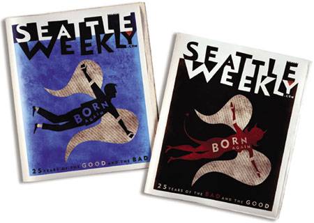
| We've all spent a few minutes admiring a beautiful magazine cover or spread. Whether it's a home decorating feature, a National Geographic special on Alaska, or a dreamy picture of a favorite model, the magazine has the power to draw us in. Why is this so? Magazines inspire us through the marriage of content and design. Every aspect of a magazine, from its cover to its inner pages and ads, is handled with precision. Beautifully written and carefully edited text is integrated with expertly handled photos and illustrations. Magazine design attracts people who have a flair for design and a love of storytelling; a successful magazine designer must be accurate and eagle-eyed on top of being creative and technically skilled. Figure 9.2. These covers created by Cyclone Design for Seattle Weekly's 25th anniversary issue leap from the newsstands with their strong composition and angelic/devilish illustration.
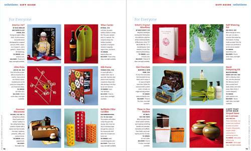
Let's explore some of the fundamentals that make magazines tick. Layout and ContentWhat makes a magazine cover or page so visually compelling? Partly it's the magic of layout: the artful arrangement of text and images on a page. Designers use a grid system to determine the placement and alignment of all page elements (text and graphics), particularly on inner pages and across facing pages called two-page spreads. Invisible to the reader, the grid provides a structure of lines or guides that determines where all the content goes on the page. The grid helps the layout artist balance the information to create an intriguing logic. This creates continuity and visual interest, which is especially important if a story has multiple pages. Figure 9.3. A spread can use a grid fluidly or rigidly to get the story contents across. This rigid grid approach from Real Simple keeps the featured products and descriptions organizedand the use of color in the background photos keeps it feeling active.
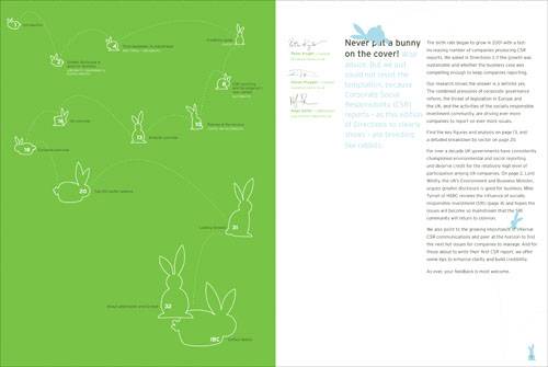
note Within a single magazine, you might first notice a variety of design stylesone for each article, with images and layouts based on the article content. But on closer inspection, you'll see that certain elements are repeated among all of the articlesthe body text style, the number of columns in the grid, and so onto give the maga- zine a consistent feel. How is the layout decided? Every magazine has a set of general guidelines for design and layout that are consistent but revamped every few years or so. The nature of the magazine itself will determine whether the focus is mostly text content or graphic content, or a mixture. A fashion magazine will have a very different set of layout standards than will a newsmagazine or literary journal, for example. A magazine designer or art director is asked to work creatively within these overall constraints. In a best-case scenario, an art director will begin shaping creative ideas for an article at the early planning stage for the magazine's next issue. At an initial story meeting, an editor will assign writers and photographers to each article and discuss some possible directions for a story, so that writers, photographers, and editors are all working in concert. In the corner of the room, art directors are busy sketching in their notebooks. Inevitably, however, the unrelenting pressure of publishing deadlines, coupled with the designer's penultimate spot on the production line, means that many decisions about a story's layout are made at the last minute, as copyedited text, new photos, and sets of illustrations make their way in at the eleventh hour. This is where the magazine designer really earns her stripes. Dozens of subtle or not-so-subtle manipulations to an article's headline, photos, pull quotes, and text columns may be required to add power and punch to the visual message of the page. Done effectively, a page layout doesn't just pull in readers; it also tells a reader where to look and what's important. Please note that even if you're not dying to work in magazine publishing, the layout concepts in this chapter can applied in many other fields: book publishing, brochure and marketing design, and Web design, to name just a few. ResearchOne of the great things about magazine design is that you're continually asked to take on projects that explore subjects or genres you're not familiar with. An on-staff designer at a magazine will work with graphic and text content that is always changing. And even if the content is well-traveled (what, another article about getting rock-hard abs?), the challenge of expressing it anew is all the greater. tip Don't stop at magazines when doing your magazine design research. Look at ads, posters, packages, books, Web sites, and other media targeting your audience. Pick up on trends that attract the audience and the design staples that speak to them. Freelance designers experience an even wider range of material. Oftentimes freelancers are called in to assist during a deadline crunch or to assemble special editions. Those folks need to get up to speed fast. Even if you don't know your axle from your elbow, you may suddenly be charged with laying out an article for a car mechanics magazine. Magazine art directors will expect you to be knowledgeable about what their readers are looking for, so it pays to do some research. If you're called, take a trip to the newsstand to gather issues of the magazine and others targeting a similar audience. Figure 9.4. This report on CSR (corporate social responsibility) put together by salterbaxter and Context illustrates the application of the grid, headline, body text, negative space, and other concepts you'll explore in this chapter. The rabbit motif is a fresh and engaging approach to communicating the proliferation of CSR.
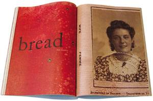
Figure 9.5. The introduction to this Zoetrope foreign affairs essay is enigmatic: just a single headline, a powerful color block, and a vintage passport photograph draw the reader into the story.
As you pore over periodicals, here are some questions to ask yourself to prepare for designing:
|
EAN: 2147483647
Pages: 103


