Using the Grid
| The idea of using a grid when designing a cover or spread might sound a little limiting to a creative type, but it isn't at all since you, the designer, will set up the grid before you begin applying elements to it. Furthermore, a grid is not an ironclad set of rules; it's a structural tool that opens up many possibilities. Before you construct a grid, you must take stock of your content. You'll most likely get text and images from other departments at the magazine along with some other rules such as the amount of ad space to be allotted. From here you can sketch out your plans for the text and images, and begin to turn this into your grid framework. To learn how text and images interact in a layout, we'll explore a design for a Magnet article about the innovative musician Tom Waits as we work through this chapter. Figure 9.6. We'll follow the design of this captivating article from MAGNET throughout the chapter, learning about the grid, page elements, and overall composition.
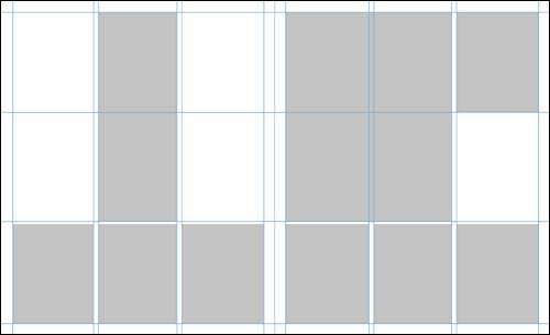
Step 1: The Grid ItselfLet's explore the grid concept more closely, looking at MAGNET's article on Tom Waits. The layout began as a tabula rasa: a blank slate. Before any text or images could be added, the designer most likely poured a cup of coffee and mapped out an empty white space with a grid. This can easily be done on paper, in layout software such as Adobe InDesign or QuarkXPress, or in Illustrator and other programs. note You'll notice that in most magazines (and newspapers too!), the columns are spanned with images or headlines but almost never with the main body text. That's because narrow areas of text are much easier to read than wide ones, and the columns help the text flow easily. The designer opted for a column grid, which is common to many articles and can be approached in a variety of ways. The grid has three columns on each page with some space between them. Text can flow from one column to the next, or the columns can be joined or spanned so that they house photos. (Magazine covers, by the way, tend to be based on relatively simple grids that mark out the page margins and logo area.) Figure 9.7. The grid system doesn't mean every page will look the same. Notice how some elements span columns to create an interesting but structured layout.
When using a column grid, you'll generally want to place some horizontal guides as well to help position items to visually break up the columns. In the case of this MAGNET article, it appears that the designers used guides that divided the pages in thirds horizontally. On the grid, you'll notice placeholders for images, headings, and body text or copy. These represent just a starting place and are by no means meant to limit creative design ideas. Figure 9.8. Popping placeholders onto your grid is a quick way to sketch out the framework for your magazine spreadbefore going to all the trouble of editing text and images and fitting them in.
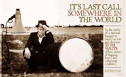
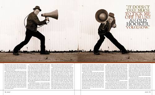
You'll also notice some empty space on the grid. What's up heredid the designer forget something? Not at all; like every other part of the layout, the empty space was carefully planned. In graphic design, one of the most important tools for creating contrast is through the relationship between positive and negative space: areas that house content (text and images) and areas that do not (colored backgrounds, empty parts of a photo, white areas, and so on). Why allot negative space? A strong contrast can attract a viewer's attention and enhance the message that each design element conveys. Providing empty space around a column of text gives the eye a break and lets the text breathe; layouts that are jam-packed can feel constricting. Negative space is the designer's friendit creates the best possible frame for a design, even if the content is flat and lifeless. Well, that part is up to the editor, after all. Step 2: Text and ImagesLet's continue dissecting how the Tom Waits article was put together. The designer's next step was to assemble the basic design elementstext and images. The magazine article is about a new Tom Waits album, which is a dark and gritty work focused on the world's political woes. The photos are simple and arresting, and their sepia-toned treatment underlines the dark theme. They make the reader focus on the man himself and think about his point of view. One thing to consider is that a magazine photo is never simply dropped into a layout. Magazine photos are nearly always retouched, corrected, creatively cropped, and positioned so that they span columns and rows of the grid. The empty areas in the photo are viewed as negative space, which must work well in the overall composition of the page. Figure 9.9. The photographs in the second spread of the Tom Waits article flow along the top two horizontal rows of the grid, and the text is easy to read broken over three columns per page.
The framing or cropping of photos or illustrations is also essential for magazine cover design. A cover typically uses just a single image to draw our attention, but that doesn't mean the design is simple. Should the photo's subject be centered on the cover? Looking off to one side? Can the subject overlap the logo? Is there room for all the story titles? The answers to these questions are decided by the art director and the editor, but there's a lot of flexibility from one issue to the next. For example, nearly everyone knows when they are looking at a cover of Vogue, even if the model partially obscures the logo. You will see a glamorous model wearing unaffordable clothing. She will be dead center and looking straight at the reader. A National Geographic cover, on the other hand, grabs readers in a different way. The cover may be a scenic photo with a point of interest off to one side to draw attention to the accompanying headline. On a magazine article or cover, text is the designer's next hurdle. Some magazines have rigorous typographic standards that are applied throughout the whole magazine (think The Economist or New Yorker), while others permit the flexibility to innovate from one article to the next. One thing's for sure: Text layout can make or break a magazine design, no matter how effective other elements may be. A quick reality check for those designers who are reluctant readers. A designer often focuses on the way the text looks, which often takes his or her attention away from what the text says. This is wonderful, because it means you are attuned to the appeal of text as a graphical object. Still, you should always keep in mind that you are responsible for communicating the whole message. Most of the time, visual layout is there to accommodate and organize the text. Let's look at some of the key text layout terms a designer needs to know, with examples pulled from the magazine article:
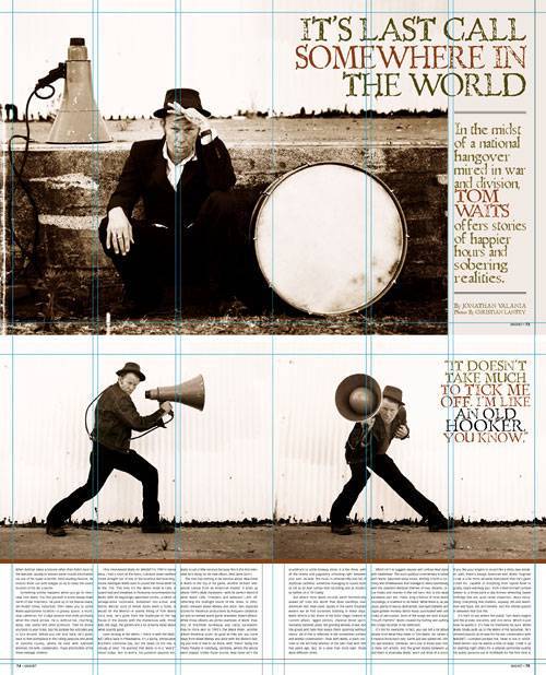
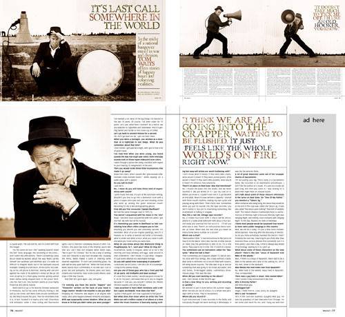
The typeface and size used for the body text are usually dictated by the magazine's style guide, but it is the designer's job to determine the column widths and text breaks for readability. Often an article title leads into a chunk of large text that flows into the beginning of the article. The purpose of introductory pages is to entice readers with smaller chunks of copy before they get into the meat of the article. note Until recently, magazines almost always used serif fonts for their body text, as it's traditionally been considered more readable. But the popularity of the Web has changed things. Sans serif fonts are easier to read onscreen, so younger readers are more used to themtherefore, some print magazines aimed at younger readers have opted for sans serif as their body font. In some cases, the positioning and design of headings, subheadings, pull quotes, typefaces, sizes, and even colors may be entirely up to the designer. For consistency, of course, it's best to stick to a single typeface or family throughout an article. In the Tom Waits article, you'll see that an aged-looking font is used in colors that complement the photographs, and the pull quotes are never larger than the heading and subheading. Step 3: The Final LayoutBack to our Tom Waits article. Next, the designer started placing text and images on the grid and refining the layout. This is an important step. By deciding how information is presented on the page, the designer determines how it will be understood by the reader. The importance and order of the content on a magazine page (or any designed surface) is often broadly defined by editors before it reaches the design stage. But as a good designer you should take the initiative to investigate and study the material thoroughly, so as to make design decisions that highlight the interesting parts of the content. The size and placement of text and images is key to creating what is called a hierarchy of information. When a reader opens a two-page spread, which element does she look at first? The headline? The image? Or an interesting pull quote? Our featured magazine article tells a story through layout alone. Where does your eye fall first? On the image and the heading, most likely. The layout creates a visual connection between the photo of Waits and the heading, and your eye shuttles back and forth between the two, trying to interpret the subject of the article. It's not immediately clear, and the ambiguity makes the article compelling. You're intriguedyou want to read more. Before you get to the full article, you check out the subheading, and then proceed from there with a better sense of what you'll be reading about. Figure 9.10. The first three spreads of the MAGNET article on Tom Waits. Notice the design of each one as well as the way they flow into a cohesive story.
When you turn the page, you are greeted with a new layout, but the grid and elements are consistent. The photos and the pull quote draw you into the body text. You continue reading to the next spread of pages, and now what you are reading is supported by the images and pull quote, rather than the other way around. One rule of human nature is that in order to determine the content of an article, readers look at the image first, no matter how descriptive the headings and subheadings may be. A common eye-catching effect is to use an image that does not reveal the story line but rather forces the reader to dig deeper to get what is called the solution to the problem or the answer to the question. Same goes for the headline, which is often a play on words to attract your attention without giving away the details. Cover designs share the same goal: to intrigue you with snappy copy and a dazzling image and entice you to explore further by buying and reading the magazine. A cover photo must give a general sense of what's inside without giving it all away. A single, bold headline will refer to the most important, must-read article inside or the theme of the issue. Smaller, less critical story titles will bolster the photo and hold your interest without distracting from the main message. You'll explore these concepts more in the project at the end of this chapter. |
 Adobe Photoshop and Adobe Illustrator Projects")
EAN: 2147483647
Pages: 103