The 35,000-Foot Overview
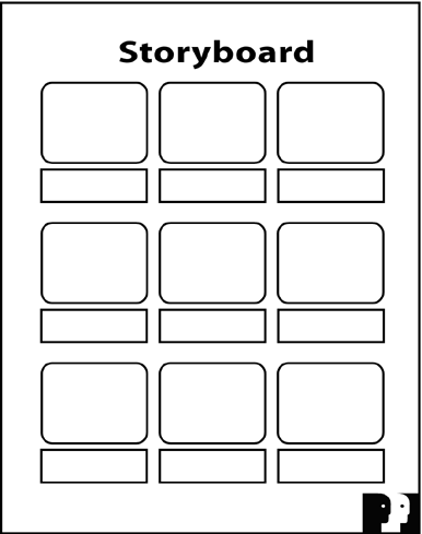
The 35,000- Foot OverviewIn the past two chapters, we focused on designing slides that convey information clearly and effectively. You've absorbed many details about everything from font styles to graph labels. Now it's time to take a step back and return to one of the earlier concepts in this book: specifically , to flow . Every communications medium has its own techniques for helping its audience remain oriented and follow the flow. Think about text, where the reader is the audience to the writer. In a book, a magazine, a newspaper, or a printed report, the designers and editors provide the reader with many tools to help track the writer's flow: the table of contents, the index, and the running heads along the top or bottom of the page. Even more important, the reader has the luxury of random access to the writer's material. The reader can navigate through the text independently by visiting and revisiting the table of contents or the index, and by flipping backward and forward as often as needed to follow the overall flow. Think of Russian novels , where all those multiple names and nicknames of the characters are listed up front. Think of plays where the Dramatis Personae , or cast of characters, precedes the first scene. Through long practice, readers are accustomed to steering through the structure of written texts on their own. Presentations are different. In a presentation, the audience can access the presenter's material only in a linear fashion: one slide at a time, one spoken sentence at a time, and all this under the presenter's control. Once a slide disappears from the screen, it's gone forever. The audience doesn't have the opportunity to flip back and forth at will to clarify the presentation's flow. Just as in the telling of the presentation story, the audience receives the visual content at the level of the trees. And, just as in the telling of the story, the presenter's job is to rise up from the trees and give the audience a view of the entire forest. As always, the presenter's job is to navigate the audience's minds, but now the presenter can also navigate the audience's eyes. The Flow Structures in Chapter 4 and Telling 'em what you're gonna tell 'em in Chapter 5 can help your audience follow your flow, but both of these are purely verbal techniques. Graphics can help express flow, too. You can design your slides to convey the connections among your ideas. You can use a set of simple visual tools to create continuity and help your audience track the overall logic of your presentation. Before introducing these tools, however, it's important to step back and check the flow of your presentation, to examine it as a whole, by taking a 35,000-foot overview. One valuable tool to do this is the Storyboard Form, illustrated in Figure 9.1. Figure 9.1. The Power Presentations Storyboard Form. Television and film directors use storyboards to plan their end products, whether it is a 60-second commercial or a multi-million-dollar special-effects epic. They map out the camera angles of each scene and then envision how the individual scenes will combine into a whole sequence. I provide my clients with a paper version of the storyboard. The Microsoft PowerPoint version of this aspect is called Slide Sorter view. Both options provide a panoramic view of your story. This view lets you see all the slides for a given presentation at a glance, a perspective that minimizes your focus on details and offers a broader outlook of the landscape. It's an efficient planning tool that helps you check the progression of your story. Note that there is also a small rectangular box beneath each slide image where you can enter notes on your narrative, further clarifying your flow.
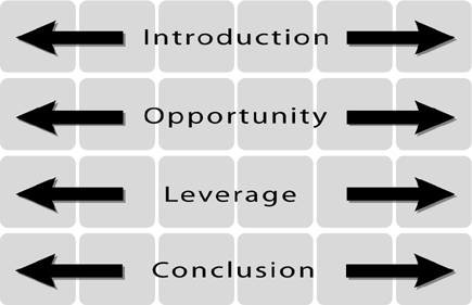
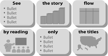
Figure 9.2 illustrates how the panoramic view works. Look at your slides in the Storyboard Form. See them in groups, reflecting the Flow Structure you chose for your presentation. In this example, the presentation includes four parts : an Introduction, an Opportunity section, a Leverage section, and the Conclusion. Each section is supported by a group of slides, and within each section, every slide should fit logically into place. Figure 9.2. The panoramic view. When you scan slides in this view, it should become evident when some slides don't fit where you've placed them. You may want to shift them to a different part of the sequence; or they may be extraneous, in which case, you might want to eliminate them altogether. The connection between any one part of the presentation and the next should also be clear. If it isn't, you might want to rethink your sequence. You could add, delete, or shuffle slides so that the logic is evident; or, you might even try a different Flow Structure. The ultimate technique for checking your flow is to read only the titles of your slides, as in Figure 9.3. If you can trace the logic of your entire presentation by reading these few words, bypassing the bullets, graphs, or other content, you've created clarity. A presentation that achieves this makes it easy for your audience to follow and easy for you to deliver. In Microsoft PowerPoint, you can use either the Slide Sorter or the Outline view to read only the titles. Figure 9.3. The ultimate flow check.
|
EAN: 2147483647
Pages: 94